It looks like you're using an Ad Blocker.
Please white-list or disable AboveTopSecret.com in your ad-blocking tool.
Thank you.
Some features of ATS will be disabled while you continue to use an ad-blocker.

-@TH3WH17ERABB17- -Q- Questions. White House Insider's postings -PART- - 31 -
page: 134share:
a reply to: EndtheMadnessNow
Dam! Love Louisiana!
lUob20zTa2w
Ah for # sakes, help me out with this video please....
www.youtube.com...
Dam! Love Louisiana!
lUob20zTa2w
Ah for # sakes, help me out with this video please....
www.youtube.com...
edit on 13-11-2020 by CanadianMason because: (no reason given)
edit on 13-11-2020 by CanadianMason because: (no reason
given)
edit on Fri Nov 13 2020 by DontTreadOnMe because: attempt to fix vid link
originally posted by: Guiltyguitarist
Are we proving the Mandela effect in real time on ATS?
I don’t care what ANYBODY says...it was Berenstein Bears when I was younger. I had all the books and all that. Never spoke the word Berenstain before around 2012.
originally posted by: djohn554
originally posted by: pale5218
originally posted by: pale5218
@gatewaypundit
As promised yesterday... WE CAUGHT THEM!
We are releasing our report in 20 minutes.
twitter.com...
ETA: The Gateway Pundit site has been carrying the tally of votes switched from Trump to Biden or lost completely
It just came out, I haven't read it yet.
twitter.com...
here is the link directly to Gateway Pundit article
www.thegatewaypundit.com... ht/?utm_source=Twitter&utm_campaign=websitesharingbuttons
I was hoping for acutal evidence. Saying that it is statistically improbable (they say impossible), is not really evidence ....I think.
Edit: computers are hard
I mean, I think that is pretty conclusive actually.
Look again at the graph, the grey data is what it should look like, kind of random. It was only AFTER election day, that mail in ballots suddenly all started going perfectly in line with Trumps election day results, minus 40%.
There is no way that happens by chance over that many counties.
a reply to: Dem0nc1eaner
That's the program weighting the votes?
whatever it is their arguing looks manufactured I agree.
That's the program weighting the votes?
whatever it is their arguing looks manufactured I agree.
originally posted by: Aallanon
a reply to: MetalThunder
Every device is a plug and play. Your TV your phone etc. You are never not having data collected on you.
Like part of this is yes, they could be listening, but as an electrical engineer who has worked design and manufacturing, you really can't trust the average person to figure out how to make it work. Hence "plug and play."
originally posted by: PokeyJoe
originally posted by: Guiltyguitarist
Are we proving the Mandela effect in real time on ATS?
I don’t care what ANYBODY says...it was Berenstein Bears when I was younger. I had all the books and all that. Never spoke the word Berenstain before around 2012.
Not in my universe. As you’ve probably noticed I can be an ass about spelling.
I remember being about eight years old and thinking, “shouldn’t that be Stein?”
a reply to: djohn554
Although the article majors on statistically impossible, for me they didn't emphasise the graph enough!
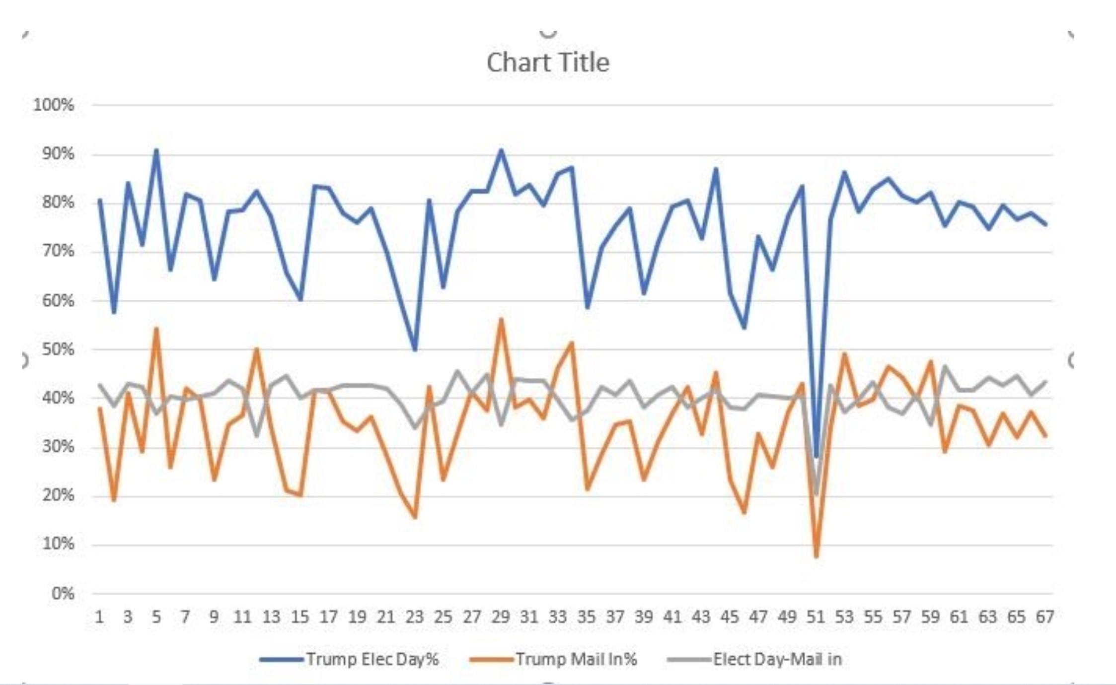
The GREY, almost straight, line is mail-ins upto/including election day.
The BLUE, is Trump's percentage cut of the Election day in-person votes.
The ORANGE, is the total Trump percentage cut of mail-in vote votes.
In summary, although at election day POTUS had a steady 40% of mail in votes in most all counties, when the final vote was graphed his mail-in votes suddenly changed to be exactly the same graph as the walk-in votes but 40% lower across the board.
You just don't get too graph plots so similar as the blue walk-ins and orange total mail-ins... you could pretty much overlay them by adding 40% back to the orange line!
Now look at counties 55 to 67... the orange line is not only a replica of the blue but also a mirror image of the grey line.
You just don't get these plot lines without applying a simple Skewing coefficient across the board.
Although the article majors on statistically impossible, for me they didn't emphasise the graph enough!
The GREY, almost straight, line is mail-ins upto/including election day.
The BLUE, is Trump's percentage cut of the Election day in-person votes.
The ORANGE, is the total Trump percentage cut of mail-in vote votes.
In summary, although at election day POTUS had a steady 40% of mail in votes in most all counties, when the final vote was graphed his mail-in votes suddenly changed to be exactly the same graph as the walk-in votes but 40% lower across the board.
You just don't get too graph plots so similar as the blue walk-ins and orange total mail-ins... you could pretty much overlay them by adding 40% back to the orange line!
Now look at counties 55 to 67... the orange line is not only a replica of the blue but also a mirror image of the grey line.
You just don't get these plot lines without applying a simple Skewing coefficient across the board.
a reply to: underpass61
Not really. What he actually said is that he heard of a tweet in German talking about the Scytl server being taken a day after he directly told Trump about said server. But there is nothing confirming this or anything official saying we act got the server in question. A lot of “I heard and supposedly”....
Not really. What he actually said is that he heard of a tweet in German talking about the Scytl server being taken a day after he directly told Trump about said server. But there is nothing confirming this or anything official saying we act got the server in question. A lot of “I heard and supposedly”....
originally posted by: RelSciHistItSufi
a reply to: djohn554
Although the article majors on statistically impossible, for me they didn't emphasise the graph enough!
The GREY, almost straight, line is mail-ins upto/including election day.
The BLUE, is Trump's percentage cut of the Election day in-person votes.
The ORANGE, is the total Trump percentage cut of mail-in vote votes.
In summary, although at election day POTUS had a steady 40% of mail in votes in most all counties, when the final vote was graphed his mail-in votes suddenly changed to be exactly the same graph as the walk-in votes but 40% lower across the board.
You just don't get too graph plots so similar as the blue walk-ins and orange total mail-ins... you could pretty much overlay them by adding 40% back to the orange line!
Now look at counties 55 to 67... the orange line is not only a replica of the blue but also a mirror image of the grey line.
You just don't get these plot lines without applying a simple Skewing coefficient across the board.
Almost like the pattern is to consistent, manufactured!
Look at 35 through 53. This is way too similar.
edit on 11/13/2020 by pale5218 because: add line
a reply to: Guiltyguitarist
See, I believe you 100% but I was the opposite. I said “Berenstein” with great regularity when I was young, and growing up many many times. Berenstain never entered into my lexicon until around 2012.
See, I believe you 100% but I was the opposite. I said “Berenstein” with great regularity when I was young, and growing up many many times. Berenstain never entered into my lexicon until around 2012.
Looks like Bidens minions have started his policy's
Michigan governor seeks shutdown of Great Lakes oil pipeline
Line 5 is part of Enbridge’s Lakehead network of pipelines that carries oil from western Canada to refineries in the U.S. and Ontario
Michigan governor seeks shutdown of Great Lakes oil pipeline
Line 5 is part of Enbridge’s Lakehead network of pipelines that carries oil from western Canada to refineries in the U.S. and Ontario
edit on 11132020 by MetalThunder because: (no reason given)
Very very interesting trending going on today.
I would hope that this point folks have caught on to the patterns. If one wakes up and the eneMedia is screaming "there is no widespread voter fraud..." then folks KNOW this is inversion. A mind control net has been tossed and that's the theme. The process is to invert the truth.
If folks wake up and they are hearing others say "oh, I don't know, I don't think that Trump can pull this off" that is inversion. A mind control net was tossed and those repeating this are repeating the desired outcome, not their experience.
In both those cases all that drivel should be ignored. On 11.4 MOST folks bought into the inversion that Joe ByeDone won with the most votes ever, and crawled into the fetal position as the mind control asked them to do.
But. There is another warning system that is not inversion related. In this case, beginning tomorrow for many, they will be saying to themselves "I don't get it, I don't fit in with any of this anymore..." Or, "I feel so disconnected from my family (or friends, coworkers etc.). Or "How did I get here, I have no idea what is going on at all?"
Those themes and more will be come a part of one's life beginning tomorrow. Many have already felt this to an extent, but it appears to be coming in a wave now.
It is part of the great awaQening and it is due to orientation, at least in part.
For most of us we see our lives like this:
And the control system likes this, order.
But in fact, life is much more like this:
If one has lived in the train version, orienting to the fractal version is odd and if one has been focused on the fractal version orienting to the train version is very odd indeed.
The current state of affairs is providing a variety of visions to create Contrast for us. That Contrast tells us where we are, but at this point it is more likely to tell folks where the are not, or no longer are.
As more and more is revealed, the orientation of the individual self comes into question. As more and more people define themselves in the polarity extremes, the ability to orient to one system or another becomes increasingly uncomfortable.
What does this mean long term? To each his own as they say. But it does mean we have arrived at a very interesting [Y] choice point in our collective experience. As such, taking Ques from others may be a challenge. Trust oneself would be the best advice.
originally posted by: PokeyJoe
a reply to: Aallanon
Why do you think that 70 inch LCD only costs 299.00$ these days? Because the real prize is all that sweet, sweet data that said TV will generate. When something is free, or greatly reduced, YOU are the actual product in this equation.
It's actually a manufacturing equation and a butt load of cost reduction.
a reply to: RelSciHistItSufi
In still don't get it.
how doo the mail in ballots match it .How do they do it?
In still don't get it.
how doo the mail in ballots match it .How do they do it?
new topics
-
When is art porn and when is it not?
Social Issues and Civil Unrest: 25 minutes ago -
“I’d like to turn it over to Jill for any comments she has. It’s all yours, kid.”
US Political Madness: 1 hours ago -
The official representative of Russia reported about concentration camps for Russians
World War Three: 3 hours ago -
Conservatives and liberals have different brain structures
Political Ideology: 4 hours ago -
Eritrean gangs clash in 10-hour riot during 'cultural celebration' North Carolina
Social Issues and Civil Unrest: 5 hours ago -
American Taxpayers Fund Hezbollah Terrorist Memorial In Dearborn Michigan
Social Issues and Civil Unrest: 7 hours ago -
Kamala Harris tells Oprah she will kill an intruder
US Political Madness: 9 hours ago -
Illegal Alien brothers arrested in Missouri for connection with deadly carjackings
Social Issues and Civil Unrest: 10 hours ago
top topics
-
BIDEN-HARRIS DOJ-DHS Blocked Florida Law Enforcement from Investigating Would-Be Trump Assassin.
US Political Madness: 15 hours ago, 23 flags -
Kamala Harris tells Oprah she will kill an intruder
US Political Madness: 9 hours ago, 15 flags -
Illegal Alien brothers arrested in Missouri for connection with deadly carjackings
Social Issues and Civil Unrest: 10 hours ago, 14 flags -
Sept 2024 - MATT GAETZ Reveals There Are FIVE Trump Assassination Teams in the USA Right Now.
2024 Elections: 15 hours ago, 13 flags -
Eritrean gangs clash in 10-hour riot during 'cultural celebration' North Carolina
Social Issues and Civil Unrest: 5 hours ago, 13 flags -
Teenage Girl Raped and Woman Sexually Assaulted on Brighton Beach
Social Issues and Civil Unrest: 12 hours ago, 10 flags -
American Taxpayers Fund Hezbollah Terrorist Memorial In Dearborn Michigan
Social Issues and Civil Unrest: 7 hours ago, 8 flags -
“I’d like to turn it over to Jill for any comments she has. It’s all yours, kid.”
US Political Madness: 1 hours ago, 5 flags -
Conservatives and liberals have different brain structures
Political Ideology: 4 hours ago, 5 flags -
When locals can spot your counterfeit pandas
Jokes, Puns, & Pranks: 13 hours ago, 4 flags
active topics
-
Sept 2024 - MATT GAETZ Reveals There Are FIVE Trump Assassination Teams in the USA Right Now.
2024 Elections • 19 • : chr0naut -
When is art porn and when is it not?
Social Issues and Civil Unrest • 8 • : Xtrozero -
A sheriff has been arrested after shooting at a judge at county courthouse with a fatality
Other Current Events • 26 • : RalagaNarHallas -
The official representative of Russia reported about concentration camps for Russians
World War Three • 16 • : Oldcarpy2 -
Teenage Girl Raped and Woman Sexually Assaulted on Brighton Beach
Social Issues and Civil Unrest • 68 • : Freeborn -
The Fight for Election Integrity Continues -- Audits, Criminal Investigations, Legislative Reform
2024 Elections • 4262 • : IndieA -
Conservatives and liberals have different brain structures
Political Ideology • 20 • : Flyingclaydisk -
The Reactionary Conspiracy 13. The plot’s theology.
General Conspiracies • 231 • : MarxistDebunker2 -
Quick Computer Question (laptop)
Computer Help • 23 • : Flyingclaydisk -
Ukraine hit 300 miles into Russia
World War Three • 178 • : grey580