It looks like you're using an Ad Blocker.
Please white-list or disable AboveTopSecret.com in your ad-blocking tool.
Thank you.
Some features of ATS will be disabled while you continue to use an ad-blocker.

Ebola - my visual charts & projections based on WHO data
page: 14share:
a reply to: ikonoklast
I keep coming back to this site daily, always hoping that the trend line starts dipping downward.
I really hope that will be the case as the surge in reinforcements arrives and the much needed beds are set up to isolate the sick where the risk of transmision is reduced. Keep up the great charting Iconoclast, a lot of people are counting on you to keep them updated.
I agree
Hopefully the WHO continues the reporting and we see the impact of the first significant effort to break the trend. It won't be instantaneous and I expect on trend data for several weeks, at least another doubling to 10,000 cases. Once the reality of that scale hits, expect calls for ten times the 1,200 or so new beds now planned. Unfortunately trained medical staff shortages may be the Achilles heal of the operation. We all hope for a permanent break off the trend line, but it will take a much bigger effort than now planned. I watched the Discovery channel news report from Liberia Friday night, utterly depressing, watching a little boy my son's age sitting on a becket naked in a shack "hospital", no one coming too close to him, no comforting him, no consoling, just letting him die from the symptoms, all alone. That's the story behind these lines.
originally posted by: Drinthearctic
a reply to: ikonoklast
I keep coming back to this site daily, always hoping that the trend line starts dipping downward.
I really hope that will be the case as the surge in reinforcements arrives and the much needed beds are set up to isolate the sick where the risk of transmision is reduced. Keep up the great charting Iconoclast, a lot of people are counting on you to keep them updated.
Hopefully the WHO continues the reporting and we see the impact of the first significant effort to break the trend. It won't be instantaneous and I expect on trend data for several weeks, at least another doubling to 10,000 cases. Once the reality of that scale hits, expect calls for ten times the 1,200 or so new beds now planned. Unfortunately trained medical staff shortages may be the Achilles heal of the operation. We all hope for a permanent break off the trend line, but it will take a much bigger effort than now planned. I watched the Discovery channel news report from Liberia Friday night, utterly depressing, watching a little boy my son's age sitting on a becket naked in a shack "hospital", no one coming too close to him, no comforting him, no consoling, just letting him die from the symptoms, all alone. That's the story behind these lines.
a reply to: ikonoklast
The few numbers that are coming don't look real. Maybe the nations are suppressing info to reassure the world and protect their economic futures. Maybe the UN is keeping it quiet seeing as Ebola is just one of "multiple crises" to be discussed at the 69th United Nations General Assembly at U.N. headquarters in New York, starting September 16, 2014 - and "the top issue for Western and Arab leaders is the rampage of Islamic State militants."
Who knows. It's all stinky.
I've been following your thread for some time now, but have only just joined up to comment.
I have just watched an interesting interview with the chief of MSF. At around 18:00 - 18:30 she says something along the lines of "We think we have about a 20% visibility on the numbers." Very scary. If this were the case, then we are at least two doubling cycles ahead of where your graphs predict and the whole chart would need to be brought forwards by over a month.
www.youtube.com...
I notice some of your projections are drawn from different start dates - I wonder, is there a way of weighting the line of best fit by case numbers? In this way, less emphasis would be given to the curve at the beginning of the outbreak, and it would remain current as the case load increases. Not sure how that would be done, or if you're doing it in some way already.
Thanks for continuing the work you are doing. I look forwards to you being very wrong.
originally posted by: soficrow
a reply to: ikonoklast
The few numbers that are coming don't look real.....
I have to disagree because the data is too consistent, these are actual reported numbers. Each of the countries reporting to the WHO have used a very consistent methodology, otherwise we would see a very crooked line, unless you believe they are all in cahoots and reporting the projection together, highly unlikely. By not speculating, using the same methodology, and just sticking to the facts as they know them, however incomplete, they are giving us a very valuable tool. Because of this we know the actual doubling rate and we will know when efforts to curb the spread are working. Icon has always talked about "reported cases" and mostly leaves the total actuals to the speculators....bring your own factor to the party depending on how deep you think the sampling rate is. As soon as they change the methodology, like perhaps once the military moves in, we will know it, but it will not signify anything more than that, a change in methodology. I hope the countries keep doing what they are doing even after he cavalry arrives, because that's all they can do.
I'll try to batch up a few replies here...
Thanks. I've noticed a lot of people are counting on me keeping the charts updated, so my intent is to keep it up as long as necessary or possible. WHO just released some more numbers today, so some new charts will be up soon.
It's heart rending. I try to focus on the numbers partly to keep track and partly because it helps me keep pictures like that out of my mind.
Maybe. I'm sure there are strong temptations for political and economic reasons to paint an optimistic picture. I've also heard that most of the cases now are outside of medical facilities because the facilities are full, and that this greatly complicates the counting and testing.
It's certainly been consistent. Or perhaps inexorable is a more precise term. It's progressing in a pretty straight line at an exponential rate, just as one would expect. So it probably is more a question of knowing what percent of the actual numbers are known, and then you know what factor to multiply the reported numbers by. If about 25% of cases and deaths are reported, then we are about 6 to 7 weeks further ahead on the same upward line line as what is reported as Micksy points out below:
You're welcome. By doing the projections from different start dates, that achieves the weighting of the curve as you describe. Looking at the logarithmic curves, you can see that after variations early on, things settle into a pretty straight line of growth at an exponential rate. It's the exponential rate of growth that causes this. As time goes on, I will periodically adjust the projection curves as appropriate based on what is happening. But so far the projection has been continuing on pretty close to the same line for several months.
I hope I'm very wrong too. The projections are essentially variations of worst case scenarios where nothing changes the current rate of growth very much. I hadn't really expected that to continue this long. But it has so far, and the longer it does, the harder it becomes to change that.
originally posted by: Drinthearctic
Keep up the great charting Iconoclast, a lot of people are counting on you to keep them updated.
Thanks. I've noticed a lot of people are counting on me keeping the charts updated, so my intent is to keep it up as long as necessary or possible. WHO just released some more numbers today, so some new charts will be up soon.
originally posted by: fwkitziger
I watched the Discovery channel news report from Liberia Friday night, utterly depressing, watching a little boy my son's age sitting on a becket naked in a shack "hospital", no one coming too close to him, no comforting him, no consoling, just letting him die from the symptoms, all alone. That's the story behind these lines.
It's heart rending. I try to focus on the numbers partly to keep track and partly because it helps me keep pictures like that out of my mind.
originally posted by: soficrow
The few numbers that are coming don't look real. Maybe the nations are suppressing info to reassure the world and protect their economic futures.
Maybe. I'm sure there are strong temptations for political and economic reasons to paint an optimistic picture. I've also heard that most of the cases now are outside of medical facilities because the facilities are full, and that this greatly complicates the counting and testing.
originally posted by: fwkitziger
Each of the countries reporting to the WHO have used a very consistent methodology, otherwise we would see a very crooked line, unless you believe they are all in cahoots and reporting the projection together, highly unlikely. By not speculating, using the same methodology, and just sticking to the facts as they know them, however incomplete, they are giving us a very valuable tool. Because of this we know the actual doubling rate and we will know when efforts to curb the spread are working. Icon has always talked about "reported cases" and mostly leaves the total actuals to the speculators....bring your own factor to the party depending on how deep you think the sampling rate is.
It's certainly been consistent. Or perhaps inexorable is a more precise term. It's progressing in a pretty straight line at an exponential rate, just as one would expect. So it probably is more a question of knowing what percent of the actual numbers are known, and then you know what factor to multiply the reported numbers by. If about 25% of cases and deaths are reported, then we are about 6 to 7 weeks further ahead on the same upward line line as what is reported as Micksy points out below:
originally posted by: Micksy
I have just watched an interesting interview with the chief of MSF. At around 18:00 - 18:30 she says something along the lines of "We think we have about a 20% visibility on the numbers." Very scary. If this were the case, then we are at least two doubling cycles ahead of where your graphs predict and the whole chart would need to be brought forwards by over a month.
www.youtube.com...
I notice some of your projections are drawn from different start dates - I wonder, is there a way of weighting the line of best fit by case numbers? In this way, less emphasis would be given to the curve at the beginning of the outbreak, and it would remain current as the case load increases. Not sure how that would be done, or if you're doing it in some way already.
Thanks for continuing the work you are doing. I look forwards to you being very wrong.
You're welcome. By doing the projections from different start dates, that achieves the weighting of the curve as you describe. Looking at the logarithmic curves, you can see that after variations early on, things settle into a pretty straight line of growth at an exponential rate. It's the exponential rate of growth that causes this. As time goes on, I will periodically adjust the projection curves as appropriate based on what is happening. But so far the projection has been continuing on pretty close to the same line for several months.
I hope I'm very wrong too. The projections are essentially variations of worst case scenarios where nothing changes the current rate of growth very much. I hadn't really expected that to continue this long. But it has so far, and the longer it does, the harder it becomes to change that.
Ikonoklast, what happens to the synchronicity of your charts when compared with the prediction
HERE combined with
THIS nugget of
information?
Does this correlate still with your models or are things more grim according to the WHO and CDC?
ETA:
According to the links we now have a good chance of 550,000 to 1.4 million infections by late January and a 70 percent fatality rate. Before it was 550,000 infections at 50 percent fatal.
This is getting out of hand.
edit on 23-9-2014 by 59demon because: (no reason given)
a reply to: armakirais
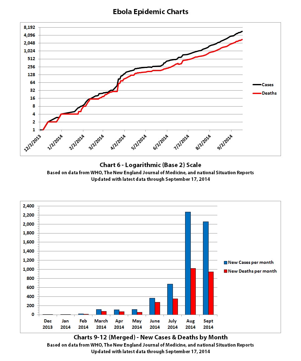
These are the latest Ebola outbreak charts updated with the newest data from WHO that was released on September 22, 2014. That data essentially only covered through September 17, 2014 because those were the most up-to-date numbers they had for Liberia, the hardest hit country. I'm splitting the charts over four posts since there are a lot of different charts now. This is post 1 of 4.
Chart 3 still has the unchanged line projections but with the new known data added.
Click the graphic below to open it to view full-size.
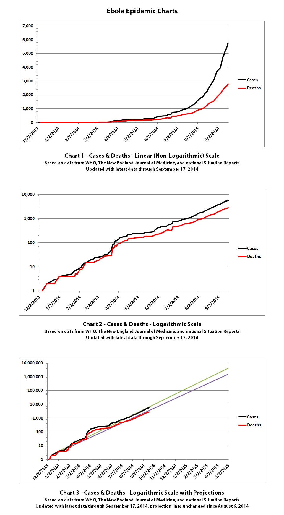
The same disclaimers and references apply to all of these charts:
Charts and future projections were done by me, not by WHO. I am not an Ebola expert, epidemiologist, virologist, or MD, but I manually compiled the data used to create these graphs from news updates on the following WHO and New England Journal of Medicine websites:
SOURCE: WHO website 1
SOURCE: WHO website 2
SOURCE: WHO website 3
SOURCE: WHO website 4
SOURCE: The New England Journal of Medicine
Please do not do anything you might regret based on charts or projections. Hopefully efforts to contain, quarantine, treat, prevent, or cure Ebola will eventually be successful, and hopefully sooner rather than later.
The numbers do not yet include the Ebola outbreak in the Congo. Currently that is believed to be unrelated to this outbreak. If that situation changes or if the Congo outbreak is not contained, I may add it to these charts or create separate charts.
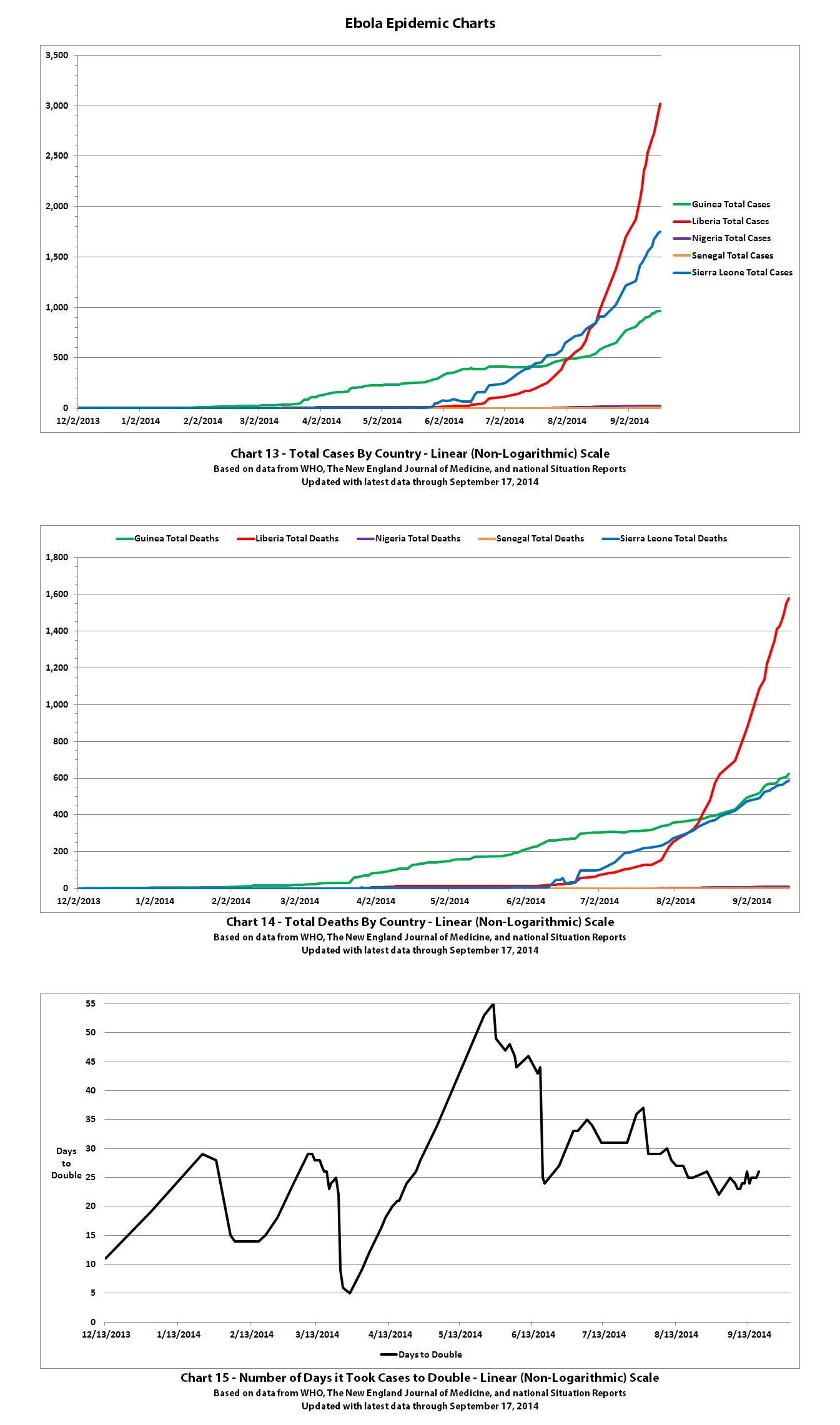
Post 2 of 4 - previous post in series: ikonoklast
More of the Ebola outbreak charts with the newest data from WHO that was released on September 22, 2014 (covering through September 17, 2014). I'm splitting the charts over four posts since there are a lot of different charts now. This is post 2 of 4.
Click any graphic below to see it full-size.

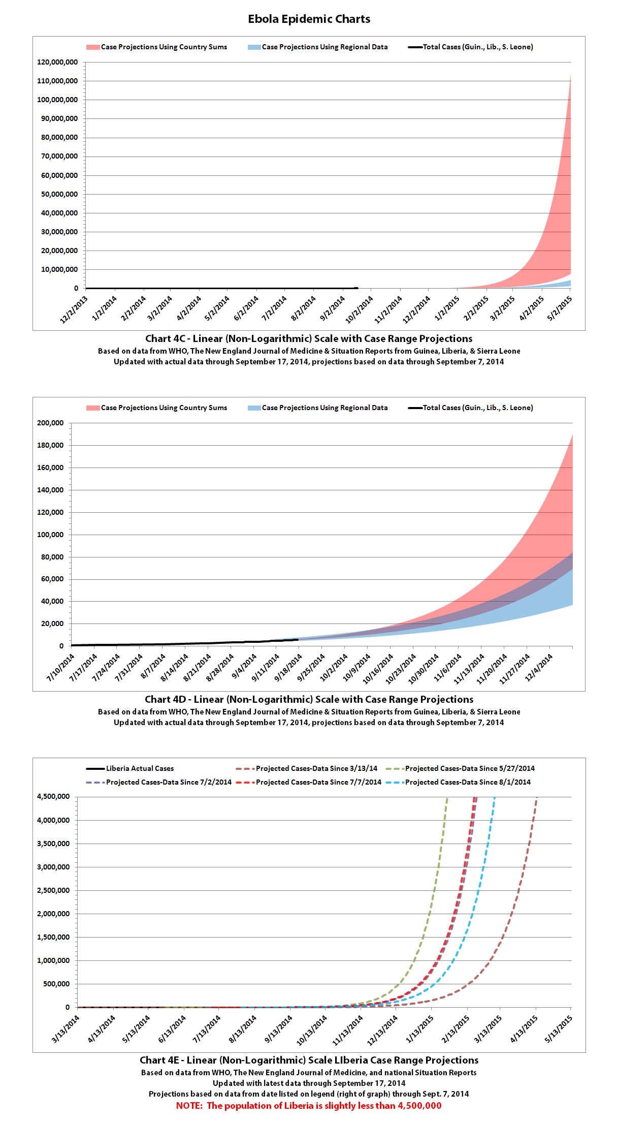
See the post above with Charts 1-3 for the standard disclaimers and references that apply to all of these charts.
Post 3 of 4 - previous post in series: ikonoklast
More of the Ebola outbreak charts with the newest data from WHO that was released on September 22, 2014 (covering through September 17, 2014). I'm splitting the charts over four posts since there are a lot of different charts now. This is post 3 of 4.
Click any graphic below to see it full-size.
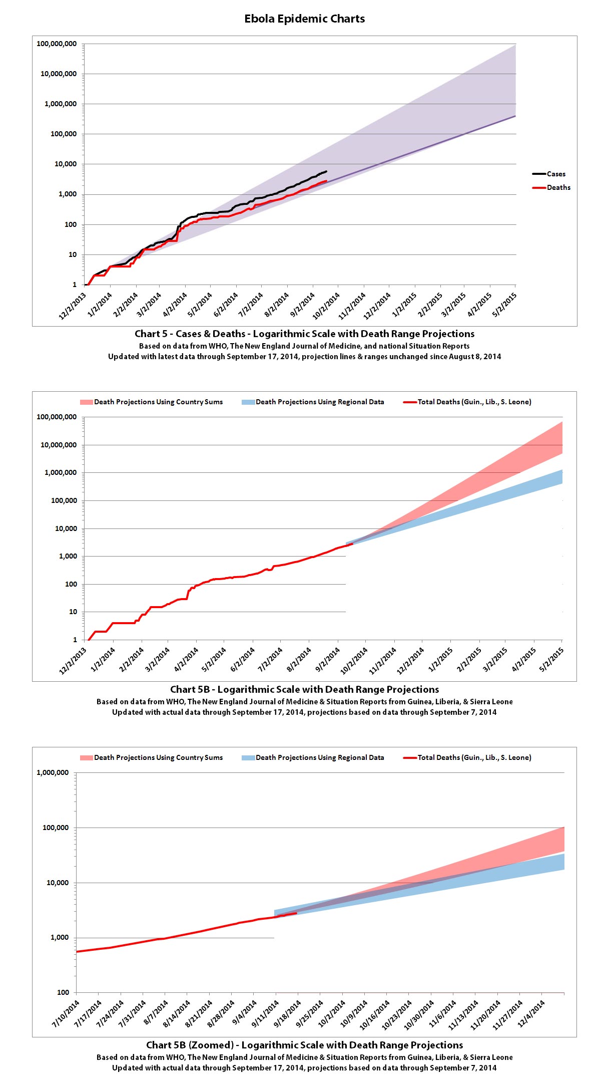
See the post above with Charts 1-3 for the standard disclaimers and references that apply to all of these charts.
More of the Ebola outbreak charts with the newest data from WHO that was released on September 22, 2014 (covering through September 17, 2014). I'm splitting the charts over four posts since there are a lot of different charts now. This is post 3 of 4.
Click any graphic below to see it full-size.


See the post above with Charts 1-3 for the standard disclaimers and references that apply to all of these charts.
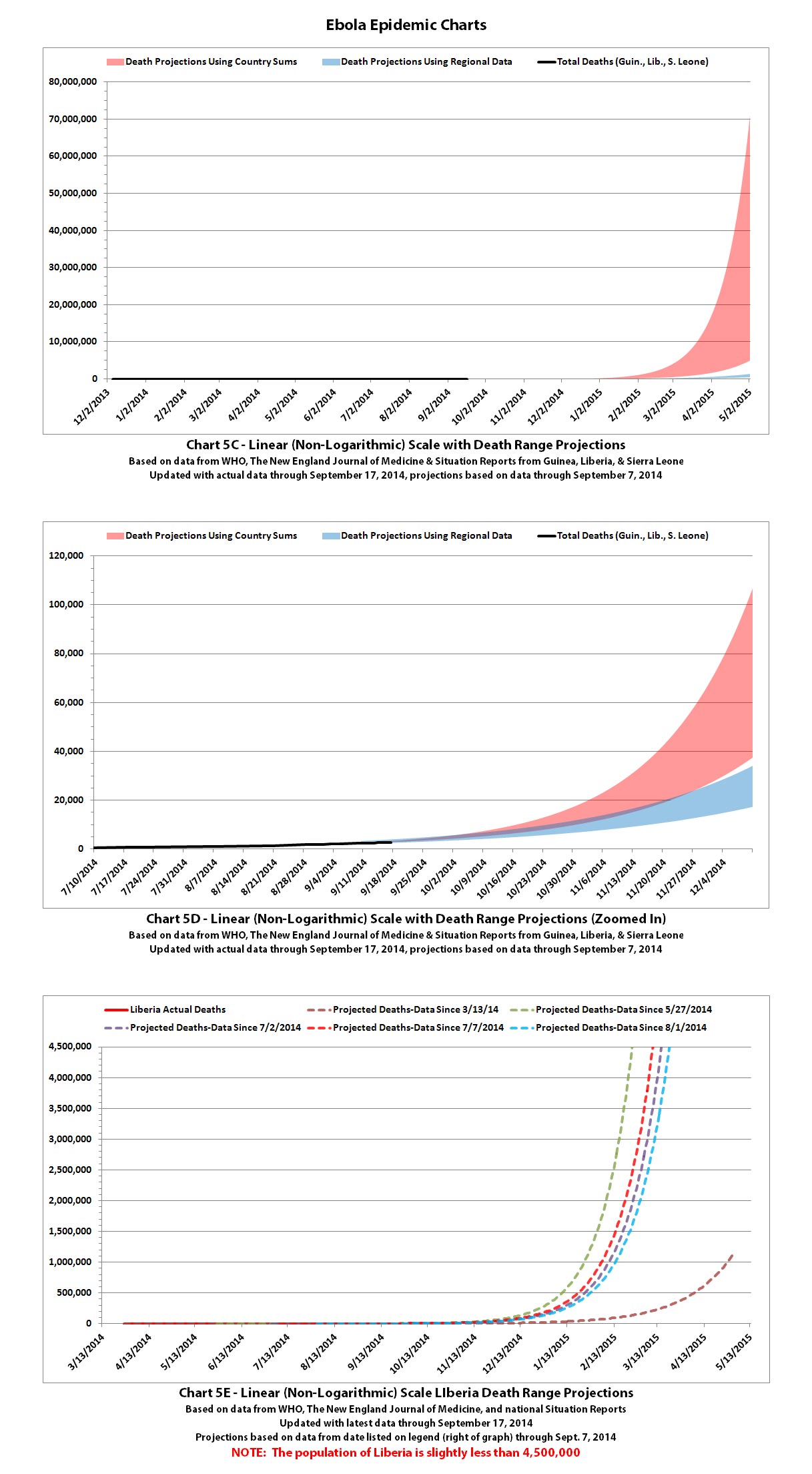
Post 4 of 4 - previous post in series: ikonoklast
More of the Ebola outbreak charts with the newest data from WHO that was released on September 22, 2014 (covering through September 17, 2014). I'm splitting the charts over four posts since there are a lot of different charts now. This is post 4 of 4.
Click any graphic below to see it full-size.
See the post above with Charts 1-3 for the standard disclaimers and references that apply to all of these charts.
More of the Ebola outbreak charts with the newest data from WHO that was released on September 22, 2014 (covering through September 17, 2014). I'm splitting the charts over four posts since there are a lot of different charts now. This is post 4 of 4.
Click any graphic below to see it full-size.


See the post above with Charts 1-3 for the standard disclaimers and references that apply to all of these charts.
originally posted by: 59demon
Ikonoklast, what happens to the synchronicity of your charts when compared with the prediction HERE combined with THIS nugget of information?
Does this correlate still with your models or are things more grim according to the WHO and CDC?
From the perspective of cases, yes, that's exactly what my charts have been projecting since early August when I first created them. It's basically right on the main line of the projections.
From the perspective of deaths, it's not quite clear to me where they got the 70% figure all of a sudden. The death rate and the doubling rate vary per country depending on things like how well they are controlling the spread and how well they are treating those infected. That 70% figure would fit for the areas where the death rate is higher, but not for all areas currently affected. Or maybe they are expecting the death rate to go up as the number of infections overwhelms the healthcare systems even more.
According to the links we now have a good chance of 550,000 to 1.4 million infections by late January and a 70 percent fatality rate. Before it was 550,000 infections at 50 percent fatal.
I did some charts that overlaid the leaked CDC projection of 550,000 cases by the end of January in this post. Basically, that's heading toward the middle to upper ranges of my charts that have projection ranges rather than lines. And 1.4 million by then would still be within my projection ranges but nearer the upper part of the range.
It has already doubled more than 12 times. It only has to double about 7 to 8 more times to be in the range of 550,000 to 1.4 million. So those figures are quite possible, and well within my projection ranges as well of those of others. Hope all of our projections are wrong...
This is getting out of hand.
Indeed it is.
a reply to: fwkitziger
We can agree to disagree but the facts remain.
We can agree to disagree but the facts remain.
As of Monday, the United Nations health organization reported that out of a total of 5,864 confirmed and probable cases, 2,811 deaths have resulted.
"The true numbers of cases and deaths are certainly higher," the authors wrote. "There are numerous reports of symptomatic persons evading diagnosis and treatment, of laboratory diagnoses that have not been included in national databases, and of persons with suspected Ebola virus disease who were buried without a diagnosis having been made."
news.sciencemag.org...
This is an excellent article on death rate calculations. Apparently WHO was calculating death rate by dividing current cases by current mortalities. Obviously this does not take into account those amongst the such who will go on to die. However, if you track mortality among admissions, you are in danger of over estimating the death rate as yet may be that the are milder cases which do not present to clinics.
It seems that the WHO may have switched from one mode of calculation to another more accurate measure, rather than there having been a sudden change.
Two excellent new articles have come out this week with projections about the Ebola epidemic.
The first is the CDC report that we first started hearing about in news leaks over the weekend. The leaks initially said that one of the worst case scenarios the CDC was projecting was 550,000 by end of January 2015. That shocked many, although it fit the projections I've been doing.
Then last night, 59demon mentioned in this thread that the latest news said the CDC was actually projecting 550,000 to 1.4 million cases by late January 2015 (if nothing changes).
The higher figure is an attempt to consider what the actual numbers may be by estimating how much under-reporting is occurring and correcting for that while also projecting forward. The authors say they used a factor of 2.5. In other words, they assumed that only 40% of actual cases are reported. Most believe that is conservative. It's also worth noting that their projections are only for Liberia and Sierra Leone and do not include Guinea or other countries. Here is a link to the report:
CDC: Estimating the Future Number of Cases in the Ebola Epidemic - Liberia and Sierra Leone, 2014–2015 (early release)
The second was also mentioned by 59demon. It's an article by the WHO Ebola Response Team published in the New England Journal of Medicine. It's the one where WHO projects 20,630 "confirmed and probable" cases by November 2, 2014 (which leaves out suspected cases, whereas most previous WHO totals have included "confirmed, probable, and suspected" cases) and says the case fatality rate is 70.8%.
Last night I said:
After a quick read through the article, it's now obvious they determined that by looking only at the 46% of reported cases for which they had "a known definitive clinical outcome." Interestingly, they found that this was pretty consistent across the three countries hardest hit (Guinea, Liberia, and Sierra Leone). They make it pretty clear that seeming differences looking at the overall data are an indication that they don't have definitive clinical outcome information for a little over half of the reported cases.
Here is a link to the article:
Ebola Virus Disease in West Africa — The First 9 Months of the Epidemic and Forward Projections
Both articles have a wealth of new information that will interest many on this thread (especially jaded and sofi!) - info on R0, doubling rates, and much more.
When I get a chance, I'll try do some comparison charts to compare the new projections from the CDC and from WHO to the projections I've been making.
The first is the CDC report that we first started hearing about in news leaks over the weekend. The leaks initially said that one of the worst case scenarios the CDC was projecting was 550,000 by end of January 2015. That shocked many, although it fit the projections I've been doing.
Then last night, 59demon mentioned in this thread that the latest news said the CDC was actually projecting 550,000 to 1.4 million cases by late January 2015 (if nothing changes).
The higher figure is an attempt to consider what the actual numbers may be by estimating how much under-reporting is occurring and correcting for that while also projecting forward. The authors say they used a factor of 2.5. In other words, they assumed that only 40% of actual cases are reported. Most believe that is conservative. It's also worth noting that their projections are only for Liberia and Sierra Leone and do not include Guinea or other countries. Here is a link to the report:
CDC: Estimating the Future Number of Cases in the Ebola Epidemic - Liberia and Sierra Leone, 2014–2015 (early release)
The second was also mentioned by 59demon. It's an article by the WHO Ebola Response Team published in the New England Journal of Medicine. It's the one where WHO projects 20,630 "confirmed and probable" cases by November 2, 2014 (which leaves out suspected cases, whereas most previous WHO totals have included "confirmed, probable, and suspected" cases) and says the case fatality rate is 70.8%.
Last night I said:
From the perspective of deaths, it's not quite clear to me where they got the 70% figure all of a sudden. The death rate and the doubling rate vary per country depending on things like how well they are controlling the spread and how well they are treating those infected. That 70% figure would fit for the areas where the death rate is higher, but not for all areas currently affected. Or maybe they are expecting the death rate to go up as the number of infections overwhelms the healthcare systems even more.
After a quick read through the article, it's now obvious they determined that by looking only at the 46% of reported cases for which they had "a known definitive clinical outcome." Interestingly, they found that this was pretty consistent across the three countries hardest hit (Guinea, Liberia, and Sierra Leone). They make it pretty clear that seeming differences looking at the overall data are an indication that they don't have definitive clinical outcome information for a little over half of the reported cases.
Here is a link to the article:
Ebola Virus Disease in West Africa — The First 9 Months of the Epidemic and Forward Projections
Both articles have a wealth of new information that will interest many on this thread (especially jaded and sofi!) - info on R0, doubling rates, and much more.
When I get a chance, I'll try do some comparison charts to compare the new projections from the CDC and from WHO to the projections I've been making.
a reply to: ikonoklast
Thanks ikonoklast. I picked up a headline this morning, followed it to the NEJM article and posted a new thread: Could the Ebola Outbreak Last Forever?. ....As you know, I rely on you for the numbers - but think other factors are important too. Like ALL of the current projections focus exclusively on H2H transmission, and analyses predicting the epidemic will "burn itself out" also assume exclusive H2H transmission.
BUT - Ebola is a zoonosis - it bounces back and forth between animals and people by various means. Everyone is forgetting that.
imho - The big story feeding the numbers has to do with Ebola's rapid mutation rate, combined with the fact that it's a zoonosis present in numerous animals, carried by bats - and airborne in pigs.
a reply to: soficrow
Very good point - presumably rats and possibly wild dogs and any and all other carrion eaters, birds and insects will be feasting on some of these dead bodies if they are lying in the streets and villages and especially out in the bush.
If pigs, bats (and monkeys?) can catch/carry Ebola then presumably the chances of other animals and insects catching/carrying is massively increasing too - i wonder if anybody is keeping an eye out on the local wildlife and its effects on them - if bats are already a potential vector what about vultures etc?
After the quarantines i would be expecting a large spike within 21 days further overwhelming the aid efforts but if people have run/escaped into the bush and IF it's now infecting other species things are surely only just going to get a whole lot worse are they not?
Looking forward to some good reasons that this is extremely unlikely.
new topics
-
Just a thought by Matt Walsh on the election
2024 Elections: 8 hours ago -
Trump's truth and reconciliation commission
Politicians & People: 8 hours ago -
Liberal women going on sex strike over Trump win
US Political Madness: 9 hours ago -
Where ARE the 20 million votes??? Where ARE they????? WHERE???
US Political Madness: 10 hours ago -
President-Elect DONALD TRUMP's 2nd-Term Administration Takes Shape.
Political Ideology: 11 hours ago
top topics
-
Where ARE the 20 million votes??? Where ARE they????? WHERE???
US Political Madness: 10 hours ago, 27 flags -
Just a thought by Matt Walsh on the election
2024 Elections: 8 hours ago, 15 flags -
The Democratic Party’s Stay Behind Program
US Political Madness: 12 hours ago, 13 flags -
President-Elect DONALD TRUMP's 2nd-Term Administration Takes Shape.
Political Ideology: 11 hours ago, 12 flags -
82 yr Woman Arrested for Hate Crime after Assaulting Trump Supporters
2024 Elections: 15 hours ago, 10 flags -
Liberal women going on sex strike over Trump win
US Political Madness: 9 hours ago, 8 flags -
Celestial Objects in Far Northern Reaches of Alaska (Polar Mystery)
Fragile Earth: 13 hours ago, 7 flags -
Lunacy
Short Stories: 17 hours ago, 5 flags -
Groaners II
Jokes, Puns, & Pranks: 16 hours ago, 3 flags -
Political Labels Quizzes
Political Ideology: 17 hours ago, 3 flags
active topics
-
Trump's truth and reconciliation commission
Politicians & People • 6 • : Flyingclaydisk -
Celestial Objects in Far Northern Reaches of Alaska (Polar Mystery)
Fragile Earth • 5 • : ArMaP -
Kamala Address the Nation -- Nov 6 2024 4pm EST
2024 Elections • 73 • : MetalThunder -
Just a thought by Matt Walsh on the election
2024 Elections • 2 • : watchitburn -
President-Elect DONALD TRUMP's 2nd-Term Administration Takes Shape.
Political Ideology • 25 • : Flyingclaydisk -
Mood Music Part VI
Music • 3695 • : Skinnerbot -
On Nov. 5th 2024 - AMERICANS Prevented the Complete Destruction of America from Within.
2024 Elections • 125 • : network dude -
Remember These Attacks When President Trump 2.0 Retribution-Justice Commences.
2024 Elections • 91 • : ADVISOR -
The CIA's Dark Search for the Ark of the Covenant, and the Ark of Gabriel Explained.
Paranormal Studies • 25 • : Skinnerbot -
Where ARE the 20 million votes??? Where ARE they????? WHERE???
US Political Madness • 30 • : PorkChop96