It looks like you're using an Ad Blocker.
Please white-list or disable AboveTopSecret.com in your ad-blocking tool.
Thank you.
Some features of ATS will be disabled while you continue to use an ad-blocker.
share:
a reply to: lottealma
No problem, it's not a stupid question at all. I'm sure there are many with the same question.
I think you are correct, and this is actually already happening. I just read this afternoon that at least one Doctors Without Borders (MSF) Ebola center is turning away at least 30 people per day with possible Ebola because they have no more room. If those people do have Ebola, now they are back out in the community and possibly spreading it more to others.
As I understand it, R0 is basically the average number of people who catch Ebola from each person who has Ebola. Anything that causes the average to go up causes R0 to increase. Anything that causes the average to go down decreases R0. Most estimates for R0 currently are between about 1.5 and 2. For Ebola to stop spreading, R0 has to be decreased to less than 1 so the number of new cases decreases eventually to zero.
By the way, your English is fine.
No problem, it's not a stupid question at all. I'm sure there are many with the same question.
Just a thought.... excuse me for my bad English. I'm afraid that at some point the R0 will start to increase, because the more people are sick less healthcareworkers will be available to stop the spreading right?
I think you are correct, and this is actually already happening. I just read this afternoon that at least one Doctors Without Borders (MSF) Ebola center is turning away at least 30 people per day with possible Ebola because they have no more room. If those people do have Ebola, now they are back out in the community and possibly spreading it more to others.
As I understand it, R0 is basically the average number of people who catch Ebola from each person who has Ebola. Anything that causes the average to go up causes R0 to increase. Anything that causes the average to go down decreases R0. Most estimates for R0 currently are between about 1.5 and 2. For Ebola to stop spreading, R0 has to be decreased to less than 1 so the number of new cases decreases eventually to zero.
By the way, your English is fine.
a reply to: whatnext21
That is an interesting article thanks. This outbreak is definitely different in many ways than previous outbreaks. It hasn't been self-limiting (so far), it's spread to major urban areas, and it's spread by international air travel. But I think they've done some excellent work.
That is an interesting article thanks. This outbreak is definitely different in many ways than previous outbreaks. It hasn't been self-limiting (so far), it's spread to major urban areas, and it's spread by international air travel. But I think they've done some excellent work.
edit on
12-9-2014 by ikonoklast because: corrected a typo
There are some new WHO numbers out. It was published today, but it only has data through September 7, 2014:
WHO: Ebola Response Roadmap Situation Report 3 (PDF)
I will be updating the charts when I get a chance. Before I spend a lot of time doing that, does anyone have a link to more recent data from WHO? I have seen a lot of news articles today that quote WHO as saying:
CBC News
That is newer data with more cases and deaths than is shown in the Situation Report 3, but I can't find any documentation on the WHO site about this so far. Seems like they move it around regularly to different sections and different types of reports and updates, so it isn't always easy to find.
WHO: Ebola Response Roadmap Situation Report 3 (PDF)
I will be updating the charts when I get a chance. Before I spend a lot of time doing that, does anyone have a link to more recent data from WHO? I have seen a lot of news articles today that quote WHO as saying:
The death toll has risen to more than 2,400 people out of 4,784 cases, WHO director general Margaret Chan told reporters at the UN health agency’s headquarters in in Geneva on Friday, noting the figures could be an underestimate.
CBC News
That is newer data with more cases and deaths than is shown in the Situation Report 3, but I can't find any documentation on the WHO site about this so far. Seems like they move it around regularly to different sections and different types of reports and updates, so it isn't always easy to find.
a reply to: ikonoklast
The WHO's "roadmap situation reports" are running days behind their press conferences. Reuters and some African news sites seem to have the most up-to-date info and WHO reports.
The WHO's "roadmap situation reports" are running days behind their press conferences. Reuters and some African news sites seem to have the most up-to-date info and WHO reports.
edit on 12/9/14 by soficrow because: (no reason given)
These are the latest Ebola outbreak charts updated with the newest data from WHO that was released on September 12, 2014 (covering through September
7, 2014). I'm splitting the charts over five posts since there are a lot of different charts now. This is post 1 of 5.
Click any graphic below to see it full-size.


Chart 3 still has the unchanged line projections but with the new known data added.

The same disclaimers and references apply to all of these charts:
Charts and future projections were done by me, not by WHO. I am not an Ebola expert, epidemiologist, virologist, or MD, but I manually compiled the data used to create these graphs from news updates on the following WHO and New England Journal of Medicine websites:
SOURCE: WHO website 1
SOURCE: WHO website 2
SOURCE: WHO website 3
SOURCE: WHO website 4
SOURCE: The New England Journal of Medicine
Please do not do anything you might regret based on charts or projections. Hopefully efforts to contain, quarantine, treat, prevent, or cure Ebola will eventually be successful, and hopefully sooner rather than later.
The numbers do not yet include the Ebola outbreak in the Congo. Currently that is believed to be unrelated to this outbreak. If that situation changes or if the Congo outbreak is not contained, I may add it to these charts or create separate charts.
Click any graphic below to see it full-size.


Chart 3 still has the unchanged line projections but with the new known data added.

The same disclaimers and references apply to all of these charts:
Charts and future projections were done by me, not by WHO. I am not an Ebola expert, epidemiologist, virologist, or MD, but I manually compiled the data used to create these graphs from news updates on the following WHO and New England Journal of Medicine websites:
SOURCE: WHO website 1
SOURCE: WHO website 2
SOURCE: WHO website 3
SOURCE: WHO website 4
SOURCE: The New England Journal of Medicine
Please do not do anything you might regret based on charts or projections. Hopefully efforts to contain, quarantine, treat, prevent, or cure Ebola will eventually be successful, and hopefully sooner rather than later.
The numbers do not yet include the Ebola outbreak in the Congo. Currently that is believed to be unrelated to this outbreak. If that situation changes or if the Congo outbreak is not contained, I may add it to these charts or create separate charts.
Post 2 of 5 - previous post in series: ikonoklast
More of the Ebola outbreak charts with the newest data from WHO that was released on September 12, 2014 (covering through September 7, 2014). I'm splitting the charts over five posts since there are a lot of different charts now. This is post 2 of 5.
Click any graphic below to see it full-size.
Chart 4 is the same case projection range as previously but with the known data updated.

Charts 4B-4E are new projections generated automatically from known data through September 7, 2014.


See the post above with Charts 1-3 for the standard disclaimers and references that apply to all of these charts.
More of the Ebola outbreak charts with the newest data from WHO that was released on September 12, 2014 (covering through September 7, 2014). I'm splitting the charts over five posts since there are a lot of different charts now. This is post 2 of 5.
Click any graphic below to see it full-size.
Chart 4 is the same case projection range as previously but with the known data updated.

Charts 4B-4E are new projections generated automatically from known data through September 7, 2014.


See the post above with Charts 1-3 for the standard disclaimers and references that apply to all of these charts.
Post 3 of 5 - previous post in series: ikonoklast
More of the Ebola outbreak charts with the newest data from WHO that was released on September 12, 2014 (covering through September 7, 2014). I'm splitting the charts over five posts since there are a lot of different charts now. This is post 3 of 5.
Click any graphic below to see it full-size.
Chart 5 is the same deaths projection range as previously but with the known data updated.

Charts 5B-5E are new death projections generated automatically from known data through September 7, 2014.


See the post above with Charts 1-3 for the standard disclaimers and references that apply to all of these charts.
More of the Ebola outbreak charts with the newest data from WHO that was released on September 12, 2014 (covering through September 7, 2014). I'm splitting the charts over five posts since there are a lot of different charts now. This is post 3 of 5.
Click any graphic below to see it full-size.
Chart 5 is the same deaths projection range as previously but with the known data updated.

Charts 5B-5E are new death projections generated automatically from known data through September 7, 2014.


See the post above with Charts 1-3 for the standard disclaimers and references that apply to all of these charts.
Post 4 of 5 - previous post in series: ikonoklast
More of the Ebola outbreak charts with the newest data from WHO that was released on September 12, 2014 (covering through September 7, 2014). I'm splitting the charts over five posts since there are a lot of different charts now. This is post 4 of 5.
Click any graphic below to see it full-size.
Chart 6 has the y-axis in powers of 2 so you can see the rate at which total cases and total deaths are doubling.

Charts 7-10 show new cases and new deaths.


See the post above with Charts 1-3 for the standard disclaimers and references that apply to all of these charts.
More of the Ebola outbreak charts with the newest data from WHO that was released on September 12, 2014 (covering through September 7, 2014). I'm splitting the charts over five posts since there are a lot of different charts now. This is post 4 of 5.
Click any graphic below to see it full-size.
Chart 6 has the y-axis in powers of 2 so you can see the rate at which total cases and total deaths are doubling.

Charts 7-10 show new cases and new deaths.


See the post above with Charts 1-3 for the standard disclaimers and references that apply to all of these charts.
Post 5 of 5 - previous post in series: ikonoklast
These are the last of this batch of the Ebola outbreak charts (5th post of 5) with the newest data from WHO that was released on September 12, 2014 (covering through September 7, 2014). The charts have been split over five posts since there are a lot of different charts now.
Charts 11 and 12 were not updated, as they would not have really had any new useful information until there is more data for this new month.
Click any graphic below to see it full-size.
Charts 13-14 show total cases and deaths by country.


Chart 15 shows how the doubling rate has varied over time. The y-axis shows how many days it took for cases to double for any given date on the x-axis. So reading this chart is essentially the opposite of other charts - high spikes are good (it's not doubling as fast), low spikes are bad (it's doubling faster).

See the post above with Charts 1-3 for the standard disclaimers and references that apply to all of these charts.
These are the last of this batch of the Ebola outbreak charts (5th post of 5) with the newest data from WHO that was released on September 12, 2014 (covering through September 7, 2014). The charts have been split over five posts since there are a lot of different charts now.
Charts 11 and 12 were not updated, as they would not have really had any new useful information until there is more data for this new month.
Click any graphic below to see it full-size.
Charts 13-14 show total cases and deaths by country.


Chart 15 shows how the doubling rate has varied over time. The y-axis shows how many days it took for cases to double for any given date on the x-axis. So reading this chart is essentially the opposite of other charts - high spikes are good (it's not doubling as fast), low spikes are bad (it's doubling faster).

See the post above with Charts 1-3 for the standard disclaimers and references that apply to all of these charts.
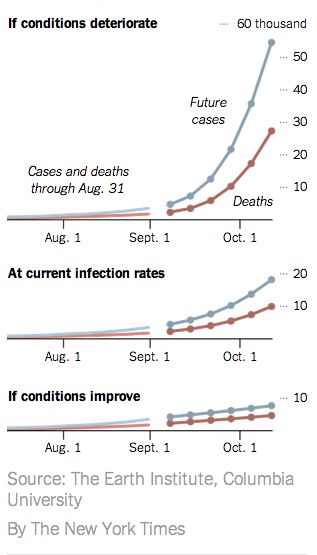
More projections have come out from epidemiologists. These projections were funded by the U.S. National Institutes of Health (NIH):
SOURCE: New York Times - U.S. Scientists See Long Fight Against Ebola
I have overlaid their projections and my projections so we can see how they compare.
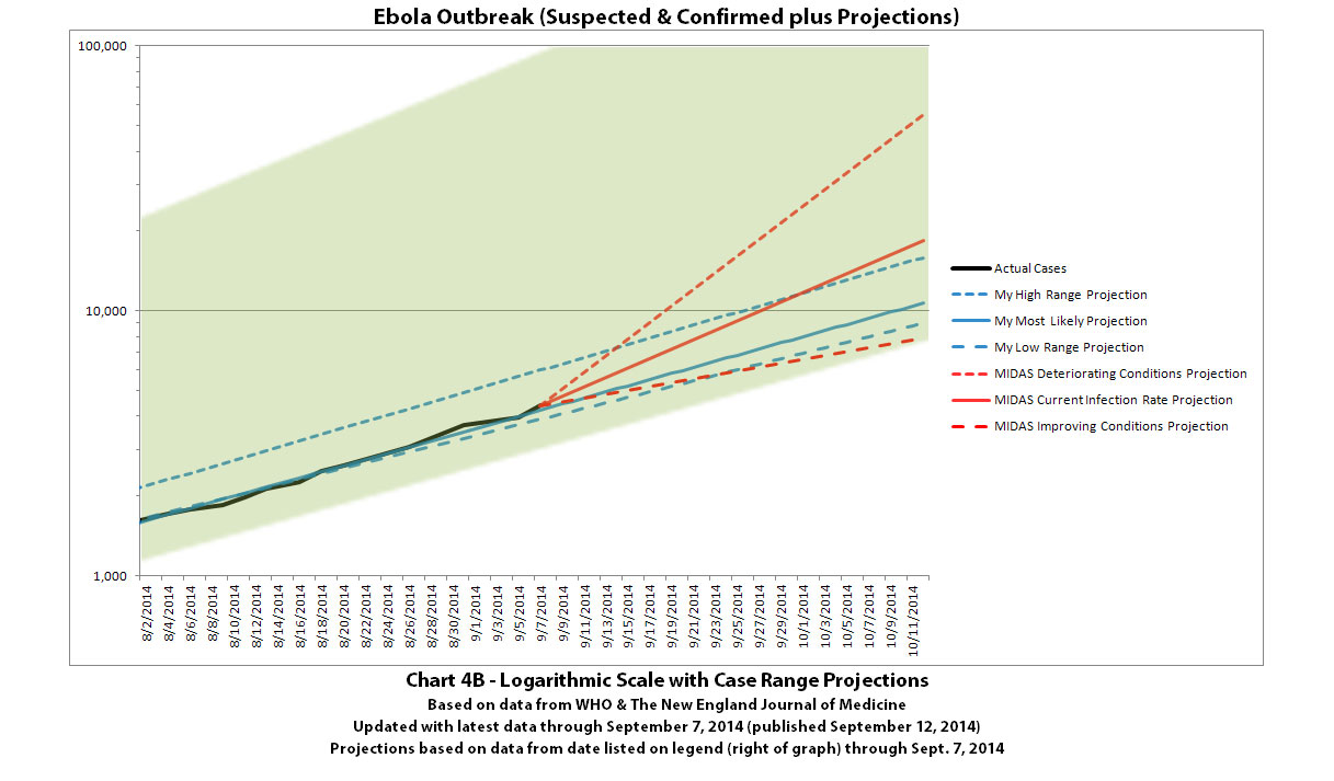
The red lines represent their 3 different scenarios. The blue lines represent my most current projection scenarios for the same time frame from chart 4B and the green shaded area is the projection range for the same time period from my chart 4.
As with many of the projections from epidemiologists that have started coming out very recently, you can see that their projections and the projections I've been posting here support each other and you can see that we are drawing similar conclusions.
Most of the graphs posted publicly have not shown projections very far into the future. But in the NY Times article, they let it slip a bit what their projections really show long term and what that really means:
SOURCE: New York Times - U.S. Scientists See Long Fight Against Ebola
The deadly Ebola outbreak... is likely to last 12 to 18 months more...
...forecasts far exceed estimates by the World Health Organization, which said last month that it hoped to control the outbreak within nine months and predicted 20,000 total cases by that time...
But researchers at various universities say that at the virus’s present rate of growth, there could easily be close to 20,000 cases in one month, not in nine. Some of the United States’ leading epidemiologists... have been creating computer models of the Ebola epidemic at the request of the National Institutes of Health and the Defense Department.
The Centers for Disease Control and Prevention declined to comment on the projections...
...Dr. Vespignani said that the W.H.O. figures would be reasonable if there were an effective campaign to stop the epidemic now, but that there is not.
...Dr. Shaman’s research team created a model that estimated the number of cases through Oct. 12, with different predictions based on whether control of the epidemic stays about the same, improves or gets worse. If control stays the same, according to the model, the case count by Oct. 12 will be 18,406. If control improves, it will be 7,861. If control worsens, it will soar to 54,895.
I have overlaid their projections and my projections so we can see how they compare.

The red lines represent their 3 different scenarios. The blue lines represent my most current projection scenarios for the same time frame from chart 4B and the green shaded area is the projection range for the same time period from my chart 4.
As with many of the projections from epidemiologists that have started coming out very recently, you can see that their projections and the projections I've been posting here support each other and you can see that we are drawing similar conclusions.
Most of the graphs posted publicly have not shown projections very far into the future. But in the NY Times article, they let it slip a bit what their projections really show long term and what that really means:
The deadly Ebola outbreak sweeping across three countries in West Africa is likely to last 12 to 18 months more, much longer than anticipated, and could infect hundreds of thousands of people before it is brought under control, say scientists mapping its spread for the federal government...
Alessandro Vespignani, a professor of computational sciences at Northeastern University who has been involved in the computer modeling of Ebola’s spread, said that if the case count reaches hundreds of thousands, “there will be little we can do.”
a reply to: ikonoklast
Great work. Thanks. ....Have you seen this model, published in Eurosurveillance?
And this?
Great work. Thanks. ....Have you seen this model, published in Eurosurveillance?
…..control could be attained by preventing over half of the secondary transmissions per primary case. ….In a worst-case hypothetical scenario, should the outbreak continue with recent trends, the case burden could gain an additional 77,181 to 277,124 cases by the end of 2014.
And this?

Let's just hope this is what is happening from the beginning. The reason why this is growing as it is. We don't need this to grow any faster as
predict! a reply to: ikonoklast
originally posted by: soficrow
a reply to: ikonoklast
Great work. Thanks. ....Have you seen this model, published in Eurosurveillance?
…..control could be attained by preventing over half of the secondary transmissions per primary case. ….In a worst-case hypothetical scenario, should the outbreak continue with recent trends, the case burden could gain an additional 77,181 to 277,124 cases by the end of 2014.
And this?
Yes, thanks, and you're welcome.
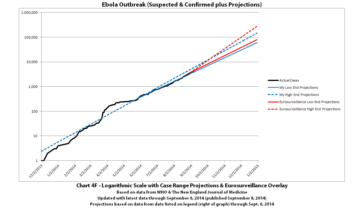
I did a comparison graph of the projections from Eurosurveillance and my projections in this previous post:
The high/low range projected by the article in Eurosurveillance is between the red lines. The high/low range projected in my most recent update of chart 4B (my latest projections) is between the blue lines.
Click to view full-size.
And I did a comparison of the projections that MIDAS did for the US National Institutes of Health (NIH) and the US Department of Defense (DoD) on a logarithmic scale (so the curves in the graph you posted are exponential lines in this graph) in this previous post:
The red lines represent their 3 different scenarios. The blue lines represent my most current projection scenarios for the same time frame from chart 4B and the green shaded area is the projection range for the same time period from my chart 4.
I included the green shaded area from my chart 4 in the second one above because the top red dashed line (the MIDAS/NIH/DoD projection for if conditions deteriorate) is the first I've seen publicly (besides mine) that starts to head into the upper range of my worst of the worst case scenarios (and rather quickly).
I'm actually quite disturbed to see such projections coming out publicly from MIDAS/NIH/DoD and some of the top experts in projecting epidemics. It validates that they have come to the same conclusions about how bad this could go if things are not brought quickly under control. I would really rather be wrong about that...
a reply to: ikonoklast
Unfortunately, some are using the worst case scenarios to justify non-intervention. And ignoring the warning that inaction -and insufficient action- will allow the virus maximum opportunity to mutate and become more virulent.
...I'm actually quite disturbed to see such projections coming out publicly from MIDAS/NIH/DoD and some of the top experts in projecting epidemics. It validates that they have come to the same conclusions about how bad this could go if things are not brought quickly under control.
Unfortunately, some are using the worst case scenarios to justify non-intervention. And ignoring the warning that inaction -and insufficient action- will allow the virus maximum opportunity to mutate and become more virulent.
a reply to: joho99
Cool, thanks! I'll have to play around with that a bit. In the meantime, I've re-done some of the projections using a different method.
Previously the projections were calculated based on the total cases and deaths for the region affected. But I'm concerned that the spread in Liberia goes quickly off the charts... literally. And my hypothesis was that if I ran the projections individually for the 3 main countries affected (Guinea, Liberia, and Sierra Leone) and then used the sum of those projections over time, the projections would actually look much worse over the long term than what I've previously been projecting and more like what MIDAS is projecting.
So I did that, and here you can see the results. Click on any graphic to view it full-size.


This last one shows my projections and the projections from MIDAS/NIH/DoD (which go through October 12, 2014) for comparison. Colors are a bit different, so be sure to look at the color code legend to see what's what.

Basically, my projections fall between the MIDAS/NIH/DoD middle and lower projection curves (which correspond to no change in the rate of spreading and a reduced rate of spreading, respectively) and my projections line up pretty well with them. But the higher projections from MIDAS/NIH/DoD (corresponding to worsening conditions making it spread faster) would be much, much worse.
Cool, thanks! I'll have to play around with that a bit. In the meantime, I've re-done some of the projections using a different method.
Previously the projections were calculated based on the total cases and deaths for the region affected. But I'm concerned that the spread in Liberia goes quickly off the charts... literally. And my hypothesis was that if I ran the projections individually for the 3 main countries affected (Guinea, Liberia, and Sierra Leone) and then used the sum of those projections over time, the projections would actually look much worse over the long term than what I've previously been projecting and more like what MIDAS is projecting.
So I did that, and here you can see the results. Click on any graphic to view it full-size.


This last one shows my projections and the projections from MIDAS/NIH/DoD (which go through October 12, 2014) for comparison. Colors are a bit different, so be sure to look at the color code legend to see what's what.

Basically, my projections fall between the MIDAS/NIH/DoD middle and lower projection curves (which correspond to no change in the rate of spreading and a reduced rate of spreading, respectively) and my projections line up pretty well with them. But the higher projections from MIDAS/NIH/DoD (corresponding to worsening conditions making it spread faster) would be much, much worse.
edit on 14-9-2014 by ikonoklast because: Corrected a
couple typos.
a reply to: ikonoklast
The WHO still has not released any updates. Means the 'roadmap' strategy is failing due to lack of support and manpower, methinks. Best go with 'worst case scenario.'
The WHO still has not released any updates. Means the 'roadmap' strategy is failing due to lack of support and manpower, methinks. Best go with 'worst case scenario.'
originally posted by: soficrow
a reply to: ikonoklast
The WHO still has not released any updates. Means the 'roadmap' strategy is failing due to lack of support and manpower, methinks. Best go with 'worst case scenario.'
I find it extremely bizarre the updates are becoming more infrequent. It seemed at the end of August and very early September we were getting hundreds of new deaths reported every few days. It's been, what...? A week now? The death toll has to have topped 3,000 and I bet the West African governments don't want to admit it.
We shall see.
new topics
-
Fire insurance in LA withdrawn months ago
General Conspiracies: 1 hours ago -
Bizarre Labour Party Tic Toc Video Becomes Even More Embarrassing
Regional Politics: 9 hours ago
top topics
-
The elephant in the room (wearing a hoodie)
US Political Madness: 17 hours ago, 14 flags -
Dr. Demento
Music: 16 hours ago, 6 flags -
Fire insurance in LA withdrawn months ago
General Conspiracies: 1 hours ago, 5 flags -
Bizarre Labour Party Tic Toc Video Becomes Even More Embarrassing
Regional Politics: 9 hours ago, 4 flags -
Potter to WHU
World Sports: 15 hours ago, 2 flags
active topics
-
Fire insurance in LA withdrawn months ago
General Conspiracies • 6 • : NoCorruptionAllowed -
-@TH3WH17ERABB17- -Q- ---TIME TO SHOW THE WORLD--- -Part- --44--
Dissecting Disinformation • 3979 • : Guyfriday -
Los Angeles brush fires latest: 2 blazes threaten structures, prompt evacuations
Mainstream News • 285 • : marg6043 -
Judge rules president-elect Donald Trump must be sentenced in 'hush money' trial
US Political Madness • 84 • : Vermilion -
S.C. Jack Smith's Final Report Says Trump Leads a Major Conspiratorial Criminal Organization!.
Political Conspiracies • 47 • : Vermilion -
Statements of Intent from Incoming Trump Administration Members - 2025 to 2029.
2024 Elections • 61 • : cherokeetroy -
Gravitic Propulsion--What IF the US and China Really Have it?
General Conspiracies • 39 • : budbayview -
The elephant in the room (wearing a hoodie)
US Political Madness • 26 • : xuenchen -
Its Looking Like Schiff - Vindman - Ciaramella Conspired to Impeach President Trump.
Political Conspiracies • 188 • : WeMustCare -
Trump's idea to make Canada the 51st US state: 'Potential is massive'
Mainstream News • 155 • : DaydreamerX

