It looks like you're using an Ad Blocker.
Please white-list or disable AboveTopSecret.com in your ad-blocking tool.
Thank you.
Some features of ATS will be disabled while you continue to use an ad-blocker.
share:
a reply to: soficrow
I don't think we have to disagree on the numbers, because I along with you and most believe the reported cases are just a sampling of the actual number of cases. I just don't see any evidence or rationale to think there is any intentional manipulation by the local Health Ministries, higher or lower, of the reported figures. I view the reported metric that Icon is tracking like sampling fish population in a river using a small net. If stick with the same net and methodology and periodically count the fish in the net, it tells you a lot about the growth or decline in fish population without even knowing the size of the river or the net. However, you would only have therories about the actual number of total fish in the river. The total number is a guess, the reported number is a fact.
I don't think we have to disagree on the numbers, because I along with you and most believe the reported cases are just a sampling of the actual number of cases. I just don't see any evidence or rationale to think there is any intentional manipulation by the local Health Ministries, higher or lower, of the reported figures. I view the reported metric that Icon is tracking like sampling fish population in a river using a small net. If stick with the same net and methodology and periodically count the fish in the net, it tells you a lot about the growth or decline in fish population without even knowing the size of the river or the net. However, you would only have therories about the actual number of total fish in the river. The total number is a guess, the reported number is a fact.
a reply to: johnb
Thanks. ....Ebola always has infected other species - the big news about this epidemic is that all the ongoing infections (that have been sequenced) are exclusively human-to-human. When animals start getting infected with this human-Ebola, and then passing it back to people, we'll likely see even more mutations.
Thanks. ....Ebola always has infected other species - the big news about this epidemic is that all the ongoing infections (that have been sequenced) are exclusively human-to-human. When animals start getting infected with this human-Ebola, and then passing it back to people, we'll likely see even more mutations.
a reply to: 59demon
I've charted the new CDC Ebola projections along with my projections. Some caveats:
Click any graphic to open it and view it full-size.


The next two charts are a bit different. I modeled the CDC projections up through January 20, 2015 and then used that model to project their curves out further to May 2. 2015, which is how far I've been projecting. So I did the projections for the dotted lines after January 20, 2015 as well as the ranges as I have been, but the dotted line projections are set at the exponential rate the CDC is projecting, it's just continued out further into the future than they went so you can see the longer term comparison.

All of these projections (mine and the CDC's) assume that nothing is done that changes the current rate of infection. Obviously we all hope that something WILL be done to change this.
Please let me know if you have any trouble viewing these graphics... I'm having trouble with many graphics on ATS not always displaying properly on my PC but they display perfectly on a smart phone and on my wife's PC. So I think the graphics are working fine for everyone except on my PC for some reason.
I've charted the new CDC Ebola projections along with my projections. Some caveats:
- The CDC projections were just for Liberia and Sierra Leone together and did not include any countries, so I've redone my projection ranges for
these charts so that they are done the same way.
- The CDC did two different projection curves. One curve was based on reported Ebola cases for Liberia and Sierra Leone only. Their other curve
assumed that due to under-reporting, there were likely (at least) 2.5 times as many cases, so they multiplied all of the cases and all of the
projection numbers by 2.5 to derive the higher curve. I've done the same for the higher range in my projections.
Click any graphic to open it and view it full-size.


The next two charts are a bit different. I modeled the CDC projections up through January 20, 2015 and then used that model to project their curves out further to May 2. 2015, which is how far I've been projecting. So I did the projections for the dotted lines after January 20, 2015 as well as the ranges as I have been, but the dotted line projections are set at the exponential rate the CDC is projecting, it's just continued out further into the future than they went so you can see the longer term comparison.

All of these projections (mine and the CDC's) assume that nothing is done that changes the current rate of infection. Obviously we all hope that something WILL be done to change this.
Please let me know if you have any trouble viewing these graphics... I'm having trouble with many graphics on ATS not always displaying properly on my PC but they display perfectly on a smart phone and on my wife's PC. So I think the graphics are working fine for everyone except on my PC for some reason.
Excellent work. I always enjoy viewing your newest charts. They really paint the picture clearly. The only other thing I think that is missing
that would help is maybe post what the actual total running tally is for instance when you say you included the numbers from September 17, is that
5,800 infected and 2,863 deaths?
Thank you for your dedication. Maybe you will have had an impact on this Ebola outbreak in a positive way by bringing it to people's attention.
Thank you for your dedication. Maybe you will have had an impact on this Ebola outbreak in a positive way by bringing it to people's attention.
a reply to: 59demon
I've charted the new WHO Ebola projections along with my projections now too. Click the graphic to open it and view it full-size.

Thanks, glad they are helpful. This is the data I have as of September 17, 2014:
Guinea Total Cases 965
Liberia Total Cases 3022
Nigeria Total Cases 20
Senegal Total Cases 1
Sierra Leone Total Cases 1753
Total Cases 5761
Guinea Total Deaths 623
Liberia Total Deaths 1578
Nigeria Total Deaths 8
Senegal Total Deaths 0
Sierra Leone Total Deaths 585
Total Deaths 2794
You're welcome.
My daughter told me that she was at her boyfriend's house the other day and his father was watching a science news show about Ebola. They put up one of my charts on the show and credited it as "from a public website." She was surprised, but recognized it immediately as one of the ones I had done because I had recently shown it to her.
So I guess the charts are bringing it to people's attention, and I hope that in some way this helps.
I've charted the new WHO Ebola projections along with my projections now too. Click the graphic to open it and view it full-size.

originally posted by: 59demon
Excellent work. I always enjoy viewing your newest charts. They really paint the picture clearly. The only other thing I think that is missing that would help is maybe post what the actual total running tally is for instance when you say you included the numbers from September 17, is that 5,800 infected and 2,863 deaths?
Thanks, glad they are helpful. This is the data I have as of September 17, 2014:
Guinea Total Cases 965
Liberia Total Cases 3022
Nigeria Total Cases 20
Senegal Total Cases 1
Sierra Leone Total Cases 1753
Total Cases 5761
Guinea Total Deaths 623
Liberia Total Deaths 1578
Nigeria Total Deaths 8
Senegal Total Deaths 0
Sierra Leone Total Deaths 585
Total Deaths 2794
Thank you for your dedication. Maybe you will have had an impact on this Ebola outbreak in a positive way by bringing it to people's attention.
You're welcome.
My daughter told me that she was at her boyfriend's house the other day and his father was watching a science news show about Ebola. They put up one of my charts on the show and credited it as "from a public website." She was surprised, but recognized it immediately as one of the ones I had done because I had recently shown it to her.
So I guess the charts are bringing it to people's attention, and I hope that in some way this helps.
These are the latest Ebola outbreak charts updated with the newest data from WHO that covered through September 21, 2014. I'm splitting the charts
over four posts since there are a lot of different charts now. This is post 1 of 4.
According to WHO (counting confirmed, probable, and suspected Ebola cases and deaths), as of the end of 21 September 2014 there are:
6263 reported cases
2917 reported deaths
It is believed that actual cases and deaths "vastly" outnumber the reported figures. Most believe that there are at least 2 to 5 times as many cases and deaths, however the reported numbers are used in these charts.
Click the graphic below to open it to view full-size.

The same disclaimers and references apply to all of these charts:
Charts and future projections were done by me, not by WHO. I am not an Ebola expert, epidemiologist, virologist, or MD, but I manually compiled the data used to create these graphs from news updates on the following WHO and New England Journal of Medicine websites:
SOURCE: WHO website 1
SOURCE: WHO website 2
SOURCE: WHO website 3
SOURCE: WHO website 4
SOURCE: The New England Journal of Medicine
Please do not do anything you might regret based on charts or projections. Hopefully efforts to contain, quarantine, treat, prevent, or cure Ebola will eventually be successful, and hopefully sooner rather than later.
The numbers do not yet include the Ebola outbreak in the Congo. Currently that is believed to be unrelated to this outbreak. If that situation changes or if the Congo outbreak is not contained, I may add it to these charts or create separate charts.
According to WHO (counting confirmed, probable, and suspected Ebola cases and deaths), as of the end of 21 September 2014 there are:
6263 reported cases
2917 reported deaths
It is believed that actual cases and deaths "vastly" outnumber the reported figures. Most believe that there are at least 2 to 5 times as many cases and deaths, however the reported numbers are used in these charts.
Click the graphic below to open it to view full-size.

The same disclaimers and references apply to all of these charts:
Charts and future projections were done by me, not by WHO. I am not an Ebola expert, epidemiologist, virologist, or MD, but I manually compiled the data used to create these graphs from news updates on the following WHO and New England Journal of Medicine websites:
SOURCE: WHO website 1
SOURCE: WHO website 2
SOURCE: WHO website 3
SOURCE: WHO website 4
SOURCE: The New England Journal of Medicine
Please do not do anything you might regret based on charts or projections. Hopefully efforts to contain, quarantine, treat, prevent, or cure Ebola will eventually be successful, and hopefully sooner rather than later.
The numbers do not yet include the Ebola outbreak in the Congo. Currently that is believed to be unrelated to this outbreak. If that situation changes or if the Congo outbreak is not contained, I may add it to these charts or create separate charts.
Post 2 of 4 - previous post in series: ikonoklast
More of the latest Ebola outbreak charts updated with the newest data from WHO that covered through September 21, 2014. I'm splitting the charts over four posts since there are a lot of different charts now. This is post 2 of 4.
Click any graphic below to see it full-size.


See the post above with Charts 1-3 for the standard disclaimers and references that apply to all of these charts.
More of the latest Ebola outbreak charts updated with the newest data from WHO that covered through September 21, 2014. I'm splitting the charts over four posts since there are a lot of different charts now. This is post 2 of 4.
Click any graphic below to see it full-size.


See the post above with Charts 1-3 for the standard disclaimers and references that apply to all of these charts.
Post 3 of 4 - previous post in series: ikonoklast
More of the latest Ebola outbreak charts updated with the newest data from WHO that covered through September 21, 2014. I'm splitting the charts over four posts since there are a lot of different charts now. This is post 3 of 4.
Click any graphic below to see it full-size.


See the post above with Charts 1-3 for the standard disclaimers and references that apply to all of these charts.
More of the latest Ebola outbreak charts updated with the newest data from WHO that covered through September 21, 2014. I'm splitting the charts over four posts since there are a lot of different charts now. This is post 3 of 4.
Click any graphic below to see it full-size.


See the post above with Charts 1-3 for the standard disclaimers and references that apply to all of these charts.
a reply to: ikonoklast
Post 4 of 4 - previous post in series
More of the latest Ebola outbreak charts updated with the newest data from WHO that covered through September 21, 2014. I'm splitting the charts over four posts since there are a lot of different charts now. This is post 4 of 4.
Click any graphic below to see it full-size.


See the post above with Charts 1-3 for the standard disclaimers and references that apply to all of these charts.
Post 4 of 4 - previous post in series
More of the latest Ebola outbreak charts updated with the newest data from WHO that covered through September 21, 2014. I'm splitting the charts over four posts since there are a lot of different charts now. This is post 4 of 4.
Click any graphic below to see it full-size.


See the post above with Charts 1-3 for the standard disclaimers and references that apply to all of these charts.
a reply to: ikonoklast
6263 reported cases
2917 reported deaths
The numbers keep going up. No end in sight yet.
Thanks again for the charts!
6263 reported cases
2917 reported deaths
The numbers keep going up. No end in sight yet.
Thanks again for the charts!
a reply to: ikonoklast
On page three of the situation report, they explain the drop in the confirmed figures for Liberia:
"The fall in the number of new cases shown in figure 1 is largely attributable to a sharp drop in the number of confirmed new cases reported from Liberia. Notably, there were no new reported confirmed cases from the capital, Monrovia, which in previous weeks has reported a surge in cases. These data differ from credible reports obtained from responders in Liberia, who indicate a deterioration of the situation in the country, and in Monrovia in particular. It is very likely that a substantial proportion of these suspected cases are genuine cases of EVD, and that the reported fall in confirmed cases reflects delays in matching laboratory results with clinical surveillance data. Efforts are being made to urgently address this problem, and it is likely that the figures will be revised upwards in due course....."
I read this to mean the Government of Liberia is running out of capacity to keep up with the accelerating epidemic even at the most basic level, confirming and counting cases. Basic care capacity was outstripped weeks ago along with safe removal of the dead. Keep a lookout for a flattening of confirmed new cases due to the inherent limits of a failing government.
originally posted by: Druid42
a reply to: ikonoklast
6263 reported cases
2917 reported deaths
The numbers keep going up. No end in sight yet.
Thanks again for the charts!
You're welcome! Yes, the number of cases has approximately doubled twice since I started doing the charts on August 4th.
On the bright side, if the reports from Senegal and Nigeria are correct, they appear to have stopped the spread there unless more cases are imported. So aggressive action at the very start of outbreaks there appears to have been successful. That's a really good sign.
a reply to: fwkitziger
I'm most concerned at the moment about Liberia. It seems to be completely out of control there. My projections basically show everyone in Liberia who is susceptible to Ebola likely being infected within the first quarter of 2015.
But I saw an article earlier that indicates it's even worse than that. A reporter talked to grave diggers in the capitol and they said they are burying many, many times as many victims of Ebola as what are reported.
The reporter then followed up with the family of an Ebola victim the cemetery reported burying who had not been in the official Ebola reports. The family said 5 family members actually died from Ebola. But none were reported in the official lists, and even the cemetery only knew of one of the victims.
The reporter noted that most bodies are thrown in the river. They are not tested, buried, or reported in any of the reports.
If this is common, and it apparently is in Liberia, we could be looking at not just 2, 4 or 5 times as many cases and deaths as are reported but potentially dozens of times as many. I tried to find a link to the article again but could not find it.
mobile.nytimes.com...
I think this could be the article. Personally, I think MSF have the best grasp on the situation and their chief is stating she thinks there are roughly five times the reported numbers.
I think this could be the article. Personally, I think MSF have the best grasp on the situation and their chief is stating she thinks there are roughly five times the reported numbers.
a reply to: ikonoklast
Could it perhaps be this one:
Ebola Corpses ‘Dumped’ In Wetlands

Maybe not though as it is an older article, but it does point out one important aspect of this tragedy and that is the safe disposal of highly infectious remains.
Could it perhaps be this one:
Since the first truckload of corpses arrived Saturday, residents of Johnsonville have vehemently rejected the use of their community to dispose of the bodies. According to Kpeh-Kpeh Town Chief Joseph S. Karway, the community's main concern is that the plot of land where the graves have been dug is a wetland on the bank of a river that is a source of water for many surrounding communities. They fear that their wells – from which they get water for drinking and domestic use – will get contaminated, exposing them to other diseases.
Furthermore, the land designated for the disposal of the corpses is privately owned, with cornerstones conspicuously planted and marked. One of the landowners, a businessman named Mr. Cole, said he was never contacted regarding the use of the piece of land he had purchased with a probated deed for his son, Joseph F. Dolo (cornerstone marked: JFD). “I’m not asking them to pay me [money] for my land. I’m going to take the authorities to task for illegally using my land to bury dead bodies,” he said.
Ebola Corpses ‘Dumped’ In Wetlands

Maybe not though as it is an older article, but it does point out one important aspect of this tragedy and that is the safe disposal of highly infectious remains.
edit on 26-9-2014 by jadedANDcynical because: (no reason given)
New case report on Who site . apps.who.int...
armakirais
6553 (probable, confirmed and suspected; see Annex 2) cases and 3083 deaths have been reported
in the current outbreak of EVD as at 23 September 2014 by the Ministries of Health of Guinea,
Liberia, and Sierra Leone (table 1).
armakirais
a reply to: armakirais
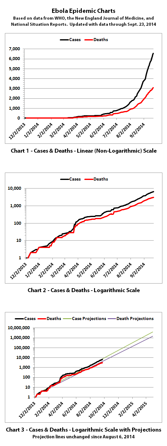
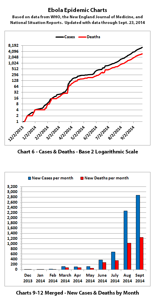
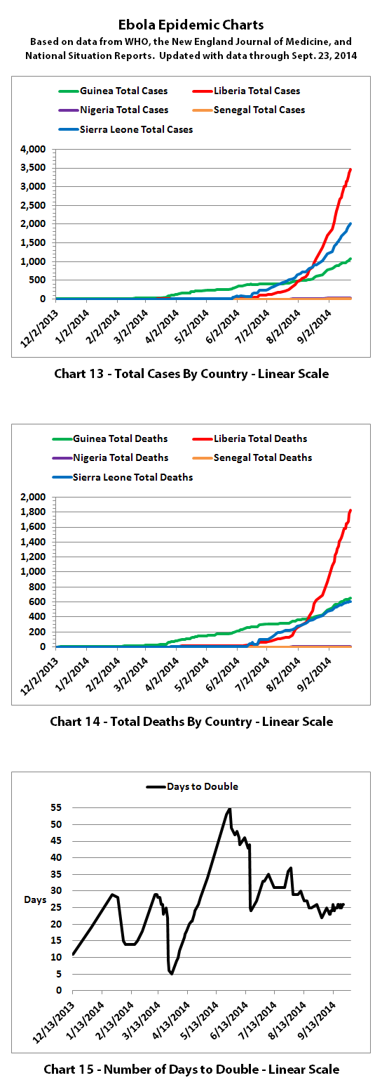
I've updated the Ebola charts with the newest data from the World Health Organization (WHO) published September 26, 2014. According to WHO, as of the end of September 23rd there were:
6574 reported cases
3091 reported deaths
(For Guinea, Liberia, Nigeria, Senegal, and Sierra Leone)
I've resized the charts so that they should be more readable across more screen sizes and devices without having to open the graphics full-size. I've also made the file sizes much smaller, so I'll try putting them all in one post.


The same disclaimers and references apply to all of these charts:
Charts and future projections were done by me, not by WHO, except in cases where it is stated that a chart includes WHO projections. I am not an Ebola expert, epidemiologist, virologist, or MD, but I manually compiled the data used to create these graphs from news updates on the following WHO and New England Journal of Medicine websites:
SOURCE: WHO website 1
SOURCE: WHO website 2
SOURCE: WHO website 3
SOURCE: WHO website 4
SOURCE: The New England Journal of Medicine
In some cases, I also filled in data for dates between WHO updates using official situation reports released by the Ministries of Health of affected countries.
According to WHO,the CDC, and many charitable medical organizations such as Doctors Without Borders (MSF), it is believed that actual cases and deaths "vastly" outnumber reported figures. Most believe that there are at least 2 to 5 times as many cases and deaths. Since it is difficult to know exactly what the actual numbers are, these charts rely on the reported numbers.
Please do not do anything you might regret based on charts or projections. Hopefully efforts to contain, quarantine, treat, prevent, or cure Ebola will eventually be successful, and hopefully sooner rather than later.
The numbers do not include the Ebola outbreak in the Congo. Currently that is believed to be unrelated to this outbreak. If that situation changes or if the Congo outbreak is not contained, I may add it to these charts or create separate charts.
I've updated the Ebola charts with the newest data from the World Health Organization (WHO) published September 26, 2014. According to WHO, as of the end of September 23rd there were:
6574 reported cases
3091 reported deaths
(For Guinea, Liberia, Nigeria, Senegal, and Sierra Leone)
I've resized the charts so that they should be more readable across more screen sizes and devices without having to open the graphics full-size. I've also made the file sizes much smaller, so I'll try putting them all in one post.


The same disclaimers and references apply to all of these charts:
Charts and future projections were done by me, not by WHO, except in cases where it is stated that a chart includes WHO projections. I am not an Ebola expert, epidemiologist, virologist, or MD, but I manually compiled the data used to create these graphs from news updates on the following WHO and New England Journal of Medicine websites:
SOURCE: WHO website 1
SOURCE: WHO website 2
SOURCE: WHO website 3
SOURCE: WHO website 4
SOURCE: The New England Journal of Medicine
In some cases, I also filled in data for dates between WHO updates using official situation reports released by the Ministries of Health of affected countries.
According to WHO,the CDC, and many charitable medical organizations such as Doctors Without Borders (MSF), it is believed that actual cases and deaths "vastly" outnumber reported figures. Most believe that there are at least 2 to 5 times as many cases and deaths. Since it is difficult to know exactly what the actual numbers are, these charts rely on the reported numbers.
Please do not do anything you might regret based on charts or projections. Hopefully efforts to contain, quarantine, treat, prevent, or cure Ebola will eventually be successful, and hopefully sooner rather than later.
The numbers do not include the Ebola outbreak in the Congo. Currently that is believed to be unrelated to this outbreak. If that situation changes or if the Congo outbreak is not contained, I may add it to these charts or create separate charts.
a reply to: jadedANDcynical
No, it was a different article. But it does reinforce the idea that apparently it's a widespread and common problem.
No, it was a different article. But it does reinforce the idea that apparently it's a widespread and common problem.
new topics
-
Greatest thing you ever bought or got??
General Chit Chat: 13 minutes ago -
OK this is sad but very strange stuff
Paranormal Studies: 5 hours ago -
Islam And A Book Of Lies
Religion, Faith, And Theology: 7 hours ago -
Sorry to disappoint you but...
US Political Madness: 9 hours ago
top topics
-
Sorry to disappoint you but...
US Political Madness: 9 hours ago, 13 flags -
Watch as a 12 million years old Crab Emerges from a Rock
Ancient & Lost Civilizations: 14 hours ago, 10 flags -
OK this is sad but very strange stuff
Paranormal Studies: 5 hours ago, 6 flags -
Islam And A Book Of Lies
Religion, Faith, And Theology: 7 hours ago, 5 flags -
Greatest thing you ever bought or got??
General Chit Chat: 12 minutes ago, 0 flags
active topics
-
Greatest thing you ever bought or got??
General Chit Chat • 0 • : Flyingclaydisk -
Post A Funny (T&C Friendly) Pic Part IV: The LOL awakens!
General Chit Chat • 7993 • : Cymru -
Joe Biden gives the USA's Highest Civilian Honor Award to Hillary Clinton and George Soros.
US Political Madness • 48 • : Flyingclaydisk -
ILLUMINATION: Dimensions / Degrees – Da Vincis Last Supper And The Philosophers Stone
Secret Societies • 6 • : Compendium -
Sorry to disappoint you but...
US Political Madness • 15 • : Flyingclaydisk -
Meta Llama local AI system is scary good
Science & Technology • 39 • : Arbitrageur -
Musk calls on King Charles III to dissolve Parliament over Oldham sex grooming gangs
Mainstream News • 180 • : Freeborn -
Islam And A Book Of Lies
Religion, Faith, And Theology • 3 • : nugget1 -
Outgoing Lame Duck BIDEN Officials and Democrats Voice Their Regrets.
2024 Elections • 30 • : WeMustCare -
Tesla Cybertruck Explodes in Front of Trump Hotel in Las Vegas
Mainstream News • 229 • : Daughter2v2
