It looks like you're using an Ad Blocker.
Please white-list or disable AboveTopSecret.com in your ad-blocking tool.
Thank you.
Some features of ATS will be disabled while you continue to use an ad-blocker.
share:
Just reported, Duncan, the first diagnosed Ebola case in the US, has died.
Thomas Duncan, the Texas Ebola patient, has died.
Add it to the stats. He's now just a number.
Bishop
Thomas Duncan, the Texas Ebola patient, has died.
Add it to the stats. He's now just a number.
Bishop
edit on 10/8/2014 by Bishop2199 because: I like change.
Just saw this on a different thread.
Source
So, we now have a possible 4 cases in Spain with an additional 22 being monitored. Here we go ...
So long Europe . . . and thanks for all the fish.
Bishop
Despite being described by Spain's public health director as "a national jewel," the head of Spain's Nursing Council warns "something went wrong" in the health care system's protocols. As RT reports, Spanish health officials have 4 patients interned including infected initial nurse, her husband, and a 2nd nurse (male). Furthermore, 22 more possible Ebola cases are under surveillance having had direct contact with the infected nurse during her vacation after being infected (officials have said they 'don't know' how she became infected with the deadly virus). Images within the hospital show "irregularities" and make-shift isolation units and an insider account said "I do not want to create social alarm, but explain what is still a reality everyday for a few months of nursing staff at the ICU.". One researcher noted "air traffic is the driver.," and added ominously, "it's just a matter of who gets lucky and who gets unlucky."
Source
So, we now have a possible 4 cases in Spain with an additional 22 being monitored. Here we go ...
So long Europe . . . and thanks for all the fish.
Bishop
a reply to: Bishop2199
WHO just released new numbers today: WHO October 8, 2014 Update
The data covers reported numbers through the end of October 5, 2014, although the numbers for Liberia, the hardest hit country, only go through October 4, 2014. I will be updating the charts as soon as possible. Although the WHO update states that they will be adding Spain in the next update, I will add Spain to this update of the charts because the nurse in Spain became symptomatic on September 30, 2014.
a reply to: ikonoklast
From he October 8 Situation Report:
"The past week has seen a continuation of recent trends: the situation in Guinea, Liberia, and Sierra Leone continues to deteriorate, with widespread and persistent transmission of EVD. Problems with data gathering in Liberia continue. It should be emphasized that the reported fall in the number of new cases in Liberia over the past three weeks is unlikely to be genuine. Rather, it reflects a deterioration in the ability of overwhelmed responders to record accurate epidemiological data. It is clear from field reports and first responders that EVD cases are being under-reported from several key locations, and laboratory data that have not yet been integrated into official estimates indicate an increase in the number of new cases in Liberia."
Apparently there is now a second suspected case of Ebola in the Dallas area:
Source
So much for containment. How many people were exposed by this individual?
Bishop
An afternoon news conference has been called in Frisco, a suburb of Dallas, to discuss a possible second case of Ebola.
According to a statement from the City of Frisco, the patient claims to have had contact with Thomas Eric Duncan, referred to as Dallas ‘patient zero.’
It is not clear how the patient had contact with Duncan or if the patient was one of the about 50 people being monitored by federal, state and local health officials.
Source
So much for containment. How many people were exposed by this individual?
Bishop
edit on 10/8/2014 by Bishop2199 because: I like change.
This Was Then
The Original CDC Position on How is Ebola Spread
The following was on the CDC website in early September and this is the mantra that the mainstream media is parroting as the “official and irrefutable doctrine of science”.
“The virus is spread through direct contact (through broken skin or mucous membranes) with blood and body fluids (urine, feces, saliva, vomit, and semen) of a person who is sick with Ebola, or with objects (like needles) that have been contaminated with the virus. Ebola is not spread through the air or by water or, in general, by food; however, in Africa, Ebola may be spread as a result of handling bushmeat (wild animals hunted for food) and contact with infected bats.”
This Is Now
The Present CDC Position on How Ebola Is Spread
The following represents the present position on how Ebola is spread by the CDC.
“Ebola is killed with hospital-grade disinfectants (such as household bleach). Ebola on dried on surfaces such as doorknobs and countertops can survive for several hours; however, virus in body fluids (such as blood) can survive up to several days at room temperature.
If a symptomatic patient with Ebola coughs or sneezes on someone, and saliva or mucus come into contact with that person’s eyes, nose or mouth, these fluids may transmit the disease.
Ebola on dried on surfaces such as doorknobs and countertops can survive for several hours; however, virus in body fluids (such as blood) can survive up to several days at room temperature.”
A CDC released a very hastily prepared advisory entitled Interim Guidance about Ebola Virus Infection for Airline Flight Crews, Cleaning Personnel, and Cargo Personnel. This smoking gun document reveals that the CDC is clearly concerned about likely airborne contamination of Ebola. The CDC urges airline staff to provide surgical masks to potential Ebola victims in order “to reduce the number of droplets expelled into the air by talking, sneezing, or coughing”. The phrase “expelled into the air” means that there is clearly the existence of the “airborne transmission of Ebola “.
Of course, the aforementioned facts do not constitute new revelations to the CDC and the NIH. On May 8, 2002, over 12 years ago, a National Institute of Health publication stated that airborne transmission of Ebola “cannot be ruled out”. And for 12 years, the CDC has been publishing lies to contrary.
www.dcclothesline.com...
Well now isn't that nice
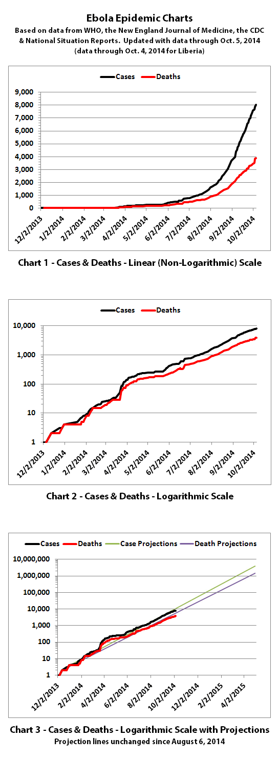
I've updated the Ebola charts with the newest data from the World Health Organization (WHO) published October 8, 2014. According to WHO, through
October 5, 2014 (October 4, 2014 for Liberia), there were:
8033 reported cases (8034 with the nurse in Spain)
3879 reported deaths
The confirmed cases in Dallas, Texas and Madrid, Spain are included in these charts, but the death of the patient in Dallas, Texas today is not included since the data provided by WHO only goes through October 5th. Also, although WHO data for Africa includes 'confirmed, probable, and suspected' cases from Africa, for countries outside of Africa (such as the USA and Spain) WHO has only provided data for confirmed cases and not for probable or suspected cases.


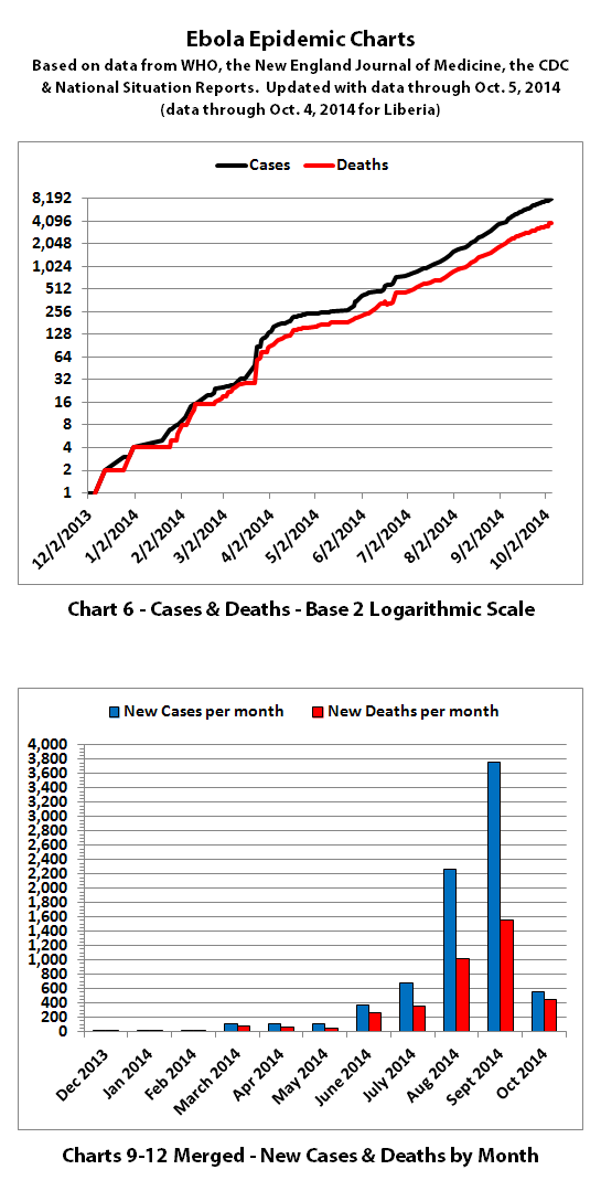

The same disclaimers and references apply to all of these charts:
Charts and future projections were done by me, not by WHO, except in cases where it is stated that a chart includes WHO projections. I am not an Ebola expert, epidemiologist, virologist, or MD, but I manually compiled the data used to create these graphs from news updates on the following WHO, CDC, and New England Journal of Medicine websites:
SOURCE: WHO website 1
SOURCE: WHO website 2
SOURCE: WHO website 3
SOURCE: WHO website 4
SOURCE: CDC website 1
SOURCE: The New England Journal of Medicine
In some cases, I also filled in data for dates between WHO updates using official situation reports released by the Ministries of Health of affected countries.
According to WHO,the CDC, and many charitable medical organizations such as Doctors Without Borders (MSF), it is believed that actual cases and deaths "vastly" outnumber reported figures. Most believe that there are at least 2 to 5 times as many cases and deaths. Since it is difficult to know exactly what the actual numbers are, these charts rely on the reported numbers.
Please do not do anything you might regret based on charts or projections. Hopefully efforts to contain, quarantine, treat, prevent, or cure Ebola will eventually be successful, and hopefully sooner rather than later.
The numbers do not include the Ebola outbreak in the Congo. Currently that is believed to be unrelated to this outbreak. If that situation changes or if the Congo outbreak is not contained, I may add it to these charts or create separate charts.
8033 reported cases (8034 with the nurse in Spain)
3879 reported deaths
The confirmed cases in Dallas, Texas and Madrid, Spain are included in these charts, but the death of the patient in Dallas, Texas today is not included since the data provided by WHO only goes through October 5th. Also, although WHO data for Africa includes 'confirmed, probable, and suspected' cases from Africa, for countries outside of Africa (such as the USA and Spain) WHO has only provided data for confirmed cases and not for probable or suspected cases.


The same disclaimers and references apply to all of these charts:
Charts and future projections were done by me, not by WHO, except in cases where it is stated that a chart includes WHO projections. I am not an Ebola expert, epidemiologist, virologist, or MD, but I manually compiled the data used to create these graphs from news updates on the following WHO, CDC, and New England Journal of Medicine websites:
SOURCE: WHO website 1
SOURCE: WHO website 2
SOURCE: WHO website 3
SOURCE: WHO website 4
SOURCE: CDC website 1
SOURCE: The New England Journal of Medicine
In some cases, I also filled in data for dates between WHO updates using official situation reports released by the Ministries of Health of affected countries.
According to WHO,the CDC, and many charitable medical organizations such as Doctors Without Borders (MSF), it is believed that actual cases and deaths "vastly" outnumber reported figures. Most believe that there are at least 2 to 5 times as many cases and deaths. Since it is difficult to know exactly what the actual numbers are, these charts rely on the reported numbers.
Please do not do anything you might regret based on charts or projections. Hopefully efforts to contain, quarantine, treat, prevent, or cure Ebola will eventually be successful, and hopefully sooner rather than later.
The numbers do not include the Ebola outbreak in the Congo. Currently that is believed to be unrelated to this outbreak. If that situation changes or if the Congo outbreak is not contained, I may add it to these charts or create separate charts.
a reply to: fwkitziger
Really good point, thanks. Of the three countries with the highest number of cases (Guinea, Liberia, and Sierra Leone), Liberia has almost half the total reported cases in the world and more than half of the reported deaths according to the WHO updates.
Looking at laboratory confirmed cases and deaths according to WHO, it is obvious that they can't keep up with laboratory tests in Liberia:
In Guinea, 80.4% of all cases and 76.4% of all deaths reported are laboratory confirmed.
In Sierra Leone, 88.0% of all cases and 82.5% of all deaths reported are laboratory confirmed.
In Liberia, only 24.0% of all cases and 46.1% of all deaths reported are laboratory confirmed.
While working on the charts, I noticed that cases and deaths in Guinea are tracking right along with my projections, but cases and deaths in Liberia have started falling below my projections.
One would expect that to be good news! But Ebola has been totally out of control in Liberia for quite some time. According to WHO, 78.8% of current known Ebola cases (844 out of 1148 known cases currently) in Liberia cannot get a bed in a treatment facility and are out in the communities.
So it seems highly unlikely that Liberia would suddenly be able to contain and limit the spread of Ebola. I think WHO is right. All of this taken together is a pretty strong indication that Liberia is overwhelmed and is not currently able to keep up with testing, reporting data, or providing medical care (or even isolation) for Ebola patients.
Here are the charts I mentioned for the three countries that show reported cases versus my projections since about the time this thread was started to now:

originally posted by: fwkitziger
a reply to: ikonoklast
From he October 8 Situation Report:
"...Problems with data gathering in Liberia continue. It should be emphasized that the reported fall in the number of new cases in Liberia over the past three weeks is unlikely to be genuine. Rather, it reflects a deterioration in the ability of overwhelmed responders to record accurate epidemiological data. It is clear from field reports and first responders that EVD cases are being under-reported from several key locations, and laboratory data that have not yet been integrated into official estimates indicate an increase in the number of new cases in Liberia."
Really good point, thanks. Of the three countries with the highest number of cases (Guinea, Liberia, and Sierra Leone), Liberia has almost half the total reported cases in the world and more than half of the reported deaths according to the WHO updates.
Looking at laboratory confirmed cases and deaths according to WHO, it is obvious that they can't keep up with laboratory tests in Liberia:
In Guinea, 80.4% of all cases and 76.4% of all deaths reported are laboratory confirmed.
In Sierra Leone, 88.0% of all cases and 82.5% of all deaths reported are laboratory confirmed.
In Liberia, only 24.0% of all cases and 46.1% of all deaths reported are laboratory confirmed.
While working on the charts, I noticed that cases and deaths in Guinea are tracking right along with my projections, but cases and deaths in Liberia have started falling below my projections.
One would expect that to be good news! But Ebola has been totally out of control in Liberia for quite some time. According to WHO, 78.8% of current known Ebola cases (844 out of 1148 known cases currently) in Liberia cannot get a bed in a treatment facility and are out in the communities.
So it seems highly unlikely that Liberia would suddenly be able to contain and limit the spread of Ebola. I think WHO is right. All of this taken together is a pretty strong indication that Liberia is overwhelmed and is not currently able to keep up with testing, reporting data, or providing medical care (or even isolation) for Ebola patients.
Here are the charts I mentioned for the three countries that show reported cases versus my projections since about the time this thread was started to now:

a reply to: ikonoklast
Everyone I know in the profession has anticipated a flat-line. The labs can't pace demand for services. Medical facilities don't have the resources to take on new patients. I don't care how optimistic the WHO and CDC plans are for dealing with this locally ... they have to admit they are overwhelmed.
What's so hard about that? I'll tell you ... because it can happen anywhere and everywhere. Every place this virus breaks, and gets its little legs under it, will be overwhelmed. Wait'll it finds its way to Japan and gets a little exposure to some low-level radiation.
The R nought doesn't lie. The fact that it's a Class IV pathogen cannot be understated. That there's no worldwide pause for mitigation and control training is appalling. Listening to the CDC drone hasn't prevented its spread. And, the next curve is approaching because time has not stopped. Oh, and let's not forget, healthcare professionals not practicing Level IV pathogen controls are 300 times more likely to contract the virus.
Sorry. My Ebola doom porn meter pegged during an Emergency Management Meeting this a.m., when the subject was addressed and waved off ... again. They've simply decided what will be will be, and it's all the Infection Control manager's call. I was told to, "Shut up!" when I asked if we even had a bottle of Clorox to wash the bottoms of our shoes with.
a reply to: Snarl
Yes, the levels of denial, over-confidence, ignorance, and stupidity I'm seeing are staggering. And because Ebola moves relatively slow (doubling about every 3 to 4 weeks), I expect a lot of people are going to believe it's not really a big issue outside of Africa until it's too late.
When it doubles in the US, people will say, "There are only 2 cases in the USA." When it doubles again, people will say, "There are only 4 cases in the USA." Most people don't understand math well enough to realize it only doubled 13 times in 10 months in Africa, and look how big of a problem it is already.
a reply to: ikonoklast
Great work as usual. Thanks. ...Besides being overwhelmed, seems Liberia is taking steps to control their information flow - and facilitate a cover-up?
Great work as usual. Thanks. ...Besides being overwhelmed, seems Liberia is taking steps to control their information flow - and facilitate a cover-up?
InternationalSOS
8 October
…..There are several reports that all Ebola media coverage at health facilities will be restricted, to protect the privacy of patients and healthcare workers and ensure safety of staff and journalists. The Liberian Ministry of Health and Social Welfare and Ministry of Information have reportedly established a new Ebola media policy. Healthcare workers will not be allowed to give any information and no interviews will be conducted without advance approval from the Ministry of Information.
a reply to: ikonoklast
I just wanted to say thank you for these charts. It makes it much easier to get my little pea brain wrapped around the figures, as scary as they are
Lil
I just wanted to say thank you for these charts. It makes it much easier to get my little pea brain wrapped around the figures, as scary as they are
Lil
originally posted by: ikonoklast
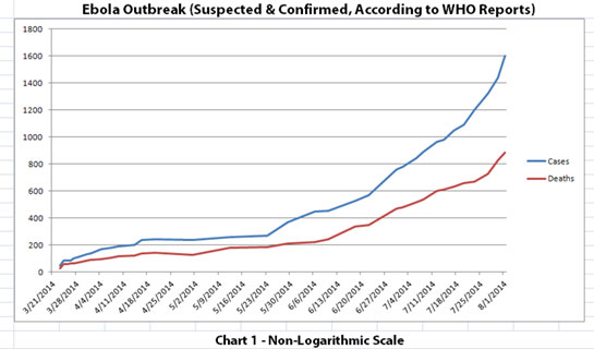
There are a lot of threads on various aspects of the current Ebola outbreak - so many that it's hard to picture just how fast Ebola is (or isn't) really spreading. To get a better picture and to see what kind of projections could be made, I created three charts using data I manually compiled from periodic updates from the World Health Organization (WHO).
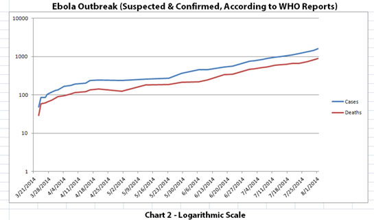
The results are pretty interesting, and a bit scary. I thought others might be interested in seeing these, too. Chart 1 and Chart 2 show the number of cases and the number of deaths for the Ebola outbreak that have been reported to WHO.
The y-axis scales are different in these graphs. In Chart 1, the y-axis is linear. In Chart 2, the y-axis is a logarithmic scale where divisions of the axis increase by powers of 10. Logarithmic scales can sometimes make a rate of progression much more clear. For example, a rapidly escalating curve may actually be a pretty straight line increase (but at a geometric rate) when viewed on a logarithmic scale.
I suspected that the spread of an epidemic like the Ebola outbreak might look more like such a straight line on a logarithmic scale. And (at least to me) that's what Chart 2 indicates.
The data used is from the news updates on these WHO sites:
SOURCE: WHO website 1
SOURCE: WHO website 2
NOTE: The WHO data used includes both laboratory-confirmed and suspected cases as reported to WHO by the affected countries in Africa.
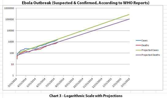
If the trend that is pretty obvious in Chart 2 was to continue to spread at this rate without slowing down, you can make some seat-of-the-pants projections just by extending the lines. That's what Chart 3 shows... and it is scary, especially if you imagine it continuing even further at that rate.
Chart 3 has future projections that hopefully will NOT happen. Actual data was only available through August 1, 2014.
I want to stress that hopefully the trend will NOT continue as projected in Chart 3. Hopefully things like travel restrictions, quarantines, possible vaccines, treatments, or just nature will limit (and ideally halt) the spread.
Nice work. They should show this on TV instead of the garbage that is shown.
a reply to: ikonoklast
I am waiting with trepidation to see whether containment measures in U.S. and Spain will be effective. Senegal and Nigeria were able to halt spread. Hoping same can be achieved in North America and Europe. On other hand mobility of people in developed countries may make things a whole lot worse.
I am waiting with trepidation to see whether containment measures in U.S. and Spain will be effective. Senegal and Nigeria were able to halt spread. Hoping same can be achieved in North America and Europe. On other hand mobility of people in developed countries may make things a whole lot worse.
a reply to: soficrow
Thanks, and you're welcome.
I'm very sorry for Liberians, but Liberia is the canary in the coal mine. Based on reported numbers from WHO, chart 4E shows even the best case projection is everyone in Liberia susceptible to Ebola will be infected by mid-April 2015 if nothing can be done to change things. If the government of Liberia shuts down the information flow, they are essentially shutting down the early warning system.
But it may be that we should realize the canary is being removed because it is half dead. Ebola spreads at an exponential rate, and in Liberia it has doubled about 12 times in slightly less than 7 months since their first reported case. Looking at Wikipedia's Powers of Two chart, Liberia is already more than half way to saturation - it only has to double again slightly more than 10 times for total cases to exceed national population.
Of course Ebola does not stay inside national borders. I don't want to fear-monger, but the numbers are incredibly chilling when you look at the exponential rate of growth. Looking at total cases in the world and the same powers of two chart, we are already more than 39.4% of the way to total cases equaling global population. Something needs to change that now.
This is extremely serious. On that note, I think I need to add an edited version of part of my standard disclaimer (for everyone, not just sofi):
These are mathematical projections based on numbers from WHO and assuming nothing changes to slow or halt the spread. Please do not do anything you might regret based on charts or projections. Hopefully efforts to contain, quarantine, treat, prevent, or cure Ebola will eventually be successful, and hopefully sooner rather than later.
originally posted by: Lilroanie
a reply to: ikonoklast
I just wanted to say thank you for these charts. It makes it much easier to get my little pea brain wrapped around the figures, as scary as they are
Lil
You're welcome. That's why I originally did the charts, so I could wrap my brain around the figures too.
originally posted by: alientransfer
Nice work. They should show this on TV instead of the garbage that is shown.
Thanks. My daughter actually saw one of my charts on a show about Ebola on one of the science channels. She was surprised, but recognized it immediately. Her boyfriend's father was watching the show.
Hopefully that means people who could actually do something about this on a large scale are seeing the charts.
new topics
-
Judge rules president-elect Donald Trump must be sentenced in 'hush money' trial
US Political Madness: 1 hours ago -
Farmers wife
Music: 3 hours ago -
NJ Drones tied to Tesla explosion at Trump Las vegas
General Conspiracies: 4 hours ago -
New Jersey-Teachers Can Now Be Certified Without Passing Basic Reading Writing Math Testing
Education and Media: 7 hours ago -
Matthew Livelsberger said he was being followed by FBI
Political Conspiracies: 10 hours ago
top topics
-
Matthew Livelsberger said he was being followed by FBI
Political Conspiracies: 10 hours ago, 16 flags -
Here we again... CHINA having mass outbreak of something
Diseases and Pandemics: 13 hours ago, 8 flags -
The 119th Congress has Officially Opened for Business
Mainstream News: 13 hours ago, 7 flags -
New Jersey-Teachers Can Now Be Certified Without Passing Basic Reading Writing Math Testing
Education and Media: 7 hours ago, 7 flags -
Paranoid Liberals Believe U.S. Service Members are More Dangerous than Illegal Aliens.
Social Issues and Civil Unrest: 13 hours ago, 6 flags -
How the Sikhs Deal with Muslim Grooming Gangs – Tommy Robinson
Social Issues and Civil Unrest: 12 hours ago, 6 flags -
NJ Drones tied to Tesla explosion at Trump Las vegas
General Conspiracies: 4 hours ago, 3 flags -
Farmers wife
Music: 3 hours ago, 0 flags -
Judge rules president-elect Donald Trump must be sentenced in 'hush money' trial
US Political Madness: 1 hours ago, 0 flags
active topics
-
Tesla Cybertruck Explodes in Front of Trump Hotel in Las Vegas
Mainstream News • 198 • : Mantiss2021 -
Judge rules president-elect Donald Trump must be sentenced in 'hush money' trial
US Political Madness • 1 • : DOCTORNO -
Matthew Livelsberger said he was being followed by FBI
Political Conspiracies • 63 • : BeyondKnowledge3 -
Paranoid Liberals Believe U.S. Service Members are More Dangerous than Illegal Aliens.
Social Issues and Civil Unrest • 30 • : hangedman13 -
Candidate TRUMP Now Has Crazy Judge JUAN MERCHAN After Him - The Stormy Daniels Hush-Money Case.
Political Conspiracies • 2172 • : WeMustCare -
Musk calls on King Charles III to dissolve Parliament over Oldham sex grooming gangs
Mainstream News • 88 • : WeMustCare -
-@TH3WH17ERABB17- -Q- ---TIME TO SHOW THE WORLD--- -Part- --44--
Dissecting Disinformation • 3923 • : RelSciHistItSufi -
Watts home paranormal activity
Paranormal Studies • 6 • : TowmasterLG -
Congress Says the FBI is Covering Up Vital Info on the Jan 5th 2021 D.C. Pipe Bombs at RNC-DNC.
Political Conspiracies • 28 • : GotterDameron23 -
New Jersey-Teachers Can Now Be Certified Without Passing Basic Reading Writing Math Testing
Education and Media • 9 • : rickymouse

