It looks like you're using an Ad Blocker.
Please white-list or disable AboveTopSecret.com in your ad-blocking tool.
Thank you.
Some features of ATS will be disabled while you continue to use an ad-blocker.
share:
a reply to: bludragin
I think Frieden's career at the CDC is already doomed. Probably the only reason he hasn't been fired yet is that they need a convenient scapegoat when someone has to be thrown under the bus if the outbreak continues to grow. That's how it's done. Someone has to take the blame, and it won't be the person at the top. Then the next potential scapegoat will be put into the position.
originally posted by: bludragin
a reply to: ikonoklastI'm considering starting a Change.org Petition to remove Dr Frieden. Your thoughts? My post on it here:
www.abovetopsecret.com...
I think Frieden's career at the CDC is already doomed. Probably the only reason he hasn't been fired yet is that they need a convenient scapegoat when someone has to be thrown under the bus if the outbreak continues to grow. That's how it's done. Someone has to take the blame, and it won't be the person at the top. Then the next potential scapegoat will be put into the position.
a reply to: olduser
Thanks, glad you find the graphs useful. The doomsday graphs were made because someone asked to see what it would look like if we imagined such a worst case scenario could happen. You're right, that won't actually happen. Realistically, even in the worst case scenarios, there will be survivors and there will be people with immunity. Currently they think survivors will have immunity against the strain they were infected with for at least 10 years.
The approximately 30% survival rate published recently was for people in Ebola centers or hospitals receiving the best care possible under the circumstances. Just rehydrating people as they lose body fluids increases the survival rate (a good Ebola survival tip to know).
In a worst case scenario (which I hope will NOT be what happens), health care, social, and economic systems would eventually be strained to the breaking point and this would have to affect survival rate (and not just among Ebola patients). It would be horrific, but some would still survive.
I have wondered how all of these different factors would affect the graphs. No one really knows, and I hope we don't find out.
UN Security Council meeting yesterday:
www.un.org...
The rest of that article is chilling.
Also:
Ebola: The Executive Summary, 10/15
www.un.org...
“Ebola got a head start on us,” he said. “It is far ahead of us, it is running faster than us, and it is winning the race. If Ebola wins, we the peoples of the United Nations lose so very much…,” he said. “We either stop Ebola now or we face an entirely unprecedented situation for which we do not have a plan,” Mr. Banbury told the Council via video link from the operation’s headquarters in Ghana.
The rest of that article is chilling.
Also:
Ebola: The Executive Summary, 10/15
originally posted by: ikonoklast
a reply to: Snarl
Whoa indeed. You apparently work in the health field - What do you think a realistic time-frame is "to synthesize, test, and distribute an effective vaccine?"
Not my area of (even limited) expertise. But, yeah, I'd have to agree that two or three years to come up with an effective and 'safe' vaccine. I am very 'pro' vaccine, but I've also been somewhat concerned by vaccines during their initial development. Not sure I'd be found in the line for voluntary human trials with the first batch.
I caught myself up on comments in-thread before this reply. Have to agree your concerns about the second and third order effects of catastrophic population decline mirror my own. I am also gravely concerned about Ebola finding a natural biological reservoir on the continents of North or South America. We've got fruit bats over here too, right?
ETA: Thanks for making that chart for me, BTW. I printed it and hung it up outside my door. The boss took it down. LOL
edit on 16102014 by
Snarl because: (no reason given)
I need to monitor this, for the simple reason I finally decide to get my life together and now the world wants to self-destruct. I swear I have a
curse.
edit on 01410k3 by Lynk3 because: (no reason given)
I've updated the Ebola charts with data from the World Health Organization (WHO) published October 15, 2014. According to WHO, through October 12,
2014 (October 11, 2014 for Liberia), there were:
8997 reported cases
4493 reported deaths
For Guinea, Liberia, Nigeria, Senegal, and Sierra Leone, the WHO data includes confirmed, probable, and suspected cases and deaths.
For other countries, the WHO data only includes two confirmed cases (in Dallas and Madrid) and one confirmed death (in Dallas). Additional probable and suspected cases have been reported in the news, but as of October 12, 2014, WHO is reporting "No data available" for probable and suspected cases outside of the five countries in west Africa.
The numbers also do not include the Congo, as that is allegedly an unrelated outbreak.
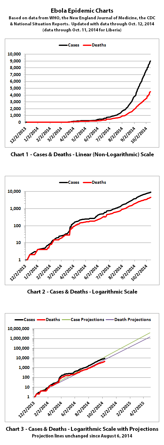

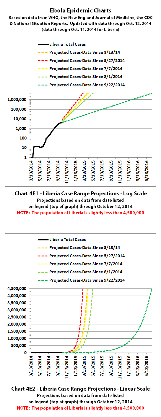

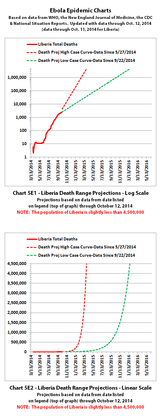
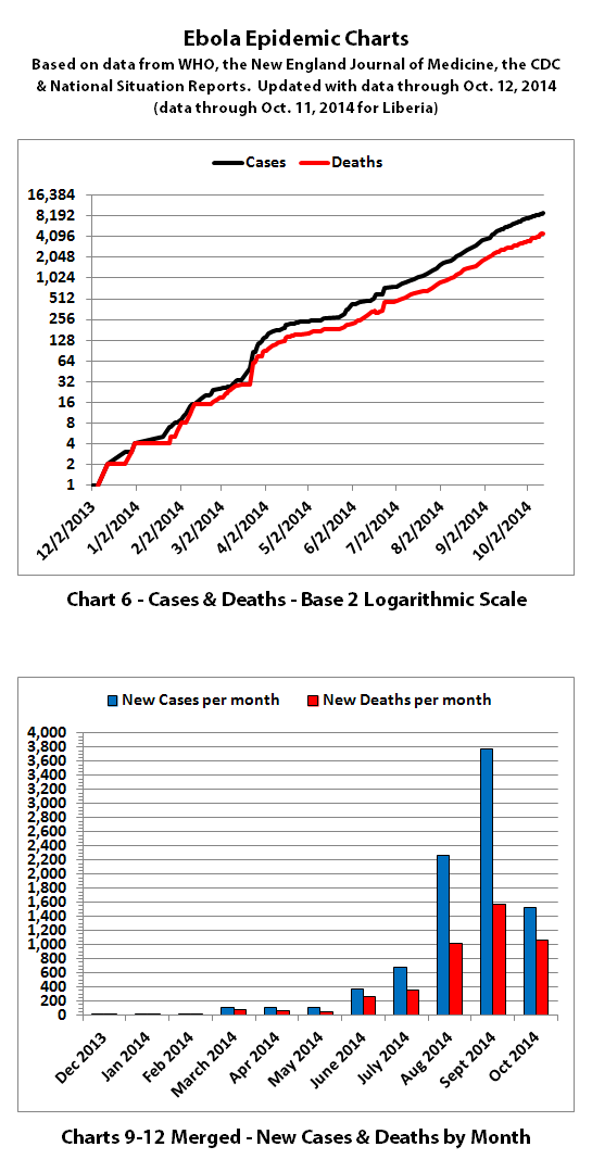

The same disclaimers and references apply to all of these charts:
Charts and future projections were done by me, not by WHO, except in cases where it is stated that a chart includes WHO projections. I am not an Ebola expert, epidemiologist, virologist, or MD, but I manually compiled the data used to create these graphs from news updates on the following WHO, CDC, and New England Journal of Medicine websites:
SOURCE: WHO website 1
SOURCE: WHO website 2
SOURCE: WHO website 3
SOURCE: WHO website 4
SOURCE: CDC website 1
SOURCE: The New England Journal of Medicine
In some cases, I also filled in data for dates between WHO updates using official situation reports released by the Ministries of Health of affected countries.
According to WHO,the CDC, and many charitable medical organizations such as Doctors Without Borders (MSF), it is believed that actual cases and deaths "vastly" outnumber reported figures. Most believe that there are at least 2 to 5 times as many cases and deaths. Since it is difficult to know exactly what the actual numbers are, these charts rely on the reported numbers.
Also according to WHO, the drop in reported new cases in Liberia over the last few weeks "...is unlikely to be genuine. Rather, it reflects a deterioration in the ability of overwhelmed responders to record accurate epidemiological data."
Please do not do anything you might regret based on charts or projections. Hopefully efforts to contain, quarantine, treat, prevent, or cure Ebola will eventually be successful, and hopefully sooner rather than later.
8997 reported cases
4493 reported deaths
For Guinea, Liberia, Nigeria, Senegal, and Sierra Leone, the WHO data includes confirmed, probable, and suspected cases and deaths.
For other countries, the WHO data only includes two confirmed cases (in Dallas and Madrid) and one confirmed death (in Dallas). Additional probable and suspected cases have been reported in the news, but as of October 12, 2014, WHO is reporting "No data available" for probable and suspected cases outside of the five countries in west Africa.
The numbers also do not include the Congo, as that is allegedly an unrelated outbreak.


The same disclaimers and references apply to all of these charts:
Charts and future projections were done by me, not by WHO, except in cases where it is stated that a chart includes WHO projections. I am not an Ebola expert, epidemiologist, virologist, or MD, but I manually compiled the data used to create these graphs from news updates on the following WHO, CDC, and New England Journal of Medicine websites:
SOURCE: WHO website 1
SOURCE: WHO website 2
SOURCE: WHO website 3
SOURCE: WHO website 4
SOURCE: CDC website 1
SOURCE: The New England Journal of Medicine
In some cases, I also filled in data for dates between WHO updates using official situation reports released by the Ministries of Health of affected countries.
According to WHO,the CDC, and many charitable medical organizations such as Doctors Without Borders (MSF), it is believed that actual cases and deaths "vastly" outnumber reported figures. Most believe that there are at least 2 to 5 times as many cases and deaths. Since it is difficult to know exactly what the actual numbers are, these charts rely on the reported numbers.
Also according to WHO, the drop in reported new cases in Liberia over the last few weeks "...is unlikely to be genuine. Rather, it reflects a deterioration in the ability of overwhelmed responders to record accurate epidemiological data."
Please do not do anything you might regret based on charts or projections. Hopefully efforts to contain, quarantine, treat, prevent, or cure Ebola will eventually be successful, and hopefully sooner rather than later.
a reply to: Snarl
a reply to: Micksy
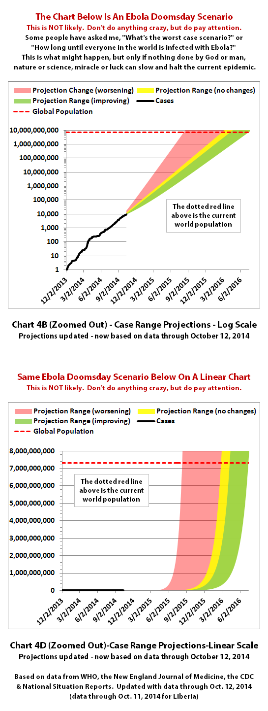
You're welcome, Snarl, and thanks, Micksy. I've updated the 'doomsday' Ebola projection charts for the case and death projections:
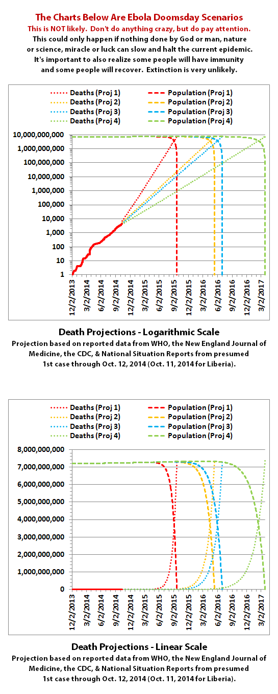
For the death projections, I've applied Snarl's idea of showing declining population versus increasing Ebola deaths. And with this update I've done that for several possible projection curves of various rates of growth.
Thanks to Micksy, I've corrected an error in my thinking the first time. Where the declining population and rising death lines cross would not be the extinction point. The points where declining population lines hit zero would be the extincion points for each set of curves. I've fixed that in this update.
For those who may not have been following closely, this set of projections is highly speculative and really couldn't happen. Even in the worst case scenario, some people would be immune and some would survive and recover. Plus one would hope that something will stop the relentless spread of Ebola before it goes nearly this far. (So please don't anyone freak out...)
Charts and future projections were done by me, not by WHO. I am not an Ebola expert, epidemiologist, virologist, or MD, but I manually compiled the data used to create these graphs from news updates on the following WHO, CDC, and New England Journal of Medicine websites:
SOURCE: WHO website 1
SOURCE: WHO website 2
SOURCE: WHO website 3
SOURCE: WHO website 4
SOURCE: CDC website 1
SOURCE: The New England Journal of Medicine
In some cases, I also filled in data for dates between WHO updates using official situation reports released by the Ministries of Health of affected countries.
According to WHO,the CDC, and many charitable medical organizations such as Doctors Without Borders (MSF), it is believed that actual cases and deaths "vastly" outnumber reported figures. Most believe that there are at least 2 to 5 times as many cases and deaths. Since it is difficult to know exactly what the actual numbers are, these charts rely on the reported numbers. If that's true, it means things are 1-2 months ahead of schedule, because it's doubling every 3-4 weeks.
Please, do not do anything you might regret based on charts or projections. Hopefully efforts to contain, quarantine, treat, prevent, or cure Ebola will eventually be successful, and hopefully sooner rather than later.
PS - Thanks for the vaccine feedback, Snarl. Yes, I believe we do have fruit bats here too. Soficrow has a map about fruit bat ranges and migration patterns around the Ebola threads somewhere, I remember seeing it.
a reply to: Micksy
You're welcome, Snarl, and thanks, Micksy. I've updated the 'doomsday' Ebola projection charts for the case and death projections:


For the death projections, I've applied Snarl's idea of showing declining population versus increasing Ebola deaths. And with this update I've done that for several possible projection curves of various rates of growth.
Thanks to Micksy, I've corrected an error in my thinking the first time. Where the declining population and rising death lines cross would not be the extinction point. The points where declining population lines hit zero would be the extincion points for each set of curves. I've fixed that in this update.
For those who may not have been following closely, this set of projections is highly speculative and really couldn't happen. Even in the worst case scenario, some people would be immune and some would survive and recover. Plus one would hope that something will stop the relentless spread of Ebola before it goes nearly this far. (So please don't anyone freak out...)
Charts and future projections were done by me, not by WHO. I am not an Ebola expert, epidemiologist, virologist, or MD, but I manually compiled the data used to create these graphs from news updates on the following WHO, CDC, and New England Journal of Medicine websites:
SOURCE: WHO website 1
SOURCE: WHO website 2
SOURCE: WHO website 3
SOURCE: WHO website 4
SOURCE: CDC website 1
SOURCE: The New England Journal of Medicine
In some cases, I also filled in data for dates between WHO updates using official situation reports released by the Ministries of Health of affected countries.
According to WHO,the CDC, and many charitable medical organizations such as Doctors Without Borders (MSF), it is believed that actual cases and deaths "vastly" outnumber reported figures. Most believe that there are at least 2 to 5 times as many cases and deaths. Since it is difficult to know exactly what the actual numbers are, these charts rely on the reported numbers. If that's true, it means things are 1-2 months ahead of schedule, because it's doubling every 3-4 weeks.
Please, do not do anything you might regret based on charts or projections. Hopefully efforts to contain, quarantine, treat, prevent, or cure Ebola will eventually be successful, and hopefully sooner rather than later.
PS - Thanks for the vaccine feedback, Snarl. Yes, I believe we do have fruit bats here too. Soficrow has a map about fruit bat ranges and migration patterns around the Ebola threads somewhere, I remember seeing it.
a reply to: ikonoklast
It would appear, according to your charts, that the spread of Ebola tends to flatten our after the initial exposure and then it continues its upward trend. This can be seen in Sierra Leone infections earlier this year where it appears to have stopped expanding its hold for a few months and then begins its upward climb as it spreads to more of the population.
I took note of this because it appears, according to chart 13b, that the same thing is happening in Nigeria right now. It has flat-lined for a couple of months. It would appear that we will soon see an upward movement of infections in Nigeria if this is the case.
Or it could be related to the infection-reporting methods of the countries involved.
So long . . . and thanks for all the fish!
Bishop
edit on 10/17/2014 by Bishop2199 because: Add Chart Number
edit on 10/17/2014 by Bishop2199 because: I like
change
Nigeria seems to have been able to stop it at the 24 cases count with good protocols applied. What really, really worries me is the lack of data from
Liberia since the last update from WHO, which could mean that things have gotten really out of hand there.
WHO released another update today. So even though it was just last night that I finished the previous Ebola chart updates, I went ahead and updated
them again with the new data.
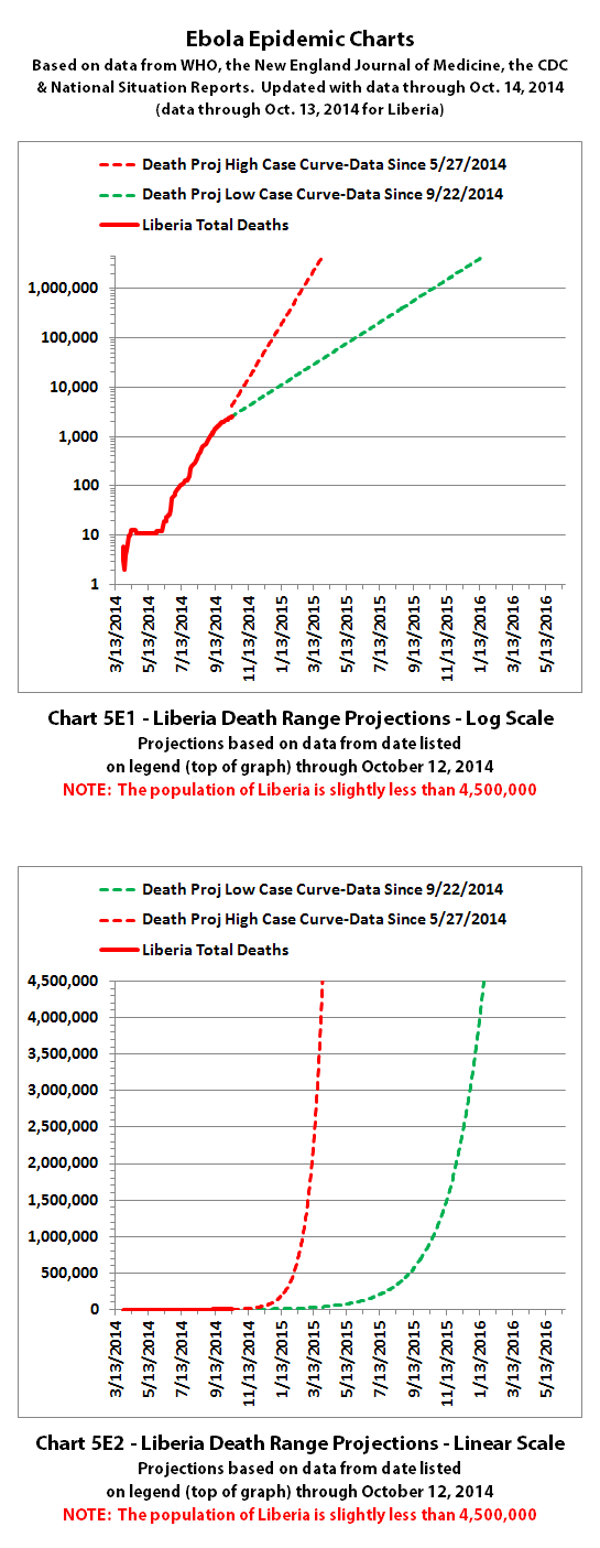
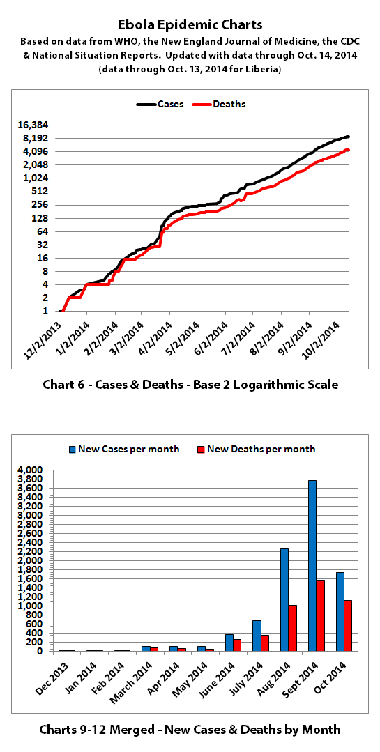
According to WHO, through October 14, 2014 (October 13, 2014 for Liberia), there were:
9216 reported cases
4555 reported deaths

The reported numbers are starting to trend down from the projection lines created on August 6,2014 (Chart 3 above) but are right on the projection lines and in the ranges created on August 8, 2014 (charts 4 and 5 below).



According to WHO,the CDC, and many charitable medical organizations such as Doctors Without Borders (MSF), it is believed that actual cases and deaths "vastly" outnumber reported figures. Most believe that there are at least 2 to 5 times as many cases and deaths. Since it is difficult to know exactly what the actual numbers are, these charts rely on the reported numbers.
WHO has also said the drop in reported new cases in Liberia over the last few weeks "...is unlikely to be genuine. Rather, it reflects a deterioration in the ability of overwhelmed responders to record accurate epidemiological data."
For Guinea, Liberia, Nigeria, Senegal, and Sierra Leone, WHO includes confirmed, probable, and suspected cases and deaths that are reported.
For other countries, WHO only includes three confirmed cases (in Dallas and Madrid) and one confirmed death (in Dallas). Additional probable and suspected cases have been reported in the news, but not by WHO. So far WHO is reporting "No data available" for probable and suspected cases in Spain and the USA.
The numbers also do not include the Congo, as that is allegedly an unrelated outbreak.
The same disclaimers and references apply to all of these charts:
Charts and future projections were done by me, not by WHO, except in cases where it is stated that a chart includes WHO projections. I am not an Ebola expert, epidemiologist, virologist, or MD, but I manually compiled the data used to create these graphs from news updates on the following WHO, CDC, and New England Journal of Medicine websites:
SOURCE: WHO website 1
SOURCE: WHO website 2
SOURCE: WHO website 3
SOURCE: WHO website 4
SOURCE: CDC website 1
SOURCE: The New England Journal of Medicine
In some cases, I also filled in data for dates between WHO updates using official situation reports released by the Ministries of Health of affected countries.
Please do not do anything you might regret based on charts or projections. Hopefully efforts to contain, quarantine, treat, prevent, or cure Ebola will eventually be successful, and hopefully sooner rather than later.
According to WHO, through October 14, 2014 (October 13, 2014 for Liberia), there were:
9216 reported cases
4555 reported deaths

The reported numbers are starting to trend down from the projection lines created on August 6,2014 (Chart 3 above) but are right on the projection lines and in the ranges created on August 8, 2014 (charts 4 and 5 below).


According to WHO,the CDC, and many charitable medical organizations such as Doctors Without Borders (MSF), it is believed that actual cases and deaths "vastly" outnumber reported figures. Most believe that there are at least 2 to 5 times as many cases and deaths. Since it is difficult to know exactly what the actual numbers are, these charts rely on the reported numbers.
WHO has also said the drop in reported new cases in Liberia over the last few weeks "...is unlikely to be genuine. Rather, it reflects a deterioration in the ability of overwhelmed responders to record accurate epidemiological data."
For Guinea, Liberia, Nigeria, Senegal, and Sierra Leone, WHO includes confirmed, probable, and suspected cases and deaths that are reported.
For other countries, WHO only includes three confirmed cases (in Dallas and Madrid) and one confirmed death (in Dallas). Additional probable and suspected cases have been reported in the news, but not by WHO. So far WHO is reporting "No data available" for probable and suspected cases in Spain and the USA.
The numbers also do not include the Congo, as that is allegedly an unrelated outbreak.
The same disclaimers and references apply to all of these charts:
Charts and future projections were done by me, not by WHO, except in cases where it is stated that a chart includes WHO projections. I am not an Ebola expert, epidemiologist, virologist, or MD, but I manually compiled the data used to create these graphs from news updates on the following WHO, CDC, and New England Journal of Medicine websites:
SOURCE: WHO website 1
SOURCE: WHO website 2
SOURCE: WHO website 3
SOURCE: WHO website 4
SOURCE: CDC website 1
SOURCE: The New England Journal of Medicine
In some cases, I also filled in data for dates between WHO updates using official situation reports released by the Ministries of Health of affected countries.
Please do not do anything you might regret based on charts or projections. Hopefully efforts to contain, quarantine, treat, prevent, or cure Ebola will eventually be successful, and hopefully sooner rather than later.
originally posted by: Bishop2199
a reply to: ikonoklast
It would appear, according to your charts, that the spread of Ebola tends to flatten our after the initial exposure and then it continues its upward trend. This can be seen in Sierra Leone infections earlier this year where it appears to have stopped expanding its hold for a few months and then begins its upward climb as it spreads to more of the population.
I took note of this because it appears, according to chart 13b, that the same thing is happening in Nigeria right now. It has flat-lined for a couple of months. It would appear that we will soon see an upward movement of infections in Nigeria if this is the case.
Or it could be related to the infection-reporting methods of the countries involved.
I suspect it's probably that when there are few cases in a country, the number of new cases and the time between is somewhat at the whim of ignorant people doing dumb things - with fate, karma, luck, or whatever you want to call it figuring in too.
When there are not too many cases yet in a country, it may be contained, leading to a flat line when looking at cumulative cases. In past outbreaks, that's how it went. But it may also only be contained for a while (the flat part of the curve) and then it slips out and starts spreading again, so the line rises again.
If it slips out and spreads again and can't be contained, eventually it spreads to enough people that statistical trends take over. That's when, on average, each case spreads to more than 1 person (estimated at about 1.5 to 2 currently). That's when the line straightens out into a very predictable exponential curve until (or unless) something changes it.
Hopefully it was really contained in Nigeria. There have not been new reported cases in some time there. But there is always the chance it could be spreading somewhere unnoticed, that there is a cover-up, or that someone else could bring it back in again.
You can see in the charts that there was a sudden upsurge in reported cases when WHO realized back in late March that there was an Ebola outbreak. And in Liberia right now, WHO believes that it has not slowed down at all but that Liberia can't keep up with testing and reporting. So reporting methods and abilities do have a significant impact.
a reply to: YodaCoda
WHO has stated that they believe Ebola has not slowed down in Liberia, that the decline in reported new cases and deaths is actually an indication that the Liberian government is completely overwhelmed. Liberia recently muzzled reporters with new laws or regulations, so that makes it difficult to know what's going on. But before that, all reports indicate it was completely out of control.
WHO did apparently get an update from Liberia (through October 13th) that was included in the new WHO update today, but it was no longer divided into confirmed, probable, and suspected cases or deaths, it was just an "all" category for each. That may be another indication of overwhelm.
ikonoklast,
Taking into consideration your last two posts, I think there are a number of potentials.
The ability to report accurate numbers fades over time: 1) The commonality of death precludes the desire for concerted efforts of accurate reporting. 2) The reports become detrimental to efforts supporting control.
The obvious agenda to control panic (yet ... this is a Class IV pathogen for crying out loud): 1) It's been stated and re-stated by TPTB and their MSM cronies ... "Please don't panic!!" 2) In your own disclaimers ... "Most believe that there are at least 2 to 5 times as many cases and deaths." and "these charts rely on the reported numbers."
An agenda to allow Ebola to intentionally spread. Don't let me get started in this thread. It doesn't belong here.
Again, kudos for keeping up with this. Anyone watching these charts ... or better yet, going back and looking at their development ... will see the trends so obvious to my own eyes. They're lying to us!! Question is: To what ends?
a reply to: ikonoklast
World wide famine will probably kill billions if it can not be contained in China and India and the USA some of the biggest food producers of the world.
Even just one of them would be catastrophic.
You are just starting to see it now on a smaller scale in the 3 main infected country's
World wide famine will probably kill billions if it can not be contained in China and India and the USA some of the biggest food producers of the world.
Even just one of them would be catastrophic.
You are just starting to see it now on a smaller scale in the 3 main infected country's
a reply to: joho99
Hopefully it will be contained or will become treatable or preventable somehow before it spreads so widely. The secondary impacts on food supply (and all supply lines) as well as society in general would be catastrophic long before the doomsday chart curves hit the sharpest changes.
Hopefully it will be contained or will become treatable or preventable somehow before it spreads so widely. The secondary impacts on food supply (and all supply lines) as well as society in general would be catastrophic long before the doomsday chart curves hit the sharpest changes.
originally posted by: Snarl
Again, kudos for keeping up with this. Anyone watching these charts ... or better yet, going back and looking at their development ... will see the trends so obvious to my own eyes.
Thanks. I went back and dredged up the original projection I did, the very first Chart 3 from the very first post in this thread back on August 4, 2014. That's the first chart below. Then using the same exact projection lines, I overlaid the reported data up through the last WHO update, which was released yesterday. That's the second chart below.
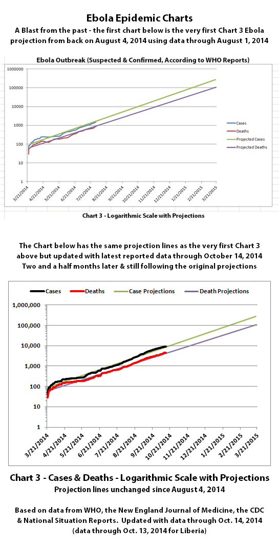
The Chart 3 I've been updating since then has been a different version of Chart 3 that I created a couple days later on August 6, 2014. That version had slightly more data, a longer timeline, and more aggressive projections. But the current reported numbers have been trending a bit down from those more aggressive projections, though that may be more due to issues with testing and reporting,
I was curious last night how accurate the projections in the very first Chart 3 (above) were, so I updated it with all of the reported data since then, leaving the projection lines exactly as they were originally on August 4th. Even I was shocked at how accurate that projection was. It's hard to imagine that it could have been more accurate over the two and a half months since it was created.
I feel a really strange mix of pride and redemption in the accuracy in the accuracy of the projections mixed with a horrible sinking queasiness in the pit of my stomach. It's quite obvious that Ebola is not slowing down. It continues to spread at the same exponential rate of growth. And it's quite obvious what that means if it can't be changed. I really expected and hoped to see something slowing Ebola down by now.
Looking at the research involved, which is largely based on a single outbreak, the assertion is not that those who are immune are asymptomatic
carriers, but that when they came into contact with the disease they produced antibodies to kill it without becoming sick. Their blood contained only
antibodies and not virus. The article used the line that ebola acted on them as its own vaccine.
Personally, I don't think any conclusions can be drawn from a sample of thirty or so. Even if the was immunity in one group, it may have been unique in some way.
I read another article that was discussing that when disease modeling reaches the burnout stage, where there are survivors, there will also be a non negligible proportion of susceptible population who have never contracted the virus, presumably because of some kind of herd immunity effect as the available vectors diminish. Sadly, I can't find it again, but it makes sense to me.
On a related note, there are theories that connect herd immunity to R0. I could only find this Wikipedia article which appears to show the
relationship. It only shows diseases with an R0 of 6. For these, 80% herd immunity is required. I wouldn't want to presume a linear relationship,
but I don't think that a figure of 70% is overly optimistic.
en.m.wikipedia.org...
As a rough illustration only, if ebola reached burnout, leaving 28% surviving infection, this would relate to an additional 12% who never become infected on a ratio of 7:3, meaning 40% of the population may survive in total.
Sorry to spam your thread, but there was a small discussion on immunity earlier and your doomsday projections were so very bleak. If it were possible to keep R0 low enough in the latter stages of an infection by enlisting survivors, it's possible that the amount of uninfected people could be maximised even higher than above.
For the sake of my sanity, we'll say I am talking about west Africa here.
new topics
-
Welp...Happy New Year!!
General Chit Chat: 1 hours ago -
Vehicle Strikes people in New Orleans
Mainstream News: 3 hours ago -
The Hand that Rocks the Cradle - Labour Plans “diversities of our society” Curriculum Change
Regional Politics: 3 hours ago -
SCOTUS Chief Justice JOHN ROBERTS Ends 2024 Describing His Fears for Safety of U.S. Judges.
Above Politics: 11 hours ago
top topics
-
Vehicle Strikes people in New Orleans
Mainstream News: 3 hours ago, 9 flags -
SCOTUS Chief Justice JOHN ROBERTS Ends 2024 Describing His Fears for Safety of U.S. Judges.
Above Politics: 11 hours ago, 3 flags -
The Hand that Rocks the Cradle - Labour Plans “diversities of our society” Curriculum Change
Regional Politics: 3 hours ago, 2 flags -
Welp...Happy New Year!!
General Chit Chat: 1 hours ago, 2 flags
active topics
-
Vehicle Strikes people in New Orleans
Mainstream News • 22 • : Flyingclaydisk -
The Hand that Rocks the Cradle - Labour Plans “diversities of our society” Curriculum Change
Regional Politics • 8 • : Cvastar -
How we've changed in 100 years
Ancient & Lost Civilizations • 15 • : TheMisguidedAngel -
Simulation theory and have we reset before like a game?
Conspiracies in Religions • 39 • : Xtrozero -
Welp...Happy New Year!!
General Chit Chat • 6 • : Flyingclaydisk -
The C.D.C. Says There Was NO INFLUENZA Worth Reporting for the 2020-2021 Flu Season.
Diseases and Pandemics • 69 • : BedevereTheWise -
SCOTUS Chief Justice JOHN ROBERTS Ends 2024 Describing His Fears for Safety of U.S. Judges.
Above Politics • 9 • : VictorVonDoom -
New UK Petition - Close the borders! Suspend ALL immigration for 5 years!
Regional Politics • 18 • : Freeborn -
US disburses $3.4 billion in budget aid for Ukraine, Yellen says
US Political Madness • 20 • : SteamyAmerican -
I dont understand what i just witnessed
Social Issues and Civil Unrest • 23 • : TheMisguidedAngel
