It looks like you're using an Ad Blocker.
Please white-list or disable AboveTopSecret.com in your ad-blocking tool.
Thank you.
Some features of ATS will be disabled while you continue to use an ad-blocker.
share:
a reply to: operation mindcrime
That's some damn good drawing OM
And you're right the a looks much better now
Cody
That's some damn good drawing OM
And you're right the a looks much better now
Cody
a reply to: cody599
Hey thanks..
I'm completely surprised you are able to make such designs in PS without any 3D technology (my poor old laptop couldn't handle it anyway). It's all just a matter of layer upon layer of relativly simple shapes and forms...
Next up is something with glass...
Peace
Hey thanks..
I'm completely surprised you are able to make such designs in PS without any 3D technology (my poor old laptop couldn't handle it anyway). It's all just a matter of layer upon layer of relativly simple shapes and forms...
Next up is something with glass...
Peace
a reply to: operation mindcrime
Look forward to it OM, I really should get into more as well, sodding RL keeps getting in the way
But my time will come
Cody
Look forward to it OM, I really should get into more as well, sodding RL keeps getting in the way
But my time will come
Cody
a reply to: OpinionatedB
Okay...well I tried to make the best of it so I hope you can view these printscreens correct..
Make a circle, gradient overlay, radial and reverse
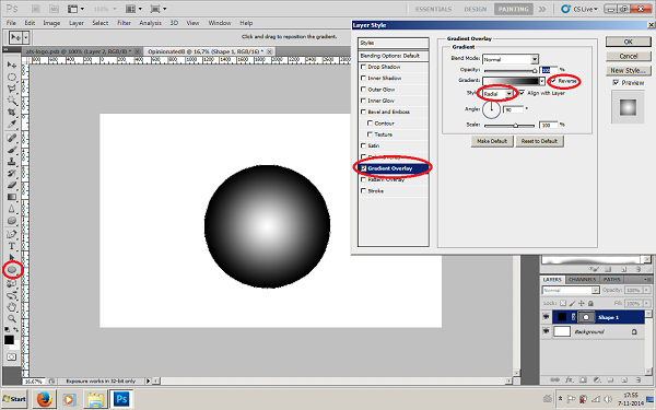
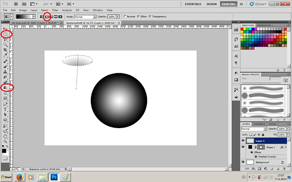
Create a new layer and with the oval selection tool drag an oval. Under "paint bucket" is also a "gradient tool"(never knew that, lol), in the top bar set it to radial and if you want play a little with the opacity and drag it across your selection in the direction you want.
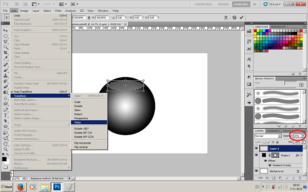
Put your circle inside your object and now go to "edit", "transform" and "warp". Wrap it around in the shape you desire and on the left play with the opacity untill you reach the desired result..
Good luck...
Peace
Okay...well I tried to make the best of it so I hope you can view these printscreens correct..
Make a circle, gradient overlay, radial and reverse

Create a new layer and with the oval selection tool drag an oval. Under "paint bucket" is also a "gradient tool"(never knew that, lol), in the top bar set it to radial and if you want play a little with the opacity and drag it across your selection in the direction you want.

Put your circle inside your object and now go to "edit", "transform" and "warp". Wrap it around in the shape you desire and on the left play with the opacity untill you reach the desired result..

Good luck...
Peace
a reply to: Ektar
Is that Latoya Jackson? IN A STUDEBACKER !
Oh, come on, that's just not funny a' tall !
Keep on' em
"This is an A-Star, not an Apache"
120 > 140 >> 160 >>>> SHE'S GONE >>>>>>> An eternity
No drinking while operating ahead on a Bud Light foam.
Sponsored by Cheerios
Is that Latoya Jackson? IN A STUDEBACKER !
Oh, come on, that's just not funny a' tall !
Keep on' em
"This is an A-Star, not an Apache"
120 > 140 >> 160 >>>> SHE'S GONE >>>>>>> An eternity
No drinking while operating ahead on a Bud Light foam.
Sponsored by Cheerios
edit on 7-11-2014 by RedDorothy because: HAD TO CALL TRIPLE EH?
a reply to: operation mindcrime
hmmmm..... okay... I'm not sure if I am missing something, because it sounds similar to what I was doing, but maybe in what I had been trying I had missed a small step somewhere.
I just got home, and as soon as I eat supper I will give that a try... and if it comes out I'll tell you... and if it doesn't seem to I'll tell you exactly what I did, and maybe you can tell me what step I missed doing.
Thank you, by the way... for taking the time to post all that. Thank you very much!
You said be honest about your A.. and my honestly lies with liking the design closer to the first one you posted. I think that first one looks a tad more like an A... but that's me. As far as this second A... it looks a tad more alien like..
so either way.. its probably more up to whatever style you like best! Opinions are like .... well you know what! And when you do something, it is usually what you like the most that matters most.
When it comes to myself...generally... I hate my work.. I sit and pick my stuff apart until I want to throw the computer out the window.. but I always love everyone else's stuff! We are always our own worst critic! If you please yourself, then you have done good!
edit on 7-11-2014 by
OpinionatedB because: (no reason given)
a reply to: operation mindcrime
I really like the metallic balls. I think the first series
one looks more like an "a". The 2nd ball looks like an alien
so it is an awesome futuristic ATS logo! & probably why
you chose that particular ball for your avatar.
Cheers
Ektar
I really like the metallic balls. I think the first series
one looks more like an "a". The 2nd ball looks like an alien
so it is an awesome futuristic ATS logo! & probably why
you chose that particular ball for your avatar.
Cheers
Ektar
a reply to: RedDorothy
Seeing as I left my decoder machine in my other car, and cryptic is not a known language to me, this is a literal stab in the dark with a butter knife. I have no clue what it is you want for an avatar, but this will have to suffice as my only attempt.

Seeing as I left my decoder machine in my other car, and cryptic is not a known language to me, this is a literal stab in the dark with a butter knife. I have no clue what it is you want for an avatar, but this will have to suffice as my only attempt.

a reply to: operation mindcrime
okay... lol... I tried... did NOT come out. This is what I ended with!

it wasn't mattering what I tried on this... whether I tried a blue metal color or a stainless steel metal color... it simply wasn't working!
I got frustrated and started hunting once more for another tutorial and found this one where I ended up with this brushed stainless...

which, I rather like in the end... but I would love to figure out how you managed that metal look! I cannot seem to manage it!
I'll keep trying...like the little engine that could!
okay... lol... I tried... did NOT come out. This is what I ended with!

it wasn't mattering what I tried on this... whether I tried a blue metal color or a stainless steel metal color... it simply wasn't working!
I got frustrated and started hunting once more for another tutorial and found this one where I ended up with this brushed stainless...

which, I rather like in the end... but I would love to figure out how you managed that metal look! I cannot seem to manage it!
I'll keep trying...like the little engine that could!
a reply to: 74Templar
What, No armored car ?
Miss New Jersey: " That would be in my other dress".
I'm liking the pony ---"There's Eleanor".
Got any Italians?
Don't it make my brown eyes Blue, you're a one hit wonder?
I'll be spoon feeding ideas until we put a fork in it for Ciao time.
What, No armored car ?
Miss New Jersey: " That would be in my other dress".
I'm liking the pony ---"There's Eleanor".
Got any Italians?
Don't it make my brown eyes Blue, you're a one hit wonder?
I'll be spoon feeding ideas until we put a fork in it for Ciao time.
a reply to: OpinionatedB
That metal look really turned out great. Now I just made a quick ball with your pattern as overlay and very sloppy cut out a B (for opininated B..lol) and added the "shine" circles as I tried to explain...

Is this the effect you are talking about? If so..I'll try to explain it a little more detailed how I reached this effect.
Peace
PS: But first coffee....it's early morning over here.
That metal look really turned out great. Now I just made a quick ball with your pattern as overlay and very sloppy cut out a B (for opininated B..lol) and added the "shine" circles as I tried to explain...

Is this the effect you are talking about? If so..I'll try to explain it a little more detailed how I reached this effect.
Peace
PS: But first coffee....it's early morning over here.
edit on 2014pAmerica/ChicagoSat, 08 Nov 2014 01:25:07 -0600am3025201411 by operation
mindcrime because: (no reason given)
Here's a tree I made up for grabs.
It's kind of winter/holiday themed. I know I'm early, but I just can't help myself.
Only 45 days til Christmas.
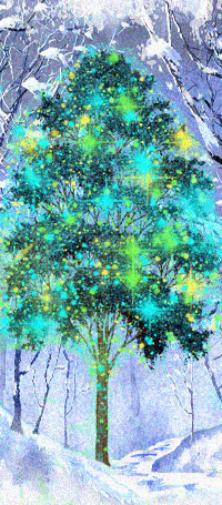
It's kind of winter/holiday themed. I know I'm early, but I just can't help myself.
Only 45 days til Christmas.

a reply to: Rainbowresidue
45 days!! That is such a long time...
I've been so busy with X-mas themed designs that it feels like it should be next week!!
I love your tree!! Very nicely done..
Peace
45 days!! That is such a long time...
I've been so busy with X-mas themed designs that it feels like it should be next week!!
I love your tree!! Very nicely done..
Peace
edit on 2014pAmerica/ChicagoSat, 08 Nov 2014 04:53:05 -0600am3053201411 by operation mindcrime because: (no reason given)
a reply to: operation mindcrime
Thanks Operation,
I enjoyed painting the tree.
And I like your futuristic looking signature.
Yeah, not that I'm counting or anything. I have an app that counts down til x-mas for me lol.
I'm also thinking of designs for the next competition.
Thanks Operation,
I enjoyed painting the tree.
And I like your futuristic looking signature.
Yeah, not that I'm counting or anything. I have an app that counts down til x-mas for me lol.
I'm also thinking of designs for the next competition.
a reply to: operation mindcrime
Yes that is the effect I'm talking about!
As far as that metal, noise and blur is added to the base background C0C0C0 color, then noise is added (14.6), then motion blur (I cannot remember off the top but I think it was around 30?) then after that a gradient overlay is used with three stops, the first stop being 000000 the second ffffff (at 50 location) and the third being 000000 again (that one is at 100 location), the blacks in this gradient are both at 50% opacity... Then you can duplicate your layer and play if you want, soft light is good, multiply is good for a darker metal, or play with hue and saturation to get a more bluish metal etc...
edit on 8-11-2014 by OpinionatedB because: (no reason given)
a reply to: OpinionatedB
Ummmmmmmmmmmmm could we all go back to English please
I'll start ... The quick brown fox jumped over BFFT
Cody
Ummmmmmmmmmmmm could we all go back to English please
I'll start ... The quick brown fox jumped over BFFT
Cody
a reply to: cody599
lol... and then BFFT purchased photoshop!
anyway... what you probably didn't understand is the colors... c0c0c0 is RGB 192,192,192 - when choosing color by RGB! 000000 is RGB 0, 0, 0. and ffffff is RGB 255, 255, 255. (both of those are pure black and pure white)
In Photoshop, instead of picking what color looks good to your eye... you can choose your color with the letter number combo (after the # sign) or you can choose the numbers of the RGB...
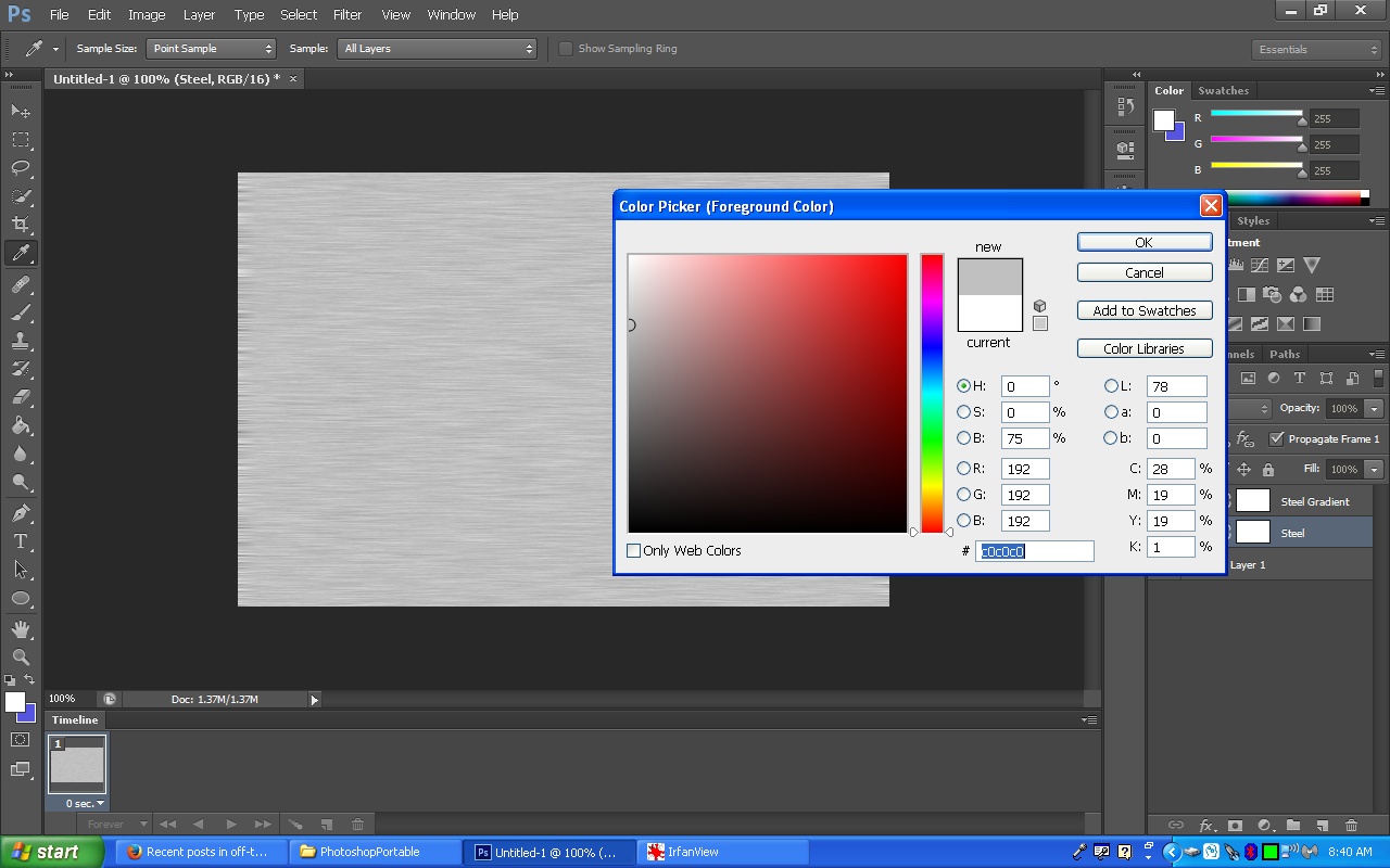
It's just another way to choose color - when using the color picker.
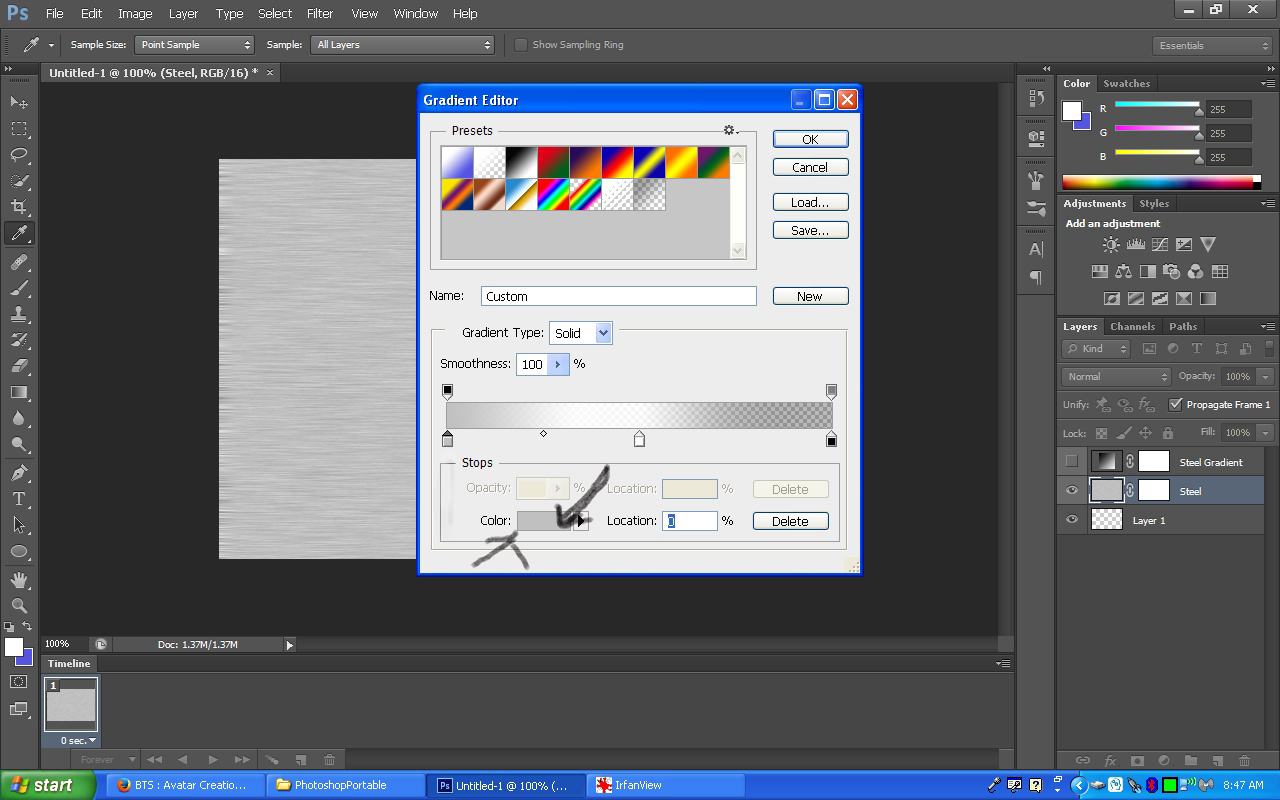
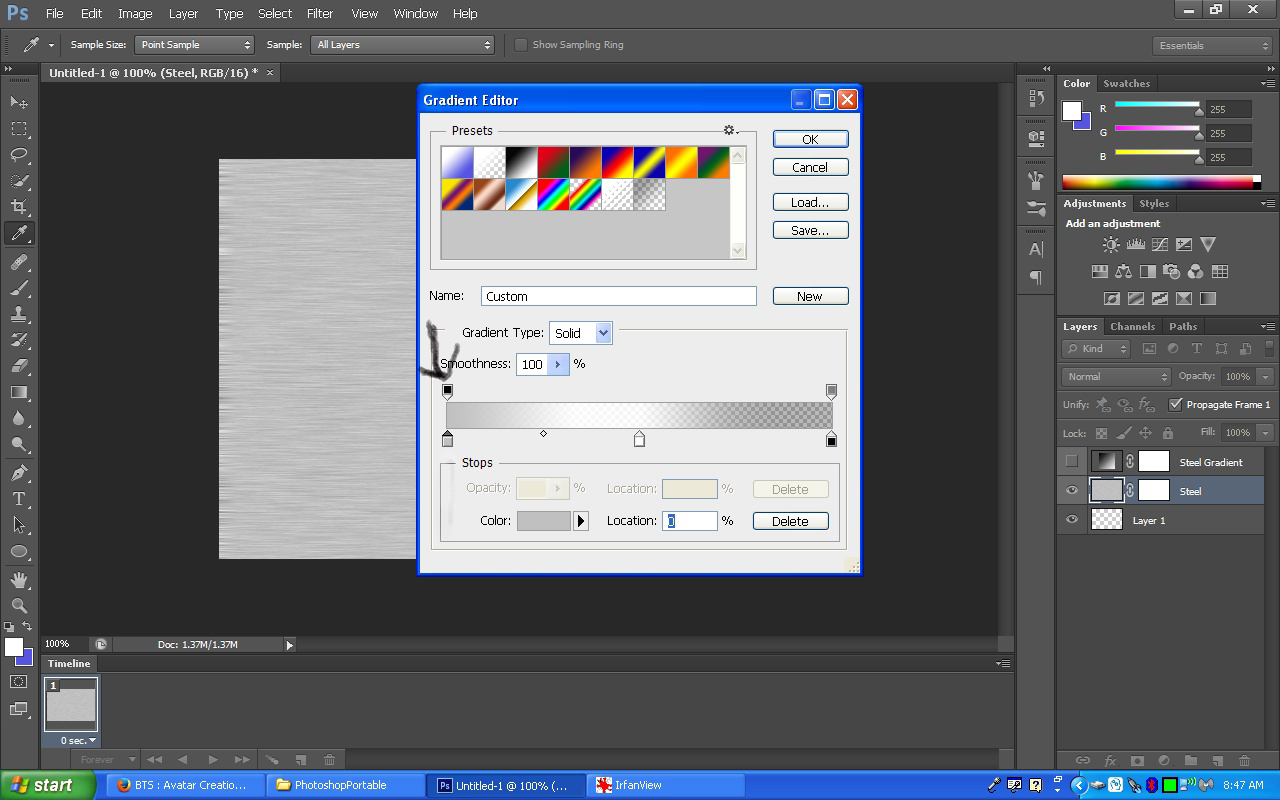
When you choose your gradient, you can choose your colors, how many stops you have, and set the location of them, as well as the opacity of the colors.
This one here, shows you the color "stop"

This here, shows you where the color is, and when you click that color, the color picker comes up and you can change the color:
And the "stop" on the top, here, allows you to change the opacity of the color in the stop underneath it:
Here is the tutorial: (which better explains all I said)
www.hongkiat.com...
lol... and then BFFT purchased photoshop!
anyway... what you probably didn't understand is the colors... c0c0c0 is RGB 192,192,192 - when choosing color by RGB! 000000 is RGB 0, 0, 0. and ffffff is RGB 255, 255, 255. (both of those are pure black and pure white)
In Photoshop, instead of picking what color looks good to your eye... you can choose your color with the letter number combo (after the # sign) or you can choose the numbers of the RGB...

It's just another way to choose color - when using the color picker.
When you choose your gradient, you can choose your colors, how many stops you have, and set the location of them, as well as the opacity of the colors.
This one here, shows you the color "stop"

This here, shows you where the color is, and when you click that color, the color picker comes up and you can change the color:

And the "stop" on the top, here, allows you to change the opacity of the color in the stop underneath it:

Here is the tutorial: (which better explains all I said)
www.hongkiat.com...
edit on 8-11-2014 by OpinionatedB because: (no reason given)
a reply to: operation mindcrime
okay! Ha! I'm starting to get somewhere!
The little engine is starting to say I can! hahahaha
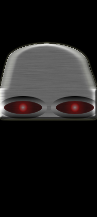
okay! Ha! I'm starting to get somewhere!
The little engine is starting to say I can! hahahaha

new topics
-
Claim: General Mark Milley Approved Heat and Sound Directed Energy Weapons During 2020 Riots
Whistle Blowers and Leaked Documents: 52 minutes ago
top topics
-
Claim: General Mark Milley Approved Heat and Sound Directed Energy Weapons During 2020 Riots
Whistle Blowers and Leaked Documents: 52 minutes ago, 0 flags
active topics
-
Claim: General Mark Milley Approved Heat and Sound Directed Energy Weapons During 2020 Riots
Whistle Blowers and Leaked Documents • 2 • : fringeofthefringe -
Post A Funny (T&C Friendly) Pic Part IV: The LOL awakens!
General Chit Chat • 7998 • : underpass61 -
The Truth about Migrant Crime in Britain.
Social Issues and Civil Unrest • 20 • : bastion -
Gravitic Propulsion--What IF the US and China Really Have it?
General Conspiracies • 20 • : Xtrozero -
Biden to award Presidential Citizens Medal to Liz Cheney and Bennie Thompson
US Political Madness • 20 • : xuenchen -
Judge rules president-elect Donald Trump must be sentenced in 'hush money' trial
US Political Madness • 39 • : xuenchen -
January 6th report shows disturbing trend (nobody is shocked)
US Political Madness • 60 • : fringeofthefringe -
RFK JR endorses Trump
2024 Elections • 47 • : fringeofthefringe -
OK this is sad but very strange stuff
Paranormal Studies • 9 • : charlyv -
Meta Llama local AI system is scary good
Science & Technology • 43 • : Arbitrageur
