It looks like you're using an Ad Blocker.
Please white-list or disable AboveTopSecret.com in your ad-blocking tool.
Thank you.
Some features of ATS will be disabled while you continue to use an ad-blocker.
share:
reply to post by Zarniwoop
I had to tinker a bit with the blink effect. It's how I learn how to do things.

I took the six frame animation, expanded it to 12, and changed eye color in between blinks. I didn't mess with the frame timing.
Needless to say, I had to figure out how to add colors into the color map, which I previously didn't know how to do, taking the colors present in the left eye to use in the right eye. I also had to edit pixels at 800% zoom. I enhanced the size of the right eye a wee bit, as I wanted the effect to stand out a bit more, making another row of pixels to add more color.
Overall, it needs more work, but the whole point was to figure out how to precisely overlay an animated avatar onto a background image.
Besides, I'm probably the only wolf avatar with multi-colored eyes that change color. Very unique.
I had to tinker a bit with the blink effect. It's how I learn how to do things.

I took the six frame animation, expanded it to 12, and changed eye color in between blinks. I didn't mess with the frame timing.
Needless to say, I had to figure out how to add colors into the color map, which I previously didn't know how to do, taking the colors present in the left eye to use in the right eye. I also had to edit pixels at 800% zoom. I enhanced the size of the right eye a wee bit, as I wanted the effect to stand out a bit more, making another row of pixels to add more color.
Overall, it needs more work, but the whole point was to figure out how to precisely overlay an animated avatar onto a background image.
Besides, I'm probably the only wolf avatar with multi-colored eyes that change color. Very unique.
reply to post by Druid42
Ha noice! Didn't even notice it blinked. I waited and stared at the wolf's eye for like five seconds until it blinked.
Good work!
-SAP-
Ha noice! Didn't even notice it blinked. I waited and stared at the wolf's eye for like five seconds until it blinked.
Good work!
-SAP-
reply to post by SloAnPainful
The effects added to background images, IMO, should be subtle, and not glaringly obvious. They shouldn't be *pow* I'm animated, but more along the lines of invoking a double-take from the viewer.
The animation is designed to catch the eye, but not detract from the overall image.
In that respect, the concept of animating a background image is more about personal preference, than anything else. I'd like to see others develop the technique, if for no other reason than to see the variety produced by the clever minds here.
Originally posted by Druid42
reply to post by Zarniwoop
I had to tinker a bit with the blink effect. It's how I learn how to do things.
I took the six frame animation, expanded it to 12, and changed eye color in between blinks. I didn't mess with the frame timing.
Needless to say, I had to figure out how to add colors into the color map, which I previously didn't know how to do, taking the colors present in the left eye to use in the right eye. I also had to edit pixels at 800% zoom. I enhanced the size of the right eye a wee bit, as I wanted the effect to stand out a bit more, making another row of pixels to add more color.
Overall, it needs more work, but the whole point was to figure out how to precisely overlay an animated avatar onto a background image.
Besides, I'm probably the only wolf avatar with multi-colored eyes that change color. Very unique.
Ok that really is cool Druid........ I like
One thing about animations that is needs to be in .GIF format. You lose clarity specially in gradients. GIF can only use a very limited color pallet.
The original was in PNG which is the best and most accurate rendering.
That said the blinking eye looks good.!
That said the blinking eye looks good.!
reply to post by CrypticSouthpaw
I wanted to give you an update on your saucer. As I stated in the U2U I had to start from scratch rather than use the one BFFT posted or it would wobble. I got the saucer spinning right and I got the fixed light source. I started to "bubble" the blue "lights" and the texture is the next step. So far it is well under the file size so I am okay there. I hope it is to your liking thus far.

I wanted to give you an update on your saucer. As I stated in the U2U I had to start from scratch rather than use the one BFFT posted or it would wobble. I got the saucer spinning right and I got the fixed light source. I started to "bubble" the blue "lights" and the texture is the next step. So far it is well under the file size so I am okay there. I hope it is to your liking thus far.

edit on 23-2-2013 by Agarta because: Spelling
reply to post by kinglizard
The color map was what I had trouble with, trying to get the other colors added in. The .gif had a rigid palette, with only 32 shades. I solved that in GIMP.
(All work done in GIMP, BTW.)
The final file size for the multicolored blink effect was a tiny 9kb. For an avatar "overlay", I can't really complain, and it's well within the avatar file size. .
reply to post by kinglizard
Thank you for the idea Kinglizard...I was able to do a divided wand with your idea, even though it doesn't come anywhere close to what you guys do in here, I just wanted to drop by and say thank you just the same.
The most beautiful avatars and signatures out there originate from this thread. Amazing work done here !!!!!
reply to post by SonoftheSun
That's just one more variation on an infinite number of themes. Nice.
However, matching kinglizard's skill is a tough cookie to bake. It's a goal I strive to achieve someday. Till then, I'll stand on the backs of the giants to see farther.
Like you say, the talent represented here is beyond belief. Amazing doesn't come close.
reply to post by Agarta
that is dope! thank you so much! it looks amazing. Looks lot like what i saw. Thank you very much means a lot to me seeing it come alive.
that is dope! thank you so much! it looks amazing. Looks lot like what i saw. Thank you very much means a lot to me seeing it come alive.
reply to post by CrypticSouthpaw
The wife and I are travelling, so i am not allowed to play in photoshop anymore until tomorrow when we get home. LOL....so i will have to get to it tomorrow. But rest assured....i will redo your background to make it worthy of Agarta's amazing effort.
The wife and I are travelling, so i am not allowed to play in photoshop anymore until tomorrow when we get home. LOL....so i will have to get to it tomorrow. But rest assured....i will redo your background to make it worthy of Agarta's amazing effort.
reply to post by DontTreadOnMe
Hey Tread look at my Avatar please and if you can tell me WTF is going on ? lol: I have no idea what happened.
Hey Tread look at my Avatar please and if you can tell me WTF is going on ? lol: I have no idea what happened.
edit on 24-2-2013 by randyvs because: (no reason given)
reply to post by randyvs
Looks like you've got the pic in the avatar space.
h ttp://files.abovetopsecret.com/files/img/pu4ffdf498.gif
Try putting the above code in the 'use as avatar' space and hit submit.
(Remove the space between the h and the t first.)
Then click on the original pic and hit 'use as background.'
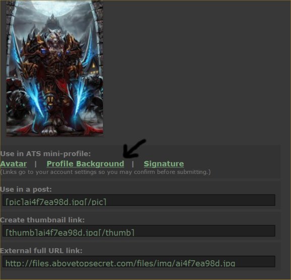
Then just click submit and it should give you the full background.
EDIT: Looks like you've got the background right, just re-submit the invisible gif and it should work ok.
Looks like you've got the pic in the avatar space.
h ttp://files.abovetopsecret.com/files/img/pu4ffdf498.gif
Try putting the above code in the 'use as avatar' space and hit submit.
(Remove the space between the h and the t first.)
Then click on the original pic and hit 'use as background.'

Then just click submit and it should give you the full background.
EDIT: Looks like you've got the background right, just re-submit the invisible gif and it should work ok.
edit on 24/2/2013 by 74Templar
because: (no reason given)
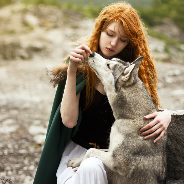
was going through another backup looking for some stuff I had done for Nenothu and came across this picture in case anyone wanted to use it, I have no
need for it

reply to post by CrypticSouthpaw
Here's a new background, re-sized to 170 wide:
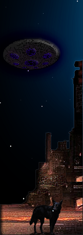
And Agarta's animated avatar, sized to 170 x 240, aligned with your background:

(@Agarta: Nice work!)
And a screen capture that shows how it looks, sans the animation:
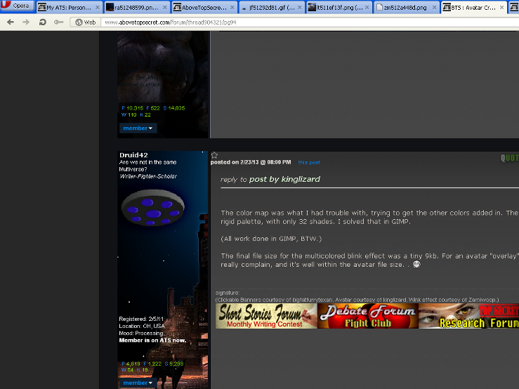
Note: The two do not line up when viewed from the profile. However, when you check a thread you've posted in, the alignment is fine.
Here's a new background, re-sized to 170 wide:

And Agarta's animated avatar, sized to 170 x 240, aligned with your background:

(@Agarta: Nice work!)
And a screen capture that shows how it looks, sans the animation:

Note: The two do not line up when viewed from the profile. However, when you check a thread you've posted in, the alignment is fine.
reply to post by vkey08
Thanks. Of course I grabbed it, anything wolfish. A bit feminine for me, so here it is re-sized to 180 x 480, and ready for use:
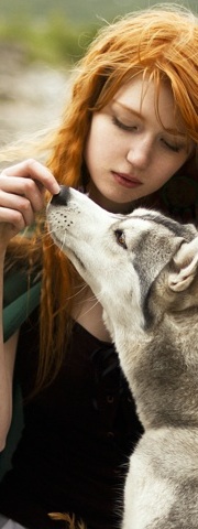
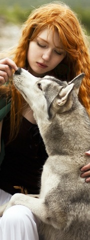
Thanks. Of course I grabbed it, anything wolfish. A bit feminine for me, so here it is re-sized to 180 x 480, and ready for use:


reply to post by Druid42
The blinking wolf eye with the color change looks awesome .. nice work!
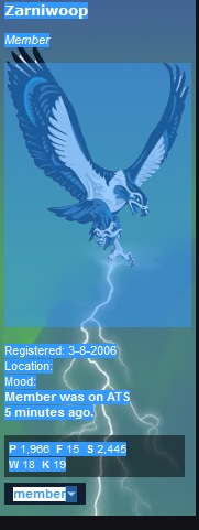
I thought I'd throw out a quick and easy tip for anyone wanting to visualize what part of your background is available for a a transparent gif "canvas"
Just highlight all your user information with your cursor and it will show the transparent gif area you have available to work with.
It will look something like this, with the large area being the workspace...

edit on 24-2-2013 by Zarniwoop because: (no reason given)
reply to post by CrypticSouthpaw
Here are two "finished" versions. They are both a touch over 25kb so there is some lee way for adjustments if you want to try something else. Both are 6 frames which is from one blue "dot" to the next. This makes it difficult to put more noticeable marks on the texture difficult as they skip back and forth. I could possibly go up to 18 frames to add the cracks and such but I am not sure it would be enough to repeat without the jump from the last frame to the first or if it would stay in the file size limit so this is where I left it. If you want me to add some more texture and the frames to make it a little more like BFFTs image I can try but there would be no guarantees, just let me know.
Here is the basic "stock of the assembly line" version.
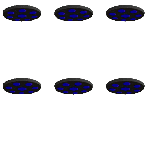
Here is the sports model

Druid did a very nice job on setting the original to the avatar size so any one you choose to use is fine.
Here are two "finished" versions. They are both a touch over 25kb so there is some lee way for adjustments if you want to try something else. Both are 6 frames which is from one blue "dot" to the next. This makes it difficult to put more noticeable marks on the texture difficult as they skip back and forth. I could possibly go up to 18 frames to add the cracks and such but I am not sure it would be enough to repeat without the jump from the last frame to the first or if it would stay in the file size limit so this is where I left it. If you want me to add some more texture and the frames to make it a little more like BFFTs image I can try but there would be no guarantees, just let me know.
Here is the basic "stock of the assembly line" version.

Here is the sports model

Druid did a very nice job on setting the original to the avatar size so any one you choose to use is fine.
new topics
-
Swedish Minister for Gender Equality is Seeking Treatment for Phobia of Bananas
Other Current Events: 3 hours ago -
Satanic ‘Little Season’ of Deception.. Awaken to the Handiwork of the Creator.
ATS Skunk Works: 4 hours ago -
USA-BIDEN and CHINA-Xi Agree Not To Let Artificial Intelligence Decide Nuclear Weapons Use.
World War Three: 4 hours ago -
The mysterious death of Aileen Conway
General Chit Chat: 7 hours ago -
Half-Life 2 is 20 Years Old - its Also Free on Steam until the 18th
Video Games: 11 hours ago
top topics
-
Does the Trump win mean No More Taylor Swift??
Politicians & People: 15 hours ago, 12 flags -
Trump-appointed judge blocks Biden administration overtime rule
Social Issues and Civil Unrest: 17 hours ago, 9 flags -
The mysterious death of Aileen Conway
General Chit Chat: 7 hours ago, 6 flags -
Satanic ‘Little Season’ of Deception.. Awaken to the Handiwork of the Creator.
ATS Skunk Works: 4 hours ago, 3 flags -
USA-BIDEN and CHINA-Xi Agree Not To Let Artificial Intelligence Decide Nuclear Weapons Use.
World War Three: 4 hours ago, 2 flags -
Half-Life 2 is 20 Years Old - its Also Free on Steam until the 18th
Video Games: 11 hours ago, 1 flags -
Swedish Minister for Gender Equality is Seeking Treatment for Phobia of Bananas
Other Current Events: 3 hours ago, 1 flags
active topics
-
The Trump effect 6 days after 2024 election
2024 Elections • 150 • : cherokeetroy -
President-elect TRUMP Picks MATT GAETZ for his ATTORNEY GENERAL - High Level PANIC Ensues.
2024 Elections • 91 • : Xtrozero -
Does the Trump win mean No More Taylor Swift??
Politicians & People • 49 • : JadedGhost -
TODAY IS A HUGE ELECTION DAY FOR AMERICA - November 5th 2024 - Reports from Around The Nation.
2024 Elections • 750 • : WeMustCare -
On Nov. 5th 2024 - AMERICANS Prevented the Complete Destruction of America from Within.
2024 Elections • 156 • : WeMustCare -
President-Elect DONALD TRUMP's 2nd-Term Administration Takes Shape.
Political Ideology • 213 • : WeMustCare -
Satanic ‘Little Season’ of Deception.. Awaken to the Handiwork of the Creator.
ATS Skunk Works • 4 • : NorthOS -
-@TH3WH17ERABB17- -Q- ---TIME TO SHOW THE WORLD--- -Part- --44--
Dissecting Disinformation • 3284 • : 777Vader -
Swedish Minister for Gender Equality is Seeking Treatment for Phobia of Bananas
Other Current Events • 2 • : WeMustCare -
USA-BIDEN and CHINA-Xi Agree Not To Let Artificial Intelligence Decide Nuclear Weapons Use.
World War Three • 5 • : nugget1
