It looks like you're using an Ad Blocker.
Please white-list or disable AboveTopSecret.com in your ad-blocking tool.
Thank you.
Some features of ATS will be disabled while you continue to use an ad-blocker.
share:
I know...I should have just said "Agarta" rather than "someone"
Maybe I'll go post the question on Druid's GIMP tutorial thread.
Maybe I'll go post the question on Druid's GIMP tutorial thread.
Originally posted by oddpenguin
Hello. ^_^
I am a new(ish) member and I found this thread today.
I would be very grateful if someone could make an avatar/background for me. Perhaps something mystical, purple-y, with a penguin. Hehe, I know, I am odd.
I am excited to see what people come up with. ^_^
Thank-you in advance.
oddpenguin
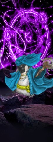
One mystical, purple penguin shaman.
reply to post by 74Templar
My, that was fast!
I love the colouring, it's quite what I was looking for. The only problem the the cute little penguin. Perhaps I am more blind than I thought, but I cannot seem to make out its face! It is a good thing I will be going to get a new pair of glasses in a few days. XD
Thank-you for your work; perhaps someday I can learn to help others in the same way. ^_^
oddpenguin
reply to post by sugarcookie1
I really like the monkey too I'll probably switch to him down the track, but at the moment I'm trying to be (taps nose) 'discreet...ish'.
Just try to keep the animation to a minimal degree, test the waters as it were....
I really like the monkey too I'll probably switch to him down the track, but at the moment I'm trying to be (taps nose) 'discreet...ish'.
Just try to keep the animation to a minimal degree, test the waters as it were....
reply to post by oddpenguin
I see 74Templar has you all fixed up but here's another in case you are interested for later on........
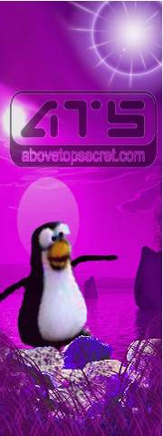
I see 74Templar has you all fixed up but here's another in case you are interested for later on........

Originally posted by Zarniwoop
reply to post by 74Templar
(It would be cool if someone could outline a method in GIMP to perfectly align a transparent 170X240 layer to a 180X480 background image. I don't know how to do that and am too lazy to figure it out.)
Hey, there used to be another thread named this that was closed! It had some really awesome stuff on it! Does that make this a copy-cat thread?
I was reading through it and found where they were talking about something similar on page 60. Here's the location of the conversation and examples: www.abovetopsecret.com...
reply to post by Zarniwoop
I addressed the issues you are having on said thread.
It would be an accomplishment, and unleash all sorts of possibilities.
Challenge, anyone? Without trial and error? Let's do this.
From the Uploader:
Backgrounds need to be reduced to 170 pixels to compensate for the Avatar width limits, then it's a simple matter of vertical placement. (Hardly simple, BTW, as this hasn't been solved yet.)
You're losing 30 pixels with the width adjustment, (15 pixels each side, really insignificant, actually) but that should help immensely with horizontal alignment, in fact, solving it, for those who want perfect alignment.
The vertical parameters are more troublesome. I have to look at the source code to see how they are placed.
I addressed the issues you are having on said thread.
It would be an accomplishment, and unleash all sorts of possibilities.
perfectly align a transparent 170X240 layer to a 180X480 background image.
Challenge, anyone? Without trial and error? Let's do this.
From the Uploader:
ATS Avatars should be no larger than 170 pixels wide by 240 pixels tall, with a maximum file size of 75kb. ATS Mini-Profile Backgrounds should be no larger than 200 pixels wide by 700 pixels tall, with a maximum file size of 150kb.
Backgrounds need to be reduced to 170 pixels to compensate for the Avatar width limits, then it's a simple matter of vertical placement. (Hardly simple, BTW, as this hasn't been solved yet.)
You're losing 30 pixels with the width adjustment, (15 pixels each side, really insignificant, actually) but that should help immensely with horizontal alignment, in fact, solving it, for those who want perfect alignment.
The vertical parameters are more troublesome. I have to look at the source code to see how they are placed.
edit on 2/21/13 by Druid42
because: clarification
reply to post by Druid42
Yeah, I'm having a tricky time getting an underlying layer of text on my background to sit and align with the font. Sometimes it seems to jiggle over by 1 pixel? Also, sometimes I try backgrounds at 180 x something higher than 480, but it gets cut off at 480... It's a tad confusing. I might try your wolf eye blink problem if I get a chance tonight!
Yeah, I'm having a tricky time getting an underlying layer of text on my background to sit and align with the font. Sometimes it seems to jiggle over by 1 pixel? Also, sometimes I try backgrounds at 180 x something higher than 480, but it gets cut off at 480... It's a tad confusing. I might try your wolf eye blink problem if I get a chance tonight!
edit on 21-2-2013 by Qumulys because: (no reason given)
reply to post by snarky412
I actually like yours better.
reply to post by oddpenguin
I've been trying to find a similar pic that is more detailed. The problem is finding a pic that re-sizes well, and doesn't lose heaps of details in the process. The original image was 3x the size it is now.
About the only other option is to draw something from scratch. Either way give me a bit of time and I will figure something out.
reply to post by 74Templar
Could you use the penguin in my design and modify it to suit your needs?
If so, do it...........
I've been trying to find a similar pic that is more detailed. The problem is finding a pic that re-sizes well, and doesn't lose heaps of details in the process. The original image was 3x the size it is now.
Could you use the penguin in my design and modify it to suit your needs?
If so, do it...........
edit on 21-2-2013 by snarky412 because: (no reason given)
Ok. I think I have it.
Here's the line in the code that defines image placement for background images:
Just a snippet. I'm not including the whole code, or definition, just the related factors to want we want to achieve.
After the background image is loaded, the avatar is placed on top.
Background images are placed in first, set to repeat if too small. They are aligned to the top left. Placing avatars on top of the background need to take this into account. Pixel counting starts at the top left of the background image, for alignment purposes.
Text is then added in, which makes the alignment a bit more tricky, but not impossible.
We need to determine the height of "mediumtxt", in pixels, from the top left downwards to see where the avatar winds up.
I'll use myself as an example:
The code shows the breaks and the start of a new line of "mediumtxt". What we find is that the coding plops in the background image, allows for three or four lines of text, and then adds the avatar picture, all aligned from the upper left. The mediumtxt standard is 16 pixels.
The break tabs should have no bearing on graphic placement, as they simply control text placement. Take the four lines of text at 16 pixels per line, in my example, multiply by four, and the vertical placement of an avatar should be 64 pixels from the upper left on a background pic.
It appears the adjustment is for either three or four lines of text. 48 pixels from upper left, or 64 from upper left.
Does anyone want to try out my theory? I'd be interested in seeing the results.
If it does work, I'd like for someone to make a blinking right eye on my wolf, as a transparent, or not, avatar. The transparency issue should be irrelevant once this is figured out. .
Here's the line in the code that defines image placement for background images:
repeat left top;">
Just a snippet. I'm not including the whole code, or definition, just the related factors to want we want to achieve.
After the background image is loaded, the avatar is placed on top.
Background images are placed in first, set to repeat if too small. They are aligned to the top left. Placing avatars on top of the background need to take this into account. Pixel counting starts at the top left of the background image, for alignment purposes.
Text is then added in, which makes the alignment a bit more tricky, but not impossible.
class='mediumtxt'
We need to determine the height of "mediumtxt", in pixels, from the top left downwards to see where the avatar winds up.
I'll use myself as an example:
class='mediumtxt' style='color: #FFFFFF; '>Druid42< br /> Are we not in the same Multiverse?Writer-Fighter-Scholar< br /> 'http://files.abovetopsecret.com/files/img/pu4ffdf498.gif'>
The code shows the breaks and the start of a new line of "mediumtxt". What we find is that the coding plops in the background image, allows for three or four lines of text, and then adds the avatar picture, all aligned from the upper left. The mediumtxt standard is 16 pixels.
The break tabs should have no bearing on graphic placement, as they simply control text placement. Take the four lines of text at 16 pixels per line, in my example, multiply by four, and the vertical placement of an avatar should be 64 pixels from the upper left on a background pic.
It appears the adjustment is for either three or four lines of text. 48 pixels from upper left, or 64 from upper left.
Does anyone want to try out my theory? I'd be interested in seeing the results.
If it does work, I'd like for someone to make a blinking right eye on my wolf, as a transparent, or not, avatar. The transparency issue should be irrelevant once this is figured out. .
edit on 2/22/13 by Druid42 because: added spaces to make code readable
edit on
2/22/13 by Druid42 because: changed a three to four
edit on 2/22/13 by Druid42 because: 63 to 64, edited.
To all of you who contributed in creating my new avatar...
Sorry for not responding any sooner but just woken up and still not had my coffee yet as was running like a little kid at christmas to switch on my comp to see what Santa might have left me.. I promise ive been good... honest!
My sincerest and deepest thanks to each and everyone of you for taking your precious time in creating my new avatar.
You can all count on me for guiding new and existing members to this thread
Mult stars and flags to all concerned
Many kindest regards and respects
Rodinus
Ps. Erm, might be a bit cheeky to ask but could someone make the pic a little smaller so that the magazine with the ATS logo can be seen or would this make the av too small?
edit on 22-2-2013 by Rodinus because: (no reason given)
reply to post by Druid42
Wow!
That hurts my head!
The problem is that they move about and shuffle depending on the lines. I'm not really that good with animations, but I might give it a go late tonight. Don't count on me though! I'm already a cheater cheater purple people eater with my background!
Wow!
That hurts my head!
The problem is that they move about and shuffle depending on the lines. I'm not really that good with animations, but I might give it a go late tonight. Don't count on me though! I'm already a cheater cheater purple people eater with my background!
reply to post by oddpenguin
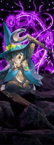
Second pass. I went for a smaller image this time, and drew in quite a few changes to match. The detail on this one is a lot easier to see, and works better imo.

Second pass. I went for a smaller image this time, and drew in quite a few changes to match. The detail on this one is a lot easier to see, and works better imo.
reply to post by Rodinus
At the moment we're working out kinks to allow the eyes to flash and still keep the full sized image. You see animated backgrounds aren't allowed, but avatars are. So what the guys are trying is to make a full sized background with just the flashing eyes. That probably doesn't make a huge amount of sense, but it's a kind of reach around techincality we can get away with.
In the meantime if you wanted to use just the static background, first copy this code into your avatar line, where you currently have the avatar posted;
h ttp://files.abovetopsecret.com/files/img/pu4ffdf498.gif
Just remember to remove the space between the h and the t before you hit submit.
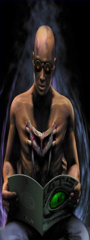
This is the original image without the animated eyes. Upload it, click on the pic and hit 'use as background.' then hit submit and it should give you the full image. Once the guys have figured out the animation on the eyes we can get them up and running.
At the moment we're working out kinks to allow the eyes to flash and still keep the full sized image. You see animated backgrounds aren't allowed, but avatars are. So what the guys are trying is to make a full sized background with just the flashing eyes. That probably doesn't make a huge amount of sense, but it's a kind of reach around techincality we can get away with.
In the meantime if you wanted to use just the static background, first copy this code into your avatar line, where you currently have the avatar posted;
h ttp://files.abovetopsecret.com/files/img/pu4ffdf498.gif
Just remember to remove the space between the h and the t before you hit submit.

This is the original image without the animated eyes. Upload it, click on the pic and hit 'use as background.' then hit submit and it should give you the full image. Once the guys have figured out the animation on the eyes we can get them up and running.
edit on 22/2/2013 by 74Templar
because: (no reason given)
reply to post by Qumulys
Three lines of text at 16 pixels is the standard for everyone, according to my theory. That puts avatar placement at 48 pixels down from upper left. I have 4 lines, (nonstandard, but the max of lines, and should need 64 pixels for the perfect overlay of an avatar.)
I'm waiting for someone to try it out.
Remember, the background image needs to be 170, to match the avatar, and then the alignment should be spot on.
Awaiting confirmation.
reply to post by 74Templar
Oh my goodness, that is epic! Thank-you so much, it's perfect!
*grabs new avatar, cuddling it while scampering away*
Thank-you!
oddpenguin
Oh my goodness, that is epic! Thank-you so much, it's perfect!
*grabs new avatar, cuddling it while scampering away*
Thank-you!
oddpenguin
reply to post by Druid42
Okay I think I have the vertical down for the very top row by your description, however is there a way to find the horizontal in or would it be center giving 5 px to each side? I am just looking for the x,y coordinates of the furthermost top left corner of the avatar. The rest is basic math.
Okay I think I have the vertical down for the very top row by your description, however is there a way to find the horizontal in or would it be center giving 5 px to each side? I am just looking for the x,y coordinates of the furthermost top left corner of the avatar. The rest is basic math.
edit on 22-2-2013 by Agarta because: (no reason given)
reply to post by 74Templar
Thanks for the good advice 74.
I will be patient and wait until the guys n gals have managed to get the eyes flashing as i am supposed to be working right now so pop on to ATS only every once in a while (Me needs 100% concentration to do all those technical thingummy jigs and the thing is i am a biologist... kind of says it all huh?
Kindest respects
Rodinus
new topics
-
Just spotted an unusual aircraft Melbourne Australia
Aliens and UFOs: 2 hours ago -
The truth lets admit it
Aliens and UFOs: 8 hours ago -
Mass Shooting Towson, Maryland - 7 shot, 1 possibly dead
Social Issues and Civil Unrest: 11 hours ago
top topics
-
Trump formally clinches Electoral College victory
2024 Elections: 15 hours ago, 17 flags -
Mass Shooting Towson, Maryland - 7 shot, 1 possibly dead
Social Issues and Civil Unrest: 11 hours ago, 5 flags -
The truth lets admit it
Aliens and UFOs: 8 hours ago, 4 flags -
Just spotted an unusual aircraft Melbourne Australia
Aliens and UFOs: 2 hours ago, 3 flags
active topics
-
Russias War Against Religion in Ukraine
World War Three • 30 • : Oldcarpy2 -
Why isn't Psychiatry involved?
Social Issues and Civil Unrest • 24 • : GENERAL EYES -
Is this really what is going on?
General Conspiracies • 51 • : Owlwatcher -
The truth lets admit it
Aliens and UFOs • 14 • : andy06shake -
Mass Shooting Towson, Maryland - 7 shot, 1 possibly dead
Social Issues and Civil Unrest • 10 • : TzarChasm -
Defending the need for adherence to Old Testament commandments under the new covenant of Christ
Conspiracies in Religions • 39 • : ADVISOR -
Could rampant land speculation have caused the Civil War?
History • 40 • : Solvedit -
Something better
Dissecting Disinformation • 45 • : AdultMaleHumanUK -
Elon Musk has Meeting with Nigel Farage at Mar-a-Lago
Regional Politics • 7 • : gortex -
Just spotted an unusual aircraft Melbourne Australia
Aliens and UFOs • 0 • : Cavemannick


