It looks like you're using an Ad Blocker.
Please white-list or disable AboveTopSecret.com in your ad-blocking tool.
Thank you.
Some features of ATS will be disabled while you continue to use an ad-blocker.
share:
reply to post by bigfatfurrytexan
Thank you! It's one of my personal fav's
Didn't rework it since the contest... that's the original. It finally got cold enough here to break it out for the season
I love that ski jump signature. Did you rework it since the contest?
Thank you! It's one of my personal fav's
Didn't rework it since the contest... that's the original. It finally got cold enough here to break it out for the season
bigfatfurrytexan
Druid42
reply to post by bigfatfurrytexan
The current logo in your sig line? Too fancy. BUT, with a color change? Perhaps.
scroll up a bit, you can see it in plain black.
Since the ATS scheme is flat (no 3d stuff), and your ATS radio one is that way, I was thinking that we match up the general style and not have 3d effects in it (other than possibly a slight drop shadow).
Okay, I see what you are saying. Hmm. I'd like to keep the ATS radio one true to form, just as a sig link, and then create two separate sig links with their own unique style. To keep the whole theme coherent? Well, that's a decision you'll have to make.
ETA: Perhaps it could be done without a matching theme? The avvy matching the OOtB, then the others down the visual spectrum. As long as it flows, and the backgrounds are transparent.
edit on 11/23/13 by Druid42 because: added ETA.
Druid42
bigfatfurrytexan
Druid42
reply to post by bigfatfurrytexan
The current logo in your sig line? Too fancy. BUT, with a color change? Perhaps.
scroll up a bit, you can see it in plain black.
Since the ATS scheme is flat (no 3d stuff), and your ATS radio one is that way, I was thinking that we match up the general style and not have 3d effects in it (other than possibly a slight drop shadow).
Okay, I see what you are saying. Hmm. I'd like to keep the ATS radio one true to form, just as a sig link, and then create two separate sig links with their own unique style. To keep the whole theme coherent? Well, that's a decision you'll have to make.
ETA: Perhaps it could be done without a matching theme? The avvy matching the OOtB, then the others down the visual spectrum. As long as it flows, and the backgrounds are transparent.
edit on 11/23/13 by Druid42 because: added ETA.
I love doing stuff for you. You absolutely are open in communication. It makes it way easier (and you have made me better at this because of it).
Okay, new idea:
Make the OOtB sig banner in the middle, with Short Stories on the left, and Avatar Creations on the right.
Working within a 525px space, it'd be 525/2=262, then 262/2=131. To size the 3 sig banners, it'd be 131 width/262 width/131 width, for left/middle/right.
Is that doable? That splits it down the middle, but I'm sure you could fudge 10-50pxs each way. It could be worked 156/212/156 and still remain balanced. An even split would be 175px per sig banner, but that's not feasible to keep the detail that's needed. I'd prefer the middle one to be the biggest/widest anyway.
reply to post by bigfatfurrytexan
I'm just challenging you because I know I suck at this, but you have the proven skills. I know what I'd like it to look like, but I spent 3 hours making that simple lil thing sittin' in my sig line.
This is going to become another collaborative effort, which we haven't had since the upgrade to 5/3, and it's about time we all pitch in and work together again.
Since we are stuck not being able to animate avvys anymore, there's no reason why we can't make sig lines twinkle a bit, aye?
reply to post by Zarniwoop
File size limit? Is there any? Trust me, we likely need one
Pair that with the less-than-full-screen PC browser window and I think we have a winner at 70X525.
File size limit? Is there any? Trust me, we likely need one
reply to post by DontTreadOnMe
50kb was the last known max file size (from the instructions in the 2010 version image uploader). I think we should stick with that one.
File size limit? Is there any? Trust me, we likely need one
50kb was the last known max file size (from the instructions in the 2010 version image uploader). I think we should stick with that one.
reply to post by Zarniwoop
That's good....if we don't have a file size, we run the risk of huge animations.....love all the collaboration going in here right now
And I can't wait to see Druid's finished banner
That's good....if we don't have a file size, we run the risk of huge animations.....love all the collaboration going in here right now
And I can't wait to see Druid's finished banner
Nothing to do with anything - just posting some bg panels I made.
Free for use as always.
Take it easy!

Free for use as always.
Take it easy!


edit on 11/23/13 by ottobot because: (no reason given)
reply to post by Druid42
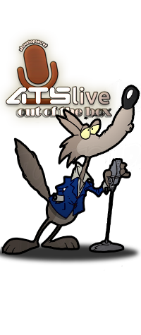
yeah. i think a rebuild of the OOTB logo is needed to get the right resolution at that size. Any idea what font the "live" in ATS Live is?
yeah. i think a rebuild of the OOTB logo is needed to get the right resolution at that size. Any idea what font the "live" in ATS Live is?
reply to post by bigfatfurrytexan
I was gonna look for that font, but hadn't gotten around to that....a google search should yield results.
I think JackKatMtn does the artwork design. He'd know.
@DTOM and Zarn, yep, we'll keep file sizes within limits. That's one thing I do know how to do.
I was gonna look for that font, but hadn't gotten around to that....a google search should yield results.
I think JackKatMtn does the artwork design. He'd know.
@DTOM and Zarn, yep, we'll keep file sizes within limits. That's one thing I do know how to do.
reply to post by Druid42
Oh, I know you will, no worries there, I'm looking from the perspective of adding something to the OP for everyone to see.
Oh, I know you will, no worries there, I'm looking from the perspective of adding something to the OP for everyone to see.
reply to post by bigfatfurrytexan
avatar creations
slight variation
avatar creations
slight variation
edit on 23-11-2013 by bigfatfurrytexan because: (no reason given)
short stories
edit on 23-11-2013 by bigfatfurrytexan because: (no reason given)
reply to post by cody599
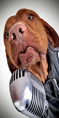
I think it will.....while I want a wolf behind the mic, and not a hound dog, that perspective is awesome, and with a little image flip and line tracing I'll bet we can swap the hound for a wolf.
Thanks cody!
ETA: Think it will be easier to trim the mic or the head???
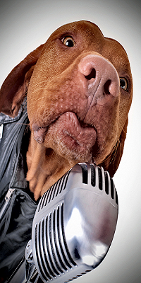
I think it will.....while I want a wolf behind the mic, and not a hound dog, that perspective is awesome, and with a little image flip and line tracing I'll bet we can swap the hound for a wolf.
Thanks cody!
ETA: Think it will be easier to trim the mic or the head???

edit on 11/24/13 by Druid42 because: added ETA.
reply to post by bigfatfurrytexan
Very nice bfft! Thanks!
Can I get a redo on the Short Stories and the Avatars Creations? They are just too pixelated compared to the rest.
Very nice bfft! Thanks!
Can I get a redo on the Short Stories and the Avatars Creations? They are just too pixelated compared to the rest.
edit on 11/24/13 by Druid42 because: sp err
new topics
-
Of course it was DEI
Dissecting Disinformation: 1 hours ago -
2nd Day Thanksgiving!...(leftovers!!)
General Chit Chat: 3 hours ago
top topics
-
New Disney Star Wars Films Failing Test of Time?
Movies: 15 hours ago, 5 flags -
2nd Day Thanksgiving!...(leftovers!!)
General Chit Chat: 3 hours ago, 3 flags -
Of course it was DEI
Dissecting Disinformation: 1 hours ago, 3 flags
active topics
-
Of course it was DEI
Dissecting Disinformation • 7 • : fringeofthefringe -
2nd Day Thanksgiving!...(leftovers!!)
General Chit Chat • 6 • : DontTreadOnMe -
Mass UAP events. DC. Machester Airport, UFOs over sub base in CT, Nuke bases.
Aliens and UFOs • 25 • : rickymouse -
New Disney Star Wars Films Failing Test of Time?
Movies • 18 • : Popoll -
Unidentified Flying Objects Over U.S. Military Bases in Northeast UK, as of roughly 11 a.m. CST.
Aliens and UFOs • 32 • : Kangawoo2 -
The Party of Peace - Trump Cabinet Picks Targeted with Death Threats
US Political Madness • 51 • : RazorV66 -
-@TH3WH17ERABB17- -Q- ---TIME TO SHOW THE WORLD--- -Part- --44--
Dissecting Disinformation • 3416 • : duncanagain -
Results of the use of the Oreshnik missile system in Dnepropetrovsk
World War Three • 263 • : DontTreadOnMe -
Anyone like the Scorpions?
Music • 23 • : Flyingclaydisk -
The Cost of True Discipleship—Count the Cost
Religion, Faith, And Theology • 5 • : alwaysbeenhere2


