It looks like you're using an Ad Blocker.
Please white-list or disable AboveTopSecret.com in your ad-blocking tool.
Thank you.
Some features of ATS will be disabled while you continue to use an ad-blocker.
share:
originally posted by: redtic
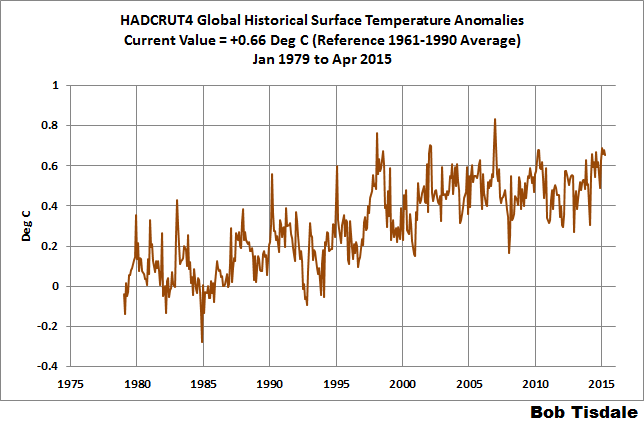
OK, first off - do you understand what that graph is showing? It's showing temperature anomaly - ie departure from normal. Meaning it takes a reference year range for an average temperature, and plots how much the current year varies from that. Since it has a reference range that is relatively recent (ie it includes much of the recent severe warming), some of it shows "cooling". But, that's ok. Second. do you understand what the fact that most of the data points on that graph are above 0 means? That means that the vast majority of temperatures since 2005 are above the reference mean - meaning it was hot. The fact that any given year within that range is less than another is meaningless. Third, and most importantly, is the range we're looking at. Let's look at another graph:
Its reference range is 1961 to 1990, and its plotted range is 30 years, instead of 13 like in your graph. Notice the upward trend - and again, these are anomalies, or departures from normal, not absolute temperatures.
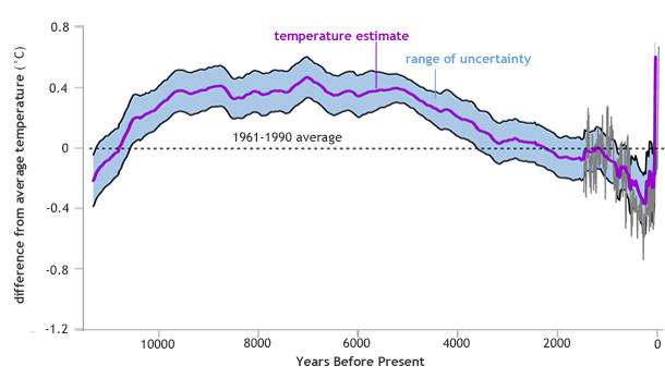
Finally, let's look at another graph:
This again shows the temperature anomaly, again with a reference range of 1961 to 1990, but with a whopping 11,300 year span. Notice the slight (that's sarcasm) upward trend at the end. That's the current situation. What we can glean from that is that it's getting pretty f*&king hot pretty f*&king fast. Here's a blurb from the associated article for that graph:
Natural variability can explain much of the temperature variation since the end of the last ice age, resulting from factors such as changes in the tilt of the Earth's axis. Over the past century, though, global average temperatures have "risen from near the coldest to the warmest levels" in the past 11,300 years, the 2013 study authors explain. Over this same period, emissions of heat-trapping gases from human activities have increased.
www.climate.gov...
So, yeah, whoopy - you take a graph from the last 13 years and plot 2 Xes on it and, wow, the more recent is lower than the other. Big f-ing deal. The fact is that the earth is warming more in a shorter time period than it ever has, and it's mainly because of man-produced greenhouse gases. Deal with it.
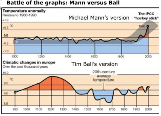
The main author, Micheal Mann, has been discredited. He used a rigged statistical analysis to produce the hockey stick. When fed random data sets, the computer program spits out hockey sticks like clockwork.
www.technologyreview.com...
Now comes the real shocker. This improper normalization procedure tends to emphasize any data that do have the hockey stick shape, and to suppress all data that do not. To demonstrate this effect, McIntyre and McKitrick created some meaningless test data that had, on average, no trends. This method of generating random data is called Monte Carlo analysis, after the famous casino, and it is widely used in statistical analysis to test procedures. When McIntyre and McKitrick fed these random data into the Mann procedure, out popped a hockey stick shape!
Hopefully you can sleep easy, now that the World is not about to imminently catch fire.
a reply to: AutonomousMeatPuppet
No he hasn't. Exactly the opposite.
That is, simply put, male bovine feces.
That false propaganda article is from 2004 - it is 13 years old for crying out loud - and is completely false in its premise and its conclusions. But the kicker is: the author of that article Richard Muller has repudiated it.
The Conversion of a Climate-Change Skeptic
Mann's methodology and conclusions have been investigated somewhere around a dozen times by independent committees since that article and have been vindicated on all supposed 'counts'. There have been minor disagreements around some statistical analysis techniques, but nothing that would affect the results in any material way.
Mann is still the Man - despite all the attempts at character assassination.
The main author, Micheal Mann, has been discredited. He used a rigged statistical analysis to produce the hockey stick.
No he hasn't. Exactly the opposite.
When fed random data sets, the computer program spits out hockey sticks like clockwork.
That is, simply put, male bovine feces.
www.technologyreview.com...
That false propaganda article is from 2004 - it is 13 years old for crying out loud - and is completely false in its premise and its conclusions. But the kicker is: the author of that article Richard Muller has repudiated it.
The Conversion of a Climate-Change Skeptic
CALL me a converted skeptic. Three years ago I identified problems in previous climate studies that, in my mind, threw doubt on the very existence of global warming. Last year, following an intensive research effort involving a dozen scientists, I concluded that global warming was real and that the prior estimates of the rate of warming were correct. I’m now going a step further: Humans are almost entirely the cause.
Mann's methodology and conclusions have been investigated somewhere around a dozen times by independent committees since that article and have been vindicated on all supposed 'counts'. There have been minor disagreements around some statistical analysis techniques, but nothing that would affect the results in any material way.
Mann is still the Man - despite all the attempts at character assassination.
edit on 13/8/2017 by rnaa because: (no reason given)
edit on 13/8/2017 by rnaa because: (no reason given)
a reply to: rnaa
Micheal Mann sues people to stop them from discrediting his work. His case against Tim Ball is now wrapping up after six years. Micheal Mann refused to provide evidence to back up his graph this whole time.
Why would he do that? Why would he hide his work, even from the court?
Tim Ball uses historical records and openly shows his work and methods.
Mann's graph doesn't even look plausible.

a reply to: AutonomousMeatPuppet
That's all you got? Attack the man, not the ball? Over and over again no matter how often you get penalized for it?
Sad.
That's all you got? Attack the man, not the ball? Over and over again no matter how often you get penalized for it?
Sad.
a reply to: AutonomousMeatPuppet
It's .6 degrees C.
Seems like this could be a natural cycle and we are going to go slightly up in temp and slightly down.
It's .6 degrees C.
Seems like this could be a natural cycle and we are going to go slightly up in temp and slightly down.
a reply to: seasonal
It doesn't really seem like you have a grasp of even highschool science. I don't know why anyone should take your word for it.
Do you have a physics backround? Biology? Geology? Chemistry?
How are you able to analyze extremely complex science?
Let me guess common sense.
It doesn't really seem like you have a grasp of even highschool science. I don't know why anyone should take your word for it.
Do you have a physics backround? Biology? Geology? Chemistry?
How are you able to analyze extremely complex science?
Let me guess common sense.
The OP's link climatedepot is a notoriously anti AGW site. It is a site full of false claims, cherry picked data points, and opinions pieces of fossil
fuel shills that they try to pass off as valid science.
I am suspicious of the OP's intentions. Recently I posted a thread with a long article linked that would take a fast reader at least 15 minutes to read thoroughly, however Seasonal replied within 5 minutes to denounce my article and mention Al Gore and tax scams.
What is sad is the OP will get more stars and flags for posting false information from shady sources, than someone who posts legitimate information from reputable sources.
I may get flagged and flamed for this, but it seems there may be astroturfing at play here.
As for climatedepot, look up Marc Morano(the site's founder) and the Committee for a Constructive Tomorrow( the sites bankroller that happens to be an Exxon funded think tank) for a better understanding of the sites intentions.
edit on 13-8-2017 by jrod because: Fix
a reply to: seasonal
Yet you routinely post false information you claim is scientific fact.
When someine brings up the valid science, you fall back to screaming tax scams, Al Gore, and claim the data is manipulated.
Not attacking you, just the junk you routinely post.
Yet you routinely post false information you claim is scientific fact.
When someine brings up the valid science, you fall back to screaming tax scams, Al Gore, and claim the data is manipulated.
Not attacking you, just the junk you routinely post.
originally posted by: seasonal
a reply to: AutonomousMeatPuppet
It's .6 degrees C.
Seems like this could be a natural cycle and we are going to go slightly up in temp and slightly down.
word is natural cycles displace temperature around, they say the oceans are absorbing the equivalent of multiple atomic bombs of energy each and every single second, and heating up all across, impeding a lot of the potential warm up from showing due to the high specific heat of water(water can absorb lots of heat before changing one degree).
a reply to: randomtangentsrme
Precisely. The truth being: The climate is changing. Though not simply warming as the carbon taxers would have you believe. The climate has always been changing and it always will regardless of our influence.
However, fear is very profitable...
Precisely. The truth being: The climate is changing. Though not simply warming as the carbon taxers would have you believe. The climate has always been changing and it always will regardless of our influence.
However, fear is very profitable...
originally posted by: ItsNotIronic
a reply to: rnaa
If you say Ball is incorrect, then we could look for a third option. I wouldn't accept Mann's work though.
Wow.
I didn't even mean that to be funny in that way. I missed the word correlations completely.
I'm quite the wordsmith aren't I?
edit on 13/8/2017 by rnaa because: (no reason given)
originally posted by: Xenogears
originally posted by: seasonal
a reply to: AutonomousMeatPuppet
It's .6 degrees C.
Seems like this could be a natural cycle and we are going to go slightly up in temp and slightly down.
word is natural cycles displace temperature around, they say the oceans are absorbing the equivalent of multiple atomic bombs of energy each and every single second, and heating up all across, impeding a lot of the potential warm up from showing due to the high specific heat of water(water can absorb lots of heat before changing one degree).
Who are "they" to which you refer? Do you have any source material and references to back up anything you say? Or is it all just supposition and opinion on your part? Without references or actual data points, then your opinion means nothing IMO.
Please, provide the sources for your repeated statements in this thread.
Keep in mind that humans vaporize trillions of tons of water into the atmosphere every year. Based on a 10 day water cycle, that is equivalent to at
least 10 times human CO2 contribution.
Also, water has double the specific heat coefficient as CO2, so go ahead and attribute 1/20 AGW to CO2.
It's possible that we should be 10 degrees cooler right now, heading back into an ice age. It's impossible to say how much we deviate from an unknowable baseline.
But the good thing about water vapor is that if we stop irrigating for 2 weeks, we will be back to pre industrial levels.
Who would want to shift focus from water vapor? Probably Monsanto.
I really don't oppose the idea of a fund going toward climate engineering. But I won't support a system based on lies and managed by Wall Street. They are professional grifters, and if you knew half their tricks, you would never trust them with your money.
new topics
-
My personal experiences and understanding of orbs
Aliens and UFOs: 1 hours ago -
Matt Gaetz ready to go global thermonuclear
US Political Madness: 2 hours ago -
Research paper about plasmoids specifically calls out missing MH370 flight
General Conspiracies: 2 hours ago -
NJ Drones just another Psy-Op
Dissecting Disinformation: 4 hours ago -
Smartest Man in the World Tells His Theory About What Happens At Death
Philosophy and Metaphysics: 6 hours ago -
Covid....... Again.
Diseases and Pandemics: 8 hours ago -
US Federal Funding set to Expire December 20th. Massive CR on the way.
Mainstream News: 9 hours ago -
and14263 New Account Not the Same Old Me
Introductions: 10 hours ago
top topics
-
Covid....... Again.
Diseases and Pandemics: 8 hours ago, 11 flags -
Matt Gaetz ready to go global thermonuclear
US Political Madness: 2 hours ago, 10 flags -
Smartest Man in the World Tells His Theory About What Happens At Death
Philosophy and Metaphysics: 6 hours ago, 9 flags -
US Federal Funding set to Expire December 20th. Massive CR on the way.
Mainstream News: 9 hours ago, 8 flags -
Just spotted an unusual aircraft Melbourne Australia
Aliens and UFOs: 17 hours ago, 6 flags -
NJ Drones just another Psy-Op
Dissecting Disinformation: 4 hours ago, 4 flags -
My personal experiences and understanding of orbs
Aliens and UFOs: 1 hours ago, 3 flags -
and14263 New Account Not the Same Old Me
Introductions: 10 hours ago, 2 flags -
Research paper about plasmoids specifically calls out missing MH370 flight
General Conspiracies: 2 hours ago, 2 flags
active topics
-
Smartest Man in the World Tells His Theory About What Happens At Death
Philosophy and Metaphysics • 18 • : EmmanuelGoldstein -
Matt Gaetz ready to go global thermonuclear
US Political Madness • 6 • : CriticalStinker -
Covid....... Again.
Diseases and Pandemics • 24 • : bscotti -
Remember These Attacks When President Trump 2.0 Retribution-Justice Commences.
2024 Elections • 117 • : Connector -
Covid Jab and the Alien Invasion
ATS Skunk Works • 20 • : FableGhost2 -
My personal experiences and understanding of orbs
Aliens and UFOs • 4 • : Compendium -
Defending the need for adherence to Old Testament commandments under the new covenant of Christ
Conspiracies in Religions • 51 • : whereislogic -
School shooting in Madison Wi.
Social Issues and Civil Unrest • 74 • : IndieA -
US Federal Funding set to Expire December 20th. Massive CR on the way.
Mainstream News • 16 • : marg6043 -
The Mystery Drones and Government Lies --- Master Thread
Political Conspiracies • 130 • : nugget1


