It looks like you're using an Ad Blocker.
Please white-list or disable AboveTopSecret.com in your ad-blocking tool.
Thank you.
Some features of ATS will be disabled while you continue to use an ad-blocker.
share:
F-E Region: Tonga Islands
Time: 2015-04-07 00:46:18.8 UTC
Magnitude: 6.2
Epicenter: 173.37°W 15.31°S
Depth: 10 km
Status: A - automatic
closer to Samoa physically though
Time: 2015-04-07 00:46:18.8 UTC
Magnitude: 6.2
Epicenter: 173.37°W 15.31°S
Depth: 10 km
Status: A - automatic
closer to Samoa physically though
ID: 2015p258452 Network: geonet
Status: confirmed
Date/Time NZDT: 07/04/2015 04:03:27
Date/Time UTC: 06/04/2015 15:03:27
Latitude, Longitude: -43.6183, 172.6037
Magnitude: 3.78M
Depth: 12.91 km
Energy Released: 6.9424 tonnes of TNT
Location: Mid Canterbury
www.geonet.org.nz...
1253 felt reports
Status: confirmed
Date/Time NZDT: 07/04/2015 04:03:27
Date/Time UTC: 06/04/2015 15:03:27
Latitude, Longitude: -43.6183, 172.6037
Magnitude: 3.78M
Depth: 12.91 km
Energy Released: 6.9424 tonnes of TNT
Location: Mid Canterbury
www.geonet.org.nz...
1253 felt reports
edit on 04u959515 by muzzy because: (no reason given)
a reply to: muzzy
regarding that Tonga/Samoa quake
GFZ finally came up with 6.4Mw. geofon.gfz-potsdam.de...
but why is UselesSGS still showing mb?
earthquake.usgs.gov...
shows 5.8mb
Mw is available on their site however
earthquake.usgs.gov...
6.3, 6.4, 6.2 depending on what Mw suffix you want to use, w, b or c
guess it makes things look less disturbing,
2 M6's in 6 days should be of concern, especially as this spot has had a couple of M8's recently
M8.0
Date: April 07, 1995 22:06:56 UTC
Depth: 21.20 km (13.17 mi)
M8.0
Date: May 03, 2006 15:26:40 UTC
Depth: 55.00 km (34.18 mi)
M8.1
Date: September 29, 2009 17:48:10 UTC (major Tsunami)
Depth: 18.00 km (11.18 mi)
FWIW GeoAus are hanging with Mwp (another suffix) at 6.53!!
www.ga.gov.au...
and the Russians at 6.0Ms and 6.2mb
www.ceme.gsras.ru.../21&n=20151182®ion=Tonga%20Islands
edit on 04u969615 by muzzy because: (no reason given)
a reply to: muzzy
the Aussies have finalized thier account for the Tonga /Samoa quake
Latitude: -15.260 (+/- 7.2364km) Longitude: -173.312 (+/- 5.1675km)
Depth: 0 km (+/- 0km)
Mwp: 6.5 (Preferred)
Mb: 6.04
Ms: 6.3
Md: Not available
ML: Not available
www.ga.gov.au...
China?
2015-04-07 08:46:15.3, -15.30 , -173.30, 10, Ms6.1, 天然地震, 汤加
now you have all the facts to come to an educated conclusion
Been struggling to find a suitable replacement for Google Classic Maps which would show the KMZ?KML files for the M7+ project.
I think I have it for World size map, ikimaps to create it and Bing to show it.
I quite like the 3D effect of the Bing map at that zoom out level, its clean and simple, without too much junk (labels).
Seems to work just as well as Google Classic Maps did.
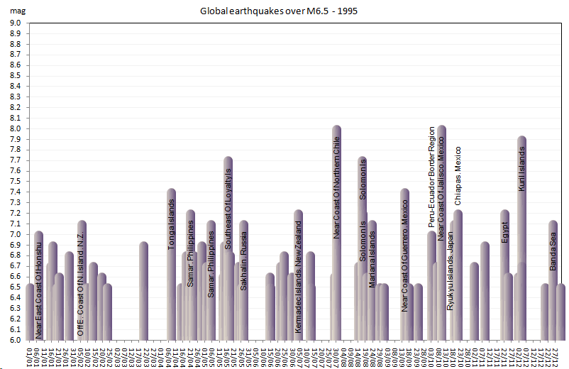
If I'm going to have to redo 104 years worth of mapping I thought I might as well include magnitude down to 6.5, which I mentioned I was thinking about last year.
It eliminates any controversy about the 6.9-7.0 bridge and also takes in a few quite seriously damaging 6's.
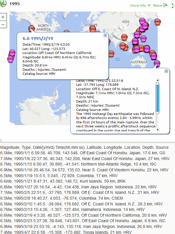
I have done 1995 as a test,
and another new filter is that I have all but eliminated the "unknown" magnitude, especially where it was the only magnitude type in the data. At this stage I'm processing the Centennial Data, I think anything that was M6.5 up would be in there. After 2000 though I'll have to wing it.
here is a screenshot of what the new layout looks like.
significantearthquakes.blogspot.co.nz...
I think I have it for World size map, ikimaps to create it and Bing to show it.
I quite like the 3D effect of the Bing map at that zoom out level, its clean and simple, without too much junk (labels).
Seems to work just as well as Google Classic Maps did.
If I'm going to have to redo 104 years worth of mapping I thought I might as well include magnitude down to 6.5, which I mentioned I was thinking about last year.
It eliminates any controversy about the 6.9-7.0 bridge and also takes in a few quite seriously damaging 6's.
I have done 1995 as a test,
and another new filter is that I have all but eliminated the "unknown" magnitude, especially where it was the only magnitude type in the data. At this stage I'm processing the Centennial Data, I think anything that was M6.5 up would be in there. After 2000 though I'll have to wing it.
here is a screenshot of what the new layout looks like.

significantearthquakes.blogspot.co.nz...
M3.6 - 3km SSE of Somers, Montana
Time
2015-04-11 06:45:54 (UTC)
2015-04-10 23:45:54 (UTC-07:00) in your timezone
Times in other timezones
Nearby Cities
3km (2mi) SSE of Somers, Montana
18km (11mi) SSE of Kalispell, Montana
132km (82mi) N of Missoula, Montana
196km (122mi) E of Hayden, Idaho
230km (143mi) NW of Helena, Montana
earthquake.usgs.gov...
M4.2 - 203km W of Bandon, Oregon
Time
2015-04-11 05:44:50 (UTC)
2015-04-10 22:44:50 (UTC-07:00) in your timezone
Times in other timezones
Nearby Cities
203km (126mi) W of Bandon, Oregon
215km (134mi) W of Coos Bay, Oregon
287km (178mi) W of Roseburg, Oregon
309km (192mi) WNW of Grants Pass, Oregon
349km (217mi) WSW of Salem, Oregon
earthquake.usgs.gov...
M4.7 - 160km W of Ferndale, California
Time
2015-04-10 18:59:38 (UTC)
2015-04-10 11:59:38 (UTC-07:00) in your timezone
Times in other timezones
Nearby Cities
160km (99mi) W of Ferndale, California
170km (106mi) W of Fortuna, California
173km (107mi) WSW of Eureka, California
182km (113mi) WSW of Arcata, California
448km (278mi) WNW of Sacramento, California
earthquake.usgs.gov...
Japan fears big earthquake after beaching 150 Dolphins...
simulair happend by the big tsunami one in 2011
and at churchville a coupple of day's before the quake...
Dutch MSM now
www.nu.nl...
simulair happend by the big tsunami one in 2011
and at churchville a coupple of day's before the quake...
Dutch MSM now
www.nu.nl...
a reply to: ressiv
Balderdash!
What about the thousands of Dolphins and Whales that stranded and there was no big earthquake, over the years.
There were no strandings before the Cook Strait quakes of 2013, or Eketahuna 2014, or the Dusky Sound 2009, none at all.
Group strandings are seasonal.
People forget things that don't fit the sensationalist agenda, ie sell newspapers (and web news)
EnglishTranslation here
It is more likely they died from living in a contaminated sea.
While I had the Translater open, I converted Balderdash to Dutch = onzin and translated back to English = no sense
also known as BS.
Balderdash!
What about the thousands of Dolphins and Whales that stranded and there was no big earthquake, over the years.
There were no strandings before the Cook Strait quakes of 2013, or Eketahuna 2014, or the Dusky Sound 2009, none at all.
Group strandings are seasonal.
People forget things that don't fit the sensationalist agenda, ie sell newspapers (and web news)
EnglishTranslation here
It is more likely they died from living in a contaminated sea.
edit on 0400000010010015 by muzzy because: (no reason given)
While I had the Translater open, I converted Balderdash to Dutch = onzin and translated back to English = no sense
also known as BS.
edit on 0400000010010015 by muzzy because: (no reason given)
originally posted by: muzzy
a reply to: muzzy
dl.dropboxusercontent.com...
I changed the bars to Green, easier to see the text
more here
its a slow process doing the new maps, I'm only getting through one year per day, takes some time to add all the text about the quake in each icon/event.
Just had a very large sharp jolt in Los Angeles Just now at 9:20 pm
Yeah I heard on the radio in the UK about a tremor /mini earthquake in LA, according to the LA times it was a 3.5, hopefully this isn't a little one
before a big one
www.latimes.com...
www.latimes.com...
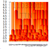
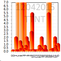
Last 7 days Radiated Energy Released TTNT graphs for Japan.
The cropped bars represent magnitudes over 3.7, therefore the more bars that reach the top the more TTNT was released. Graph shows up to 13/04/2015 18:00:34 UTC, the last 2 graphs are either reviewed and automatic mix, so will change in the next few days. 12th was the busy day with M3.9, 3.9, 4.3, 4.3, 4.3, 5.6 quakes
rightclickviewimageforfullsize (1400pixels wide)

I have just started this on japanearthquakes, graph thumbnail and (Bing) map popup when you click it, on Preview Style.
For comparison here is the graph the day of the M9 on 10/3/2011UTC
The cropped bars represent magnitudes over 3.7, therefore the more bars that reach the top the more TTNT was released. Graph shows up to 13/04/2015 18:00:34 UTC, the last 2 graphs are either reviewed and automatic mix, so will change in the next few days. 12th was the busy day with M3.9, 3.9, 4.3, 4.3, 4.3, 5.6 quakes
rightclickviewimageforfullsize (1400pixels wide)

I have just started this on japanearthquakes, graph thumbnail and (Bing) map popup when you click it, on Preview Style.
For comparison here is the graph the day of the M9 on 10/3/2011UTC

further to: muzzy
a little gif animation to show how the JMA/NIED review changes things
animation shows the preliminary versus reviewed, the preliminary one is the one with the lighter orange bar at 19:25.
the graphs show the bigger quakes in a lighter hue of orange, so bigger the quake the lighter the hue . And a couple of others were added or upgraded or downgraded in sizeThat 5.6 at 19:25 downgraded to 5.2 so being smaller the bar is darker, and the new one added on the graph in front of the 5.2 was a 3.7 Southwestern Ryukyu Isl
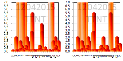
I have noticed that generally the review reduces the magnitude reading compared to the automatic reading, note also the 3.6 and 15:07 and 3.5 at 15:15 also went down, to 2.9 and 3.4 repectively.
for clarity here are the 2 images together, preliminary on the top, reviewed below

the first half of the preliminary graph had reviewed data to 18:00hrs, that is why no change there.
therefore caution should be taken when looking at preliminary (automatic) data
a little gif animation to show how the JMA/NIED review changes things
animation shows the preliminary versus reviewed, the preliminary one is the one with the lighter orange bar at 19:25.
the graphs show the bigger quakes in a lighter hue of orange, so bigger the quake the lighter the hue . And a couple of others were added or upgraded or downgraded in sizeThat 5.6 at 19:25 downgraded to 5.2 so being smaller the bar is darker, and the new one added on the graph in front of the 5.2 was a 3.7 Southwestern Ryukyu Isl

I have noticed that generally the review reduces the magnitude reading compared to the automatic reading, note also the 3.6 and 15:07 and 3.5 at 15:15 also went down, to 2.9 and 3.4 repectively.
for clarity here are the 2 images together, preliminary on the top, reviewed below


the first half of the preliminary graph had reviewed data to 18:00hrs, that is why no change there.
therefore caution should be taken when looking at preliminary (automatic) data
edit on 0400000010310315 by muzzy because: (no reason given)
2015-04-15 08:25:12.660
5.6 Ml
34.8238°N, 32.3690°E
8 km NW of Pafos, Cyprus
Depth: 27.6 km
eight aftershocks, biggest m4.0
link to Cyprus Geological Survey
5.6 Ml
34.8238°N, 32.3690°E
8 km NW of Pafos, Cyprus
Depth: 27.6 km
eight aftershocks, biggest m4.0
link to Cyprus Geological Survey
edit on 04u10410415 by muzzy because: (no reason given)
new topics
-
Covid Jab and the Alien Invasion
ATS Skunk Works: 4 hours ago -
Quantum Computer’s, Plasmoid’s, & UAP’s
Aliens and UFOs: 4 hours ago -
Political Warfare & The Resister Special Forces Underground
Political Ideology: 7 hours ago -
Trump Cancel trip to New Jersey because of drones
Aliens and UFOs: 7 hours ago
top topics
-
Is this really what is going on?
General Conspiracies: 16 hours ago, 10 flags -
School shooting in Madison Wi.
Social Issues and Civil Unrest: 12 hours ago, 10 flags -
Prisoner CNN helped free from Syrian prison was actually notorious Assad regime torturer: report
Mainstream News: 14 hours ago, 9 flags -
Trump Cancel trip to New Jersey because of drones
Aliens and UFOs: 7 hours ago, 5 flags -
Political Warfare & The Resister Special Forces Underground
Political Ideology: 7 hours ago, 5 flags -
Russias War Against Religion in Ukraine
World War Three: 17 hours ago, 4 flags -
Labour Plotting to Postpone May's Council Elections ?
Regional Politics: 15 hours ago, 4 flags -
Covid Jab and the Alien Invasion
ATS Skunk Works: 4 hours ago, 4 flags -
Quantum Computer’s, Plasmoid’s, & UAP’s
Aliens and UFOs: 4 hours ago, 2 flags
active topics
-
Quantum Computer’s, Plasmoid’s, & UAP’s
Aliens and UFOs • 5 • : SteamyAmerican -
-@TH3WH17ERABB17- -Q- ---TIME TO SHOW THE WORLD--- -Part- --44--
Dissecting Disinformation • 3733 • : duncanagain -
Covid Jab and the Alien Invasion
ATS Skunk Works • 8 • : SteamyAmerican -
Trump Cancel trip to New Jersey because of drones
Aliens and UFOs • 19 • : SteamyAmerican -
School shooting in Madison Wi.
Social Issues and Civil Unrest • 42 • : RalagaNarHallas -
Rant. I am sick of people saying the police are revenue raising.
Rant • 14 • : inflaymes69 -
Drones everywhere in New Jersey ---and Elsewhere Master Thread
Aliens and UFOs • 196 • : nugget1 -
Remember These Attacks When President Trump 2.0 Retribution-Justice Commences.
2024 Elections • 106 • : Connector -
Something better
Dissecting Disinformation • 33 • : Xtrozero -
Is this really what is going on?
General Conspiracies • 42 • : rickymouse

