It looks like you're using an Ad Blocker.
Please white-list or disable AboveTopSecret.com in your ad-blocking tool.
Thank you.
Some features of ATS will be disabled while you continue to use an ad-blocker.

Ebola - my visual charts & projections based on WHO data
page: 24share:
a reply to: frugal
Your not wrong.
I remember reading this before they started to attempt to contain the panic.
Calculating the Grim Economic Costs of Ebola Outbreak
Your not wrong.
I remember reading this before they started to attempt to contain the panic.
Calculating the Grim Economic Costs of Ebola Outbreak
Over the weekend, the topic of Ebola was front and center at the annual meeting of the International Monetary Fund and World Bank in Washington, where central bankers, world leaders and some of Wall Street’s senior executives held a series of meetings and dinners. Christine Lagarde, the managing director of the I.M.F., was seen wearing a button that read: “Isolate Ebola, Not Countries.” She implored the audience: “We should be very careful not to terrify the planet in respect of the whole of Africa.” That’s because the economic cost of fear, far more than medical costs, may be the most expensive outcome. “Economic consequences also result when fear and concern change behavior,” David R. Kotok, the chairman and chief investment officer of Cumberland Advisors, wrote in a report late last week, addressing the potential fallout on gross domestic products. “If consumers and businesses retrench by reducing flights on airplanes, changing vacation plans or altering business connections in a globally interdependent world, G.D.P. growth rates will fall farther. We do not know how much, at what speed, or for how long.”
a reply to: frugal
If they are telling the truth, she tested negative for Ebola.
It just seems rather coincidental that she returns from Guinea just 18 days prior and she dies of a heart attack.
Also, it was not a bloody scene:
Source
So long . . . and thanks for all the fish!
Bishop
If they are telling the truth, she tested negative for Ebola.
The remains of a woman who died of an apparent heart attack at a hair salon in Brooklyn have tested negative for Ebola.
It just seems rather coincidental that she returns from Guinea just 18 days prior and she dies of a heart attack.
Also, it was not a bloody scene:
this was a "clean scene," meaning the woman, in her early 40s, died without any bodily fluids leaving her body.
Source
So long . . . and thanks for all the fish!
Bishop
originally posted by: SunnyRunner360
I am a data analyst and I definitely appreciate your steadfastness in continuing with your updates.
Thanks, and you're welcome.
I began a similar endeavor but became too frustrated with the data in that the data coming from the WHO was inconsistent historically for the manner in which it was reported.
Yes, this has been one of the most frustrating and difficult things in maintaining the chart updates.
What troubles me more, however, is the unknown manner in which they are deriving their data. It took a couple months to begin receiving numbers from the three countries consistently, which suggests they may be relying on the individual countries to report their numbers and if the country decides that a PR campaign is more important than facts the numbers could be essentially useless. I am doubtful that the WHO audits the data they are being given and unless they have people on the ground trained to report numbers in the exact same manner across all regions, we will likely never get true numbers whether by design or out of sheer incompetence.
All of your concerns with this are exactly correct I think. WHO is not what most people think it is. They are much more a high level bureaucratic, administrative, data compiling, and standards organization, it's the organizations like Doctors Without Borders (MSF) that are much more on the front lines.
WHO was apparently tremendously underfunded for years, although the Ebola epidemic has brought a lot of funding, I'm sure (a potential problem of it's own, perhaps). By their own statements, some of their branches in Africa were terribly managed. Most of their data collection comes straight from the ministries of health of the affected governments, although sometimes their numbers differ slightly or in some cases significantly.
Additionally, the mortality rate in reported numbers has dropped in recent weeks, which troubles me. The rate of mortality from reported numbers in all three countries remained above 50% through October but is now dropping. You could suggest that this is because of the increased supportive care being provided to infected patients, but if you look at the map illustrating the WHO response plan, they have barely begun meeting their goal for adding beds to address patient care and I would suspect existing hospitals continue to be stretched past their available resources.
There have been major sudden decreases in total deaths reported in October and November. Partly it comes from some countries suddenly dropping large number of suspected deaths due to Ebola from their totals. The rest seem largely unexplained. They are definitely far from their goal of having enough beds. It seems likely there are a lot of deaths that are not reported.
To say we are not receiving the truth is an understatement, especially with the media blackout that was designed to protect us from unnecessary panic seems to also mean that our only source of information is a corrupt global organization and a non-profit that is not present in all areas of infection (and is also beyond its available resources). Do I think its cause for panic, rumor, and innuendo? No, we saw what happens with the US MSM circus but to go from global panic to barely a trickle of information just seems off.
Yes, it definitely seems off. I think it's for a number of reasons, but mainly for political and economic reasons. Some of the countries in west Africa (especially Liberia) were gravely concerned that their continued existence was endangered because they were overwhelmed to the point where things were becoming unstable. Shortly after Liberia started saying this, they clamped down on journalists and all of a sudden the reported numbers started improving for no obvious reason.
As joho99 pointed out, the movers and shakers of the world like the IMF, the World Bank, and the wealthy elite in general are very concerned about the impact on the global economy (at least as far as it affects their personal wealth and power).
From what I have been able to gather from a wide variety of sources, it was decided months ago that WHO had to walk a fine line regarding how things were reported. They had to publicize the Ebola epidemic enough that people support funding the response, but not so much that people panic. Assuming that is correct, what we are seeing is exactly what you would expect: carefully worded reports, somewhat censored news, and lots of media emphasis on calming people down.
originally posted by: frugal
It would be smart to just go ahead and assume the worst...
...So use hand sanitizer a lot, and just stand back from people you don't know. It is just smart.
Prior to a recent trip to Texas, when it was still very unclear how things would unfold there, I got more or less the same advice indirectly from a friend of a friend who works for the CDC and is an expert on Ebola. It is just smart.
originally posted by: Bishop2199
a reply to: frugal
If they are telling the truth, she tested negative for Ebola...
...Also, it was not a bloody scene:
There seems to be some reason to question whether the woman may have been bleeding despite the official statement that it was a "clean scene." At least one eyewitness is on news video saying the woman was bleeding from her nose, mouth, and face. I posted a link to the original news video in the thread about the incident.
I don't know anything more than that, but it at least raises some questions.
Ikonoklast,
I have been following this thread for a number of months now. Your charts are the only way of accurately assessing the development of Ebola.
Thank you and please continue this essential work,
Expol
I have been following this thread for a number of months now. Your charts are the only way of accurately assessing the development of Ebola.
Thank you and please continue this essential work,
Expol
after analyzing all charts and how they change, are the projections holding true or are they getting lower or higher?
are the projections holding true or are they getting lower or higher?
In my opinion we are in a period of flux. Ikonoklast's charts have shown broadly exponential trends which have recently been broken without an obvious reason.
Over the next few months I will be looking for either:
a) Convincing explanations as to why the spread of Ebola has been arrested
or,
b) Numbers which show that Ebola is truly out of control.
It is things like this that affect projections unfortunately.
Liberia: Secret Night Burials - Liberia's Health Ministry Alarms Growing
Liberia: Secret Night Burials - Liberia's Health Ministry Alarms Growing
By Stephen D. Kollie Monrovia — The Ministry of Health of and Social Welfare has raise a serious alarm over the refusal of people allowing their dead ones to be buried with dignity by health officials but rather, many family members have begun carrying out secret burials at night in their various communities. Speaking to reporters Tuesday at the Ministry of Information regular Ebola press briefing, Assistant Health Minister Tolbert Nyenswah disclosed that the time is not certified yet for Liberians to return to their usual cultural practices and that an attempt to do so will lead the nation to a dangerous trajectory. Said Minister Nyenswah: "People are in the night burying secretly being unsafe and they bury these people without any safety. They are not trained to do that and we have health workers that could bury safely with the dignity that is required for the family people. We regret a lot for the loved ones that we lost during this crisis and we are also feeling it to the extent that people cannot perform the rituals, the traditional practices that we all used to perform. But the time is not certified yet for us to revert to those practices when we still having active transmission of the disease." The Assistant Health Minister noted that the Ministry is still recording 20-50 new Ebola suspected cases on a daily basis across the country, suggesting that there is active transmission of the Ebola virus disease in Liberia. Health workers infected The Minister expressed shock that in the past weeks there were low infections in health care workers, but of recent, the situation has changed with more health care workers beginning to get infected again with the Ebola Virus Disease. He many of the health workers that are getting infected are either treating sick patients at home or in the private health facilities in the country. "Common example is in Jenewonde where we visited over the weekend and we noticed that a vaccinator who was not working at the clinic in Jenewonde got infected from the Ebola virus disease, refused to come to any ETU and died in the community infecting other people in the home," the Minister said. Ebola base in Monrovia Minister Nyenswah also revealed that the highest number of Ebola ceases is now being reported from Monrovia and that the capital is actively infecting other leeward counties. He said the current hotspots of outbreak in the rest of the fifteen counties are cases that originates from Monrovia Minister Nyenswah said: "We want to sound this warning especially to our people in the leeward counties that don't take sick strangers at this time and even if somebody goes into your village, into your community or county, make sure you keep active surveillance on that individual and report that to the county health team so that we can properly follow up that person. And traditional healers also should be careful of people leaving from Monrovia going to the leeward counties for healing when we have ETUs that could accept them."
originally posted by: expol
I have been following this thread for a number of months now. Your charts are the only way of accurately assessing the development of Ebola.
Thank you and please continue this essential work,
Thanks for the feedback, and you're welcome. I'm glad the charts are useful, and I'll do my best to continue with them.
I have some really good news!
a reply to: jlafleur02
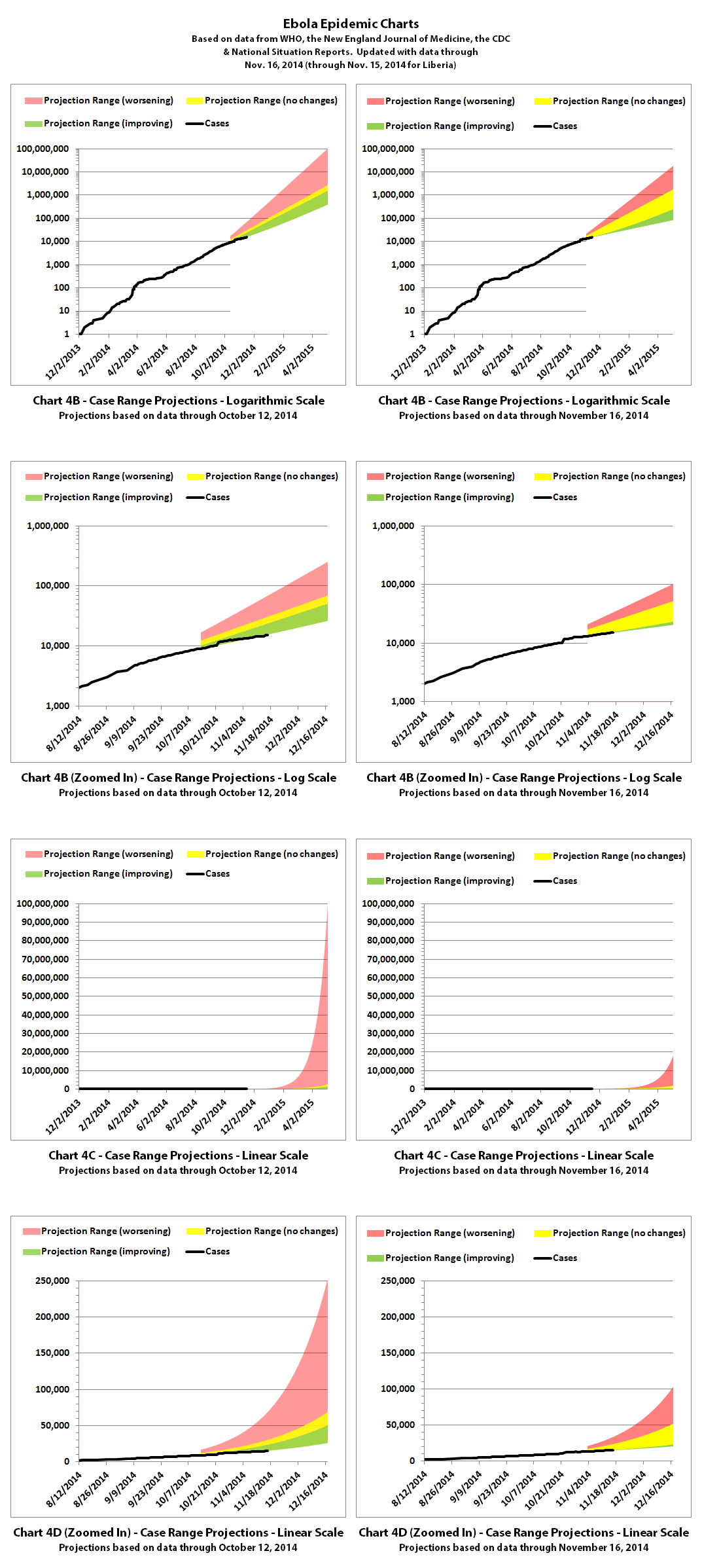
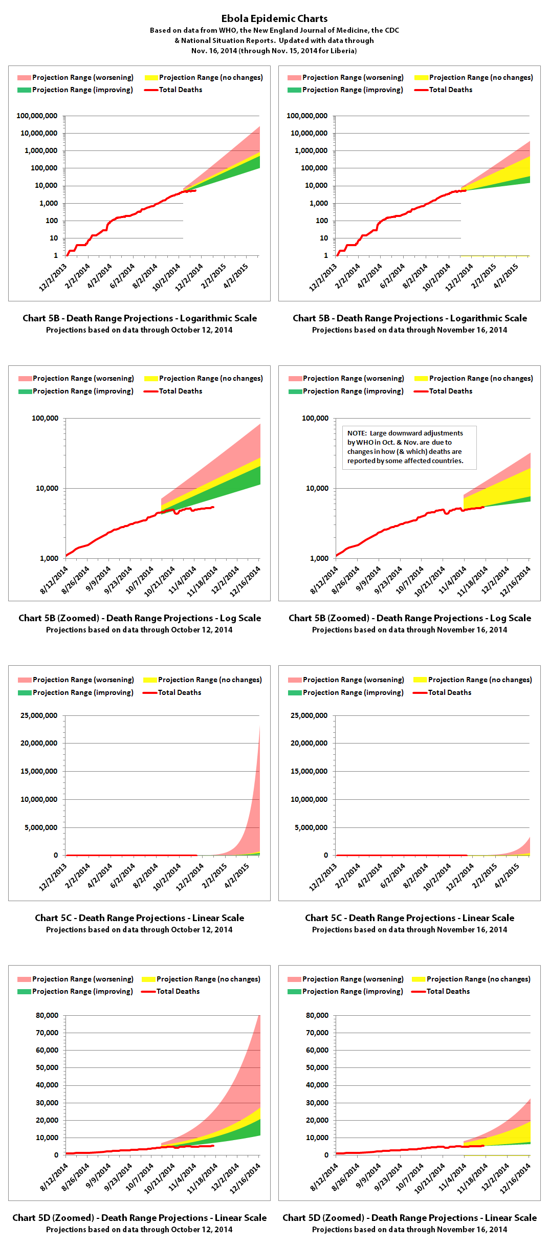
Good question, I've been wondering this myself. I've been working on updating the projection ranges over the last couple days. I've just finished. If the data from WHO is close enough to what's really happening to be a real indication of improvement (and that's a pretty big IF), then Ebola is spreading more slowly now. I've recalculated the projection ranges for charts 4B-4D and 5B-5E and they are shown below.
On the left is the previous projection for each chart and on the right is the new projection. The green range is the projection if the spread continues at the current rate, which is slower than previously. The yellow range is if it goes back to spreading at the rate it has been up until more recently. And the red range is if it spreads at the worst rates experienced so far during this epidemic.
Click any graphic to view it full-size.
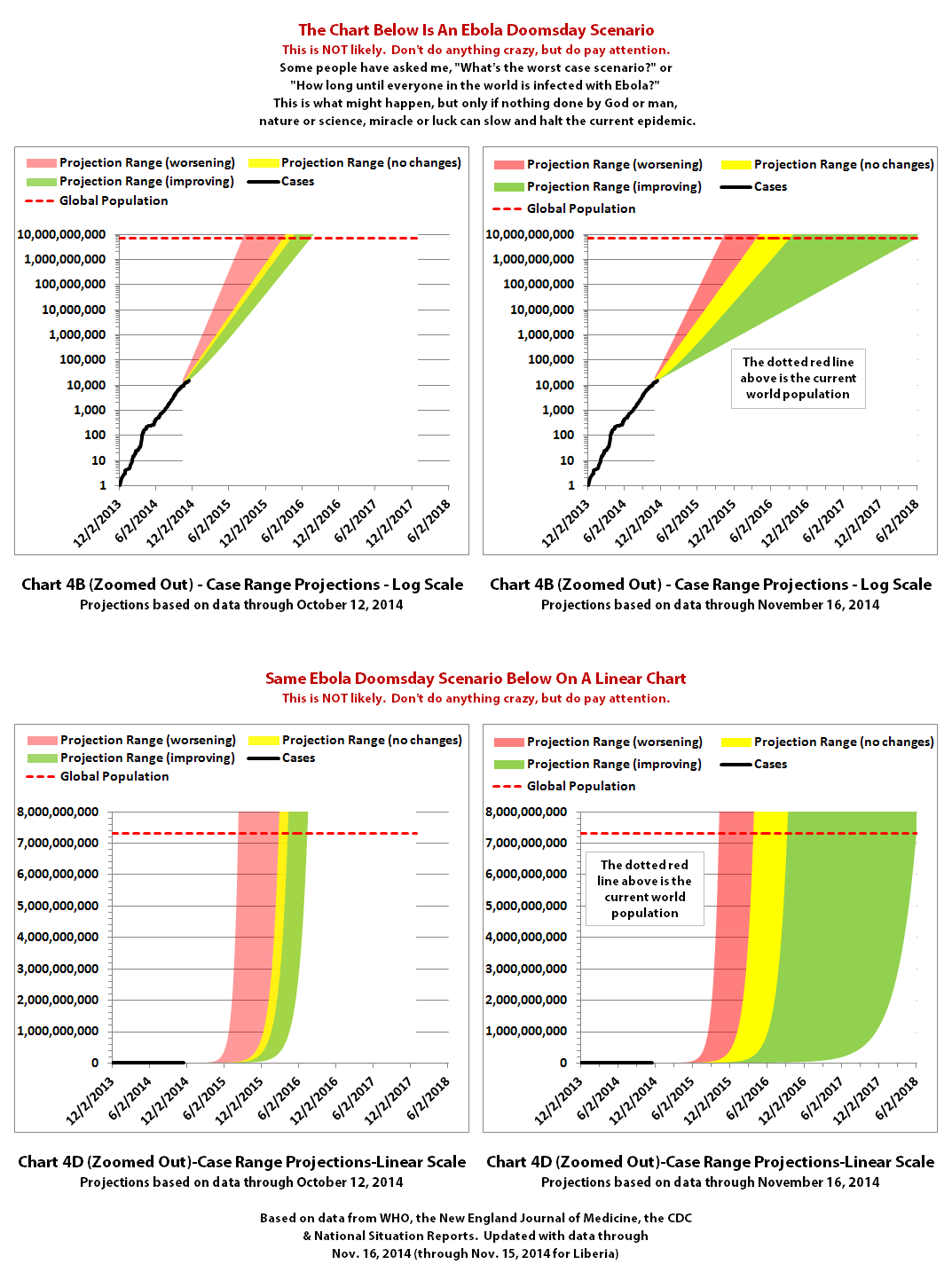
The difference is particularly obvious if you look at how it affects really long range 'Doomsday' scenarios. These next charts are unrealistic projections that are extremely unlikely (and hopefully impossible) scenarios, but they show quite well how the changes (if true) have bought more time to take further action and further slow or halt the spread of Ebola before it potentially infects everyone in the world who is exposed and not immune.
As with the previous charts, on the left is the previous projection for each and on the right is the new projection for each. The color coding is the same as above in the cases 'Doomsday' projections. Click to view full-size.
The case and death projections in these 'Doomsday' scenarios were calculated separately based on their current reports. One result of this is that the best death curve is much further in the future than the best case curve. That doesn't make much sense and wouldn't be likely to actually happen like that, but it's because the death rate appears to be slowing faster than the case rate if the reported data is correct.
In the death curves, the global population goes down as the total deaths go up. This made it hard to do color coded areas, so dashed and dotted lines are used instead.
The red curves are based on the worst death rates seen so far in this epidemic, the yellow and blue lines are based on some of the more typical death rates so far, and the green lines are based on the current death rate, which has significantly slowed down, pushing this scenario much further into the future. Click to view full-size.
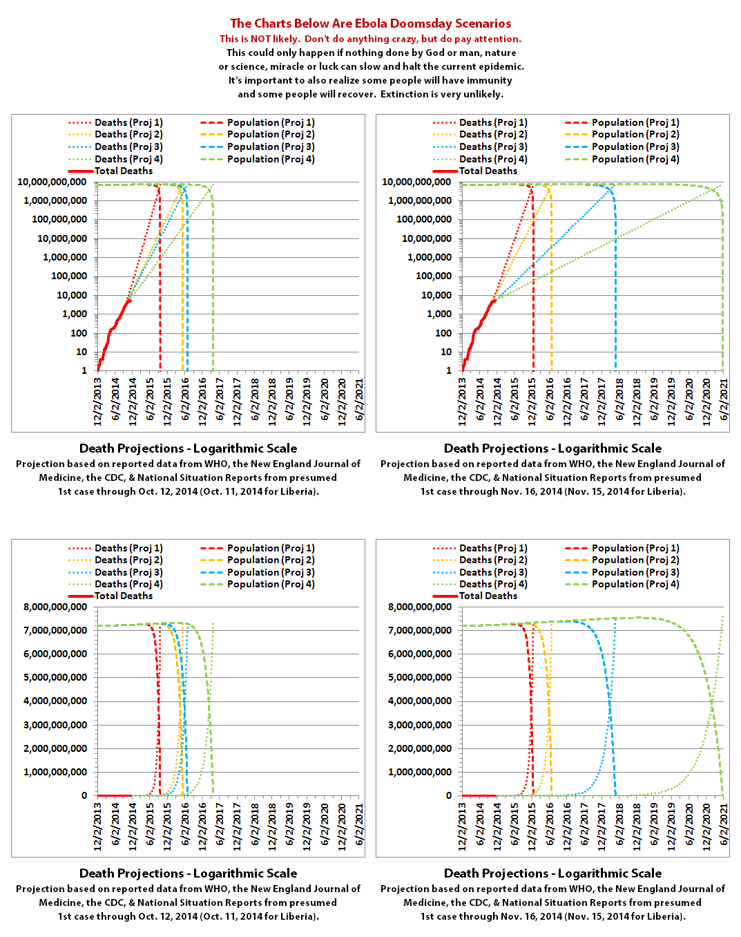
Of course not everyone is going to die from Ebola or even catch it. Even if it couldn't be stopped and nothing could be done, some people will have immunity, some will be able to avoid exposure, or the virus could mutate to be less virulent on its own. And hopefully it won't even come remotely close to a worse case scenario.
But the projections at least give an idea what kind of time frame we would be looking at if it could happen. What I take away from the new projections is that we may have at least bought more time to continue dealing with the epidemic until it can be slowed further and hopefully stopped.
It's a good thing, a good change, if the numbers from WHO are sufficiently accurate.
The numbers do not include the Congo, as that was allegedly an unrelated outbreak and it has now been declared over.
These charts rely on the reported numbers. Reported Ebola data is subject to change as cases and deaths are reclassified, as data sources change, or as reporting methods change.
The charts and projections can only be as accurate as the data they are based on. Please be aware there are a number of possible issues:
1. WHO,the CDC, Doctors Without Borders (MSF), etc. have in the past stated that actual cases and deaths "vastly" outnumber reported figures, possibly by at least 2 to 5 times.
2. There have recently been sudden large decreases in officially reported cases and deaths. It is unclear if this indicates improvement or inability to keep up. A sudden improvement seems unlikely, but let's hope.
3. Some of the countries most affected have clamped down on journalists, in some cases imprisoning journalists and even closing a newspaper. In the USA, Forbes recently reported:
Update: Forbes has since edited the article above and they now link a statement from the Associated Press.
4. There are theories regarding Ebola that differ from the 'official' reports. Some believe there is no such thing as Ebola or that what is spreading is not Ebola. Some believe there is no outbreak at all. Some believe people are purposely being infected for economic or depopulation plans. I do not know if there is any truth to any of these beliefs, it can be a strange world.
The same disclaimers and references apply to all of these charts:
Charts and future projections were done by me, not by WHO, except in cases where it is stated that a chart includes WHO projections. I am not an Ebola expert, epidemiologist, virologist, or MD, but I manually compiled the data used to create these graphs from news updates on the following websites:
SOURCE: WHO website 1
SOURCE: WHO website 2
SOURCE: WHO website 3
SOURCE: WHO website 4
SOURCE: CDC website 1
SOURCE: The New England Journal of Medicine
SOURCE: Guinea Situation Reports (posted on Humanitarian Response)
[NOTE: Situation Reports from Guinea are in French.]
SOURCE: Liberia Situation Reports
Mali Ministry of Sanitation and Hygiene
[NOTE: Situation Reports from Mali are in French.]
SOURCE: Sierra Leone Situation Reports
Please do not do anything you might regret based on charts or projections. Hopefully efforts to contain, quarantine, treat, prevent, or cure Ebola will eventually be successful, and hopefully sooner rather than later.
a reply to: jlafleur02
after analyzing all charts and how they change, are the projections holding true or are they getting lower or higher?
Good question, I've been wondering this myself. I've been working on updating the projection ranges over the last couple days. I've just finished. If the data from WHO is close enough to what's really happening to be a real indication of improvement (and that's a pretty big IF), then Ebola is spreading more slowly now. I've recalculated the projection ranges for charts 4B-4D and 5B-5E and they are shown below.
On the left is the previous projection for each chart and on the right is the new projection. The green range is the projection if the spread continues at the current rate, which is slower than previously. The yellow range is if it goes back to spreading at the rate it has been up until more recently. And the red range is if it spreads at the worst rates experienced so far during this epidemic.
Click any graphic to view it full-size.


The difference is particularly obvious if you look at how it affects really long range 'Doomsday' scenarios. These next charts are unrealistic projections that are extremely unlikely (and hopefully impossible) scenarios, but they show quite well how the changes (if true) have bought more time to take further action and further slow or halt the spread of Ebola before it potentially infects everyone in the world who is exposed and not immune.
As with the previous charts, on the left is the previous projection for each and on the right is the new projection for each. The color coding is the same as above in the cases 'Doomsday' projections. Click to view full-size.

The case and death projections in these 'Doomsday' scenarios were calculated separately based on their current reports. One result of this is that the best death curve is much further in the future than the best case curve. That doesn't make much sense and wouldn't be likely to actually happen like that, but it's because the death rate appears to be slowing faster than the case rate if the reported data is correct.
In the death curves, the global population goes down as the total deaths go up. This made it hard to do color coded areas, so dashed and dotted lines are used instead.
The red curves are based on the worst death rates seen so far in this epidemic, the yellow and blue lines are based on some of the more typical death rates so far, and the green lines are based on the current death rate, which has significantly slowed down, pushing this scenario much further into the future. Click to view full-size.

Of course not everyone is going to die from Ebola or even catch it. Even if it couldn't be stopped and nothing could be done, some people will have immunity, some will be able to avoid exposure, or the virus could mutate to be less virulent on its own. And hopefully it won't even come remotely close to a worse case scenario.
But the projections at least give an idea what kind of time frame we would be looking at if it could happen. What I take away from the new projections is that we may have at least bought more time to continue dealing with the epidemic until it can be slowed further and hopefully stopped.
It's a good thing, a good change, if the numbers from WHO are sufficiently accurate.
The numbers do not include the Congo, as that was allegedly an unrelated outbreak and it has now been declared over.
These charts rely on the reported numbers. Reported Ebola data is subject to change as cases and deaths are reclassified, as data sources change, or as reporting methods change.
The charts and projections can only be as accurate as the data they are based on. Please be aware there are a number of possible issues:
1. WHO,the CDC, Doctors Without Borders (MSF), etc. have in the past stated that actual cases and deaths "vastly" outnumber reported figures, possibly by at least 2 to 5 times.
2. There have recently been sudden large decreases in officially reported cases and deaths. It is unclear if this indicates improvement or inability to keep up. A sudden improvement seems unlikely, but let's hope.
3. Some of the countries most affected have clamped down on journalists, in some cases imprisoning journalists and even closing a newspaper. In the USA, Forbes recently reported:
The Associated Press and other press outlets have agreed not to report on suspected cases of Ebola in the United States until a positive viral RNA test is completed.
Update: Forbes has since edited the article above and they now link a statement from the Associated Press.
4. There are theories regarding Ebola that differ from the 'official' reports. Some believe there is no such thing as Ebola or that what is spreading is not Ebola. Some believe there is no outbreak at all. Some believe people are purposely being infected for economic or depopulation plans. I do not know if there is any truth to any of these beliefs, it can be a strange world.
The same disclaimers and references apply to all of these charts:
Charts and future projections were done by me, not by WHO, except in cases where it is stated that a chart includes WHO projections. I am not an Ebola expert, epidemiologist, virologist, or MD, but I manually compiled the data used to create these graphs from news updates on the following websites:
SOURCE: WHO website 1
SOURCE: WHO website 2
SOURCE: WHO website 3
SOURCE: WHO website 4
SOURCE: CDC website 1
SOURCE: The New England Journal of Medicine
SOURCE: Guinea Situation Reports (posted on Humanitarian Response)
[NOTE: Situation Reports from Guinea are in French.]
SOURCE: Liberia Situation Reports
Mali Ministry of Sanitation and Hygiene
[NOTE: Situation Reports from Mali are in French.]
SOURCE: Sierra Leone Situation Reports
Please do not do anything you might regret based on charts or projections. Hopefully efforts to contain, quarantine, treat, prevent, or cure Ebola will eventually be successful, and hopefully sooner rather than later.
WHO released another Ebola update today, November
21, 2014. According to WHO, through November 18, 2014 (November 17, 2014 for Liberia), there were:
15,351 reported Ebola cases
5,459 reported Ebola deaths
I have updated the charts with the new data.
If the data from WHO over the last two months is close enough to what's really happening to be a real indication of improvement (and that's a pretty big IF), then Ebola is beginning to spread more slowly now. Barring future information to the contrary, that's really good news!
You can see the beginnings of the curves becoming less steep in some of the charts now if you look closely.
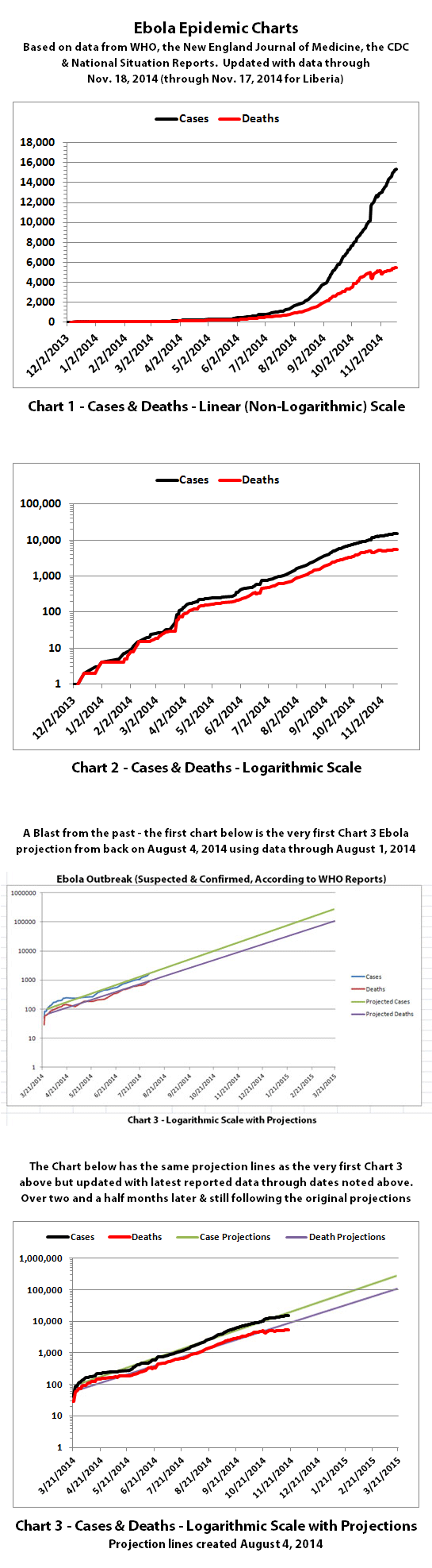
Chart 3 above and charts 4 and 5 below are historical projections. Up until now, the spread of Ebola has followed them very closely. You can begin to see the actual numbers starting to slightly dip below the historical projections for the first time. Hopefully that will continue.
Charts 4B-4E and 5B-5E include the newly recalculated projections from my last post, updated with the latest current data.
For the charts with the color coded ranges, the green range is the projection if the spread continues at the current slower rate. The yellow range would be if it goes back to spreading more at the previous rates of growth. And the red range is if it spreads more at the worst rates experienced so far during this epidemic.
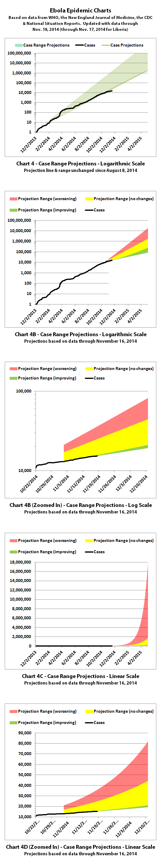
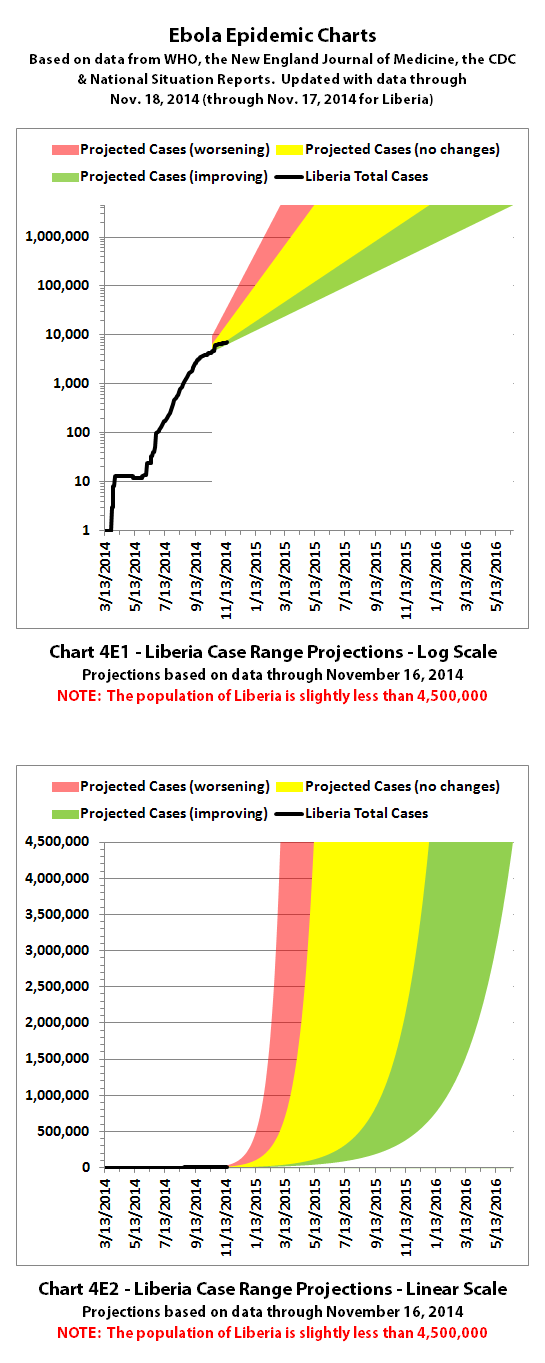
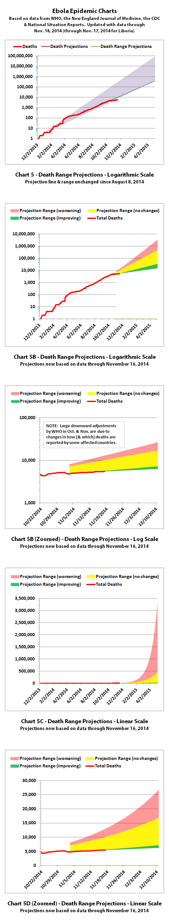
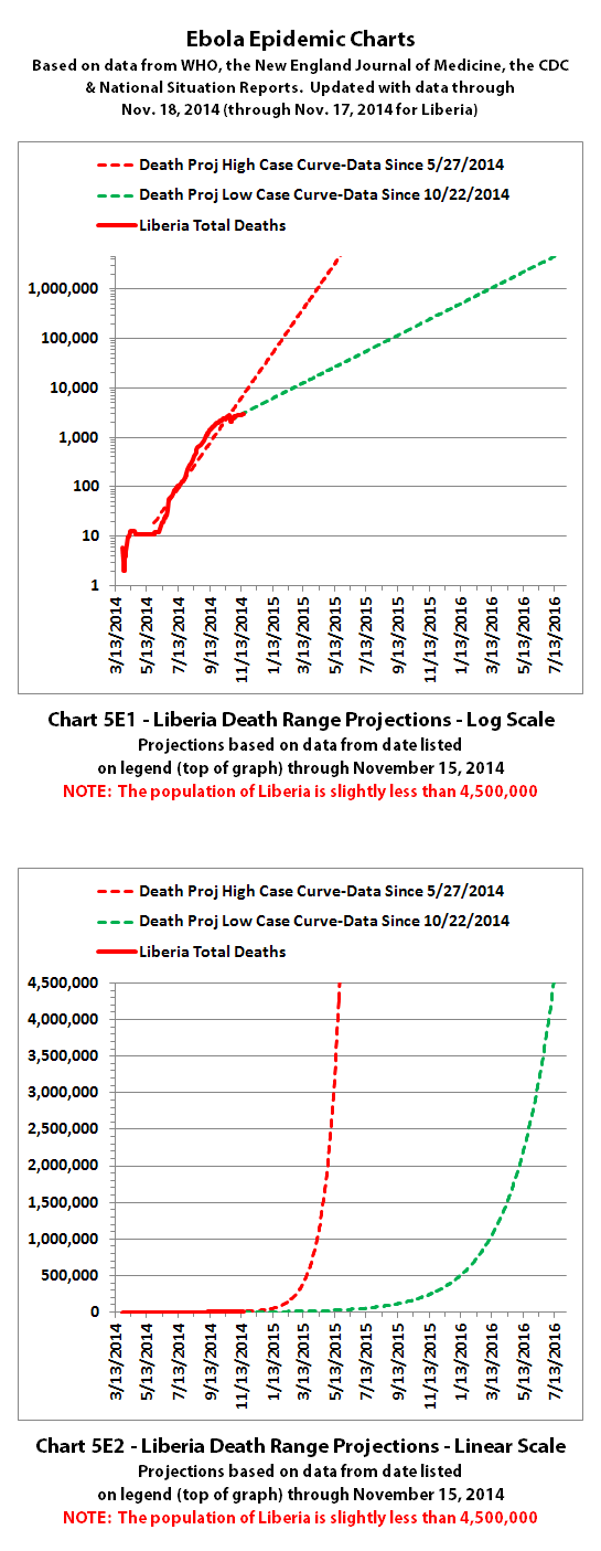
Chart 6 has the y axis in powers of 2 (1, 2, 4, 8, etc.), so it shows at a glance how quickly the epidemic doubles. Charts 7-8 were discontinued a quite a while back.
Charts 9-12 were merged quite a while back as well, and the combined chart shows monthly new cases and deaths. You can see in Charts 9-12 that the epidemic is not growing as quickly so far in November, although the number of new deaths is seriously skewed because of large decreases in total reported deaths.
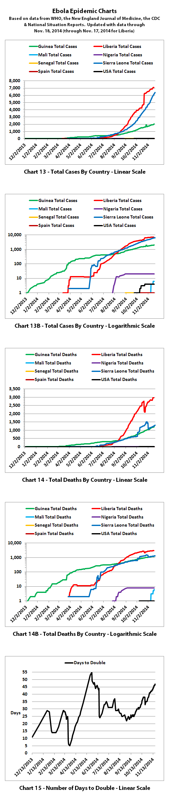
Charts 13-14B show the growth curves by country, and you can see that most of the decrease is in Liberia. Guinea and Sierra Leone continue more or less at close to the same rate. Chart 15 shows how many days it takes to double for different points in time. You can see that over the last two months it is taking longer and longer to double overall.
The numbers do not include the Congo, as that was allegedly an unrelated outbreak and it has now been declared over.
These charts rely on the reported numbers. Reported Ebola data is subject to change as cases and deaths are reclassified, as data sources change, or as reporting methods change.
The charts and projections can only be as accurate as the data they are based on. Please be aware there are a number of possible issues:
1. WHO,the CDC, Doctors Without Borders (MSF), etc. have in the past stated that actual cases and deaths "vastly" outnumber reported figures, possibly by at least 2 to 5 times.
2. There have recently been sudden large decreases in officially reported cases and deaths. It is unclear if this indicates improvement or inability to keep up. A sudden improvement seems unlikely, but let's hope.
3. Some of the countries most affected have clamped down on journalists, in some cases imprisoning journalists and even closing a newspaper. In the USA, Forbes recently reported:
Update: Forbes has since edited the article above and they now link a statement from the Associated Press.
4. There are theories regarding Ebola that differ from the 'official' reports. Some believe there is no such thing as Ebola or that what is spreading is not Ebola. Some believe there is no outbreak at all. Some believe people are purposely being infected for economic or depopulation plans. I do not know if there is any truth to any of these beliefs, it can be a strange world.
The same disclaimers and references apply to all of these charts:
Charts and future projections were done by me, not by WHO, except in cases where it is stated that a chart includes WHO projections. I am not an Ebola expert, epidemiologist, virologist, or MD, but I manually compiled the data used to create these graphs from news updates on the following websites:
SOURCE: WHO website 1
SOURCE: WHO website 2
SOURCE: WHO website 3
SOURCE: WHO website 4
SOURCE: CDC website 1
SOURCE: The New England Journal of Medicine
SOURCE: Guinea Situation Reports (posted on Humanitarian Response)
[NOTE: Situation Reports from Guinea are in French.]
SOURCE: Liberia Situation Reports
Mali Ministry of Sanitation and Hygiene
[NOTE: Situation Reports from Mali are in French.]
SOURCE: Sierra Leone Situation Reports
Please do not do anything you might regret based on charts or projections. Hopefully efforts to contain, quarantine, treat, prevent, or cure Ebola will eventually be successful, and hopefully sooner rather than later.
15,351 reported Ebola cases
5,459 reported Ebola deaths
I have updated the charts with the new data.
If the data from WHO over the last two months is close enough to what's really happening to be a real indication of improvement (and that's a pretty big IF), then Ebola is beginning to spread more slowly now. Barring future information to the contrary, that's really good news!
You can see the beginnings of the curves becoming less steep in some of the charts now if you look closely.
Chart 3 above and charts 4 and 5 below are historical projections. Up until now, the spread of Ebola has followed them very closely. You can begin to see the actual numbers starting to slightly dip below the historical projections for the first time. Hopefully that will continue.
Charts 4B-4E and 5B-5E include the newly recalculated projections from my last post, updated with the latest current data.
For the charts with the color coded ranges, the green range is the projection if the spread continues at the current slower rate. The yellow range would be if it goes back to spreading more at the previous rates of growth. And the red range is if it spreads more at the worst rates experienced so far during this epidemic.
Chart 6 has the y axis in powers of 2 (1, 2, 4, 8, etc.), so it shows at a glance how quickly the epidemic doubles. Charts 7-8 were discontinued a quite a while back.
Charts 9-12 were merged quite a while back as well, and the combined chart shows monthly new cases and deaths. You can see in Charts 9-12 that the epidemic is not growing as quickly so far in November, although the number of new deaths is seriously skewed because of large decreases in total reported deaths.
Charts 13-14B show the growth curves by country, and you can see that most of the decrease is in Liberia. Guinea and Sierra Leone continue more or less at close to the same rate. Chart 15 shows how many days it takes to double for different points in time. You can see that over the last two months it is taking longer and longer to double overall.
The numbers do not include the Congo, as that was allegedly an unrelated outbreak and it has now been declared over.
These charts rely on the reported numbers. Reported Ebola data is subject to change as cases and deaths are reclassified, as data sources change, or as reporting methods change.
The charts and projections can only be as accurate as the data they are based on. Please be aware there are a number of possible issues:
1. WHO,the CDC, Doctors Without Borders (MSF), etc. have in the past stated that actual cases and deaths "vastly" outnumber reported figures, possibly by at least 2 to 5 times.
2. There have recently been sudden large decreases in officially reported cases and deaths. It is unclear if this indicates improvement or inability to keep up. A sudden improvement seems unlikely, but let's hope.
3. Some of the countries most affected have clamped down on journalists, in some cases imprisoning journalists and even closing a newspaper. In the USA, Forbes recently reported:
The Associated Press and other press outlets have agreed not to report on suspected cases of Ebola in the United States until a positive viral RNA test is completed.
Update: Forbes has since edited the article above and they now link a statement from the Associated Press.
4. There are theories regarding Ebola that differ from the 'official' reports. Some believe there is no such thing as Ebola or that what is spreading is not Ebola. Some believe there is no outbreak at all. Some believe people are purposely being infected for economic or depopulation plans. I do not know if there is any truth to any of these beliefs, it can be a strange world.
The same disclaimers and references apply to all of these charts:
Charts and future projections were done by me, not by WHO, except in cases where it is stated that a chart includes WHO projections. I am not an Ebola expert, epidemiologist, virologist, or MD, but I manually compiled the data used to create these graphs from news updates on the following websites:
SOURCE: WHO website 1
SOURCE: WHO website 2
SOURCE: WHO website 3
SOURCE: WHO website 4
SOURCE: CDC website 1
SOURCE: The New England Journal of Medicine
SOURCE: Guinea Situation Reports (posted on Humanitarian Response)
[NOTE: Situation Reports from Guinea are in French.]
SOURCE: Liberia Situation Reports
Mali Ministry of Sanitation and Hygiene
[NOTE: Situation Reports from Mali are in French.]
SOURCE: Sierra Leone Situation Reports
Please do not do anything you might regret based on charts or projections. Hopefully efforts to contain, quarantine, treat, prevent, or cure Ebola will eventually be successful, and hopefully sooner rather than later.
a reply to: ikonoklast
You beat me to the update!
I'll still ost about 'Mali':
a new outbreak has hit Mali, where six people have died.
www.euronews.com/2014/11/22/mali-succumbs-to-ebola-as-death-toll-nears-5500
The Friday report states 39 more deaths and 106 new cases since Wednesday
english.farsnews.com...
You beat me to the update!
I'll still ost about 'Mali':
a new outbreak has hit Mali, where six people have died.
www.euronews.com/2014/11/22/mali-succumbs-to-ebola-as-death-toll-nears-5500
The Friday report states 39 more deaths and 106 new cases since Wednesday
english.farsnews.com...
a reply to: TruthxIsxInxThexMist
Yes, Mali is a big concern, apparently WHO has a new situation assessment on what they've learned about the Ebola outbreak in Mali so far here:
Mali: Details of the additional cases of Ebola virus disease
And another new case just tested positive today. I don't think it's included in the WHO update yet:
Mali Announces New Ebola Case
The new cases are believed to trace back to a Grand Imam who traveled to Mali for treatment. The illness and death were not recognized as Ebola at the time, so no precautions were taken during the treatment or funeral. Hundreds of contacts of the Grand Imam and the healthcare workers are currently being monitored. But thousands attended the Grand Imam's funeral and an unspecified number touched the body.
According to the New York Times, WHO and the UN are quite concerned about the new outbreak in Mali and the Times indicates they may be revising their goal from achieving 70% in treatment centers and 70% safe burials by December 1st to instead containing Ebola by mid 2015:
Officials Revise Goals on Containing Ebola After Signs of Wider Exposure in Mali
Unless they know more than is being publicized, I think it's too early to tell how things will go in Mali. Perhaps they can contain it there soon, while it's still early in the outbreak.
After reading the article on the link below I find it virtually impossible for accurate data to be be gathered and counted. As the article states
ambulances dont even get to the possibly infected some of the time. I fear the numbers are higher then what is being reported.
www.npr.org...
www.npr.org...
a reply to: sirlancelot
I think it's almost certain the numbers are higher than reported. Ebola is spreading much faster than they can build and staff treatment and isolation facilities, so a high percentage of the cases are out in the communities and are not even in hospitals or Ebola centers. I just hope the reported numbers at least give somewhat of a picture of any changes in the rate that it's spreading and a partial picture of what's really going on.
These numbers from the November 19th WHO Situation Report show how far behind they are in having enough treatment centers and beds.
Percent of reported Ebola patients isolated and hospitalized between October 20th and November 9th:
Guinea: 72%
Liberia: 20%
Sierra Leone: 13%
Total for all 3 countries: 23%
An additional 24% of all reported cases were hospitalized but not isolated. There was no data for 52% of reported cases. And that's just for reported cases.
There are two types of Ebola centers:
1. Ebola Treatment Centers (ETCs) are larger facilities with more beds. As of November 18th:
Percent of planned ETCs operational: 32% (18 of 56)
Percent of planned ETC beds operational: 26% (1159 of 4461)
2. Community Care Centers (CCCs) are smaller centers with 8-15 beds each, intended to provide more capacity and to be distributed more widely geographically than ETCs. As of November 18th:
Percent of planned CCC beds operational: 2% (60 of 2629)
Looking at the total number of beds planned:
Percent of planned ETC & CCC beds operational: 17% (1219 of 7090)
It doesn't look like they could possibly hit the goal of 70% of Ebola patients in treatment facility beds by December 1, 2014.
More news and I think you ay have to add 'Pakistan' to the list and possibly Thailand:
tribune.com.pk...
www.bangkokpost.com...
And a new case in Mali:
www.startribune.com...
ISLAMABAD / FAISALABAD: A patient suspected to be suffering from Ebola virus disease (EVD) was hospitalised at the Allied Hospital on Monday. If confirmed, this will be the first case in Pakistan of Ebola virus
The patient has serious liver issues. Blood is coming from his mouth, urine and bowl,” Dr Maqbool said. “He is in a critical condition. We have sent his blood and urine samples to the National Institute of Health (NIH) in Islamabad,” he added. “The test reports will establish whether or not it’s Ebola virus.”
tribune.com.pk...
Police and health authorities are searching for a man who arrived from Sierra Leone and was suspected of carrying the Ebola virus disease, after he failed to report for daily physical checkups from Nov... Please credit and share this article with others using this link:www.bangkokpost.com... View our policies at goo.gl... and goo.gl... © Post Publishing PCL. All rights reserved.
www.bangkokpost.com...
And a new case in Mali:
Mali has confirmed a new case of Ebola, bringing to eight the number of people who have fallen ill with the deadly disease in the West African country.
www.startribune.com...
The patient from Pakistan died. They still
sent the blood & urine samples to NIH.
Source www.pakistantribune.com.pk...
Cheers
Ektar
sent the blood & urine samples to NIH.
Source www.pakistantribune.com.pk...
Cheers
Ektar
a reply to: ikonoklast
It is a pity we do not get regular data on the amount of beds because it would be useful to see a chart on actual beds compared to beds needed for the magic 70%.
It is a pity we do not get regular data on the amount of beds because it would be useful to see a chart on actual beds compared to beds needed for the magic 70%.
New data from WHO:
So, its still on the rise but I think no where near first predictions.... I reckon we were getting worried far too early.
5,689 out of total population for the affected areas isnt really that much when you think about it.
Lets just hope it doesn't mutate with the 'Bubonic Plague' which is rife in 'Madagasca' at present.
The death toll in the world's worst Ebola epidemic has risen to 5,689 out of 15,935 cases reported in eight countries by Nov. 23, the World Health Organization said on Wednesday.
So, its still on the rise but I think no where near first predictions.... I reckon we were getting worried far too early.
5,689 out of total population for the affected areas isnt really that much when you think about it.
Lets just hope it doesn't mutate with the 'Bubonic Plague' which is rife in 'Madagasca' at present.
new topics
-
Plane Crash in South Korea
Mainstream News: 8 hours ago -
Cutting Boards
Food and Cooking: 11 hours ago
top topics
-
Why Such An Uproar Over Non-US Citizens With H1-B Work Visas.
Social Issues and Civil Unrest: 17 hours ago, 8 flags -
Cutting Boards
Food and Cooking: 11 hours ago, 8 flags -
Mexico Plans Alert App For Migrants Facing Arrest In US
Mainstream News: 12 hours ago, 6 flags -
Plane Crash in South Korea
Mainstream News: 8 hours ago, 6 flags
active topics
-
Why Such An Uproar Over Non-US Citizens With H1-B Work Visas.
Social Issues and Civil Unrest • 46 • : Daughter2v2 -
Plane Crash in South Korea
Mainstream News • 9 • : 38181 -
Petition Calling for General Election at 564,016 and rising Fast
Political Issues • 177 • : AdultMaleHumanUK -
Post A Funny (T&C Friendly) Pic Part IV: The LOL awakens!
General Chit Chat • 7967 • : KrustyKrab -
New York Governor signs Climate Law that Fines Fossil Fuel Companies
US Political Madness • 33 • : Lazy88 -
UK Borders are NOT Secure!
Social Issues and Civil Unrest • 17 • : gortex -
New UK Petition - Close the borders! Suspend ALL immigration for 5 years!
Regional Politics • 8 • : angelchemuel -
Cutting Boards
Food and Cooking • 4 • : angelchemuel -
Christmas Car Near Detroit…
Automotive Discussion • 9 • : JJproductions -
Mood Music Part VI
Music • 3769 • : paviabari