It looks like you're using an Ad Blocker.
Please white-list or disable AboveTopSecret.com in your ad-blocking tool.
Thank you.
Some features of ATS will be disabled while you continue to use an ad-blocker.
share:
reply to post by SkepticOverlord
Yup. At the bottom of the page.
Not something I can't live with, or are bothered by.
Ill be interested to see how it works on my work laptop. I think I have Chrome on there, too.
Yup. At the bottom of the page.
Not something I can't live with, or are bothered by.
Ill be interested to see how it works on my work laptop. I think I have Chrome on there, too.
Earlier on the live release version that was reversed, when I clicked the "little man" under avatars, nothing happened. NOW it works for me.
I can't be sure old bookmarked ATS URLs port okay as we're in an alternative sandbox of sorts - so I will have to wait until this style is the regular style to test that again.
White is way less wonky now but then it is night time now and it was daylight for me earlier.
Can the text on the black background be a tad more white for contrast? Just a wee bit.
edit on 31/8/2013 by trexter ziam because: (no reason
given)
I'm headed offline for the night.
One final word -- step into the light!
If you're in a bright room, the light version is excellent. With bright ambient light, I can't spend too much time on the current ATS.
So give the light version a chance. It's not white, but a very subtle beige determined by many readability tests to be optimum for screen reading.
SkepticOverlord
If you're in a bright room, the light version is excellent. With bright ambient light, I can't spend too much time on the current ATS.
So give the light version a chance. It's not white, but a very subtle beige determined by many readability tests to be optimum for screen reading.
I remember the last site re-design I voted to stay dark.
I've changed my mind now. I'm stepping over to the light side Likey very much.
Font size is still a wee bit big, but I can live with it.
Nice.
(Not real fussed on the emoticons though, sorry)
edit on 31/8/2013 by Netties Hermit because: (no reason given)
I guess you need to capitalize the first letter in the color code now?
It used to work only with uncapitalized first letters. I noticed this when reading an old thread and saw that the color codes in a few of the posts didn't show up right.
Did something change with the new design? It makes the old threads look messed up.
It used to work only with uncapitalized first letters. I noticed this when reading an old thread and saw that the color codes in a few of the posts didn't show up right.
Did something change with the new design? It makes the old threads look messed up.

edit on 8/31/13 by FortAnthem because: 

The statistics on the "forums" button page are now at the top and on a desktop PC you have to scroll a long way down to get to the forum list. I'm
thinking new visitors may not spend the extra few seconds to scroll down to see what they are wanting to see (the list of forums.)
Similiar to above with other menu icon groups.
Can the logout button be moved to the far right? It's easy to mistakenly logout when intending to open the small but wide-legged "v".
Similiar to above with other menu icon groups.
Can the logout button be moved to the far right? It's easy to mistakenly logout when intending to open the small but wide-legged "v".
edit on
31/8/2013 by trexter ziam because: (no reason given)
Testing upload system
Yay! New avatars coming up.
New upload system is

Yay! New avatars coming up.
New upload system is
edit on 31/8/2013 by Netties Hermit because: testing emoticon in edit window
Here is a perfect example of why the new smilies suck...

It looks like a hand flicking a coin or something but it's two separate smilies next to each other.
EDIT: wait it is a single smiley? What's it supposed to be?
EDIT: Ok after looking at the other smilies I see what it's supposed to be... kind of confusing.

It looks like a hand flicking a coin or something but it's two separate smilies next to each other.
EDIT: wait it is a single smiley? What's it supposed to be?
EDIT: Ok after looking at the other smilies I see what it's supposed to be... kind of confusing.
edit on 31/8/2013 by ChaoticOrder because: (no
reason given)
Every now and then I use the "this post" feature to bookmark a particular post for later reading.
I can't see the ability to do this in the new system. Will this be available?
I can't see the ability to do this in the new system. Will this be available?
edit on 31/8/2013 by Netties Hermit because: (no reason given)
Thanks for asking -
I've changed to pc view - it still doesn't change there's a great deal of empty space to the RIGHT beside the post area.
Please try and widen the post box for PC view - it's real hard on the eye at the moment. And all the 'unused' space! Eeek!
That's enough for now.
peace
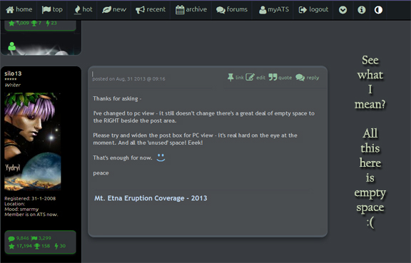
I've changed to pc view - it still doesn't change there's a great deal of empty space to the RIGHT beside the post area.
Please try and widen the post box for PC view - it's real hard on the eye at the moment. And all the 'unused' space! Eeek!
That's enough for now.
peace

edit on 31-8-2013 by silo13 because: add pic
ChaoticOrder
Here is a perfect example of why the new smilies suck...
It looks like a hand flicking a coin or something but it's two separate smilies next to each other.
EDIT: wait it is a single smiley? What's it supposed to be?edit on 31/8/2013 by ChaoticOrder because: (no reason given)
It looks like someone lighting a cigarette with an old Ronson lighter. Then there is another line there I can't quite make out.
Maybe there will be a version coming up for people that still use computers also. I don't like trying to post with a touch-screen phone.
edit on 31-8-2013 by Erongaricuaro because: (no reason given)
How about some cosmetic alterations?
SkepticOverlord
This open test is not intended as an opportunity to offer significant alterations to the UI/UX in any way.
The other 39 page thread "ALL MEMBERS: We may be launching ATS.5/3 today." had "wasted space" mentioned and I noted a couple examples of where wasted space can be eliminated, and to me at least and perhaps the others who noted the wasted space, this would improve the site.
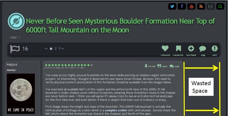
Note the right edge of the posts has wasted space where it doesn't line up with the headings, so why not align the right edge as shown by the yellow arrows/lines here to eliminate this wasted space?
Likewise, there are other opportunities where the old format was more efficient. Here's an example of the subscribed thread list, which on the right is made to look more like the old format and doesn't waste so much space.
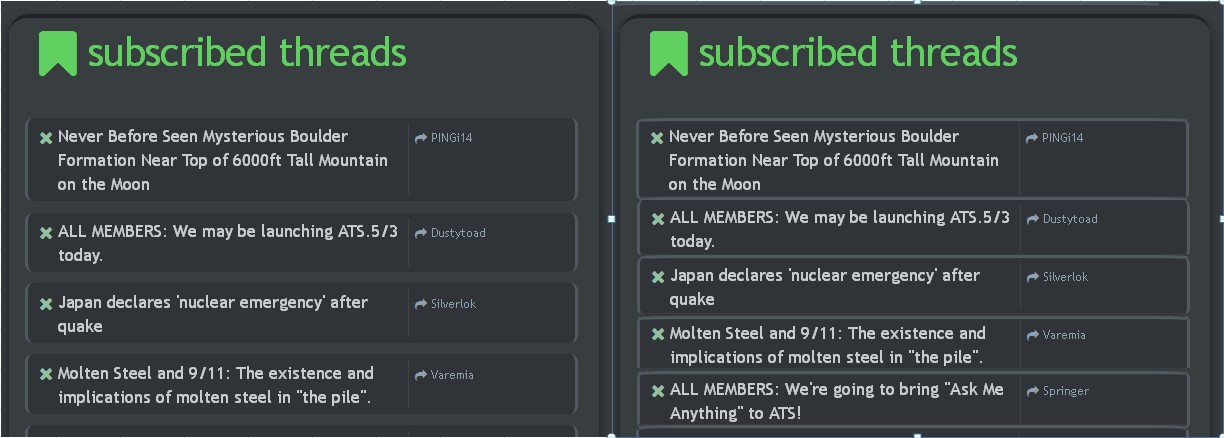
You get 5 threads listed in the space of 4, a 20% improvement, and to me the right side also looks better, but I have a strong bias for display space efficiency, I admit.
It seems to me that space efficiency on mobile devices with limited screen size is even more important, so if part of the reason for this change is to accommodate mobile devices also, display space efficiency improvements will also help mobile users.
ChaoticOrder
EDIT: wait it is a single smiley? What's it supposed to be?edit on 31/8/2013 by ChaoticOrder because: (no reason given)
It's the "thumbs up" smiley
Though it took me a while to work that out.
Could also be interpreted as being a different finger
I like the new design. Seems to be easier to read the text for me at my age.
The only problem I have is that when I switch to another page the system goes to the new page and then sends me back to the home page. I have to hit the back button and I'm back where I'm supposed to be. May be an Opera problem.
Other than that one issue I think the overall design is an improvement.
Originally posted by ChaoticOrder
Here is a perfect example of why the new smilies suck...
It looks like a hand flicking a coin or something but it's two separate smilies next to each other.
EDIT: wait it is a single smiley? What's it supposed to be?
EDIT: Ok after looking at the other smilies I see what it's supposed to be... kind of confusing.edit on 31/8/2013 by ChaoticOrder because: (no reason given)
I think it is supposed to be a thumbs up...
I thought it looked like a squid...
reply to post by SkepticOverlord
Thanks for the new web site link in private message. It should help members connect to the new web site.
I prefer the new web site over the old web site. To me it is cleaner, clearer and easier to read.. I am glad I still have my blue left column profile background color, because it helps me find my posts.
So far, these are my four issues with new web site. First, the profile personalization page is not available. Second, there is no link to my previous posts page.. I could link to my posts page from left column profile. Third, all the signatures are in a light blue colored text which is not easy as it could be, to read. I think a light and bright green or yellow signature text color would be better. Four, I pinned the new web site to my task bar, and now I have the fifth "e" with yellow swirl on white background icon on my task bar. I suggest the new web site have a distinct icon like the old web site.
Overall, I do like the new web site and hope it increases membership and participation.
reply to post by SkepticOverlord
I like it. There's just something quaint about it. It's exciting and I can't wait to see it in it's entirety. I'm off to do that now. Thank you
I like it. There's just something quaint about it. It's exciting and I can't wait to see it in it's entirety. I'm off to do that now. Thank you
It looks like we were writing our posts about the same time on this issue. A number of people pointed this out in the other thread also. It does seem like a good opportunity for improvement, and should be pretty easy to fix.
Originally posted by silo13
Thanks for asking -
I've changed to pc view - it still doesn't change there's a great deal of empty space to the RIGHT beside the post area.
Please try and widen the post box for PC view - it's real hard on the eye at the moment. And all the 'unused' space! Eeek!
Okay, I figured out what was wrong.
If you copy + paste the password from the PM, there is a space at end for some unknown reason. After removing the space, it works.
As far as the design goes, it reminds me of going from Windows XP to Windows Vista. I don't get why ATS needs to change and be more "user friendly," but whatever. Time will tell if this new design attracts more people on the site or not.
new topics
-
Simple Thanksgiving
Food and Cooking: 36 minutes ago -
Trump could make a peaceful American Revolution
US Political Madness: 3 hours ago -
Trump Presidential Transition Team will not use GSA or Government entities to come to DC
US Political Madness: 4 hours ago -
Mind Blowing Cave under someones land
Fragile Earth: 4 hours ago -
The Party of Peace - Trump Cabinet Picks Targeted with Death Threats
US Political Madness: 5 hours ago -
V.P. Kamala Harris releases a video and nobody understands why
US Political Madness: 8 hours ago
top topics
-
D.B. Cooper mystery may be solved
General Conspiracies: 13 hours ago, 21 flags -
V.P. Kamala Harris releases a video and nobody understands why
US Political Madness: 8 hours ago, 16 flags -
The Party of Peace - Trump Cabinet Picks Targeted with Death Threats
US Political Madness: 5 hours ago, 13 flags -
Mind Blowing Cave under someones land
Fragile Earth: 4 hours ago, 12 flags -
Trump Presidential Transition Team will not use GSA or Government entities to come to DC
US Political Madness: 4 hours ago, 12 flags -
Trump could make a peaceful American Revolution
US Political Madness: 3 hours ago, 10 flags -
Simple Thanksgiving
Food and Cooking: 36 minutes ago, 2 flags
active topics
-
Simple Thanksgiving
Food and Cooking • 1 • : CriticalStinker -
Post A Funny (T&C Friendly) Pic Part IV: The LOL awakens!
General Chit Chat • 7837 • : Flyingclaydisk -
V.P. Kamala Harris releases a video and nobody understands why
US Political Madness • 61 • : Flyingclaydisk -
Trump Presidential Transition Team will not use GSA or Government entities to come to DC
US Political Madness • 8 • : Flyingclaydisk -
The Acronym Game .. Pt.4
General Chit Chat • 995 • : JJproductions -
Trump could make a peaceful American Revolution
US Political Madness • 8 • : Flyingclaydisk -
Mind Blowing Cave under someones land
Fragile Earth • 14 • : Flyingclaydisk -
I thought Trump was the existential threat?
World War Three • 105 • : Xtrozero -
The Party of Peace - Trump Cabinet Picks Targeted with Death Threats
US Political Madness • 8 • : DontTreadOnMe -
President-Elect DONALD TRUMP's 2nd-Term Administration Takes Shape.
Political Ideology • 254 • : WeMustCare
