It looks like you're using an Ad Blocker.
Please white-list or disable AboveTopSecret.com in your ad-blocking tool.
Thank you.
Some features of ATS will be disabled while you continue to use an ad-blocker.
share:
Just noticed a problem with multi-level quotes in a post- there aren't any... only the first quoted text appears...
Old style post link:
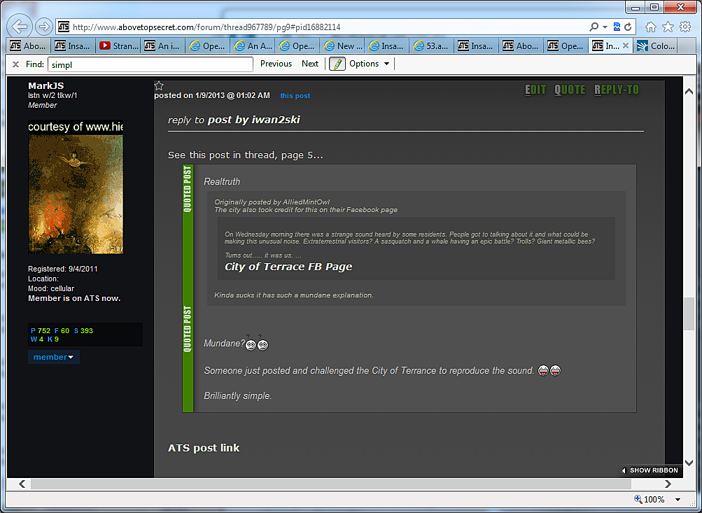
... while the multi-level quotes is hard to read, all the information is there, including the referenced quote FB page link... nice.
Same post as above: New style 5.3 version (old vrs as above) in same thread:
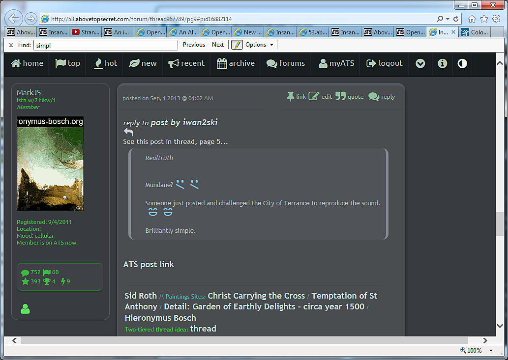
...trying to read the quoted text for the post doesn't even make sense. And the back/reverse arrow at the top does not navigate back to the original post. Probably a problem.
The picture upload facility did not work for me under 5.3... Maybe it's just me... dunno.
Old style post link:

... while the multi-level quotes is hard to read, all the information is there, including the referenced quote FB page link... nice.
Same post as above: New style 5.3 version (old vrs as above) in same thread:

...trying to read the quoted text for the post doesn't even make sense. And the back/reverse arrow at the top does not navigate back to the original post. Probably a problem.
The picture upload facility did not work for me under 5.3... Maybe it's just me... dunno.
edit on 31/8/2013 by MarkJS because: (no reason
given)
edit on 1/9/2013 by MarkJS because: (no reason given)
Old School Emoticons.....uploaded to ATS with full url links.
Feel free to copy/paste to word doc for future use.
Chair shot files.abovetopsecret.com...
STFU files.abovetopsecret.com...
Heyhowyadoin files.abovetopsecret.com...
Hammertime files.abovetopsecret.com...
Drunk files.abovetopsecret.com...
Whiskey files.abovetopsecret.com...
Uzi files.abovetopsecret.com...
Spam files.abovetopsecret.com...
Go Mods files.abovetopsecret.com...
Puke files.abovetopsecret.com...
Shocked files.abovetopsecret.com...
Monkey files.abovetopsecret.com...
Livid files.abovetopsecret.com...
Clown files.abovetopsecret.com...
Banned files.abovetopsecret.com...
Hail files.abovetopsecret.com...
Flamed files.abovetopsecret.com...
Cussing files.abovetopsecret.com...
Crybaby files.abovetopsecret.com...
Clowndance files.abovetopsecret.com...
Breakdance files.abovetopsecret.com...
Bash files.abovetopsecret.com...
Banghead files.abovetopsecret.com...
Banana files.abovetopsecret.com...
Afroman files.abovetopsecret.com...
Wow files.abovetopsecret.com...
Wink files.abovetopsecret.com...
Tumble files.abovetopsecret.com...
Tongue files.abovetopsecret.com...
Thumbs up files.abovetopsecret.com...
Thumbs down files.abovetopsecret.com...
Smile files.abovetopsecret.com...
Sad files.abovetopsecret.com...
Shocked files.abovetopsecret.com...
Roll eyes files.abovetopsecret.com...
Puzzled files.abovetopsecret.com...
Mad files.abovetopsecret.com...
LOL files.abovetopsecret.com...
Flaming files.abovetopsecret.com...
Exclamation files.abovetopsecret.com...
Duh files.abovetopsecret.com...
Cool files.abovetopsecret.com...
Big Grin files.abovetopsecret.com...
Feel free to copy/paste to word doc for future use.
Chair shot

STFU

Heyhowyadoin

Hammertime

Drunk

Whiskey

Uzi

Spam

Go Mods

Puke

Shocked

Monkey

Livid

Clown

Banned

Hail

Flamed

Cussing

Crybaby

Clowndance

Breakdance

Bash

Banghead

Banana

Afroman

Wow

Wink

Tumble

Tongue

Thumbs up

Thumbs down

Smile

Sad

Shocked

Roll eyes

Puzzled

Mad

LOL

Flaming

Exclamation

Duh

Cool

Big Grin

edit on 1-9-2013 by Sublimecraft because: added
emoticon title next to each one.
MarkJS
Just noticed a problem with multi-level quotes in a post- there aren't any...
Because you're not supposed to do it.
Most of the tablet-related issues should be solved, or much better -- especially for non-standard sizes.
I had forgot that I hard-coded something specific to myself, and on tablets in portrait, to me, everything looked fine.
IMPORTANT IMPORTANT
If you're reporting an issue with an apparent odd or misaligned layout, please be sure to include the information below the footer, like this:
viewport: 1548 x 1117 | document: 1548 x 1577
This tells me a great deal.
reply to post by Iamschist
I was having the same issue with the new chat. I did check out my flash just to make sure but nothing changed.
I did like the look of it though, very easy on the eyes.
Penny
I was having the same issue with the new chat. I did check out my flash just to make sure but nothing changed.
I did like the look of it though, very easy on the eyes.
Penny
pennylemon
I was having the same issue with the new chat. I did check out my flash just to make sure but nothing changed.
The new chat does not utilize Flash or Java.
You know how you scroll to the bottom of the page and it auto loads new posts? Is that for mobile versions only? Or does auto load only load up to a
certain limit of posts ? It's the beginning of a new month so that is why I ask. Maybe it only loads a month at a time or something?
This is what it does in the off topic part. Could be because it only loads 24hrs worth of topics?
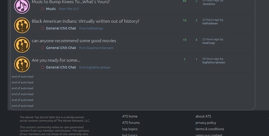
This is what it does in the off topic part. Could be because it only loads 24hrs worth of topics?

edit on 1-9-2013 by Hollie because: (no reason given)
reply to post by SkepticOverlord
I just skipped in so I'm sorry if it is reported already.
When I go to my profile. Threads, flags and replies all fit in the layout. (Basic stats and forums on the left and a big block on the right for threads, flags or replies) but with posts it seems te place the block "posts" under basic stats and forums.
Vp 980x550 doc 1024x2029
edit on 1-9-2013 by Dumbass because: (no reason given)
reply to post by SkepticOverlord
That's a new one... Or maybe it's not new... but new to me only.
If you don't mind me saying... I'm not trying to be a smart-a__ or anything... Please read on:
The restriction makes it tedious because if I want to quote somebody, who's already quoting someone else... I can do a 1st level quote, then I have to explicitly add a link into the post to reference the 2nd level quoted info... Otherwise, the first-level quote may not even make sense.. like the example in my post above.
I belong to different technical forums (probably as yourself). There (as you know) the posts are more arbitrary, and there is less flow of a development of an idea there. There, it's either wrong, or right... You like the solution, or you don't.
In ATS though... threads are sometimes similar and/or connected. For example: what happens in one thread- such as increased magna in the earth, may affect/produce more earthquakes.... Or the other way around: more earthquakes may move the underground enough to allow for more magna flow. And one or both of these may produce the strange sky-sounds that people hear, which someone else postulated is a communication to the whales and dolphins to serve as a warning. Things are more complex and interconnected in ATS, it seems. Quoting posts, albeit in a multi-level fashion, helps with these connections. If the posts are already quoting other posts, in 5.3 this is a problem, as the flow of the development of the idea may be broken.
What I'm trying to say is that at times, one post may not speak of some phenomena it in its totality. But one poster mentions one aspect, another poster may build on it, and another poster may add another fact to the story, resembling a multi-faceted diamond when it's all done (with multi-level quotes). Sometimes this is all done in one thread, but on disparate pages.
And yes.. the progressively diminishing size of quotes does make it unbearable to read after a while...
So then, is there a better solution? To: 1. retain the flow of the progression of a concept? 2. maintain the readability of quoted posts?
edit
on 1/9/2013 by MarkJS because: (no reason given)
reply to post by SkepticOverlord
Hello There,
I like this current set up that you have going.
I was able to access it via your message system, following the Login
Protocols. I will respect the rules noted as well.
In particular, I find the darker toned "background" with lighter fonts,
to be not only a "Signature" of ATS, but much easier on the eyes.
At Night in particular, the darker screen creates gentle light in the room
and is less intrusive to others in the vicinity.
Yesterday, I was directed to another "template" with the lighter grey background.
Not only did I find this previous trial version uncomfortable, I found it to be confusing
and non intuitive as well. For what is worth, these are my responses.
I really miss the Page that has new threads,top topics, recent posts,etc. In Columns.
As some of us members are on demanding time schedules and it allows us to have a
quick overview of "Whats happening at ATS", in an instant.
At any rate, all the best to you S.O. and your teams creativity,
Wildmanimal
edit on 1-9-2013 by Wildmanimal because: Add Content
I am trying to collaborate with other members on taking up SO's offer to redesign the smilies. While doing this, Loam came in with some nice stuff
made using powerpoint
Link to thread: www.abovetopsecret.com...
Itl'll need a bit of cleanup/touchup, and I haven't sized down to see how they resolve....but I think its a great concept:
Link to thread: www.abovetopsecret.com...
Itl'll need a bit of cleanup/touchup, and I haven't sized down to see how they resolve....but I think its a great concept:
Originally posted by loam
So, I'm curious what these look like here...
=
=
=
=
=
=
=
=
=
=
=
=
=
=
=
=
*down* =
*@@* =
I actually banged these out on powerpoint...
What size are the emoticons supposed to be?
Originally posted by pennylemon
reply to post by Iamschist
I was having the same issue with the new chat. I did check out my flash just to make sure but nothing changed.
I did like the look of it though, very easy on the eyes.
Penny
Thank you, it is hard not to take being ignored personally. lol The only thing I can think is that my connection is not fast enough to support the new chat. It will work for me for a minute or two and then I become invisible, I can see what I type, I can see it go out into the room, I can see other's chat, I can even get a private message window and type in it, but I do not get responses. It is like being a ghost, very disconcerting. I have to listen on the 32 deally for the radio show, and there is lag for me on that, so my connection is all I can think of that could be wrong. I am on a dell studio, using chrome.
I do like the look and features of the new chat, apart from the invisible thing
edit on 1-9-2013 by Iamschist because: (no reason
given)
reply to post by bigfatfurrytexan
Good job BFFT!
Only feedback would be the tongue out needs abit of work.
However I do understand that once scaled down - this may not be as obvious.
Great effort man !
Good job BFFT!
Only feedback would be the tongue out needs abit of work.
However I do understand that once scaled down - this may not be as obvious.
Great effort man !
reply to post by SkepticOverlord
thanks..
I got the notice .. but password wouldn't work .. this makes 2nd time..
thanks..
I got the notice .. but password wouldn't work .. this makes 2nd time..
I'd still like to know if there's a reason I cannot start a new thread in the Posse Comitatus forum, where it says new thread on all other forums
there is now a no entry symbol. I also can't post a reply on the thread without going via someone elses post.
Is this forum being stopped? I haven't this issue on the old site.
Is this forum being stopped? I haven't this issue on the old site.
Originally posted by SkepticOverlord
MarkJS
Just noticed a problem with multi-level quotes in a post- there aren't any...
Because you're not supposed to do it.
Every second thread contains nested quotes... like this very post for example. We need at least one level of nesting or old threads are going to read like complete gibberish.
edit on 1/9/2013 by ChaoticOrder because: (no reason given)
reply to post by SkepticOverlord
I like this A LOT better! I like the way it loads pages faster and how it does not open a new tab so often. You were right when you said it was going to be cleaner in a video I recently watched about the new version of ATS. It is easier to see post I have recently made and I can switch to one section of the ATS to another seamlessly.
In fact, I don`t wanna go back to the current version. I know this beta test will end soon but I wish I could use this new version all the time from now on.
bigfatfurrytexan
I am trying to collaborate with other members on taking up SO's offer to redesign the smilies. While doing this, Loam came in with some nice stuff made using powerpoint
Link to thread: www.abovetopsecret.com...
Itl'll need a bit of cleanup/touchup, and I haven't sized down to see how they resolve....but I think its a great concept:
Originally posted by loam
So, I'm curious what these look like here...
=
I actually banged these out on powerpoint...
What size are the emoticons supposed to be?
=

If you don't mind me responding... IMHO: all of them are great! (not sure about the color)... We need one more though, a 'hhhhhhmmmmf'. It's neither smiling, or is it frowning. The one above, w/out the question mark would work....
This one is like it, but when ppl see this one, it's cool, not hhhhhhmmmmf!.
=

Can they be made to animate?
edit on 1/9/2013 by MarkJS because: (no reason given)
edit on 1/9/2013 by MarkJS because: (no
reason given)
Like the new look but can we have the option of changing the background color to white?
Black just seems to stand out more when viewing from locations would rather not be so conspicuous.
Black just seems to stand out more when viewing from locations would rather not be so conspicuous.
new topics
-
Greenland is now calling Trump-let's talk about it
Mainstream News: 48 minutes ago -
Yet another reason for the Civil War... Advancements in steam ships and cannon
History: 1 hours ago -
Letters to the Editor: Altadena, my neighborhood, has burned. Make fossil-fuel companies pay
Propaganda Mill: 3 hours ago -
The LEGACY of Outgoing President JOSEPH R. BIDEN Jr. - Forced From Office Eff 1.20.2025.
US Political Madness: 3 hours ago -
UK and Europe Floods
Rant: 6 hours ago -
FEMA kicks hurricane survivors out of temporary housing into snowstorm and freezing temperatures
Disaster Conspiracies: 6 hours ago -
Failures of leadership on display
US Political Madness: 6 hours ago -
Power grid faults surged right before Los Angeles wildfires began
Mainstream News: 6 hours ago -
Tustin California Military equipment stolen BIG equipment .
Social Issues and Civil Unrest: 6 hours ago -
PALES-TINE, PALES-ADES and the Australian Aboriginal "Lightning Man"
Dreams & Predictions: 7 hours ago
top topics
-
Tustin California Military equipment stolen BIG equipment .
Social Issues and Civil Unrest: 6 hours ago, 16 flags -
FEMA kicks hurricane survivors out of temporary housing into snowstorm and freezing temperatures
Disaster Conspiracies: 6 hours ago, 16 flags -
Letters to the Editor: Altadena, my neighborhood, has burned. Make fossil-fuel companies pay
Propaganda Mill: 3 hours ago, 15 flags -
Failures of leadership on display
US Political Madness: 6 hours ago, 11 flags -
Power grid faults surged right before Los Angeles wildfires began
Mainstream News: 6 hours ago, 8 flags -
Greenland is now calling Trump-let's talk about it
Mainstream News: 48 minutes ago, 6 flags -
The LEGACY of Outgoing President JOSEPH R. BIDEN Jr. - Forced From Office Eff 1.20.2025.
US Political Madness: 3 hours ago, 6 flags -
UK and Europe Floods
Rant: 6 hours ago, 6 flags -
PALES-TINE, PALES-ADES and the Australian Aboriginal "Lightning Man"
Dreams & Predictions: 7 hours ago, 5 flags -
Yet another reason for the Civil War... Advancements in steam ships and cannon
History: 1 hours ago, 2 flags
active topics
-
Trump says ownership of Greenland 'is an absolute necessity'
Other Current Events • 216 • : Lazy88 -
Los Angeles brush fires latest: 2 blazes threaten structures, prompt evacuations
Mainstream News • 425 • : xuenchen -
Greenland is now calling Trump-let's talk about it
Mainstream News • 4 • : fringeofthefringe -
FEMA kicks hurricane survivors out of temporary housing into snowstorm and freezing temperatures
Disaster Conspiracies • 16 • : Tolkien -
Yet another reason for the Civil War... Advancements in steam ships and cannon
History • 1 • : Solvedit -
Letters to the Editor: Altadena, my neighborhood, has burned. Make fossil-fuel companies pay
Propaganda Mill • 8 • : Tolkien -
Failures of leadership on display
US Political Madness • 15 • : network dude -
How To Spot Fake U.F.O. Photos
Aliens and UFOs • 8 • : ArMaP -
The LEGACY of Outgoing President JOSEPH R. BIDEN Jr. - Forced From Office Eff 1.20.2025.
US Political Madness • 8 • : Dalamax -
New UK Petition - Close the borders! Suspend ALL immigration for 5 years!
Regional Politics • 27 • : angelchemuel


