It looks like you're using an Ad Blocker.
Please white-list or disable AboveTopSecret.com in your ad-blocking tool.
Thank you.
Some features of ATS will be disabled while you continue to use an ad-blocker.
share:
reply to post by bigfatfurrytexan
I like them...nice and clear,=good.....Outstanding colors to push the feeling
I like them...nice and clear,=good.....Outstanding colors to push the feeling
reply to post by loam
Really nice loam, good colour choice as well.
The last one or "roll eyes" - the mouth is not quite right, imo, and therefore does not give the impression it is meant to.
Curious, can you animate them, like a current ones on the "old" website?
Just my opinion, overall however those are very nice,
Really nice loam, good colour choice as well.
The last one or "roll eyes" - the mouth is not quite right, imo, and therefore does not give the impression it is meant to.
Curious, can you animate them, like a current ones on the "old" website?
Just my opinion, overall however those are very nice,
BIG
, but nice LOL
Originally posted by Sublimecraft
reply to post by loam
Really nice loam, good colour choice as well.
The last one or "roll eyes" - the mouth is not quite right, imo, and therefore does not give the impression it is meant to.
Curious, can you animate them, like a current ones on the "old" website?
Just my opinion, overall however those are very nice,BIG
, but nice LOL
Yea, we can try sizing them down....I haven't checked the filetype, but hope they are either gif or png.
THe mouth thing I am sure he can fix. I would be happy to help with the hand, the gun, and the lemonade to get them cleaned up.
But they are awesome.
reply to post by bigfatfurrytexan
They are png.
And yes, they can be changed in any way. It's really rather easy. Colors can change too, though I chose the green to stay with the new theme....also a bit alien-ish...
Oddly enough, I found it easier making them in power point than photoshop. All of the elements move easily. On the props, as long as those have transparent backgrounds, they can be easily superimposed upon and joined with the basic image.
Honestly, I just banged these out as proof of concept. With much more time...good suggestions...and some membership creativity, they could go anywhere.

reply to post by Sublimecraft
They can be animated, but before doing that work, I'd like to understand if SO will permit animated gifs.
Here's another size test:

They can be animated, but before doing that work, I'd like to understand if SO will permit animated gifs.
Here's another size test:

edit on 1-9-2013 by loam because: (no reason given)
I don't know, the more I look at these the more 'kiddie' they look.
Maybe I'll work on an alternative set for comparison.
I'd like to see something in between the cryptic alien script version we have now and traditional emoticons.
Maybe I'll work on an alternative set for comparison.
I'd like to see something in between the cryptic alien script version we have now and traditional emoticons.
reply to post by bigfatfurrytexan
Since S.O had invested so much time on the 5.3, it stands to reason that the emoticons, which are used extensively by the members, are given a total revamp. You and loam seem to be on the right path.
My thinking is of a "pixar" type 3D animated series of emoticons with little feet and hands, but with a distinct ATS slant (maybe a grey alien guy) along these lines.......
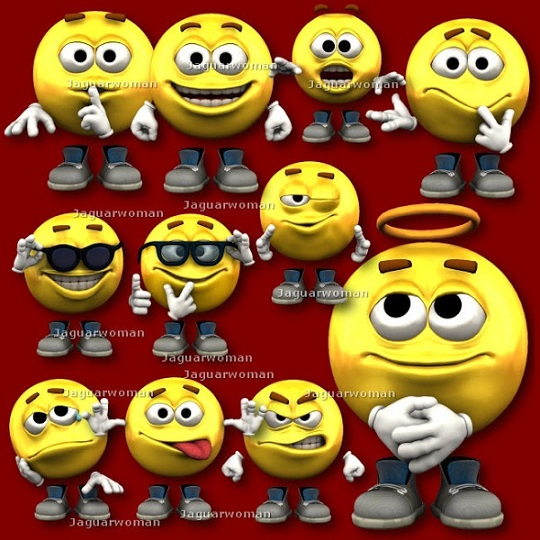
combined with these guys...........
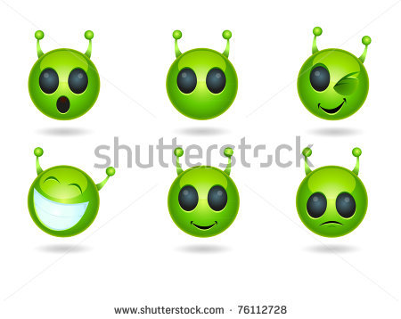
Since S.O had invested so much time on the 5.3, it stands to reason that the emoticons, which are used extensively by the members, are given a total revamp. You and loam seem to be on the right path.
My thinking is of a "pixar" type 3D animated series of emoticons with little feet and hands, but with a distinct ATS slant (maybe a grey alien guy) along these lines.......

combined with these guys...........

edit on 1-9-2013 by Sublimecraft because: (no reason given)
Here's another pool I made using more of the modern touch:
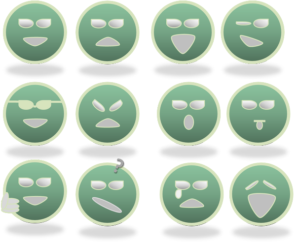
Is this a better direction?

Is this a better direction?
edit on 1-9-2013 by loam because: (no reason given)
reply to post by loam
From the other thread
From the other thread
Originally posted by Blue_Jay33
reply to post by bigfatfurrytexan
I like yours way better, very good job.
Way better than the new ATS ones.
I realize these are super-sized but if they were bigger than standard like the size of dime and maybe light blue instead of green that would be even better IMO.
Originally posted by loam
reply to post by Sublimecraft
They can be animated, but before doing that work, I'd like to understand if SO will permit animated gifs.
Here's another size test:
See this is the size that is good for me.
Loam should finalize about a dozen and get skeptic to put them to a vote at ATS yours verses those new horrid ones, pretty sure yours would win. You have my vote. Again something so simple yet it makes a difference.
reply to post by loam
Those are pretty awesome smileys. I would love to see them used here. The color is awesome too.
Did you UL images of those to ATS, or is it code (which you could share with those who might want to use them)?
And what about size?
ETA: I like the original concept better (with the dark mouths and eyes, etc) than the modern version (which I guess is more similar to the new ATS).
edit on 1-9-2013 by Liquesence because: (no reason given)
loam
Here's another pool I made using more of the modern touch:
Is this a better direction?edit on 1-9-2013 by loam because: (no reason given)
Can you try a transparent version of those, using the lt. green as the circle and eyes, (to match the reply buttons, etc.), but make the circles hollow?
They are still a bit too "kiddie", or in my own words, "cartoonish".
I think if you stick with the circle, you'll come up with something interesting.....
edit on 9/1/13 by Druid42 because: spelling
reply to post by Druid42
I was curious about your no-fill suggestion. Here's what that set would look like:
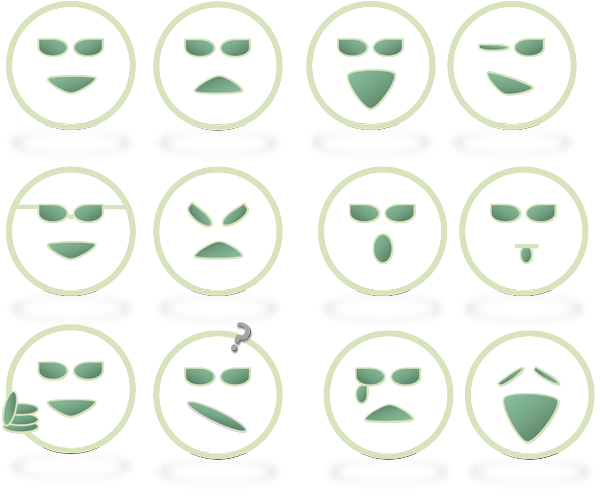
Really easy to do... only took a few minutes...
Like I said, any color works.
I was curious about your no-fill suggestion. Here's what that set would look like:

Really easy to do... only took a few minutes...
Like I said, any color works.
edit on 1-9-2013 by loam because: (no reason given)
reply to post by loam
So this is a nice set. I like the clear.
If the sunglasses were a grey (that was like the washed out black of the color scheme), they would be more noticable. Same with the tongue....if it were pinkish (wash out red) it would be more noticable.
I think we go with this, and expand a little.
We can't have animations. But we can still create a few others (thumbs down, for example, or a red faced angry one using wash out red)
reply to post by bigfatfurrytexan
Ok. Let me work on those and we'll see how they come out.
I'm headed out now, but should have something to look at later to see if we like this direction.
Ok. Let me work on those and we'll see how they come out.
I'm headed out now, but should have something to look at later to see if we like this direction.
reply to post by loam
I sure do. and it seems to have popular support. and, and....anything would beat what is in place now.
Have fun, im about to do the same.
Something to consider: it seems that 32X32 is the size. I think we should aim designs to have the right impact at that size, so as to make it easier for SO to integrate into the site.
edit on 1-9-2013 by bigfatfurrytexan because: (no reason given)
I really appreciate the member effort on new smilies. It's something for which I simply don't have the time.
But please, before you go making a slew of smilies, run them past me first. There are a few considerations that must be taken into account:
1) two colors/versions for each UI option (dark/light)
2) high contrast and able to scale down to 32x32 pixels (or smaller) and still be immediately discernible as to which emoticon it represents
3) Match existing colors in use on the site in either the current smilies, or UI
4) Mostly flat in design -- limited shading, and now shadows
5) all the same physical box size... they can all be rectangular or square, but should all be the same aspect ratio
Thank you!
Here's one I experimented with last week, and represents the likely final size:

It's based on a Photoshop smilies template I purchased and can provide to anyone who asks.
But please, before you go making a slew of smilies, run them past me first. There are a few considerations that must be taken into account:
1) two colors/versions for each UI option (dark/light)
2) high contrast and able to scale down to 32x32 pixels (or smaller) and still be immediately discernible as to which emoticon it represents
3) Match existing colors in use on the site in either the current smilies, or UI
4) Mostly flat in design -- limited shading, and now shadows
5) all the same physical box size... they can all be rectangular or square, but should all be the same aspect ratio
Thank you!
Here's one I experimented with last week, and represents the likely final size:

It's based on a Photoshop smilies template I purchased and can provide to anyone who asks.
edit on 1-9-2013 by SkepticOverlord because: (no
reason given)
edit on 1-9-2013 by SkepticOverlord because: (no reason given)
new topics
-
This is an interesting picture. Do we actually pick our leaders?
Politicians & People: 55 minutes ago -
U.S. Govt Agencies That Protect Criminals in Government - National Archives Records Admin-NARA.
Political Conspiracies: 2 hours ago -
Trump says ownership of Greenland 'is an absolute necessity'
Other Current Events: 4 hours ago -
An Updated China Navy Analysis and the Challenges of their AI/Drone Development
Military Projects: 5 hours ago -
University looking for gender diverse kids to play with transgender dolls for research
Social Issues and Civil Unrest: 5 hours ago -
FAA Investigates Christmas Drone Show Gone Wrong in Orlando, FL 12/2024
Other Current Events: 5 hours ago -
Mass Extinctions May Hold the Key to Life in the Universe
Education and Media: 10 hours ago
top topics
-
University looking for gender diverse kids to play with transgender dolls for research
Social Issues and Civil Unrest: 5 hours ago, 9 flags -
RIP Merrily Harpur British Big Cat Realist
Cryptozoology: 14 hours ago, 7 flags -
Trump says ownership of Greenland 'is an absolute necessity'
Other Current Events: 4 hours ago, 6 flags -
U.S. Govt Agencies That Protect Criminals in Government - National Archives Records Admin-NARA.
Political Conspiracies: 2 hours ago, 5 flags -
This is an interesting picture. Do we actually pick our leaders?
Politicians & People: 55 minutes ago, 5 flags -
Can we be certain that Jesus Christ was born on December 25th?
Religion, Faith, And Theology: 12 hours ago, 4 flags -
Mass Extinctions May Hold the Key to Life in the Universe
Education and Media: 10 hours ago, 4 flags -
FAA Investigates Christmas Drone Show Gone Wrong in Orlando, FL 12/2024
Other Current Events: 5 hours ago, 4 flags -
An Updated China Navy Analysis and the Challenges of their AI/Drone Development
Military Projects: 5 hours ago, 3 flags
active topics
-
President-elect TRUMP Picks MATT GAETZ for his ATTORNEY GENERAL - High Level PANIC Ensues.
2024 Elections • 133 • : WeMustCare -
Spiritual Solstice
Short Stories • 15 • : argentus -
U.S. Govt Agencies That Protect Criminals in Government - National Archives Records Admin-NARA.
Political Conspiracies • 3 • : xuenchen -
The Effects of Electric Fields and Plasma on Plant Growth
Science & Technology • 9 • : bscotti -
RIP Merrily Harpur British Big Cat Realist
Cryptozoology • 3 • : bscotti -
Trump says ownership of Greenland 'is an absolute necessity'
Other Current Events • 7 • : xuenchen -
Australian mercenary caught and crying as he is a prisoner of war.
Other Current Events • 38 • : annonentity -
University looking for gender diverse kids to play with transgender dolls for research
Social Issues and Civil Unrest • 20 • : xuenchen -
Smartest Man in the World Tells His Theory About What Happens At Death
Philosophy and Metaphysics • 53 • : ToneD -
This is an interesting picture. Do we actually pick our leaders?
Politicians & People • 0 • : berbofthegreen
