It looks like you're using an Ad Blocker.
Please white-list or disable AboveTopSecret.com in your ad-blocking tool.
Thank you.
Some features of ATS will be disabled while you continue to use an ad-blocker.
share:
you have a choice red pill or blue pill
MCcain can't and won't help the middle class (which basically is supporting the whole of society)......ooo even though he is not like bush he is not for the little guys he is for "only" the men that make more then the numbers on ur social security card
Obama as a liberal has to be the opposition force that questions why a certain rigid white collar / conservative/ narrow view must be the only view!
although new to this game he wants to fix this
...the United states has lost numerous opportunities to help her own by not acknowledging the following as potentials for prez : Gore, Lieberman, Kerry, Edwards and Dean
what f with my head more is the ones that can help the country in the most civilized of ways are the ones that are getting f'd this way
the faux article get me on my last nerves and ya know what i could care less form where he came from but i do care in that he cares for the american public
reply to post by CaptGizmo
When is the race card used?
When someone says "he's trying to get back to his black roots" in a negative context.
When someone says something racially motivated.
I believe it speaks for its self. You generalize way too much to support your claim. your own generalizations debuff your argument.
Nobody says "your'e racist if you dont support obama" but people do say "you're racist if you dont support obama because of his skin color or his ties to the muslim world"
which SO many members here have made it abundantly clear that those are parts of the reasons they dont support obama.
A guy in this thread did it on this very page where he talks about "Obama did id to get back to his black roots" as if it were some bad thing for Barack to do.
Originally posted by Andrew E. Wiggin
No i dont have a better theory on what you say
because its not a photoshopped document, i believe this has been proven in, not only this thread, but one or two others as well (?)
Andy, pay attention! The document IS 100% most certainly Photoshopped. That's how they blacked out the Cert. No.
And there is still debate as to whether the area where the name is printed was photoshopped or not. Nobody has ever suggested that that have PROVEN it could not have been photoshopped.
but you can also make the cast that "i have nothing to hide, so screw you, ill make you get the warrant, and prove you to be an idiot when its all said and done with'
me? I prefer the latter.
If I was running for POTUS and blah, blah, blahing about "Hope" and "Change" and being a different kind of politician, etc., I would take out a full page ad in the NY Times and show my original BC there as soon as possible.
Do you really think it's ok for somebody who is running for POTUS to intentionally withhold information that the public desires to see just for political gain?
If he looks like he's making this into a political "in your face" moment it's going to turn even more people off.
[edit on 16-6-2008 by jamie83]
reply to post by Andrew E. Wiggin
Actually He did not say Obama was trying to get back to his black roots. Thats the way you chose to interpret it. He said Obamas wifes thesis about how blacks needed to get back to their roots.He did not write the thesis; Obamas wife did. I am playing the devils advocate here and not taking any side in this particular argument. I just get frustrated when I here time and time again whether it is here or out and about people who support Obama calling anyone who questions his background or decisions a racist.If you have not experienced this then you are lucky.I have experienced this myself in questioning his lie about his CFR membership.If we are not to question a candidate for presidents background regardless of his race or religion then we might as well just give up all our rights now.
Actually He did not say Obama was trying to get back to his black roots. Thats the way you chose to interpret it. He said Obamas wifes thesis about how blacks needed to get back to their roots.He did not write the thesis; Obamas wife did. I am playing the devils advocate here and not taking any side in this particular argument. I just get frustrated when I here time and time again whether it is here or out and about people who support Obama calling anyone who questions his background or decisions a racist.If you have not experienced this then you are lucky.I have experienced this myself in questioning his lie about his CFR membership.If we are not to question a candidate for presidents background regardless of his race or religion then we might as well just give up all our rights now.
Originally posted by jetxnet
It isn't even the same font as the standard 1960s issue cert from Hawaii as we learned earlier. Another strike.
So, to me, it is obvious the digitial cert image is a fake.
[edit on 16-6-2008 by jetxnet]
Somewhere along the way, I lost my ORIGINAL birth certificate. I had the state re-issue me another. It looks a lot different than the original did.
Is anyone claiming that this is the exact piece of paper issued in 1961? Maybe I missed it, but I haven't seen that claim. I'm assuming that the Jun 6 2007 that is in reverse is an issue date stamp for this document.

If you look close, on the bottom left it even says (Rev. 11/01). Something tells me an original 1961 birth certificate couldn't have been revised in November 2001.

I guess that strike was really a ball.
***EDIT - Added Photobucket links***
[edit on 16-6-2008 by BRQuick]
[edit on 16-6-2008 by BRQuick]
Originally posted by HaTaX
reply to post by jamie83
Exactly, the difference in contrast creates more visible artifacting between blocks that are next to each other.
Hopefully those images show what I'm talking about easily. You can click on them to see the full view.
Great examples! Thanks!!!!
Would this same effect be seen in the scanning process base on the quality of the scan?
Am I correct that if the scan was a high resolution and the saved jpg a lower resolution, would distortion be more likely in a layer that WAS photoshopped?
Or would the distortion be the same whether the text was dropped in or not??
Originally posted by BRQuick
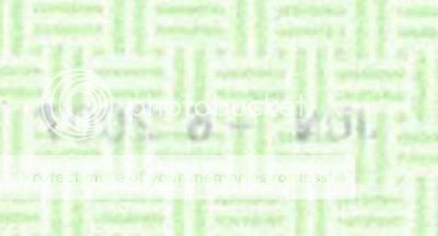
Why do you keep mirroring the 2007 date stamp? On the original, it's reversed. It must be showing through from the other side. That would explain the difference in appearance from the other text.
Sorry, I flipped it to read it when I first saw it and saved it flipped.
That said, I don't think the image processing software doesn't care which side of the paper the ink was on, nor does the scanner.
Here's the original:
[edit on 16-6-2008 by jamie83]
Originally posted by coven
Calling me names sir, will get you no where, but a guarantee of seeing my lovely avatar on a daily basis.
Nice post!
I'm not sure if you're referring to me or not, but I don't think I called you any names. If I did, please accept my apology.
Originally posted by BlueTriangle
Frankly, I'm shocked that a fellow ATS poster would intentionally misrepresent the evidence in order to prove his case. The act of clipping out what is obviously a stamp on the back of the form, flipping the image, and presenting it in comparison to text from the front of the BC is a deliberate falsifaction.
I think you might have misunderstood. I was trying to show the difference in pixelation between the two areas of the certificate, and I never meant to mislead people into thinking that the date stamp was originally on the front or not.
In fact, I'm not convinced the date stamp was on the back. I had flipped the image to be able to make out the date and saved it that way.
And I'm not sure that it matters whether the ink was on the front or back of the CoB anyway. The scanner is simply digitizing the colors it sees -it can't tell whether the color is coming from the front or the back anyway. Therefore, I'm not sure that it would make a difference in terms of artifacts whether or not the ink was on the front or the back.
Sorry for the confusion. I wasn't trying to intentionally mislead anybody.
Originally posted by Andrew E. Wiggin
reply to post by CaptGizmo
When is the race card used?
When someone says "he's trying to get back to his black roots" in a negative context.
I wasn't doing anything in a negative context. I was paraphrasing what Obama wrote in his own book.
[edit on 16-6-2008 by jamie83]
Originally posted by BRQuick
If you look close, on the bottom left it even says (Rev. 11/01). Something tells me an original 1961 birth certificate couldn't have been revised in November 2001.
I guess that strike was really a ball.
[edit on 16-6-2008 by BRQuick]
FYI... if you use photobucket to upload your photos, you can put an img tag in the post to embed the images. This is how it would look, except use [ brackets instead of curly:
You mean the great Chicago Community Organizer may have lost his and had to request another? Possible. Doe the Hospital in Hawaii do a Photoshop job
on a scanned cert. and then send to Obama? Not likely.
Would all the text and granularity be uniform if the image was one layer? Yes.
Is the Obama CoB image uniform with regard to granularity or does it include a pixilization affect where there would be swappable text? Yes, it does.
Has Obama made is CoB public? No. Has he made it public with a digital image on his website? Yes.
Here's what makes me think Obama has something to hide on his BC. He's posting on his "fight the smears" site misinformation about his BC.
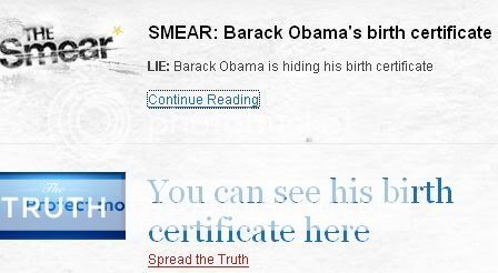
No, it is NOT the TRUTH that "You can see his birth certificate here." What this has done is create the impression that he's released his BC when in fact he hasn't. He's released a certificate from 2007 and he's trying to pass it off as his birth certificate.
Maybe it's semantics, but it's still misleading.
It reminds me of the "1984"-ish, Orwellian double-speak. What he calls the "Lie: Barack Obama is hiding his birth certificate" is actually the truth.
What he calls the "Truth: You can see his birth certificate here" is an outright lie.
This May Be Evidence of Photoshopping
There have been arguments put forth that the distortion was caused by the scanner or editing software. The theory was that the pixelation was the result of the software not being able to accurately represent areas of high contrast precisely.
But look at this image that shows both the letter "C" in the "Child's Name" and the left border.
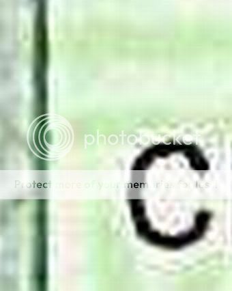
There is barely a trace of distortion along the black border which abuts the same white background that the black letters abut. In fact, the black letters show distortion when they are adjacent to the green background as well as the white background.
Now look at the upper portion of the black border where the green pattern meets the border. There is ZERO trace of the "halo" effect that's seen where the letters abut the green background.
Here is an example of the "halo" effect:
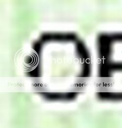
Now here is the question: How can the black line on the left border, which abuts both the white and the green backgrounds, produce almost no distortion, pixelation, or halo effect while the letters do?
I think this shows the strongest evidence that the letters were placed on the image in the editing software and were NOT part of the original scan.
There have been arguments put forth that the distortion was caused by the scanner or editing software. The theory was that the pixelation was the result of the software not being able to accurately represent areas of high contrast precisely.
But look at this image that shows both the letter "C" in the "Child's Name" and the left border.

There is barely a trace of distortion along the black border which abuts the same white background that the black letters abut. In fact, the black letters show distortion when they are adjacent to the green background as well as the white background.
Now look at the upper portion of the black border where the green pattern meets the border. There is ZERO trace of the "halo" effect that's seen where the letters abut the green background.
Here is an example of the "halo" effect:

Now here is the question: How can the black line on the left border, which abuts both the white and the green backgrounds, produce almost no distortion, pixelation, or halo effect while the letters do?
I think this shows the strongest evidence that the letters were placed on the image in the editing software and were NOT part of the original scan.
I imagine that the original scanned document was scanned at a high resolution and then scaled down so it was easily viewable on the web.
So, I present to you a PERFECT example. It's a document that was scanned at a high resolution. Straight off the scanner.
Here's a link to the original scan. It's a PNG, and it's BIG. 8.3 MB. I'm guessing the first scan of BHO's birth certificate was something around this size.
Now, I resized it for viewing on the web. This one is a JPG and only 75KB.
You can download and view them if you like, or you can just have a look at the difference here.


The same section, zoomed in. The first, a PNG at high resolution. The second, the JPG resized. Note the JPG artifacts, just like the ones on the BHO birth certificate. And it's all just from resizing and not "photoshopping" anything.
***EDIT - Thanks jamie83 for the Photobucket tip***
[edit on 16-6-2008 by BRQuick]
So, I present to you a PERFECT example. It's a document that was scanned at a high resolution. Straight off the scanner.
Here's a link to the original scan. It's a PNG, and it's BIG. 8.3 MB. I'm guessing the first scan of BHO's birth certificate was something around this size.
Now, I resized it for viewing on the web. This one is a JPG and only 75KB.
You can download and view them if you like, or you can just have a look at the difference here.


The same section, zoomed in. The first, a PNG at high resolution. The second, the JPG resized. Note the JPG artifacts, just like the ones on the BHO birth certificate. And it's all just from resizing and not "photoshopping" anything.
***EDIT - Thanks jamie83 for the Photobucket tip***
[edit on 16-6-2008 by BRQuick]
reply to post by jamie83
You are just another bitter Hillary supporter! Frankly I don't care if Obama was born in Mars I would still vote for him because I think he's the best candidate for president.
You are just another bitter Hillary supporter! Frankly I don't care if Obama was born in Mars I would still vote for him because I think he's the best candidate for president.
Originally posted by jetxnet
Would all the text and granularity be uniform if the image was one layer? Yes.
??? Have you zoomed in on the document and looked? It is all the same except for the reversed date stamp from the other side of the paper. And that's only because the text wasn't dark enough to affect it in the same way as EVERY other printed part on the document. Even the white text at the top shows jpg artifacts.
Originally posted by BRQuick
The same section, zoomed in. The first, a PNG at high resolution. The second, the JPG resized. Note the JPG artifacts, just like the ones on the BHO birth certificate. And it's all just from resizing and not "photoshopping" anything.
***EDIT - Thanks jamie83 for the Photobucket tip***
[edit on 16-6-2008 by BRQuick]
Great example!!
I think it's really interesting how the letters right above the "Z" in hazardous completely were obliterated in the resizing process.
So now we KNOW that resizing alone can cause the pixelation.
But can this explain the variations in the BO certificate, especially the example I just posted about re the left border having no pixelation.
Great work!!!
Originally posted by jamie83
Originally posted by BRQuick
The same section, zoomed in. The first, a PNG at high resolution. The second, the JPG resized. Note the JPG artifacts, just like the ones on the BHO birth certificate. And it's all just from resizing and not "photoshopping" anything.
***EDIT - Thanks jamie83 for the Photobucket tip***
[edit on 16-6-2008 by BRQuick]
Great example!!
I think it's really interesting how the letters right above the "Z" in hazardous completely were obliterated in the resizing process.
So now we KNOW that resizing alone can cause the pixelation.
But can this explain the variations in the BO certificate, especially the example I just posted about re the left border having no pixelation.
Great work!!!
I think it can.
Example. Note the bottom left corner from the resized copy of the document I scanned. The straight lines have little or no jpg artifacts, while the slanted portion and curved letters have a lot.
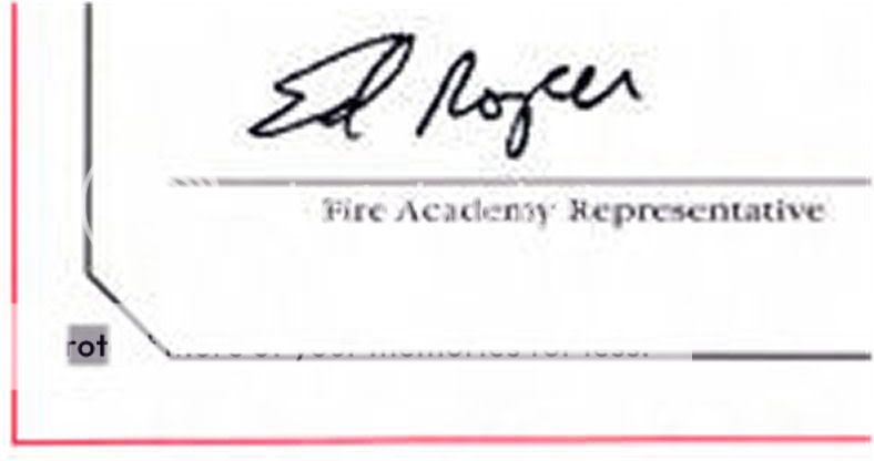
Sorry about it being a white document. If you can't tell for sure on this one, I'll try to find another with some color to it. But, I think the artifacts are fairly evident.
Originally posted by BRQuick
Example. Note the bottom left corner from the resized copy of the document I scanned. The straight lines have little or no jpg artifacts, while the slanted portion and curved letters have a lot.
Sorry about it being a white document. If you can't tell for sure on this one, I'll try to find another with some color to it. But, I think the artifacts are fairly evident.
Great examples!
How about the "halo" effect around the letters? Is that from re-sizing too or was that caused by something else???
No need to do another document. This one works well! And you're right about the curvature of the letters vs. the border. I just noticed that the left side of the "B"s in the Obama document have little distortion compared to the curved letters.
This would also explain why the other scanned documents I posted in the OP didn't show any artifacts -they weren't resized.
WAIT! OMG! I think I noticed something else!!!
Isn't that Obama at the bottom of the pile in your avatar???
[edit on 16-6-2008 by jamie83]
new topics
-
Anybody else using Pomodoro time management technique?
General Chit Chat: 1 hours ago -
Bucks County commissioners vote to count illegal ballots in Pennsylvania recount
2024 Elections: 3 hours ago -
Trump sues media outlets -- 10 Billion Dollar lawsuit
US Political Madness: 4 hours ago -
Fired fema employee speaks.
US Political Madness: 5 hours ago -
How long till it starts
US Political Madness: 6 hours ago -
USSS Agent Fired for Having Sex In Michelle Obama's Bathroom
Politicians & People: 8 hours ago -
Watching TV
Jokes, Puns, & Pranks: 10 hours ago
top topics
-
Trump sues media outlets -- 10 Billion Dollar lawsuit
US Political Madness: 4 hours ago, 20 flags -
Bucks County commissioners vote to count illegal ballots in Pennsylvania recount
2024 Elections: 3 hours ago, 15 flags -
How long till it starts
US Political Madness: 6 hours ago, 14 flags -
USSS Agent Fired for Having Sex In Michelle Obama's Bathroom
Politicians & People: 8 hours ago, 9 flags -
Fired fema employee speaks.
US Political Madness: 5 hours ago, 9 flags -
Watching TV
Jokes, Puns, & Pranks: 10 hours ago, 7 flags -
Anybody else using Pomodoro time management technique?
General Chit Chat: 1 hours ago, 1 flags
active topics
-
Trump sues media outlets -- 10 Billion Dollar lawsuit
US Political Madness • 23 • : Oldcarpy2 -
The Guardian quits Elon Musk's X social media platform
Mainstream News • 16 • : burntheships -
Turns out, they planned to go after P-nut.
US Political Madness • 38 • : Oldcarpy2 -
The Acronym Game .. Pt.4
General Chit Chat • 957 • : tinkerbell99 -
The Trump effect 6 days after 2024 election
2024 Elections • 126 • : burntheships -
Post A Funny (T&C Friendly) Pic Part IV: The LOL awakens!
General Chit Chat • 7775 • : underpass61 -
WATCH LIVE: US Congress hearing on UFOs, unidentified anomalous phenomena
Aliens and UFOs • 77 • : putnam6 -
Breaking: FBI Agents Raid Polymarket CEO After Betting Site Predicts Trump Win
General Conspiracies • 24 • : burntheships -
Bucks County commissioners vote to count illegal ballots in Pennsylvania recount
2024 Elections • 10 • : xuenchen -
Sick sick sick ---graphic story
Social Issues and Civil Unrest • 44 • : Oldcarpy2
