It looks like you're using an Ad Blocker.
Please white-list or disable AboveTopSecret.com in your ad-blocking tool.
Thank you.
Some features of ATS will be disabled while you continue to use an ad-blocker.
share:
Geee....guess what?
A Whitehouse......with a white flag has been used before Obama became president.
Look up "The Progress Report On The Global War On Terrorism" from 2003, and look at the cover of the report.
Guess what you'll see?
This:
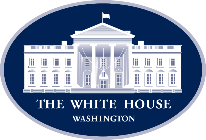
So...sorry, if you're going to start making wild claims about presidents changing the flag over the white house on the logo, better go back and look at George W. Bush first.
The OP is about as sinister as Michelle Obama changing the color of napkins at the White House.
The new logo for the White House is a silhouette of the original logo, look at it closely.
Sitting presidents make changes. Next one might change it again. They can do that.
A Whitehouse......with a white flag has been used before Obama became president.
Look up "The Progress Report On The Global War On Terrorism" from 2003, and look at the cover of the report.
Guess what you'll see?
This:

So...sorry, if you're going to start making wild claims about presidents changing the flag over the white house on the logo, better go back and look at George W. Bush first.
The OP is about as sinister as Michelle Obama changing the color of napkins at the White House.
The new logo for the White House is a silhouette of the original logo, look at it closely.
Sitting presidents make changes. Next one might change it again. They can do that.
originally posted by: neo96
a reply to: seagull
Showing disrespect to one this nations highest symbols.
Is a topic worthy of debate.
Rather easy to see why they make websites that don't work.
Then I know you will be bashing Bush for this web.archive.org...://www.whitehouse.gov/homeland/progress/progress_report_0903.pdf
Not that this should even be a thing.
edit on 27-6-2016 by MrSpad because: (no reason given)
edit on 27-6-2016 by MrSpad
because: (no reason given)
Line will not work just google Progress Report Global War on Terror 2003. That is your logo.
edit on 27-6-2016 by MrSpad because: (no reason
given)
originally posted by: MrSpad
originally posted by: neo96
a reply to: seagull
Showing disrespect to one this nations highest symbols.
Is a topic worthy of debate.
Rather easy to see why they make websites that don't work.
Then I know you will be bashing Bush for this www.whitehouse.gov..." target="_blank" class="postlink">White House Logo 2003
Not that this should even be a thing.
I am sure ATS was in 2003.
So it's Obama's fault is it?
Oh.....wait! What's this I see?

Hmm...looks the same. But....How can this be?
Wikipedia page
web.archive.org...://www.whitehouse.gov/homeland/progress/progress_report_0903.pdf
But how can this be! It's supposed to be Obama's fault, and show that he's a traitor!
Oh.....wait! What's this I see?

Hmm...looks the same. But....How can this be?
Description
Logo of the United States White House, especially in conjunction with offices like the Chief of Staff and Press Secretary.
Date 19 September 2003
Source Extracted from PDF version of a 2003 progress report (direct PDF URL www.whitehouse.gov...).
Author U.S. federal government
Permission
(Reusing this file)
Public domain from a copyright standpoint, but other restrictions apply
Wikipedia page
web.archive.org...://www.whitehouse.gov/homeland/progress/progress_report_0903.pdf
But how can this be! It's supposed to be Obama's fault, and show that he's a traitor!
edit on 6/27/2016 by Zaphod58 because: (no reason
given)
originally posted by: Konduit
Original WH logo.
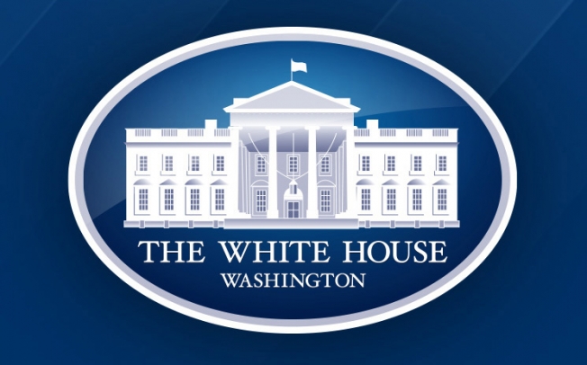
Obama's revision of the WH logo.
Why is the American flag missing/replaced?
I was thinking, other than a surrender flag, it looks like a blank flag, as in who's or what country will the U.S. become, once the agenda is complete.
iTruthSeeker
edit on 27-6-2016 by iTruthSeeker because: (no reason given)
originally posted by: Metallicus
a reply to: xuenchen
How did a man that actually hates our country get elected? Oh, that's right he had a 'D' next to his name.
And it's historic: first African-American and first Anti-American!
This kind of thing right here and not the ad blockers and attackers are why ATS is dying. IMO
a reply to: xuenchen
I believe it means that the United States has surrendered to the NWO.
Our traitors, in our bought and paid for Congress have sold us out to the globalist, Frankly I am not surprised the White House isn't flying the UN flag.
In my 57 years I have never seen so much hatred towards our Nation from our politicians in Washington. The fact is the hatred I am witnessing is against the Constitution. It is the laws of our land that represents our freedoms. I have watched in disbelief for three decades of our law makers in Washington spit on the constitution, by passing all kinds of amendments against the Constitution.
We are supposed to be a Republic Nation, however that has already been destroyed by another system that is not working, a system called capitalism where only a handful of people seems to run the world.
The fact is, the system we are living in the United States is not for The People, or By The People any longer.
The cartoon style logo show a flag flying on the White House, but it's a white flag.
Older logos had the American Flag in red-white & blue.
What gives ?
I believe it means that the United States has surrendered to the NWO.
Our traitors, in our bought and paid for Congress have sold us out to the globalist, Frankly I am not surprised the White House isn't flying the UN flag.
In my 57 years I have never seen so much hatred towards our Nation from our politicians in Washington. The fact is the hatred I am witnessing is against the Constitution. It is the laws of our land that represents our freedoms. I have watched in disbelief for three decades of our law makers in Washington spit on the constitution, by passing all kinds of amendments against the Constitution.
We are supposed to be a Republic Nation, however that has already been destroyed by another system that is not working, a system called capitalism where only a handful of people seems to run the world.
The fact is, the system we are living in the United States is not for The People, or By The People any longer.
edit on 27-6-2016 by Informer1958 because: (no reason given)
Oh, and btw -
That's a logo. That's all it is.
Big deal.
Want to know what image is actually the important one? This one:
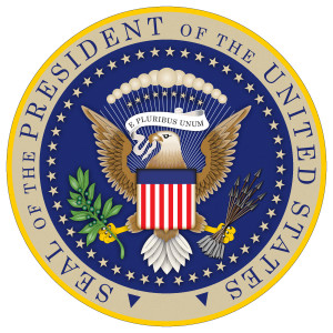
That's the actual SEAL of the office.
Which one is used for official use? The Seal.
Which one is nice deco? The logo.
Non-issue.
Or rather: let's look for something and try to make a mountain out of a mole hill issue.
That's a logo. That's all it is.
Big deal.
Want to know what image is actually the important one? This one:

That's the actual SEAL of the office.
Which one is used for official use? The Seal.
Which one is nice deco? The logo.
Non-issue.
Or rather: let's look for something and try to make a mountain out of a mole hill issue.
originally posted by: eriktheawful
So...sorry, if you're going to start making wild claims about presidents changing the flag over the white house on the logo, better go back and look at George W. Bush first.
Great. I already knew the Bushes and the Clintons have a criminal history together that cannot be separated. And I already knew the Clintons and Obama's family have a criminal history that cannot be separated.
They are all corrupt pieces of garbage who exploit positions of power...no matter if they are talked about separately or together.
If you meant your comment to remind people of anything more than/except the above, I missed it.
a reply to: eriktheawful
I thought it was a welcome break from bathrooms,guns,abortion,healthcare, and everything else.
Or rather: let's look for something and try to make a mountain out of a mole hill issue.
I thought it was a welcome break from bathrooms,guns,abortion,healthcare, and everything else.
originally posted by: theantediluvian
a reply to: xuenchen
Maybe they just wanted to "simplify" the logo.
We decided to clean it up and create two versions: a more streamlined version that kept the important details minus the triangle over the window, and a simplified version for digital use. We also optimized the kerning and tracking of the logotype
What's ironic is that the AdWeek article mentions an error where one of the window pediments (ffs people, things have names) is a triangle instead of a crescent shape (if you look, they alternate on the sides) which led some people to think that it was supposed to represent a pyramid and therefore a big wink wink to the Illuminati.
People are dumb. I don't know what else there's to be said.
I think it's called agenda, no matter how miniscule. Anyway the Hello Monday crowd, (originators) admitted mistakes in their start-up company yonks ago.
originally posted by: eriktheawful
Oh, and btw -
That's a logo. That's all it is.
Big deal.
Want to know what image is actually the important one? This one:
That's the actual SEAL of the office.
Which one is used for official use? The Seal.
Which one is nice deco? The logo.
Non-issue.
Or rather: let's look for something and try to make a mountain out of a mole hill issue.
I've seen the Great Seal debossed, rather than officially embossed, on meaningful documents. The embossed Great Seal is, indeed, important. It's a legal certification. A debossed great seal is fraudulent.
a reply to: MotherMayEye
A president changing a logo is about as sinister as changing the curtains in the White House: Non Issue.
Changing the official seal would be the big news item.
The seal of the white house is the actual symbol of office.
NOT the "logo" of the White House.
The seal itself has undergone changes over the history of the US too. Anyone can look it up and see all the different seals that the office has had in the past.
originally posted by: Metallicus
a reply to: xuenchen
How did a man that actually hates our country get elected? Oh, that's right he had a 'D' next to his name.
The Logo is from 2003 when Bush Jr was President so that would be an R next to his name.
new topics
-
Speaking of Pandemics
General Conspiracies: 55 minutes ago -
Stuck Farmer And His Queue Jumping Spawn
Rant: 1 hours ago -
Paradox of Progress
Ancient & Lost Civilizations: 9 hours ago -
Joe Biden gives the USA's Highest Civilian Honor Award to Hillary Clinton and George Soros.
US Political Madness: 11 hours ago
top topics
-
Joe Biden gives the USA's Highest Civilian Honor Award to Hillary Clinton and George Soros.
US Political Madness: 11 hours ago, 13 flags -
Winter Storm
Fragile Earth: 12 hours ago, 7 flags -
A great artist and storyteller, for kids of all ages
General Entertainment: 14 hours ago, 6 flags -
Paradox of Progress
Ancient & Lost Civilizations: 9 hours ago, 6 flags -
Biden Face Planted Somewhere
Politicians & People: 14 hours ago, 5 flags -
Stuck Farmer And His Queue Jumping Spawn
Rant: 1 hours ago, 1 flags -
Speaking of Pandemics
General Conspiracies: 55 minutes ago, 0 flags
active topics
-
The theory that COVID-19 originated in China takes a body blow.
Diseases and Pandemics • 57 • : Lazy88 -
FIEND SLASHED: Sara Sharif’s killer dad ‘has neck & face sliced open with jagged tuna tin lid
Mainstream News • 21 • : Asktheanimals -
Post A Funny (T&C Friendly) Pic Part IV: The LOL awakens!
General Chit Chat • 7989 • : Flyingclaydisk -
A great artist and storyteller, for kids of all ages
General Entertainment • 2 • : Asktheanimals -
Nigel Farage's New Year Message.
Politicians & People • 21 • : gortex -
Speaking of Pandemics
General Conspiracies • 2 • : Flyingclaydisk -
Stuck Farmer And His Queue Jumping Spawn
Rant • 0 • : TimBurr -
The Future of fashion .
Social Issues and Civil Unrest • 20 • : Flyingclaydisk -
NJ Drones tied to Tesla explosion at Trump Las vegas
General Conspiracies • 46 • : Flyingclaydisk -
Tesla Cybertruck Explodes in Front of Trump Hotel in Las Vegas
Mainstream News • 222 • : Flyingclaydisk

