It looks like you're using an Ad Blocker.
Please white-list or disable AboveTopSecret.com in your ad-blocking tool.
Thank you.
Some features of ATS will be disabled while you continue to use an ad-blocker.
share:
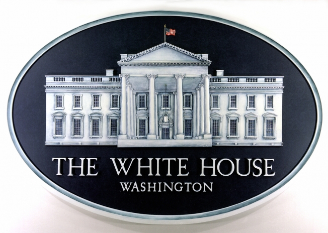
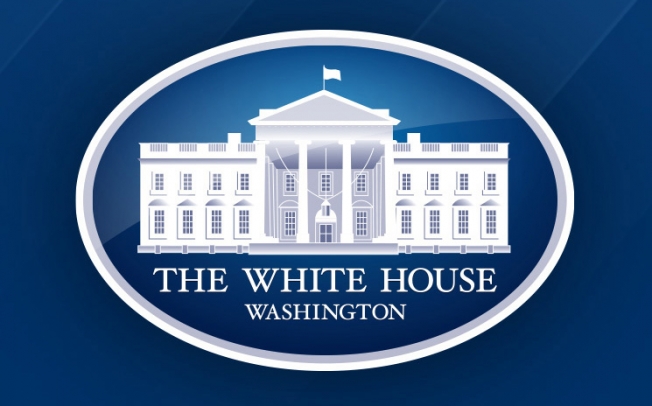
Something strange happened to the official White House logo a while back.
Seems it somehow lost its luster and color for the American Flag.
The cartoon style logo show a flag flying on the White House, but it's a white flag.
Older logos had the American Flag in red-white & blue.
What gives ?
Maybe they just wanted to "simplify" the logo.
Maybe there's an agenda in play ?
Some other oddities are in this logo as well.
Hmmm.
picture comparison:
Obama Admin Replaces U.S. Flag On White House Logo With White Surrender Flag…
other odds and ends:
Why Are There Errors in the White House Logo, and How Did They Get There?
The White House doesn't publicize changes to its brand identity. But something fishy has been going on with its logo over the past decade, according to a design agency that worked on refresh ideas for the famous mark several years ago.
The story starts in 2009, when New York-based digital design agency Hello Monday was invited to submit ideas for a redesign of the White House logo. Naturally, the agency, which had only recently opened its doors, was thrilled. It quickly dove into the history of the logo—and of the iconic north face of the White House more broadly, which the logo depicts.
You probably recognize the north face mostly from the back of the $20 bill (which used to show the south face, until the bill was redesigned in 1998): ............
Why fly the flag of a country you don't give a sh** about.
I see this as one more of Obama's little F.U.to America and it's people. Now, let's hear all the excuses his fans are going to come up with.
I see this as one more of Obama's little F.U.to America and it's people. Now, let's hear all the excuses his fans are going to come up with.
Original WH logo.

Obama's revision of the WH logo.

Why is the American flag missing/replaced?

Obama's revision of the WH logo.

Why is the American flag missing/replaced?
edit on 27-6-2016 by Konduit because: (no reason given)
a reply to: xuenchen
You think? Skeuomorphic design has been supplanted by flat, clean design without all the textures, gradients, shadows, etc. It's a ubiquitous trend, here are some examples: iOS, Windows 8 & 10, websites, mobile apps, etc. Also, it says so right in the AdWeek link:
What's ironic is that the AdWeek article mentions an error where one of the window pediments (ffs people, things have names) is a triangle instead of a crescent shape (if you look, they alternate on the sides) which led some people to think that it was supposed to represent a pyramid and therefore a big wink wink to the Illuminati.
People are dumb. I don't know what else there's to be said.
Maybe they just wanted to "simplify" the logo.
You think? Skeuomorphic design has been supplanted by flat, clean design without all the textures, gradients, shadows, etc. It's a ubiquitous trend, here are some examples: iOS, Windows 8 & 10, websites, mobile apps, etc. Also, it says so right in the AdWeek link:
We decided to clean it up and create two versions: a more streamlined version that kept the important details minus the triangle over the window, and a simplified version for digital use. We also optimized the kerning and tracking of the logotype
What's ironic is that the AdWeek article mentions an error where one of the window pediments (ffs people, things have names) is a triangle instead of a crescent shape (if you look, they alternate on the sides) which led some people to think that it was supposed to represent a pyramid and therefore a big wink wink to the Illuminati.
People are dumb. I don't know what else there's to be said.
edit on 2016-6-27 by theantediluvian because: (no reason given)
originally posted by: Metallicus
a reply to: xuenchen
How did a man that actually hates our country get elected? Oh, that's right he had a 'D' next to his name.
Also, anyone voting against him was, by default, a racist, a bigot and probably liked to kick cats and run over squirrels.
a reply to: DAVID64
Who needs excuses for whatever this is supposed to be? If there's any excuses to be made, it's by you for saying the that crap I just quoted.
Why fly the flag of a country you don't give a sh** about. I see this as one more of Obama's little F.U.to America and it's people. Now, let's hear all the excuses his fans are going to come up with.
Who needs excuses for whatever this is supposed to be? If there's any excuses to be made, it's by you for saying the that crap I just quoted.
a reply to: xuenchen
None of this should matter.
As Michelle Obama pointed out (in between vacations using Air Force One... and the second Air Force One when she wanted to see the sights in South America).... the White House was built by slaves..... so... you know.
(Know what? I have no idea.)
None of this should matter.
As Michelle Obama pointed out (in between vacations using Air Force One... and the second Air Force One when she wanted to see the sights in South America).... the White House was built by slaves..... so... you know.
(Know what? I have no idea.)
originally posted by: Konduit
Original WH logo.
Obama's revision of the WH logo.
Why is the American flag missing/replaced?
Why does the architecture above the bottom right-side windows not mirror those on the left side?
... as it does on the original image?
From left to right it should be arch-triangle-arch-triangle-arch-door-arch-triangle-arch-triangle-arch.
edit on 27-6-2016 by paradoxious because: (no reason given)
a reply to: eluryh22
But but but I thought there was a "silent majority" of Americans who have mostly "conservative" views?
Also:
Blah blah blah.
Also, anyone voting against him was, by default, a racist, a bigot and probably liked to kick cats and run over squirrels.
But but but I thought there was a "silent majority" of Americans who have mostly "conservative" views?
Also:
Blah blah blah.
Don't laugh its happening all over the world, more and more foreign born bastards running countries...we had Julia Gillard who was born in Wales and
then Tony Abbott who was born in London run the Country as Prime Ministers. Now we have this guy Mathias Cormann the Minister for Finance who was born
in Belgium for goodness sake and Mike Nahan from Yankland who is our minister for finance and Energy in my home state WA.
Its globalism and its bad.
Its globalism and its bad.
a reply to: theantediluvian
Great.
All in favor of flying a white flag on the White House say "I".
Let's take a survey and a poll !!!
Great.
All in favor of flying a white flag on the White House say "I".
Let's take a survey and a poll !!!
originally posted by: Metallicus
a reply to: xuenchen
How did a man that actually hates our country get elected? Oh, that's right he had a 'D' next to his name.
Because of the larger number of non-educated voters in this country. (and Romney).You know , the ones that cant state the 3 branches of the Federal Government . Much less what they are there for.And the test that a legal immigrant takes to become a citizen would be impossible. As I stated in another thread "good thing they were grandfathered in" if you know what I mean.
I think I have answered that one. On to the next.
Peace
edit on 6/27/16 by Gothmog because: (no reason given)
a reply to: paradoxious
That's a nod to the Reptilians clearly.
Or a half ass graphic artist lacking an eye for detail.
Why does the architecture above the bottom right-side windows not mirror those on the left side? From left to right it should be arch-triangle-arch-triangle-arch-door-arch-triangle-arch-triangle-arch.
That's a nod to the Reptilians clearly.
Or a half ass graphic artist lacking an eye for detail.
It never ceases to amaze me the stretches people will go to so that they can find a reason to complain about Obama.
An obviously simplified and less detailed logo with two primary colors where using the full colored flag would make no sense in the scheme of the design but hey it is now "Obama's revision of the WH logo" . Does anyone really doubt that is the White House and having any common sense questioning what flag that is on top? Do you have the same concern for military patches of the American flag that are not in color or does that not apply because its not Obama?
Literally Obama could walk out and say the "sky is blue" and people would be pointing to that as an indication that he killed all the dinosaurs and caused every Mandela Effect in the history of the world because he is a Sith lord.
"Conservative" cognitive dissonance illustrated perfectly:
Whine that anyone who you disagree with calls you names like "racist" and then call anyone who disagrees with you an "anti patriot."
Brilliant!
originally posted by: eluryh22Also, anyone voting against him was, by default, a racist, a bigot and probably liked to kick cats and run over squirrels.
originally posted by: onequestion
He's the anti patriot and he's our president.
Whine that anyone who you disagree with calls you names like "racist" and then call anyone who disagrees with you an "anti patriot."
Brilliant!
a reply to: opethPA
Get out of here with all that rational thought you anti-patriot!
An obviously simplified and less detailed logo with two primary colors where using the full colored flag would make no sense in the scheme of the design but hey it is now "Obama's revision of the WH logo"
Get out of here with all that rational thought you anti-patriot!
new topics
-
Speaking of Pandemics
General Conspiracies: 58 minutes ago -
Stuck Farmer And His Queue Jumping Spawn
Rant: 1 hours ago -
Paradox of Progress
Ancient & Lost Civilizations: 9 hours ago -
Joe Biden gives the USA's Highest Civilian Honor Award to Hillary Clinton and George Soros.
US Political Madness: 11 hours ago
top topics
-
Joe Biden gives the USA's Highest Civilian Honor Award to Hillary Clinton and George Soros.
US Political Madness: 11 hours ago, 13 flags -
Winter Storm
Fragile Earth: 12 hours ago, 7 flags -
A great artist and storyteller, for kids of all ages
General Entertainment: 14 hours ago, 6 flags -
Paradox of Progress
Ancient & Lost Civilizations: 9 hours ago, 6 flags -
Biden Face Planted Somewhere
Politicians & People: 14 hours ago, 5 flags -
Stuck Farmer And His Queue Jumping Spawn
Rant: 1 hours ago, 1 flags -
Speaking of Pandemics
General Conspiracies: 58 minutes ago, 0 flags
active topics
-
The theory that COVID-19 originated in China takes a body blow.
Diseases and Pandemics • 57 • : Lazy88 -
FIEND SLASHED: Sara Sharif’s killer dad ‘has neck & face sliced open with jagged tuna tin lid
Mainstream News • 21 • : Asktheanimals -
Post A Funny (T&C Friendly) Pic Part IV: The LOL awakens!
General Chit Chat • 7989 • : Flyingclaydisk -
A great artist and storyteller, for kids of all ages
General Entertainment • 2 • : Asktheanimals -
Nigel Farage's New Year Message.
Politicians & People • 21 • : gortex -
Speaking of Pandemics
General Conspiracies • 2 • : Flyingclaydisk -
Stuck Farmer And His Queue Jumping Spawn
Rant • 0 • : TimBurr -
The Future of fashion .
Social Issues and Civil Unrest • 20 • : Flyingclaydisk -
NJ Drones tied to Tesla explosion at Trump Las vegas
General Conspiracies • 46 • : Flyingclaydisk -
Tesla Cybertruck Explodes in Front of Trump Hotel in Las Vegas
Mainstream News • 222 • : Flyingclaydisk
