It looks like you're using an Ad Blocker.
Please white-list or disable AboveTopSecret.com in your ad-blocking tool.
Thank you.
Some features of ATS will be disabled while you continue to use an ad-blocker.
share:
a reply to: JohnthePhilistine
Well, for me it's just suited for my moods.
We are not defined by the way we look, but who we are and how we relate to others!
Your call, my friend!
Well, for me it's just suited for my moods.
We are not defined by the way we look, but who we are and how we relate to others!
Your call, my friend!
Being one who changes avatars often, I went through the same decision process when I originally strayed from my kangaroo.
Now no matter what I use there is always an element of my original avatar involved. Usually it's the whole "WTF?" theme that is carried from each avatar to the next. Whatever I use, I have to have that element of ME in it.
You can do the same thing with yours. BFFT's suggestion was a good one. You can keep your original and rework it, or you can go with something completely different but pick something from this avatar to carry through to your new one. Maybe the caterpillar sushi bug??
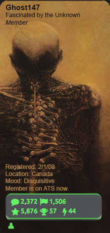
If you are determined to pic one from those which you just listed above... I like number 3. I don't know why. It just speaks to me the way the others do not.
Just remember that you don't have to leave all of this avatar behind to try out a new one.
I don't think the OP asking for opinions means that he isn't a grown up or that he needs acceptance from others to change his avatar. It's a discussion board. No discussions... no board.
Now no matter what I use there is always an element of my original avatar involved. Usually it's the whole "WTF?" theme that is carried from each avatar to the next. Whatever I use, I have to have that element of ME in it.
You can do the same thing with yours. BFFT's suggestion was a good one. You can keep your original and rework it, or you can go with something completely different but pick something from this avatar to carry through to your new one. Maybe the caterpillar sushi bug??
If you are determined to pic one from those which you just listed above... I like number 3. I don't know why. It just speaks to me the way the others do not.
Just remember that you don't have to leave all of this avatar behind to try out a new one.
originally posted by: JohnthePhilistine
originally posted by: mysterioustranger
a reply to: Ghost147
Why not? I change mine sometimes twice a week...depending on my mood!
YOU DO!!? And you do this without seeking the acceptance of others? My golly gosh, you must be a grown-up.
I don't think the OP asking for opinions means that he isn't a grown up or that he needs acceptance from others to change his avatar. It's a discussion board. No discussions... no board.
edit on 1/17/2016 by Kangaruex4Ewe because: (no reason given)
I agree with what Kangaruex said about #3...
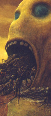
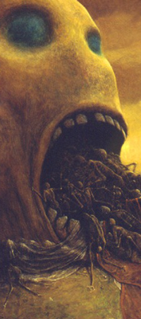


edit on 17-1-2016 by Murgatroid because: felt like it...
originally posted by: Layaly
a reply to: Ghost147
1) Which of the following images invokes the strongest reaction from you?
Only the current one
I love it actually the avatar and when you write in pink or red then it feels warm for some reason
Your topics are mostly religion and nature images from experience
The avatar goes strong with the religion touch (traditional.. not it goes with your point of view on that topic)
The bulb one would go with the strange mushrooms and crazy beautiful eyes threads (progressive)
Thank you for all your input, and to everyone else as well
It seems the original avatar holds the most votes.
I do like the suggestions made by everyone, so I may consider 'tweaking' the original image with a bit
Thanks for all your support everyone
I just keep rotating my avatars on a daily basis. Your avatar has kind of creeped me out for some time now ... its the face man. That said, I like
option 1.
originally posted by: Murgatroid
I agree with what Kangaruex said about #3...
Looks pretty interesting. Although I was thinking about changing it up a bit
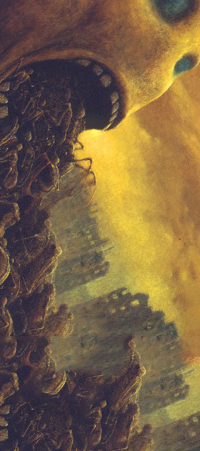
a reply to: Murgatroid
It looks a little faded and there is no contrast
If you make it sharper (I only noticed it is people going into the mouth when I put it on 100% sharpness)
Differt colour schemes it makes the eyes more blue and it highlights the face better
That size you can't blow it only as background image like yours so it still needs some background color not ?
Darn all this talk at least show us how it would look like

That looks real cool
It looks a little faded and there is no contrast
If you make it sharper (I only noticed it is people going into the mouth when I put it on 100% sharpness)
Differt colour schemes it makes the eyes more blue and it highlights the face better
That size you can't blow it only as background image like yours so it still needs some background color not ?
Darn all this talk at least show us how it would look like

That looks real cool
edit on 17-1-2016 by Layaly because: (no reason given)
a reply to: Ghost147
I like that idea...
A 90 degree flip usually looks odd but not so much in this case.
Also if one wanted to really take the time, the sky and the buildings could be selected, expanded and turned so that they appeared normal.
It would probably require someone with some skills using the content aware fill and healing tools in Photoshop.
I tried but my Photoshop skilz were just too lame...
edit on 17-1-2016 by Murgatroid because: felt like it...
originally posted by: Layaly
a reply to: Murgatroid
Darn all this talk at least show us how it would look like
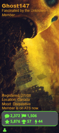
Here. touched it up a bit
edit on 17/1/16 by Ghost147 because: fixed quote
To put the others in perspective. These were my thoughts
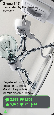

and the original next to them
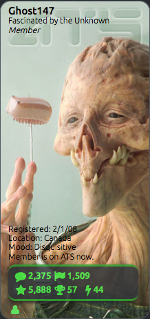


and the original next to them

edit on 17/1/16 by Ghost147 because: (no reason given)
originally posted by: Ghost147
originally posted by: Layaly
a reply to: Murgatroid
Darn all this talk at least show us how it would look like
Here. touched it up a bit
That looks really good actually. I like your original avatar, but if you decide to keep it make it full sized. I also liked #1. I am assuming you know how to full size the avatar but just in case here is a link to a helpful thread...
www.abovetopsecret.com...
a reply to: Ghost147
Don't forget the banner...
EDIT: maybe even combine the first and the last one below as a composite, (eyes looking over the city)?
With a little of that color adjust to match as well...

The two below are just stretched the hell out...


Don't forget the banner...
EDIT: maybe even combine the first and the last one below as a composite, (eyes looking over the city)?
With a little of that color adjust to match as well...

The two below are just stretched the hell out...


edit on 17-1-2016 by Murgatroid because: felt like it...
new topics
-
Holy Cow! Erm...Six Legged Turkey!!
World Sports: 1 hours ago -
Ben Habib has Left Reform UK
Regional Politics: 4 hours ago -
Turkey Day Rhyme…
Short Stories: 4 hours ago -
Can someone please translate Biden's speech?
US Political Madness: 5 hours ago -
NIH Chief Confesses COVID Initiatives Were "Completely Made Up " OMG Investigates
Health & Wellness: 6 hours ago -
Awesome Dip Recipe
Food and Cooking: 9 hours ago -
Vladimir Putin's speech at the meeting of the CSTO Collective Security Council
World War Three: 9 hours ago
top topics
-
Happy Thanksgiving to ATS
General Chit Chat: 17 hours ago, 9 flags -
NIH Chief Confesses COVID Initiatives Were "Completely Made Up " OMG Investigates
Health & Wellness: 6 hours ago, 9 flags -
Vladimir Putin's speech at the meeting of the CSTO Collective Security Council
World War Three: 9 hours ago, 7 flags -
Can someone please translate Biden's speech?
US Political Madness: 5 hours ago, 7 flags -
Traveling the world with no passport
Social Issues and Civil Unrest: 13 hours ago, 6 flags -
Awesome Dip Recipe
Food and Cooking: 9 hours ago, 5 flags -
Turkey Day Rhyme…
Short Stories: 4 hours ago, 5 flags -
Ben Habib has Left Reform UK
Regional Politics: 4 hours ago, 4 flags -
Holy Cow! Erm...Six Legged Turkey!!
World Sports: 1 hours ago, 1 flags
active topics
-
Turkey Day Rhyme…
Short Stories • 4 • : JJproductions -
Awesome Dip Recipe
Food and Cooking • 4 • : texas thinker -
Mood Music Part VI
Music • 3721 • : BrucellaOrchitis -
NIH Chief Confesses COVID Initiatives Were "Completely Made Up " OMG Investigates
Health & Wellness • 10 • : ColeYounger2 -
Vladimir Putin's speech at the meeting of the CSTO Collective Security Council
World War Three • 52 • : Dalamax -
Traveling the world with no passport
Social Issues and Civil Unrest • 7 • : Flyingclaydisk -
Holy Cow! Erm...Six Legged Turkey!!
World Sports • 0 • : Flyingclaydisk -
V.P. Kamala Harris releases a video and nobody understands why
US Political Madness • 80 • : xuenchen -
Interesting Video-UFO?
Aliens and UFOs • 20 • : BrucellaOrchitis -
Happy Thanksgiving to ATS
General Chit Chat • 13 • : gort69
