It looks like you're using an Ad Blocker.
Please white-list or disable AboveTopSecret.com in your ad-blocking tool.
Thank you.
Some features of ATS will be disabled while you continue to use an ad-blocker.
share:
So, it's been 8 years that I've forced all of you to stare at what some have called, 'that hideous monstrosity', and also 'that revolting
thing', and also 'is that a self portrait?', and also 'that fascinating creature', avatar.
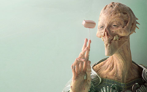
A long time ago I stumbled upon an extremely talented 3D artist (Greg Petchkovsky), and this one particular piece really stuck out and 'spoke' to me.
To me, it's a gorgeous representation of the feeling of fascination of the unknown. The creature within it seems as though they are in deep, deep thought on the little alien-caterpillar it has skewered, and is analyzing and evaluating every detail.
What makes it even more intense - for me - is how the creature itself is both incredibly beautiful and terribly ugly at the same time. It invokes a certain inability to really decide what to think of it.
Over the years I've received hundreds of comments regarding that avatar, with a spectrum from 'beautiful fascination' to 'appalling disgust'. It's important to note that although I've thoroughly enjoyed receiving all the attention for it, none of these comments effected how I feel about the avatar itself.
Nevertheless, it's been 8 years now, and I'm on the edge of a blade figuring out if I should continue to keep it, or move on to the next obscure avatar, with hopes of implementing a similar discomforting/fascinating/weird effect this one has had on all you fine folks.
I have Four options for you to choose from. However, before you do choose, I want you to take these three factors into consideration:
1) Which of the following images invokes the strongest reaction from you? (any reaction, be it Disquisitive, Fear, fascination, join, amusement, whatever)
2) Which of the following images do you find to be the most appealing, and why?
3) (this only applies if you're familiar with the topics I tend to create, and the responses I tend to give) Which of the following images do you feel best represents how you view my content within the forum?
________________________________________
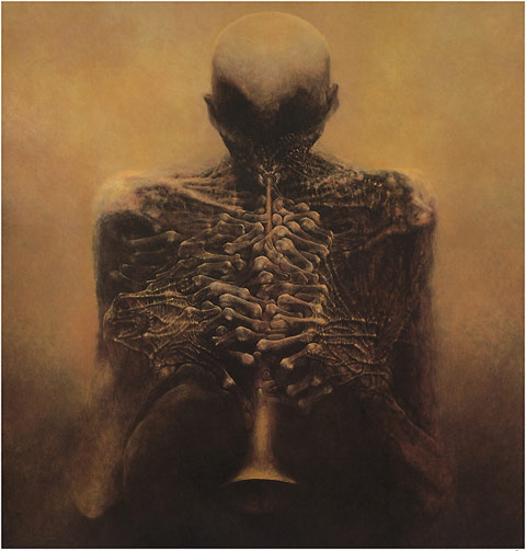
Option 1: A painting by polish artist Zdzisław Beksiński. I'm incredibly enthralled by his work, option 3 is also by him
________________________________________
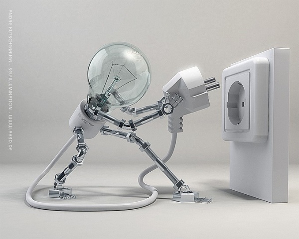
Option 2: I've had my eye on this 3d artist for a long time as well, his work is very inspiring.
________________________________________
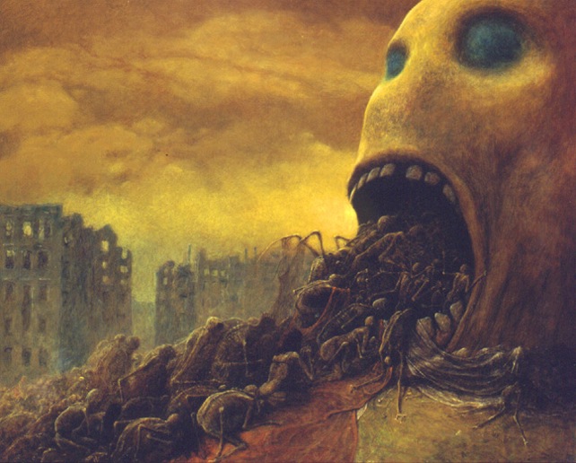
Option 3: A second painting by polish artist Zdzisław Beksiński.
________________________________________
Option 4: Lastly, should I simply keep my current Avatar by 3d artist Greg Petchkovsky?
Thanks for helping me come to this decision
A long time ago I stumbled upon an extremely talented 3D artist (Greg Petchkovsky), and this one particular piece really stuck out and 'spoke' to me.
To me, it's a gorgeous representation of the feeling of fascination of the unknown. The creature within it seems as though they are in deep, deep thought on the little alien-caterpillar it has skewered, and is analyzing and evaluating every detail.
What makes it even more intense - for me - is how the creature itself is both incredibly beautiful and terribly ugly at the same time. It invokes a certain inability to really decide what to think of it.
Over the years I've received hundreds of comments regarding that avatar, with a spectrum from 'beautiful fascination' to 'appalling disgust'. It's important to note that although I've thoroughly enjoyed receiving all the attention for it, none of these comments effected how I feel about the avatar itself.
Nevertheless, it's been 8 years now, and I'm on the edge of a blade figuring out if I should continue to keep it, or move on to the next obscure avatar, with hopes of implementing a similar discomforting/fascinating/weird effect this one has had on all you fine folks.
I have Four options for you to choose from. However, before you do choose, I want you to take these three factors into consideration:
1) Which of the following images invokes the strongest reaction from you? (any reaction, be it Disquisitive, Fear, fascination, join, amusement, whatever)
2) Which of the following images do you find to be the most appealing, and why?
3) (this only applies if you're familiar with the topics I tend to create, and the responses I tend to give) Which of the following images do you feel best represents how you view my content within the forum?
________________________________________
Option 1: A painting by polish artist Zdzisław Beksiński. I'm incredibly enthralled by his work, option 3 is also by him

________________________________________
Option 2: I've had my eye on this 3d artist for a long time as well, his work is very inspiring.

________________________________________
Option 3: A second painting by polish artist Zdzisław Beksiński.

________________________________________
Option 4: Lastly, should I simply keep my current Avatar by 3d artist Greg Petchkovsky?

Thanks for helping me come to this decision
Ghost, I would vote to NOT change your snarled non nostril alien with blimp in background avtar. You are him, he is you.
Don't change it buddy.... I've grown to love this alien...
Don't change it buddy.... I've grown to love this alien...
My vote goes to number 2.
I've enjoyed many of your posts, but have to admit the current avatar creeps me out--every single time.
I've enjoyed many of your posts, but have to admit the current avatar creeps me out--every single time.
a reply to: Ghost147
NOOOOOOOOO! Just no!
I love it!
IT (the avatar pic) is what makes YOU...YOU...
PLEASE don't change...
SOME of US...enjoy...you....
NOOOOOOOOO! Just no!
I love it!
The creature within it seems as though they are in deep, deep thought on the little alien-caterpillar it has skewered, and is analyzing and evaluating every detail
IT (the avatar pic) is what makes YOU...YOU...
PLEASE don't change...
SOME of US...enjoy...you....
a reply to: Ghost147
how about this:
You keep the alien in your avatar, but click my signature and let one of our artists make you an update on the theme?
The alien creature is simply outstanding artwork, and it seems most who wish to chime in, seem to like it. So if you want a change, lets do a change without changing the spirit?
a reply to: Ghost147
To be honest it really freaked me out when I started here .. Your username is so strong no one will mistake you for anyone else
But now I read the description of your avatar and it's actually really beautiful and meaningful
You can always change it back
Maybe change the avatar keep the signature deciding if it works for you
edit on 17-1-2016 by Layaly because: (no reason given)
I like the original. He's creepy without verging on disturbing. He's almost personable in a bizarre sort of way.
Options 1 and 3 are verging on disturbing. But I do like Option 2. Not sure if it's quite you though. You might try it on for a bit.
Options 1 and 3 are verging on disturbing. But I do like Option 2. Not sure if it's quite you though. You might try it on for a bit.
originally posted by: ketsuko
a reply to: intrepid
Look, it's China!
Actually it's inspired by an old Cree saying:
Only when the last tree has died
and the last river been poisoned
and the last fish been caught
will we realise we cannot eat money
www.unitedearth.com.au...
a reply to: Ghost147
The only thing is with the second and third one
Your avatar window will be I think smaller when you keep the full dimension
The first picture won't be as detailed as it is now enlarged either
Lol Ketsuko .. China is here
The only thing is with the second and third one
Your avatar window will be I think smaller when you keep the full dimension
The first picture won't be as detailed as it is now enlarged either
Lol Ketsuko .. China is here
edit on 17-1-2016 by Layaly because: Sp
edit on 17-1-2016 by Layaly because: (no reason given)
a reply to: Ghost147
Only the current one
I love it actually the avatar and when you write in pink or red then it feels warm for some reason
Your topics are mostly religion and nature images from experience
The avatar goes strong with the religion touch (traditional.. not it goes with your point of view on that topic)
The bulb one would go with the strange mushrooms and crazy beautiful eyes threads (progressive)
1) Which of the following images invokes the strongest reaction from you?
Only the current one
I love it actually the avatar and when you write in pink or red then it feels warm for some reason
Your topics are mostly religion and nature images from experience
The avatar goes strong with the religion touch (traditional.. not it goes with your point of view on that topic)
The bulb one would go with the strange mushrooms and crazy beautiful eyes threads (progressive)
edit on 17-1-2016 by Layaly because: (no reason given)
originally posted by: mysterioustranger
a reply to: Ghost147
Why not? I change mine sometimes twice a week...depending on my mood!
edit on 17-1-2016 by JohnthePhilistine because: Ugliness
new topics
-
To become president, Zelensky had to learn Ukrainian
Political Conspiracies: 6 minutes ago -
Green Grapes
General Chit Chat: 4 hours ago -
Those Great Fresh Pet Commercials
Television: 9 hours ago -
S.C. Jack Smith's Final Report Says Trump Leads a Major Conspiratorial Criminal Organization!.
Political Conspiracies: 11 hours ago
top topics
-
Joe meant what he said about Hunter's pardon....
US Political Madness: 13 hours ago, 11 flags -
S.C. Jack Smith's Final Report Says Trump Leads a Major Conspiratorial Criminal Organization!.
Political Conspiracies: 11 hours ago, 11 flags -
Advice for any young Adult .
General Chit Chat: 12 hours ago, 10 flags -
Green Grapes
General Chit Chat: 4 hours ago, 5 flags -
It’s Falling…
Philosophy and Metaphysics: 15 hours ago, 4 flags -
Regent Street in #London has been evacuated due to a “bomb threat.”
Other Current Events: 13 hours ago, 3 flags -
Those Great Fresh Pet Commercials
Television: 9 hours ago, 3 flags -
To become president, Zelensky had to learn Ukrainian
Political Conspiracies: 6 minutes ago, 0 flags
active topics
-
House Passes Laken Riley Act
Mainstream News • 22 • : KrustyKrab -
To become president, Zelensky had to learn Ukrainian
Political Conspiracies • 0 • : Imhere -
Los Angeles brush fires latest: 2 blazes threaten structures, prompt evacuations
Mainstream News • 107 • : Vermilion -
Russia Ukraine Update Thread - part 3
World War Three • 6904 • : Imhere -
Steering the Titantic from the Drydock.
Rant • 43 • : charlest2 -
What Comes After January 20th
Mainstream News • 33 • : underpass61 -
President Carter has passed
Mainstream News • 44 • : WeMustCare -
Those stupid GRAVITE commercials
Rant • 13 • : GENERAL EYES -
-@TH3WH17ERABB17- -Q- ---TIME TO SHOW THE WORLD--- -Part- --44--
Dissecting Disinformation • 3973 • : duncanagain -
Green Grapes
General Chit Chat • 1 • : nugget1

