It looks like you're using an Ad Blocker.
Please white-list or disable AboveTopSecret.com in your ad-blocking tool.
Thank you.
Some features of ATS will be disabled while you continue to use an ad-blocker.

Mandela Effect - Reality Being Edited Evidenced in Changing Logos
page: 3share:
a reply to: Pearj
Sure, why not?
I do like and appreciate your posts.
Our problem is that we both think we're right.
That's fine, but I don't see as much willingness to question your ideas that I (probably falsely) assume that I have. I could accept that however I don't see a willingness to question my ideas either.
Hitler's eyes is a good one however, I remember them being brown also.
But since we're BFF's now there is a question I would like to ask...
When did you change your name from Pearlj?
a reply to: Pearj
How is it unusual?
Yes but lets just restrict to logos just for this thread.
How is it unusual that people remember different logos?
Yes, it is real, if we are talking about it its real. on a conceptual level everything is real id its talked about.
What the effect is is whats debatable.
That said,
I have to go on record and say logos and designs change, the coke logos you posted.
The new one is one I have not seen but the old one is what I have on my coke bottle in the fridge I bought a few days ago.
I guess, Logos that slightly are different in different countries is proof of the Mandela effect to some.
So Mandela effect used to be different timelines, now newly added is if you are in different country and something is different with a product that is in Australia that is also sold in the States,
We can see some think its evidence of the so called Mandela effect.
What's unusual is tons of people have 'more than a passing memory' of the logo being different.
How is it unusual?
It's not restricted to logos..
Yes but lets just restrict to logos just for this thread.
How is it unusual that people remember different logos?
That said, I have to go on record stating the Mandela Effect is absolutely real, and words will never do justice to describe it..
Yes, it is real, if we are talking about it its real. on a conceptual level everything is real id its talked about.
What the effect is is whats debatable.
That said,
I have to go on record and say logos and designs change, the coke logos you posted.
The new one is one I have not seen but the old one is what I have on my coke bottle in the fridge I bought a few days ago.
I guess, Logos that slightly are different in different countries is proof of the Mandela effect to some.
So Mandela effect used to be different timelines, now newly added is if you are in different country and something is different with a product that is in Australia that is also sold in the States,
We can see some think its evidence of the so called Mandela effect.
originally posted by: Krahzeef_Ukhar
originally posted by: TombEscaper
Regardless of what anyone says, these logos ARE changing in these ways; but not changing in the sense that the logos are being updated by the companies, of course.
As long as you are keeping an open mind.
Why do you think some great intelligence is changing all this?
And why do you think some intelligence is not only skilled enough to change this but unskilled enough to get past you.
Perhaps this great intelligence has chosen you to be able to see all of this.
But then what advantage is there to seeing a reality which is completely irrelevant to our current timeline?
There has to be an intelligence behind it. Otherwise the changes would be chaotic and senseless. For instance, in the patterns of these logo changes. A's aren't changing to different letters to make incoherent words, or to non-existent characters. They're changing to Greek lambdas.
I don't see how anyone would have to be "chosen" to see this. Take the Samsung logo as an example.

I don't need to have any specific past recollections of studying the A and saying "that is a normal A" to know that it has now changed. If someone you have known your whole life has had a mustache and then one day you saw them clean shaven, the change would be obvious to you. You wouldn't have had to consciously tell yourself on a regular basis "he has a mustache" to recognize that it was gone.
Make sense?
originally posted by: stormcell
It's worth looking at the history of these logo's. The designers do revamp logos every few years. There's the history of the NASA "meatball" logo:
www.logodesignlove.com...
I have seen pictures change when you view them. That can be because visiting that webpage causes the server cache to be refreshed in the background and a new picture is loaded in. Some companies like Amazon do update prices and picture as you visit their site.
The problem is that these explanations don't apply when we're dealing with the "retroactive" nature of the changes. They are "changes" that never actually "changed."
a reply to: abago71
What is interesting is that as soon as I noticed the ^s in place of the A's, I signed up on the Dream Theater message board to ask fans what they recall. Most didn't even seem to understand the premise of what I was talking about, but others said they recalled the ^'s as opposed to regular A's - and that's precisely what I expected. Because that's the way this phenomenon works.
What is interesting is that as soon as I noticed the ^s in place of the A's, I signed up on the Dream Theater message board to ask fans what they recall. Most didn't even seem to understand the premise of what I was talking about, but others said they recalled the ^'s as opposed to regular A's - and that's precisely what I expected. Because that's the way this phenomenon works.
originally posted by: SlapMonkey
a reply to: TombEscaper
Let me break a few things down for you since I'm a graphic designer by trade (although I don't do logos much anymore):
- The "T" Phenomenon: Stop the freak-out! There are many, many fonts out there that exist with lower-case t's like that, but honestly, anyone with vector-editing software (in my case, Adobe Illustrator, InDesign, or even Photoshop) can make any "t" from any font family look like that. There are myriad reasons why, but a bit one is kerning (the space between two given letters in a word or series of letters)--it looks terrible in many instances to have a lot of white space between letters, especially in logos.
In the case of logos like K-mart's, Hostess', and Walmart's, the top edge of the letters "s" and "r" serve also as the left side of the t's crossbar. And if they didn't do that with the word "mart," the white space between the "r" and "t" would be that much worse.
- Ligatures: Ligatures, or the combining of two or more letters into one symbol/glyph, is a common practice in typesetting and design. There's not always a good reason for it, but it does happen, and has happened at least the Roman times and Latin words. Theres generally nothing wrong with it, and it has been around forever, and it is generally used in ways where the combining of letters isn't readily noticeable by the casual observer.
Just because you may not have noticed it before doesn't mean that it wasn't there.
- Crossbar-lacking A's: This is another very, very common thing, and is generally used in logos that deal with techy-type companies or 'futuristic' typefaces. And, again, this is something that's not always immediately noticed by people, even if they notice it later.
- Logo Updates: Logos are updated very regularly in many companies, trying to keep their look fresh and relevant to trends and their target audience. This happens all of the time, and unless you are someone like me who looks at websites dedicated to logo redesigns, they can be so subtle that 95% of the population won't notice until it's pointed out.
Look, I find the whole idea of the ME interesting and possible, but even though you don't care about the naysayers and you're only here to apparently seek out an echo chamber or hope that no one debates you, the bottom line is that you just probably didn't notice a lot of this before.
I still swear that the Berenstain Bears was the "Berenstein Bears," and I will argue until I die that it used to be that way (I specifically used that "ei" in the name to learn the difference of "ei" and "ie" pronunciations of German names), but that doesn't mean that everything is attributable to such things.
Check out this website if you want to look at how logos and branding is changed by companies.
And just for fun, here is the history of Aetna logo changes. The "A" and the "E" were connected or incorporated into other letter for every single logo except the one from 2001 to 2012. I'm guessing you worked for them during that time?
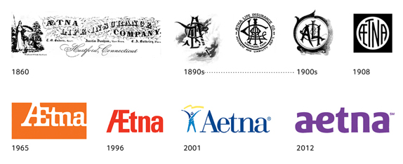
No one is denying that designers like to throw fancy curveballs into logos, insignias, etc. But that doesn't apply here. What we're talking about is things that are different to certain people's prior perceptions, but that have never actually "changed." The purple lower case aetna logo is a perfect example. That purple font style logo has "always" had the a and the e connected but I KNOW it did not in my prior recollection because I saw it on the building every day. And in fact, I used to imagine to myself what would change with it if it ever got Mandela Effected. And there is my answer.
originally posted by: blindprometheus
Many of the MEs I agree with. None of these clicked with with me though. I'm sure I've seen the Nasa logo as pictured.
The Mandela that convinced me to 100% was Froot Loops. It was posted here on ATS that it had changed from Froot Loops to Fruit Loops. At that point in time it WAS "Fruit". Everyone scoffed at the spelling "Froot" saying how dumb it would be, though I remember it as being the Froot spelling with loops for all the Os. I even got into an argument with five others IRL over it. Weeks later as I was starting another debate on it, while searching for a video of a guy buying it years ago, showing it spelled froot. RIGHT IN FRONT OF MY EYES, every picture in google image changed from fruit to froot.
Reality still holds as "Froot" and those I argued with think I hacked the internet and switched every box ever made, or just say, I can't handle it, don't make me think about it. I searched the idea that it switched back around that time and others noticed the switch and switch back, two years before the arguments I had, adding more confusion to the matter.
Its why I call any ME believers Froot Loops, which means kind of unusual. It has had that interpretation before MEs where a thing, now it has a reason.
Everyone seems to have those two or three that they are 100% sure of, with other levels of certainty amongst other possible ME's. I have probably 10 or so what I call no doubters, with full certainty. And then I sort of rank the rest down to 90, 80, etc. Some I just don't have any knowledge of, although many others seem to be adamant about.
a reply to: Pearj
Thanks. I definitely remember the squiggle in the Coca~Cola design, and am also certain about the previous VW logo all in one piece. I'm also fairly certain on Chic-Fil-A and Febreeze, although not as sure as I am about the other two.
Okay, I'll check my messages. There's a good chance I'm already familiar with the YouTube channel. I've been studying this pretty closely for about three years now!
Why is it that these ME threads always end up with the believers all confirming their confirmation bias to each other whilst ignoring the obvious and
simple explanations that others provide?
It gets very tedious.
It gets very tedious.
a reply to: oldcarpy
I think it's because it becomes a part of peoples identities.
The exact same thing happens with religious discussions.
Best case scenario is a discussion that ends with "you just don't understand".
This is what fascinates me most about the subject.
It's also what scares me most.
It's only a matter of time before someone is killed to "correct" the timeline.
originally posted by: TombEscaper
What we're talking about is things that are different to certain people's prior perceptions, but that have never actually "changed." The purple lower case aetna logo is a perfect example. That purple font style logo has "always" had the a and the e connected but I KNOW it did not in my prior recollection because I saw it on the building every day. And in fact, I used to imagine to myself what would change with it if it ever got Mandela Effected. And there is my answer.
Key phrase being subjective "prior perceptions."
But I'm not going to try and talk you out of what you perceive to be the truth concerning this effect. Like I said, I have my own experiences.
Best regards.
a reply to: Krahzeef_Ukhar
a reply to: oldcarpy
a reply to: SlapMonkey
I know attention spans are short, but I hope you read the whole thing..
Your "Pearlj" question is usually formatted "So when did you change your name from Pearlj?". That tells me you don't understand the Mandela Effect. The fact that you ask in every ME thread I'm in is technically trolling, and tells me you have a larger point to get out. Have you considered I might be shaped like a pear? Or that I might be of Indian descent, and a Pearl Jam has no significance to me?
Around 80% of replies in ME threads are jabs at the OP. The behavior is unusual and therefor suspect. With all of the above, you can understand why I won't be answering your question..
..But I'll address your eventual point:
Mainstream science isn't going to go on record definitively stating God, UFOs or ghosts exist (yet).
You won't be able to convince someone that's experienced God, UFOs or ghosts that they don't exist - even if you feel your opinion should be good enough for them.
Most sift through logical explanations before accepting an experience as beyond scientific explanation, including 'Effected' people. Occam's Razor has already been applied.
Effected people are aware of faulty memory. We talk about personally saturated things (aka knowledge) and are confident a given Effect passes the faulty memory test before labeling it.
Effected people already understand you feel it's faulty memory - even if you are affected.
Effected people know about misheard lyrics and bad spelling.
Effected people already know a thing has always been that thing.
Effected people know the proper use of 'affected' and 'effected'. 'Effected' is short for "affected by the Mandela Effect".
Effected people don't want to convince you.
If you're put off by the Mandela Effect, don't visit ME threads.
If you want to explain why you think God isn't real to someone that's experienced God and has already sifted through logical explanations, then you need to have an understanding of why your plea will fall on deaf ears.
You are correct that we won't accept your repeat logical explanations - we've already explored them, and the conversation moved on.
I hope this post re-explained a few things I assume you already understood, and resolves any point you might of had behind "Pearlj".
Ανοίξτε το μυαλό σας και να είστε είδος.
a reply to: Pearj
Firstly I'm "Effected" and I don't believe timelines are changing. And I don't believe it's faulty memory.
Regarding Pearlj, I guess I'll read between the lines and assume your answer is that you've never changed it and it has always been Pearj. I agree that the question was poorly constructed, but how much time should be spent on a question that's ignored? I would also add that repeating questions which are ignored isn't trolling.
Whether it's your fruity shape or your Indian descent you can trace the word back so it would be silly to question if it was once Pearlj.
I was just trying to show some inconsistencies in your thoughts.
Fruity shape and Indian descent proves you were always Pearj.
Why doesn't Jewish Ukranian descent with a Slavic pronunciation prove it was always Berenstain?
Oh well, I should at least thank you for not answering my question so eloquently.
Cheers.
You can claim you've researched all you like but any academic claims fall apart instantly when you refuse to address the flaws in your argument. The flaws you aren't blind to you actively ignore.
I guess you can't reason someone out of a position they didn't reason themselves into.
Edit to add...
We're still besties tho, nothing can break that bond.
edit on 9-3-2018 by Krahzeef_Ukhar because: ed
a reply to: TombEscaper
marketing , corporate branding - corporate -rebranding , graphic design are all normal typical examples of what companies do every few years, they update and change their branding to keep up with modern changes in design and what appeals to their audience and what fits with society at present.
Corporations or companies can change their branding for many reasons, new CEO who doesnt like the eggshell white used on the logo , the old logo reflects on poor decisions and a new Logo is required to make the public forget about the old company , the company becomes a fortune 500 and wants something a bit more classy than grass roots look !
not mandela affect
as for the connections between a-e , some typefaces have this others dont it is dependent on the typeface used
a lot of typefaces abandoned it as its an old use for letters and is only really used linguistically
(post by halenmark removed for a serious terms and conditions violation)
new topics
-
BIDEN Admin Begins Planning For January 2025 Transition to a New President - Today is 4.26.2024.
2024 Elections: 5 hours ago -
Big Storms
Fragile Earth: 7 hours ago -
Where should Trump hold his next rally
2024 Elections: 10 hours ago -
Shocking Number of Voters are Open to Committing Election Fraud
US Political Madness: 10 hours ago -
Gov Kristi Noem Shot and Killed "Less Than Worthless Dog" and a 'Smelly Goat
2024 Elections: 11 hours ago -
Falkville Robot-Man
Aliens and UFOs: 11 hours ago
top topics
-
James O’Keefe: I have evidence that exposes the CIA, and it’s on camera.
Whistle Blowers and Leaked Documents: 12 hours ago, 17 flags -
Australian PM says the quiet part out loud - "free speech is a threat to democratic dicourse"...?!
New World Order: 13 hours ago, 15 flags -
Blast from the past: ATS Review Podcast, 2006: With All Three Amigos
Member PODcasts: 16 hours ago, 14 flags -
Biden "Happy To Debate Trump"
2024 Elections: 14 hours ago, 14 flags -
Ireland VS Globalists
Social Issues and Civil Unrest: 13 hours ago, 11 flags -
Mike Pinder The Moody Blues R.I.P.
Music: 16 hours ago, 9 flags -
BIDEN Admin Begins Planning For January 2025 Transition to a New President - Today is 4.26.2024.
2024 Elections: 5 hours ago, 9 flags -
Big Storms
Fragile Earth: 7 hours ago, 8 flags -
What is the white pill?
Philosophy and Metaphysics: 15 hours ago, 6 flags -
Shocking Number of Voters are Open to Committing Election Fraud
US Political Madness: 10 hours ago, 6 flags
active topics
-
A Warning to America: 25 Ways the US is Being Destroyed
New World Order • 30 • : glen200376 -
Eclipse picture taken by my son from the NH-ME border - Cool!
General Chit Chat • 26 • : EyeoftheHurricane -
University of Texas Instantly Shuts Down Anti Israel Protests
Education and Media • 319 • : CriticalStinker -
-@TH3WH17ERABB17- -Q- ---TIME TO SHOW THE WORLD--- -Part- --44--
Dissecting Disinformation • 705 • : cherokeetroy -
Falkville Robot-Man
Aliens and UFOs • 10 • : billxam1 -
Gov Kristi Noem Shot and Killed "Less Than Worthless Dog" and a 'Smelly Goat
2024 Elections • 64 • : cherokeetroy -
What is the white pill?
Philosophy and Metaphysics • 23 • : TheDiscoKing -
BIDEN Admin Begins Planning For January 2025 Transition to a New President - Today is 4.26.2024.
2024 Elections • 21 • : worldstarcountry -
Ditching physical money
History • 23 • : worldstarcountry -
Australian PM says the quiet part out loud - "free speech is a threat to democratic dicourse"...?!
New World Order • 9 • : ScarletDarkness