It looks like you're using an Ad Blocker.
Please white-list or disable AboveTopSecret.com in your ad-blocking tool.
Thank you.
Some features of ATS will be disabled while you continue to use an ad-blocker.

Mandela Effect - Reality Being Edited Evidenced in Changing Logos
page: 2share:

a reply to: TombEscaper
Funny how it's only pop culture and things in the current media that the MELievers claim are affected.
Why not major historical events? Locations?
Odd how it's confined to things within the past 20-30 years when mass media and the Internet took to spreading information faster than you could blink eye.
originally posted by: Krahzeef_Ukhar
originally posted by: TombEscaper
Regardless of what anyone says, these logos ARE changing in these ways; but not changing in the sense that the logos are being updated by the companies, of course.
As long as you are keeping an open mind.
Actually, no, no they are not keeping an open mind:
I don't give a damn what the skeptics and naysayers try to tell me.
a reply to: TombEscaper
I believe that these ME happenings occur in order to jump start the process of questioning our reality. Like a gentle, timed awakening that will eventually usher in a greater reality. I hope, anyways......
I believe that these ME happenings occur in order to jump start the process of questioning our reality. Like a gentle, timed awakening that will eventually usher in a greater reality. I hope, anyways......
I think the logos tell a story of whoever may have changed reality. Maybe a cryptic way of pointing a finger. Residue of residue.
The Ae being connected makes perfect sense, since it means 'Æ'. In the old days 'Æ' was written as Ae.
I had a whole bottle of hot sauce disappear from in front of me at a local sub sandwich place. It had pastel pink and purple fancy lettering, a design
around the border of the label in the same colors- I looked away for one sec, with the mental note "must try", looked back, Poof. Gone. Shook me so
hard, I grabbed a super hot sauce by mistake.
a reply to: abago71
Lets just for a second assume the phenomenon is real.
What do you think is the end goal or outcome by oneself following that road to completion?
Do you want to be lost?
Has it even crossed your mind that you're being baited like a fish in a vast ocean of cosmic predators?
Perhaps the concepts behind this phenomenon are geneally valid, perhaps not.
If true, perhaps the reason why people are telling you to STOP is because theyre trying to save you from making a huge mistake.
edit on 6-3-2018 by CreationBro because: (no reason given)
Many of the MEs I agree with. None of these clicked with with me though. I'm sure I've seen the Nasa logo as pictured.
The Mandela that convinced me to 100% was Froot Loops. It was posted here on ATS that it had changed from Froot Loops to Fruit Loops. At that point in time it WAS "Fruit". Everyone scoffed at the spelling "Froot" saying how dumb it would be, though I remember it as being the Froot spelling with loops for all the Os. I even got into an argument with five others IRL over it. Weeks later as I was starting another debate on it, while searching for a video of a guy buying it years ago, showing it spelled froot. RIGHT IN FRONT OF MY EYES, every picture in google image changed from fruit to froot.
Reality still holds as "Froot" and those I argued with think I hacked the internet and switched every box ever made, or just say, I can't handle it, don't make me think about it. I searched the idea that it switched back around that time and others noticed the switch and switch back, two years before the arguments I had, adding more confusion to the matter.
Its why I call any ME believers Froot Loops, which means kind of unusual. It has had that interpretation before MEs where a thing, now it has a reason.
a reply to: TombEscaper
Great thread!
The one that stands out the most to me is Coke. Just a week before the change I was standing in line with a Coke and was studying the typography, including the '~'.
It currently looks like this: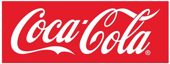 It used to look more like this:
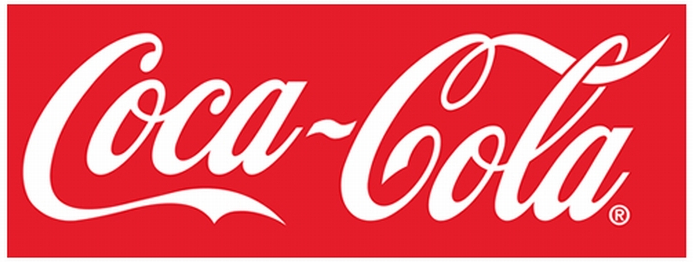 Here's someone that painted it from
memory - odd.. they used a ~.
Here's someone that painted it from
memory - odd.. they used a ~.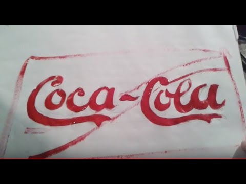
The next biggie for me is JCPenny - it's now JCPenney. There's a giant "JCPenney" sign near where we live - it's freaky to see it, not to mention see it all the time. This is what it looks like now: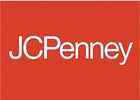 Here's how it used to be:
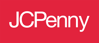
There's also a Chic-Fil-A down the street - definitely was not "Chick". Here's how it looks now: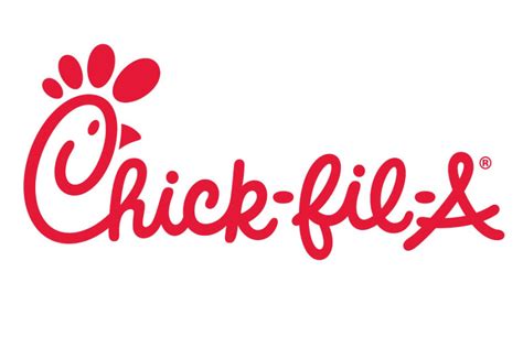 This is how it used to
be:
This is how it used to
be:
The Monopoly guy lost his monocle. This image shows how it looks now, followed by how it used to look: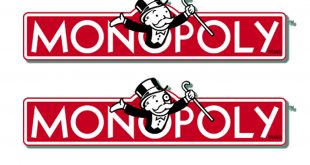
Febreze now has an extra e (febreeze).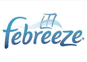
The V and W in VW are split now. I remember them as joined (had a few vw's). Here's the history of the logo: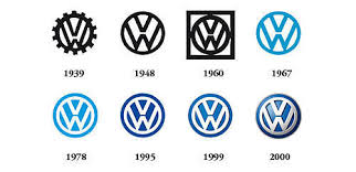 Here's how it
looks now, and how it used to look:
Here's how it
looks now, and how it used to look:
I used to have a bunch of good Ford logo residue, they're around somewhere online I'm sure if anyone wants to look it up.
About the computer stuff changing on you.. My photo editor (Gimp) changed the color pallet over night (flipped and reversed). I'm used to clicking on a part of the pallet for greyer colors - I've done it for years; its' muscle-memory. I wrote the developers, it's always been the way it is now. Crazy - absolutely freaky.
I'll send you a PM for a YT channel that does a lot of logo stuff.
Great thread!
The one that stands out the most to me is Coke. Just a week before the change I was standing in line with a Coke and was studying the typography, including the '~'.
It currently looks like this:
The next biggie for me is JCPenny - it's now JCPenney. There's a giant "JCPenney" sign near where we live - it's freaky to see it, not to mention see it all the time. This is what it looks like now:
There's also a Chic-Fil-A down the street - definitely was not "Chick". Here's how it looks now:
The Monopoly guy lost his monocle. This image shows how it looks now, followed by how it used to look:
Febreze now has an extra e (febreeze).
The V and W in VW are split now. I remember them as joined (had a few vw's). Here's the history of the logo:
I used to have a bunch of good Ford logo residue, they're around somewhere online I'm sure if anyone wants to look it up.
About the computer stuff changing on you.. My photo editor (Gimp) changed the color pallet over night (flipped and reversed). I'm used to clicking on a part of the pallet for greyer colors - I've done it for years; its' muscle-memory. I wrote the developers, it's always been the way it is now. Crazy - absolutely freaky.
I'll send you a PM for a YT channel that does a lot of logo stuff.
originally posted by: noonebutme
Why not major historical events? Locations?
Uhm..
Hitler has blue eyes now...
Eli Whitney is now a white man.
Franklin Delanor Roosevelt is now Franklin Delano Roosevelt.
South America is way further Eastward now.
Panama Canal now goes N+S, not E+W.
There's a few Historical and Location items..
I could keep going, but dinners done.
You know it's not limited to pop-culture.. you just don't want to hear it.
I'm no Naysayer,etc., to ME. However, I pay attention to logos as Graphic Designer. Companies do change their logos often, as well as their
message-by law. The fist three have the fonts in serif fonts, particularly the t, personally they look better than sans serif for the last letter in
the logo name in those cases.
Letters joined together in a logo aren't unpopular, it makes the logo more unique, more memorable to the consumer especially if the font and or vector joining of them didn't come front a font bank and is uniquely published by the companies designers.
Saturn is no longer manufacturing cars, so not sure how that is a changing example as it seems they always had the font that way. Also, as for examples bands are not a good example, as some change their logos and designers of them often.
a reply to: Krahzeef_Ukhar
Same, I thought Pearlj, as in PearlJam. Good examples though, showing how these logos change.
Same, I thought Pearlj, as in PearlJam. Good examples though, showing how these logos change.
edit on 6-3-2018 by dreamingawake because: (no reason given)
edit on 6-3-2018 by dreamingawake because: how*
a reply to: dreamingawake
That's the point, they've always been the way they are now - so of course it's not unusual.
What's unusual is tons of people have 'more than a passing memory' of the logo being different.
It's not restricted to logos.. Do a little digging and you're likely to find several things you could swear were different before (being honest with yourself on the strength of a given memory or 'knowledge').
Or.. you may notice the difference, but doubt your memory.
Or.. you may not be affected at all.
One way or the other - you will find a way to justify the way you feel - just like me, just like everyone else. Which ever way you go - I hope you're kind about it.
That said, I have to go on record stating the Mandela Effect is absolutely real, and words will never do justice to describe it..

originally posted by: dreamingawake
a reply to: Krahzeef_Ukhar
So true.
edit on 6-3-2018 by dreamingawake because: quote issues
new topics
-
New York Governor signs Climate Law that Fines Fossil Fuel Companies
US Political Madness: 6 hours ago -
Meta Llama local AI system is scary good
Science & Technology: 11 hours ago
top topics
-
This is why ALL illegals who live in the US must go
Social Issues and Civil Unrest: 13 hours ago, 18 flags -
New York Governor signs Climate Law that Fines Fossil Fuel Companies
US Political Madness: 6 hours ago, 12 flags -
Former ‘GMA Producer’ Sues NPR-Legacy Media Exposed
Propaganda Mill: 16 hours ago, 9 flags -
Happy Hanukkah…
General Chit Chat: 17 hours ago, 8 flags -
UK Borders are NOT Secure!
Social Issues and Civil Unrest: 14 hours ago, 6 flags -
Meta Llama local AI system is scary good
Science & Technology: 11 hours ago, 6 flags -
New Footage - Randy Rhoads 1979 LIVE Guitar Solo Footage at the Whisky - Pro Shot
Music: 17 hours ago, 5 flags
active topics
-
The Mystery Drones and Government Lies --- Master Thread
Political Conspiracies • 154 • : Flyingclaydisk -
New York Governor signs Climate Law that Fines Fossil Fuel Companies
US Political Madness • 12 • : Flyingclaydisk -
Elon Musk futurist?
Dreams & Predictions • 14 • : cherokeetroy -
UK Borders are NOT Secure!
Social Issues and Civil Unrest • 6 • : angelchemuel -
Trump says ownership of Greenland 'is an absolute necessity'
Other Current Events • 53 • : cherokeetroy -
Happy Hanukkah…
General Chit Chat • 23 • : JJproductions -
This is why ALL illegals who live in the US must go
Social Issues and Civil Unrest • 23 • : WeMustCare -
Statements of Intent from Incoming Trump Administration Members - 2025 to 2029.
2024 Elections • 57 • : WeMustCare -
Meta Llama local AI system is scary good
Science & Technology • 24 • : glend -
Putin Compares Himself to Jesus Promoting Traditional Values Against the Satanic West
Mainstream News • 77 • : Dalamax