It looks like you're using an Ad Blocker.
Please white-list or disable AboveTopSecret.com in your ad-blocking tool.
Thank you.
Some features of ATS will be disabled while you continue to use an ad-blocker.
share:
reply to post by jiggerj
LOL, but I think ATS won't get a universal language AI engine till version 10.0. Looking at some of his other posts it appears that English is not his first language.
LOL, but I think ATS won't get a universal language AI engine till version 10.0. Looking at some of his other posts it appears that English is not his first language.
antar
One suggestion, if SO or anyone else competent could do one of those video tutorials, that would help me as I am a audio/visual learner.
Look here: Using the new features and and functions of ATS.5/3
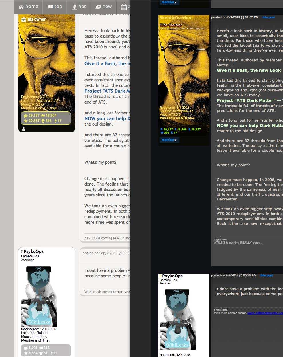
Here's a look back in history, to late 2006 when the site-wide redesign introduced our, then very small, user base to essentially the same color
scheme used on ATS.2010, called ATS DarkMater at the time. For those who have been around, you'll recall the gnashing of teeth as many people decried
the layout (early version of what ATS.2010 is now) and colors to be the most horrible and hard-to-read thing they've ever seen.
This thread, authored by member psyopswatcher, was created solely to bash the new ATS Dark Mater...
Give it a Bash, the new Look
I started this thread to start giving members a heads up to the heavily skeuomorphic design featuring the first-ever consistent user experience for ATS based a dark (not pure-black) background and light (not pure-white) text. In fact, the colors used are exceptionally close to what we have on ATS today.
Project "ATS Dark Matter" -- The Evolution Continues.
The thread is full of threats of never visiting ATS again, unreadable pages, too gloomy, and predictions for the end of ATS.
And a long lost former staffer who contributed on several levels, started a bug hunt thread:
NOW you can help Dark Matter evolve - Problems? That also became a bitch-fest of calls to revert to the old design.
And there are 37 threads from that time in our Trash Bin that were angry calls and lamentations of all varieties. The policy at the time was to close the thread with a link to one of the above threads, leave it available for a couple hours, then put it in the trash.
What's my point?
Change must happen. In 2006, we were on the cusp of either fizzling away. Something serious needed to be done. The feeling that the discussion board using online population was getting fatigued by the sameness of nearly all discussion boards. So we took a big bold step at being different, and our traffic quadrupled in just 3 years since the launch of the "highly controversial" ATS DarkMater.
We took an even bigger step away from ho-hum discussion board cookie-cutter sameness with the ATS.2010 redeployment. In both cases, nothing was arbitrary. The designs were based on contemporary sensibilities combined with research and analysis of how people were using the site. Such is the case now, except that even more time was spent on research and comparative designs.
I dont have a problem with the look. I however do not like if there's tons of space wasted everywhere just because some people use tablets and
phones.
This is my first comment on the transition to the new design - WHERE IS MY FIREHOSE?
It looks like firehose.php is redirecting to forum/newtopics.php and is getting a 404.
As an avid and exclusive firehose drinker I have not been impressed by the new design, but I understand the single column format lends itself better to small screen smart phones and tablets. However, it isn't nearly as time effective or easy to use as the previous 3 column format. It's true the columns haven't worked liked they used to in segregating the newer content from the older content (0-4 hours, 4-8 hours, etc) and the new entries "wrap" across the screen instead of always showing up in the 0-4 hour column - but hey, I got used to it without complaint.
Not wanting to complain about the new format and I'll eventually get used to it in time, although I probably won't be spending as much time reading forum posts because of the inherent inefficiency of dealing with a huge single column of information.
PLEASE BRING THE FIREHOSE BACK! I feel like I'm missing out on all the wonderful new topics presented as a timeline (lifo stack) instead of within their specific forums. Thanks
ganjoa
edit on 7-9-2013 by ganjoa because: spellin'
PsykoOps
I however do not like if there's tons of space wasted everywhere just because some people use tablets and phones.
Tons of wasted space? Where?

In thread-view, the new design is actually tighter.
I loved the new design, and last night was the first time it had changed on me. I was disappointed when I found that it had changed back
reply to post by SkepticOverlord
I remember back in 2006 under another screen name which I since forgot after a break from ATS, I recall the improvements made then were vast, moving from small time to big time forum essentially.
Every design since, for me has had a few niggles but essentially were a great improvement. The current, old design is great but I totally understand the need for the new design.
I am an artist and have worked in graphic design. I think the new design looks like more space is being wasted because of the design features, the fact that the text is in rounded rectangles, leaving large areas of screen unused. Also when the icon buttons are so huge and bright and detract the attention, all else on the screen seems to fade from attention, making the screen look busier than it need be, a style more suited to something like texting or facebook rather than a forum with serious topics that requires a lot of reading, thought and concentration on text.
The ease of use of the current old style is in it's simplicity and great use of colour and tonal contrast, it is easy on the eye and neat, essentially the borders, style and format aren't competing with the text, ie the content, which as you correctly, mentioned before as important, is the main focus of the eye.
The colours of the new style jar the eyes too much, as they are tonally too similar. The contrast between the muted tones on the current old style are probably perfect for easy on the eye forum reading. The font style and size is also easier on the eye than the new style.
The current old style has great balance of light and dark, space and content and it works in a UI sense. If this could be translated into the new style and it's tech requirements it would probably be another great leap forward for ATS.
forgive my ignorance, but how do i get the new design back? i thought it was excellent and am sad to see it gone.
bcccl
forgive my ignorance, but how do i get the new design back? i thought it was excellent and am sad to see it gone.
It may be back for good tomorrow, certainly Monday. Depends on my progress tonight.
reply to post by TrueBrit
When I look in MESSAGES/REPLIES
I see a lot of listed REPLIES that when I click on them there is
NOT referent thread that pops up to go to in order to see the reply.
Annoying.
When I look in MESSAGES/REPLIES
I see a lot of listed REPLIES that when I click on them there is
NOT referent thread that pops up to go to in order to see the reply.
Annoying.
reply to post by SkepticOverlord
YEA. THAT ANSWERS THAT!
CONGRATS on the progress. Glad to know it's on the very near horizon.
The old color bugs are driving me buggy on this old system. LOL.
. . . .uhhh . . . not that the new version couldn't stand some tweaking in that dept. LOL. In due course, no doubt.
Thanks for all you do.
YEA. THAT ANSWERS THAT!
CONGRATS on the progress. Glad to know it's on the very near horizon.
The old color bugs are driving me buggy on this old system. LOL.
. . . .uhhh . . . not that the new version couldn't stand some tweaking in that dept. LOL. In due course, no doubt.
Thanks for all you do.
Will be nice to just have it in place permanently. I really like the new design; just not a fan of the back and forth.
Thank you for the return of the firehose and the elimination of that annoying 404 message.
I'll look forward to the new release format and adjust to it in time.
ganjoa.
I'll look forward to the new release format and adjust to it in time.
ganjoa.
The font was way, way too big resulting in lots of scrolling. This really needs to be fixed for me.
Risco
The font was way, way too big resulting in lots of scrolling. This really needs to be fixed for me.
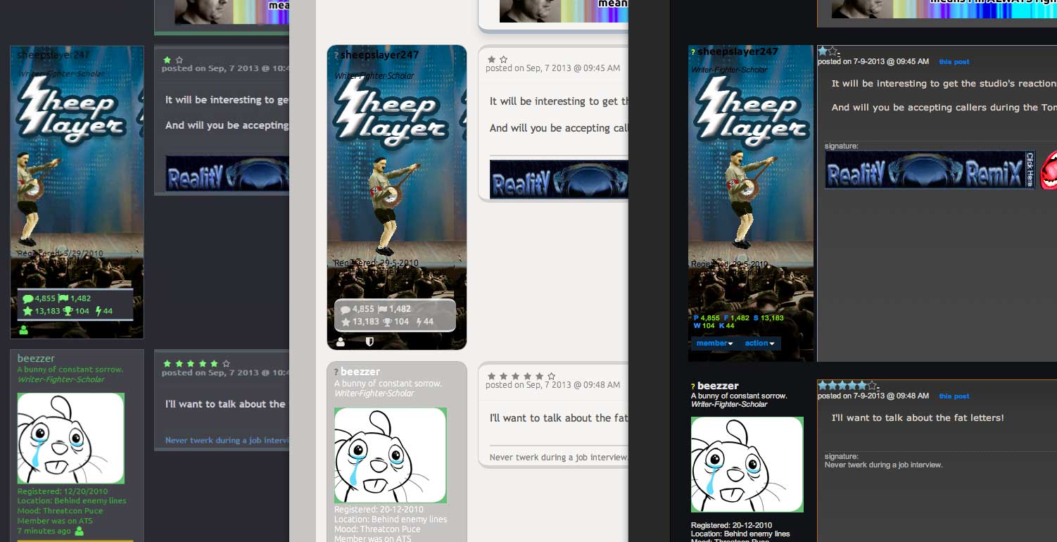
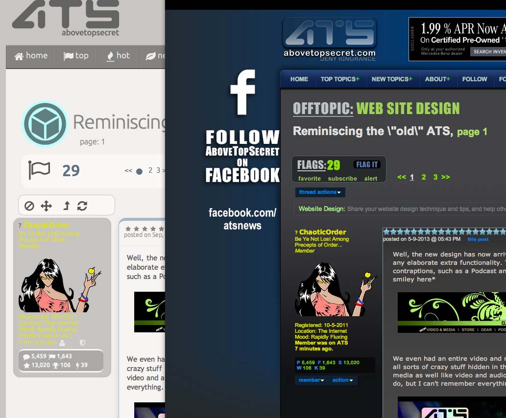
Have you seen the side-by-side comparisons? The new version is actually tighter in thread-view.


theabsolutetruth
If the first one on the top picture is a preview, I like it!
That's what ATS.5/3 looks like in IE8.
new topics
-
Let's talk planes.
General Chit Chat: 1 hours ago -
January 6th report shows disturbing trend (nobody is shocked)
US Political Madness: 3 hours ago -
Inexplicable military simulation - virtual reality showdown in the night..
The Gray Area: 3 hours ago -
The Truth about Migrant Crime in Britain.
Social Issues and Civil Unrest: 4 hours ago -
Trudeau Resigns! Breaking
Other Current Events: 6 hours ago -
Live updates: Congress meets to certify Trump's presidential election victory
US Political Madness: 7 hours ago -
Gravitic Propulsion--What IF the US and China Really Have it?
General Conspiracies: 7 hours ago -
Greatest thing you ever got, or bought?
General Chit Chat: 8 hours ago
top topics
-
Trudeau Resigns! Breaking
Other Current Events: 6 hours ago, 22 flags -
January 6th report shows disturbing trend (nobody is shocked)
US Political Madness: 3 hours ago, 16 flags -
Live updates: Congress meets to certify Trump's presidential election victory
US Political Madness: 7 hours ago, 12 flags -
Gravitic Propulsion--What IF the US and China Really Have it?
General Conspiracies: 7 hours ago, 9 flags -
The Truth about Migrant Crime in Britain.
Social Issues and Civil Unrest: 4 hours ago, 9 flags -
Greatest thing you ever got, or bought?
General Chit Chat: 8 hours ago, 3 flags -
Let's talk planes.
General Chit Chat: 1 hours ago, 3 flags -
Inexplicable military simulation - virtual reality showdown in the night..
The Gray Area: 3 hours ago, 2 flags
active topics
-
Gravitic Propulsion--What IF the US and China Really Have it?
General Conspiracies • 11 • : YouSir -
January 6th report shows disturbing trend (nobody is shocked)
US Political Madness • 9 • : BeyondKnowledge3 -
Let's talk planes.
General Chit Chat • 3 • : Shoshanna -
Trudeau Resigns! Breaking
Other Current Events • 54 • : Flyingclaydisk -
Meta Llama local AI system is scary good
Science & Technology • 41 • : glend -
Sorry to disappoint you but...
US Political Madness • 29 • : Kaiju666 -
The Truth about Migrant Crime in Britain.
Social Issues and Civil Unrest • 11 • : putnam6 -
Greatest thing you ever got, or bought?
General Chit Chat • 20 • : lilzazz -
-@TH3WH17ERABB17- -Q- ---TIME TO SHOW THE WORLD--- -Part- --44--
Dissecting Disinformation • 3952 • : AianawaQ1320 -
Live updates: Congress meets to certify Trump's presidential election victory
US Political Madness • 17 • : Dalamax

