It looks like you're using an Ad Blocker.
Please white-list or disable AboveTopSecret.com in your ad-blocking tool.
Thank you.
Some features of ATS will be disabled while you continue to use an ad-blocker.
share:
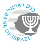
The logo of the Bank of Israel contains the map of Eretz Israel... which is a land mass much larger than Israel as we know it today. We can see it includes Lebanon, Jordan, parts of Syria, Iraq and Saudi Arabia.
Its also obvious that design of the Bank of Israel's logo was directly inspired from the controversial 10 agorot coin, as we see here...
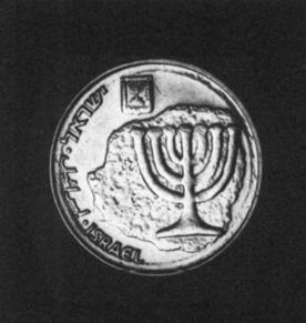
I encourage readers to go over the Biblical interpretations of the borders of Israel.
So why would the central bank of Israel use a logo containing a map that is larger than modern Israel's border and is identical to the conceptual "greater Israel"?
Why would Biblical Israel matter so much to modern day Israel (that does NOT live by Biblical laws)... that it appears on their central banks logo?
How would you react if your entire country or parts of it were shown on a map representing another country?
edit on 13-6-2013 by sk0rpi0n because: (no reason given)
reply to post by sk0rpi0n
The coin is most offensive and suggestive.
Imagine if a Mexican Bank made a coin with an image of their country which included the Southwest United States, jeez. No one would take it seriously though. Now if America flipped the script, Mexican nationalists would get worried, so I see your point clearly.
If Iran made one suggesting Israel as part of their national border, watch out. All in all this is just rude and provocative, nothing new though, sadly.
How would you react if your entire country or parts of it were shown on a map representing another country?
Good question you would think most would not be happy. The nations that are included should refuse to accept Israeli currency until they change it to show Israel as it should be.
Great find, and good eye!
It is a rather pompous attitude, especially in
such a tumultuous region.
It is a rather pompous attitude, especially in
such a tumultuous region.
It is just another aspect of the false fulfillment of Biblical prophecy for political purposes, by a people who never lived in Canaan until recent
decades. They are not descendants of Judah, Jacob/Israel, or even Shem. Most Palestinians have more Israelite heritage than most "Israelis." BTW,
my opinion is based on decades of study - is yours?
reply to post by sk0rpi0n
Well, i'd be a little miffed if my country was shown on a map or whatnot as being part of another country. That said, I never heard about the 10 agorot controversy until you mentioned it.
10_agorot_controversy
As you can see in that link it's a replica of a coin issued by Mattathias Antigonus, the one he issued was actually in the shape of "greater Israel" or whatever you choose to call it, while the 10 argorot was a round modern day coin with the shape engraved.
EH, I dunno, I don't think it's really indicating what you might think it's indicating. Then again, it very might well be that. This is one of those cases where, after looking at the pictures of the 10 argorot and the one it's a replica of, i'd consider this meaningless.
that said.... Why did they choose use parts of a replica coin as the Bank of Israel logo? That does smack of something more than liking the design of the coin, in my opinion.
Originally posted by buster2010
How would you react if your entire country or parts of it were shown on a map representing another country?
Good question you would think most would not be happy. The nations that are included should refuse to accept Israeli currency until they change it to show Israel as it should be.
No one and no country in this whole world can do anything about it , Israel is above all world laws , they are the only ones in this world that can do anything they want and sit back and watch the world whining about it while they are laughing .
This could be a tie-in to the alleged secret symbology of the Zionist Flag of the state of Israel.
The "Seal of Solomon" (aka Star of David) on a white background between two blue stripes. The two blue stripes representing the Nile and Euphrates rivers. Therefore, perpetuating the goal of Eretz Yisrael encompassing all land between the two rivers.
(This is a debatable conspiracy, which I do not wish to defend as my own opinion)
Peace.
reply to post by Kgnow
Never knew that the two stripes represents the Nile and the Euphrates. This is some very new and interesting information.
The two blue stripes representing the Nile and Euphrates rivers. Therefore, perpetuating the goal of Eretz Yisrael encompassing all land between the two rivers.
Never knew that the two stripes represents the Nile and the Euphrates. This is some very new and interesting information.
Originally posted by Boscov
reply to post by sk0rpi0n
The coin is most offensive and suggestive.
Imagine if a Mexican Bank made a coin with an image of their country which included the Southwest United States, jeez. No one would take it seriously though. Now if America flipped the script, Mexican nationalists would get worried, so I see your point clearly.
If Iran made one suggesting Israel as part of their national border, watch out. All in all this is just rude and provocative, nothing new though, sadly.
America already flipped the script.
Texas, California, Arizona, etc. all use to be part of Mexico....
reply to post by sk0rpi0n
I heard of this allegation from the speeches of the now deceased Yasser Arafat. Israeli government officials quickly denied the claim, stating the flag is meant to be reminiscent of the prayer veil (tallit) of Judaism.
That's the claim and its rebuttal. Only the ones who designed the flag know for sure.
reply to post by sk0rpi0n
I would like to see the actual logo image superimposed onto a map.
Here is an approximation from Jonathan Azaziah of www.maskofzion.com
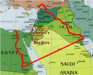
The logo and coin seem to cut further into Saudi Arabia than what is shown on this map.
I take it that Israeli position is that all lands "granted to Abraham" (Genesis 15:18-21) are Israel's. I guess Abraham's other descendants are disinherited?
And is the Saudi King cool with this? To serve at the pleasure of Israel?
I would like to see the actual logo image superimposed onto a map.
Here is an approximation from Jonathan Azaziah of www.maskofzion.com

The logo and coin seem to cut further into Saudi Arabia than what is shown on this map.
I take it that Israeli position is that all lands "granted to Abraham" (Genesis 15:18-21) are Israel's. I guess Abraham's other descendants are disinherited?
And is the Saudi King cool with this? To serve at the pleasure of Israel?
edit on 13-6-2013 by pthena because: (no reason given)
Originally posted by sk0rpi0n
The logo of the Bank of Israel contains the map of Eretz Israel... which is a land mass much larger than Israel as we know it today.
No it doesn't. This ludicrous theory was proposed by some idiotic Palestinian 13 years ago, and debunked in the same year.
The design itself has been on Israeli currency since 1984, so why didn't anyone make a fuss about it earlier?
We can see it includes Lebanon, Jordan, parts of Syria, Iraq and Saudi Arabia.
No we can't, that's ridiculous. It's just an abstract blob. You could superimpose it over any map of any country and make all kinds of outlandish claims about it.
Oh wait, I've just realised it's a map of Israel and Australia, with Israel's borders clearly overlapping Queensland! How shocking!!!
reply to post by Sankari
Its not just an "abstract blob" and there is no reason it should be superimposed over any other country.
This has to do with Israel and anybody can see that the "blob" is the outline map of the conceptual "greater Israel" that includes territory of other nations. So stop denying the obvious.
No we can't, that's ridiculous. It's just an abstract blob. You could superimpose it over any map of any country and make all kinds of outlandish claims about it.
Its not just an "abstract blob" and there is no reason it should be superimposed over any other country.
This has to do with Israel and anybody can see that the "blob" is the outline map of the conceptual "greater Israel" that includes territory of other nations. So stop denying the obvious.
reply to post by pthena
There are variants of the boundaries of "greater Israel"... here is another example...
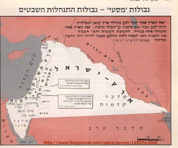
What we see in the banks logo is another variation, which was also used for the coin earlier.
The logo and coin seem to cut further into Saudi Arabia than what is shown on this map.
There are variants of the boundaries of "greater Israel"... here is another example...

What we see in the banks logo is another variation, which was also used for the coin earlier.
Originally posted by Sankari
Originally posted by sk0rpi0n
The logo of the Bank of Israel contains the map of Eretz Israel... which is a land mass much larger than Israel as we know it today.
No it doesn't. This ludicrous theory was proposed by some idiotic Palestinian 13 years ago, and debunked in the same year.
The design itself has been on Israeli currency since 1984, so why didn't anyone make a fuss about it earlier?
We can see it includes Lebanon, Jordan, parts of Syria, Iraq and Saudi Arabia.
No we can't, that's ridiculous. It's just an abstract blob. You could superimpose it over any map of any country and make all kinds of outlandish claims about it.
Oh wait, I've just realised it's a map of Israel and Australia, with Israel's borders clearly overlapping Queensland! How shocking!!!
?
Do you think you could show us any other currency with an intentional "abstract blob." on the face of it.
I do believe most coinage represents the country it is produced in. Don't you ?
You stated:
"The design itself has been on Israeli currency since 1984, so why didn't anyone make a fuss about it earlier?"
Just how do you know a fuss hasn't been raised a number of times over the years ?
We are not always privy to each and every discrepancy that goes on in the world.
Or are you aware of so much more controversy over bank logo and currency designs in the past 29 years than the rest us?
I find it quite interesting and controversial that the logo appears to represent the shape of a countries borders.
edit on 14-6-2013 by
azureskys because: changed lots of stuff
reply to post by Sankari
I can't help myself
What gaul you have, to call Yasir Arafat "some idiotic Palestinian".
To many he was one of the greatest of Freedom Fighters.
I can't help myself
What gaul you have, to call Yasir Arafat "some idiotic Palestinian".
To many he was one of the greatest of Freedom Fighters.
edit on 14-6-2013 by azureskys because: changed words
edit on 14-6-2013
by azureskys because: spelling
reply to post by jmdewey60
Thats because it IS the outline of "greater Israel".... the J-shaped cut bordering the Mediterranean sea is obvious. You will find it in all variations of the map.
Consider the emblem of the Irgun... who carried out the King David hotel bombing and the
The first one is a more abstracted version of the actual map, but the J-shaped cut around the Mediterranean is also present. I guess to some, thats just another random blob thrown in there for no good reason.
The coin image looks suspiciously like a representation of a "Greater Israel" to me.
Here is my attempt at overlaying the outline on a map to show what they are laying dibs on here.
Thats because it IS the outline of "greater Israel".... the J-shaped cut bordering the Mediterranean sea is obvious. You will find it in all variations of the map.
Consider the emblem of the Irgun... who carried out the King David hotel bombing and the
The first one is a more abstracted version of the actual map, but the J-shaped cut around the Mediterranean is also present. I guess to some, thats just another random blob thrown in there for no good reason.
edit on 14-6-2013 by sk0rpi0n because: (no reason given)
new topics
-
Happy Thanksgiving to ATS
General Chit Chat: 2 hours ago -
Simple Thanksgiving
Food and Cooking: 8 hours ago
top topics
-
V.P. Kamala Harris releases a video and nobody understands why
US Political Madness: 17 hours ago, 16 flags -
Mind Blowing Cave under someones land
Fragile Earth: 13 hours ago, 16 flags -
The Party of Peace - Trump Cabinet Picks Targeted with Death Threats
US Political Madness: 14 hours ago, 15 flags -
Trump could make a peaceful American Revolution
US Political Madness: 12 hours ago, 14 flags -
Simple Thanksgiving
Food and Cooking: 8 hours ago, 14 flags -
Trump Presidential Transition Team will not use GSA or Government entities to come to DC
US Political Madness: 12 hours ago, 13 flags -
Happy Thanksgiving to ATS
General Chit Chat: 2 hours ago, 5 flags
active topics
-
Happy Thanksgiving to ATS
General Chit Chat • 3 • : IceHappy -
Simple Thanksgiving
Food and Cooking • 27 • : Owlwatcher -
Mind Blowing Cave under someones land
Fragile Earth • 17 • : Owlwatcher -
Trump Presidential Transition Team will not use GSA or Government entities to come to DC
US Political Madness • 12 • : 777Vader -
The Party of Peace - Trump Cabinet Picks Targeted with Death Threats
US Political Madness • 27 • : DBCowboy -
President-Elect DONALD TRUMP's 2nd-Term Administration Takes Shape.
Political Ideology • 256 • : WeMustCare -
-@TH3WH17ERABB17- -Q- ---TIME TO SHOW THE WORLD--- -Part- --44--
Dissecting Disinformation • 3389 • : Crazierfox -
I thought Trump was the existential threat?
World War Three • 113 • : WeMustCare -
Mood Music Part VI
Music • 3719 • : MRTrismegistus -
Tunnels of Terror: The Cryptid Connection The Why Files
Cryptozoology • 5 • : TheMisguidedAngel

