It looks like you're using an Ad Blocker.
Please white-list or disable AboveTopSecret.com in your ad-blocking tool.
Thank you.
Some features of ATS will be disabled while you continue to use an ad-blocker.

Unilever Logo: An Hidden Message? The story of Life on this planet from its begin to its end...
page: 1share:
Did you ever watch closely the Unilever logo? Unilever logo was designed to include 24 icons, each of which
represents something important to Unilever... and maybe also for all human kind... Each icon representing (officially) an aspect of the business but
maybe it is something different: an hidden message, "The story of Life on this planet from its begin to its end..."
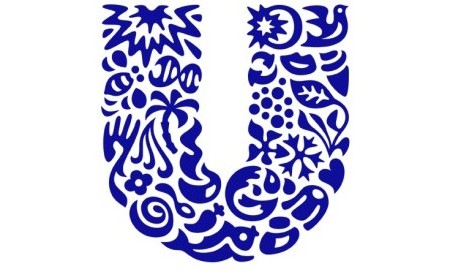
The Logo is composed of 24 icons woven together to create a U shape, with each icon representing one of the company's sub-brands or its corporate values. The brand identity was developed around the idea of "adding vitality to life." Obviously the big blue ‘U’ of the logo stands for Unilever. But look a little closer and you’ll see there’s much more to it.
This is what, in my opinion, each icon rapresent.
Your personal adds for each image are welcome
edit on 12-3-2012 by Arken because: (no reason given)
Interesting. I wanna spend more time looking at this, but the day is just starting. I question the explosion meaning life to you, but we will see
when I ge a chance to go through them all.. Very interesting.. You should get the names of their sub brands..
wow thats very interesting thanks for the post! Ive never seen anything about this before!
Well whomever did that, did really good job at summing it up. I actually like that. I like how they incorporated it from beginning to end. That's
pretty cool.
I need to get back into drawing. Lately the only thing I can make, are eyes. I seem to be getting good at it.
Now if only I can make lashes.
I need to get back into drawing. Lately the only thing I can make, are eyes. I seem to be getting good at it.
Now if only I can make lashes.
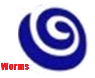
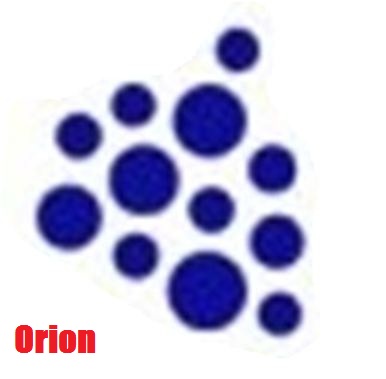
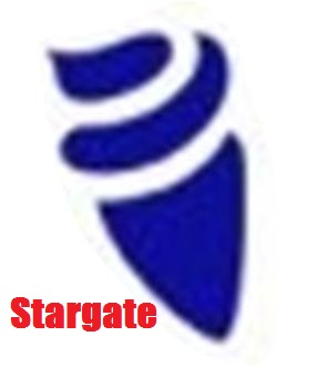
If we look at it like a timeline of existance, then the explosion must be first or last. I think what you have as worms is a stargate... Very
fascinating
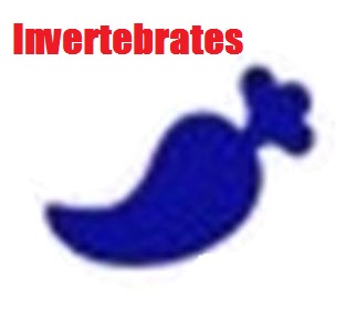
The invertebrate looks like a carrot/pepper
The whole idea is reaching hard, graphic designers are rarely that creative.
The whole idea is reaching hard, graphic designers are rarely that creative.
edit on 12-3-2012 by RealSpoke because: (no reason given)
reply to post by Hecate666
lol nice
This thread should be used as an example of how people can see conspiracies in anything where the are none.
lol nice
This thread should be used as an example of how people can see conspiracies in anything where the are none.
edit on 12-3-2012 by RealSpoke
because: (no reason given)
LOL I think you get most of them bang on...however some are open to interpretation...what is this Uniliver thing anyway?? sorry forgot what its called
already
ETA: ohh got it right anyway lol
ETA: ohh got it right anyway lol
edit on 12-3-2012 by Sinny because: (no reason given)
Originally posted by Hecate666
Here are the explanations for their signs:
www.unilever.com...
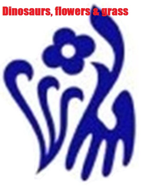
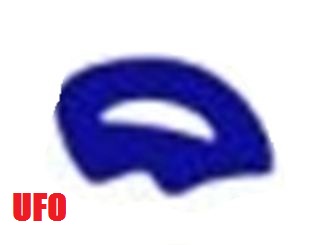
The dinosaur is a hand lol.
Nice one
Move along...nothing more to see here...
reply to post by Arken
Ok so i've seen what the icons supposedly mean on unilever. But, who cares what they say it means right?
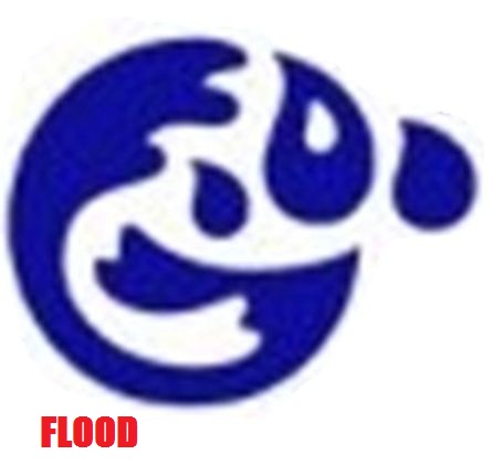
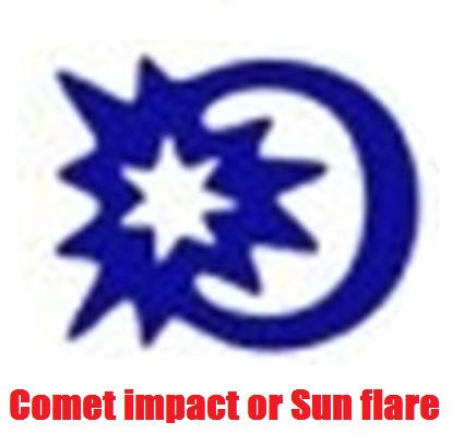
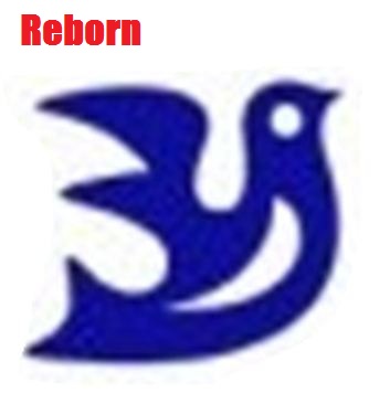
Here is what i see in certain icons.The "sauces and spreads" icon is clearly a galaxy, because when have spread ever been drawn the way they did it? The bowl icon looks almost as a hazard sign, obviously they are creating something in the bowl and its letting off heat. Seems more nefarious than a simple "bowl". They can call that icon "sparkle" all they want, it looks like a star and half moon. The bird looks like a specific bird, a dove. The "ice cream" icon looks like no such thing lol. It look like a TORCH, lady liberty's torch anyone? Isis torch? The "recylce" icon means reincarnation. The "particles" look like microbes, moreover their are 12 of them. Is 12 a significant number? I don't know but this is what i see so far.
Ok so i've seen what the icons supposedly mean on unilever. But, who cares what they say it means right?
Here is what i see in certain icons.The "sauces and spreads" icon is clearly a galaxy, because when have spread ever been drawn the way they did it? The bowl icon looks almost as a hazard sign, obviously they are creating something in the bowl and its letting off heat. Seems more nefarious than a simple "bowl". They can call that icon "sparkle" all they want, it looks like a star and half moon. The bird looks like a specific bird, a dove. The "ice cream" icon looks like no such thing lol. It look like a TORCH, lady liberty's torch anyone? Isis torch? The "recylce" icon means reincarnation. The "particles" look like microbes, moreover their are 12 of them. Is 12 a significant number? I don't know but this is what i see so far.
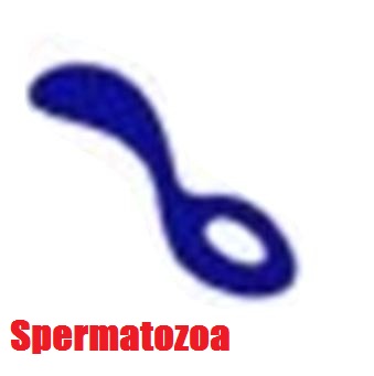
Some of those description are reaaally far-fetched, spermatozoa looks suspiciously like a spoon to me . Some other are beyond me either ;].
Nevertheless I think op may be onto something. This corporation sometimes takes half of commercial breaks on Sky Broadcasting, with their knorr cooking recipes, and lynx deodorants (axe for continental europe), and tons of other stuff. It's my main candidate to become The Company in the future .
Nevertheless I think op may be onto something. This corporation sometimes takes half of commercial breaks on Sky Broadcasting, with their knorr cooking recipes, and lynx deodorants (axe for continental europe), and tons of other stuff. It's my main candidate to become The Company in the future .
edit on 12-3-2012 by stainlesssteelrat because: (no reason given)
what interests me more than the icons, is the fact that when you click on the link on the right hand side, that says "Related Links", "Brand
Center" you are required to enter in a username and password (o.O)
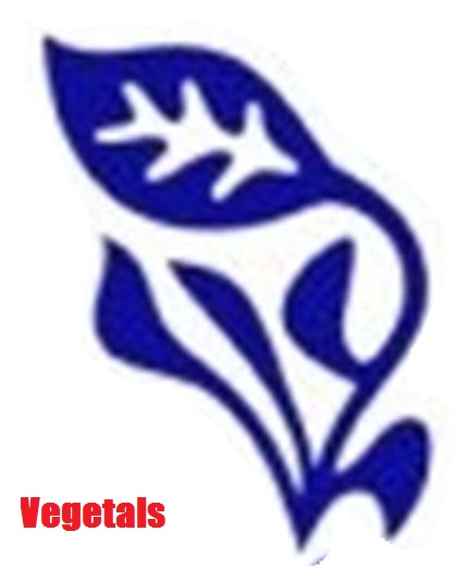
Woah cool, I never noticed that. My favorite part of this however was "Vegetals."
So im interested to see if anyone knows more about these things
So im interested to see if anyone knows more about these things
Originally posted by Arken
Did you ever watch closely the Unilever logo? Unilever logo was designed to include 24 icons, each of which represents something important to Unilever... and maybe also for all human kind... Each icon representing (officially) an aspect of the business but maybe it is something different: an hidden message, "The story of Life on this planet from its begin to its end..."
The Logo is composed of 24 icons woven together to create a U shape, with each icon representing one of the company's sub-brands or its corporate values. The brand identity was developed around the idea of "adding vitality to life." Obviously the big blue ‘U’ of the logo stands for Unilever. But look a little closer and you’ll see there’s much more to it.
This is what, in my opinion, each icon rapresent.
Your personal adds for each image are welcome
edit on 12-3-2012 by Arken because: (no reason given)
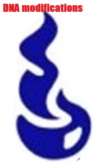
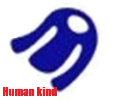
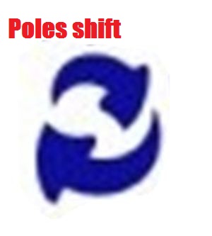
Honestly, I don't see much in this other than a cool design. As others have said, "invertibrate" looks like a carrot or pepper. "DNA modifications" looks like a simple cup of coffee. "Human kind" is just a shirt. How do you get "stargate" out of some kind of torch looking thing? And finally, how the heck do you get "pole shift" out of the two arrows? They could simply mean the cycle of life or something like that. It's a big jump to pull "pole shift" from two arrows.
Forgive me for my ignorance, but what it "Unilever"? I gather it's some kind of company, but what do they do? I could Google, but simply don't feel like it. Lol.
reply to post by Arken
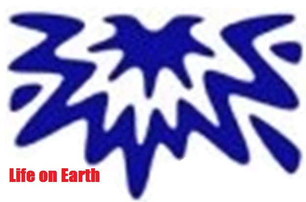
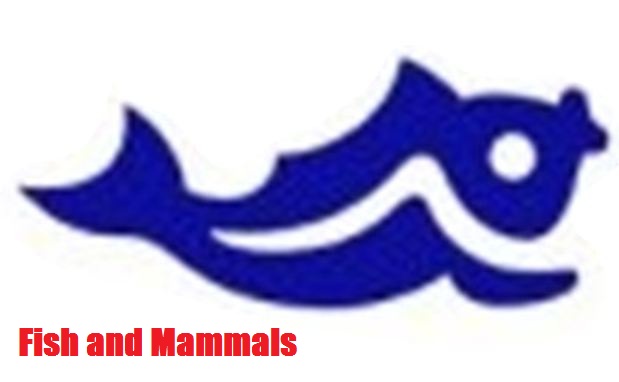
the top right hand corner of the U looks like a comet impact ending the dinosaurs, and then the bird (mammals).
get it?
thanks for bringing this up op.
its cool.
the top right hand corner of the U looks like a comet impact ending the dinosaurs, and then the bird (mammals).
get it?
thanks for bringing this up op.
its cool.
new topics
-
In another world, it was the apocalypse.
Short Stories: 1 hours ago -
Blinken indicates he would decline any offer to stay on under Harris
Politicians & People: 3 hours ago -
Trump’s N.Y. hush money sentencing delayed until after Nov. election
2024 Elections: 3 hours ago -
is this why they want to go to mars?
Space Exploration: 4 hours ago -
Harris economic plans all seem to involve giving money away
US Political Madness: 4 hours ago -
Israel Defense Forces Shoot American Woman in the Head in Occupied West Bank
Middle East Issues: 6 hours ago -
Secrets of the Name of God & His Epithets (Titles) in the Holy Bible. Life Changing Stuff...
Conspiracies in Religions: 10 hours ago
top topics
-
Due to Trump Leading the Race for President - NY Judge Merchan Will Sentence Him to Prison 9.18.2024
US Political Madness: 17 hours ago, 17 flags -
Father of teen suspect in Georgia school shooting charged with 2nd-degree murder
Mainstream News: 15 hours ago, 14 flags -
Trump’s N.Y. hush money sentencing delayed until after Nov. election
2024 Elections: 3 hours ago, 13 flags -
Harris economic plans all seem to involve giving money away
US Political Madness: 4 hours ago, 9 flags -
Israel Defense Forces Shoot American Woman in the Head in Occupied West Bank
Middle East Issues: 6 hours ago, 8 flags -
Secrets of the Name of God & His Epithets (Titles) in the Holy Bible. Life Changing Stuff...
Conspiracies in Religions: 10 hours ago, 5 flags -
is this why they want to go to mars?
Space Exploration: 4 hours ago, 5 flags -
Blinken indicates he would decline any offer to stay on under Harris
Politicians & People: 3 hours ago, 4 flags -
In another world, it was the apocalypse.
Short Stories: 1 hours ago, 1 flags
active topics
-
Hells Angels are on their way to Aurora Colorado
ATS Skunk Works • 70 • : KnowItAllKnowNothin -
This is an anti-free speech right/Nazi/Right Conservatives, a Pro-LGBT community that supports BLM
Rant • 40 • : strongfp -
Israel Defense Forces Shoot American Woman in the Head in Occupied West Bank
Middle East Issues • 65 • : KrustyKrab -
Embalmers clots analysed
Science & Technology • 21 • : annonentity -
Due to Trump Leading the Race for President - NY Judge Merchan Will Sentence Him to Prison 9.18.2024
US Political Madness • 52 • : WeMustCare -
Common Sense Gun Legislation
Social Issues and Civil Unrest • 266 • : Terpene -
Australia the lucky country
Political Issues • 27 • : KnowItAllKnowNothin -
Old School Punk
Music • 549 • : underpass61 -
is this why they want to go to mars?
Space Exploration • 21 • : ARM19688 -
KAMALA HARRIS is Having a Hard Time Readying for the 9-10-2024 Debate with Donald Trump.
2024 Elections • 81 • : KrustyKrab