It looks like you're using an Ad Blocker.
Please white-list or disable AboveTopSecret.com in your ad-blocking tool.
Thank you.
Some features of ATS will be disabled while you continue to use an ad-blocker.
share:
As we prepare for a massive overhaul of the entire ATS site design and significant portions of the core code, a burning question remains for our
members... dark versus light.
While there are many good reasons (most from your optometrist) to display light-gray text on a dark-gray background for text-heavy content on a computer screen, the fact remains that our eyes/brain have been trained since soon-after birth to recognize black text on white (or near-white) paper.
(Setting aside the "just make a light/dark selection option" argument for now.)
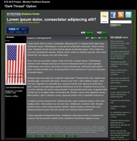
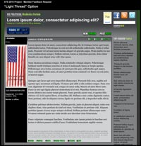
In an ideal world, one visual design standard is the best solution, rather than rely on people finding and selecting an alternative. So with that in mind, here are two representations of an opening post within the partial framework of new design (as you'll see, the core structure of thread content is relatively unchanged). If you could choose to pick one version for your many hours on ATS, which would it be?
The Dark Meat
1050 wide by 1080 high image at 200k
The Light Meat
1050 wide by 1080 high image at 220k
Thank you.
EDIT TO ADD:
Pay no attention to the green profile buttons at the bottom of the post area.
[edit on 2-12-2010 by SkepticOverlord]
i would choose the top one because it doesn't hurt my eyes, however its hard to see the green at the bottom.
I loved reading stuff with a white background. it just seems unpleasant to read on a dark background.
i prefer the "dark meat" image mainly because it's by far easier on the eyes, which is important since a lot of the members are on here for a very
very long time.
So i vote for the Darker one 100%
So i vote for the Darker one 100%
Definitely the 'light meat' for me. It's much easier for me to read.
A good thread for a poll system...
Definitely the Dark Meat option.
Definitely the Dark Meat option.
I have no preference. Light seems to make my room glow in the evening, Dark does not. Either option is fine.
As one who started out disliking the 'Dark Side', I now prefer it and never use the 'Light Side' any longer.
I vote dark.
I vote dark.
I think the lighter one gives better contrast.
Perhaps you should poll optometritists to ask which is the better as far as least eye strain. They should be able to give you an "expert" opinion.
Perhaps you should poll optometritists to ask which is the better as far as least eye strain. They should be able to give you an "expert" opinion.
I prefer dark and it makes ATS different from most forums in appearance....all shades are muted rather than garish. I guess whatever happens, it's
impossible to please everyone.
I also prefer the top version. I have gotten so used to it that I find I get a headache very quickly now when I read text heavy messages on boards
that have black text on a light background. The dark background with the light grey text is soothing for my eyes and is less likely to give me a
headache just for looking at it.
Take care,
Cindi
Take care,
Cindi
Explanation: I prefer the Dark Meat version!
Personal Disclosure: The green text at bottom requires some anti-aliasing with a border or shadows like the green text at top of the screen shot!
Personal Disclosure: The green text at bottom requires some anti-aliasing with a border or shadows like the green text at top of the screen shot!
new topics
-
RFK is Trumps health pick
2024 Elections: 7 hours ago
top topics
-
The art of being offended
Social Issues and Civil Unrest: 15 hours ago, 20 flags -
FLORIDA Sues Biden-Harris FEMA for Denying Disaster Assistance to Homeowners with TRUMP Signs.
US Political Madness: 16 hours ago, 15 flags -
Thanksgiving 2024
Member Art: 13 hours ago, 12 flags -
RFK is Trumps health pick
2024 Elections: 7 hours ago, 12 flags
active topics
-
Mike Tyson returns 11-15-24
World Sports • 31 • : network dude -
Thanksgiving 2024
Member Art • 16 • : YouSir -
Judge’s Dismissal of Classified Document Case Against Trump Explained
Other Current Events • 25 • : UKTruth -
The art of being offended
Social Issues and Civil Unrest • 32 • : andy06shake -
Alex Jones Reinstated on X
Education and Media • 85 • : NoCorruptionAllowed -
FLORIDA Sues Biden-Harris FEMA for Denying Disaster Assistance to Homeowners with TRUMP Signs.
US Political Madness • 38 • : Flyingclaydisk -
Nephilim looked like clowns
Conspiracies in Religions • 37 • : andy06shake -
US warship Edsall Lost after Pearl Harbor Attack Found 80 Years Later ... by Accident
Mainstream News • 13 • : andy06shake -
Critical shortcomings of the Patriot complex
Weaponry • 98 • : Lazy88 -
The Trump effect 6 days after 2024 election
2024 Elections • 114 • : PorkChop96


