It looks like you're using an Ad Blocker.
Please white-list or disable AboveTopSecret.com in your ad-blocking tool.
Thank you.
Some features of ATS will be disabled while you continue to use an ad-blocker.
share:
Since ATS gave me a good response on my first attempt I was inspired to go back and dive a little deeper into the digital art world.
I give you,
The Dawn of Insight
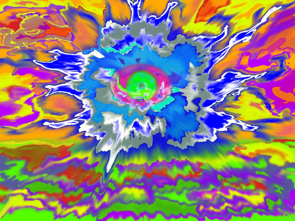
What ya think, ATS? I'm thinking about putting this on the front of black and white t-shirts for my smoke shop.
I give you,
The Dawn of Insight

What ya think, ATS? I'm thinking about putting this on the front of black and white t-shirts for my smoke shop.
edit on 9-3-2023 by AOx6179
because: (no reason given)
edit on 9-3-2023 by AOx6179 because: (no reason given)
edit on 9-3-2023 by AOx6179 because:
(no reason given)
a reply to: AOx6179
That has a late 1960s tie-dye vibe to it. Brings back memories.
Reminds me of my first experiments with digital. You can do things with digital art not possible with traditional media.
The abstract is very freeing for the mind. It lets you get lost in your work. Keep it up
That has a late 1960s tie-dye vibe to it. Brings back memories.
Reminds me of my first experiments with digital. You can do things with digital art not possible with traditional media.

The abstract is very freeing for the mind. It lets you get lost in your work. Keep it up
originally posted by: Blaine91555
a reply to: AOx6179
That has a late 1960s tie-dye vibe to it. Brings back memories.
Reminds me of my first experiments with digital. You can do things with digital art not possible with traditional media.
The abstract is very freeing for the mind. It lets you get lost in your work. Keep it up
Oh -Nooooooooooooooo!
Same reaction/conclusion at same time !!!
Moderators now doing mind control !!
I knew it.
originally posted by: Blaine91555
a reply to: AOx6179
That has a late 1960s tie-dye vibe to it. Brings back memories.
Reminds me of my first experiments with digital. You can do things with digital art not possible with traditional media.
The abstract is very freeing for the mind. It lets you get lost in your work. Keep it up
Very cool, thanks!
Yeah, I think I'll need a better app to pull off something that deep. The one I'm using is pretty elementary. I hope I can reach that level one day with it.
Thanks for sharing.
a reply to: AOx6179
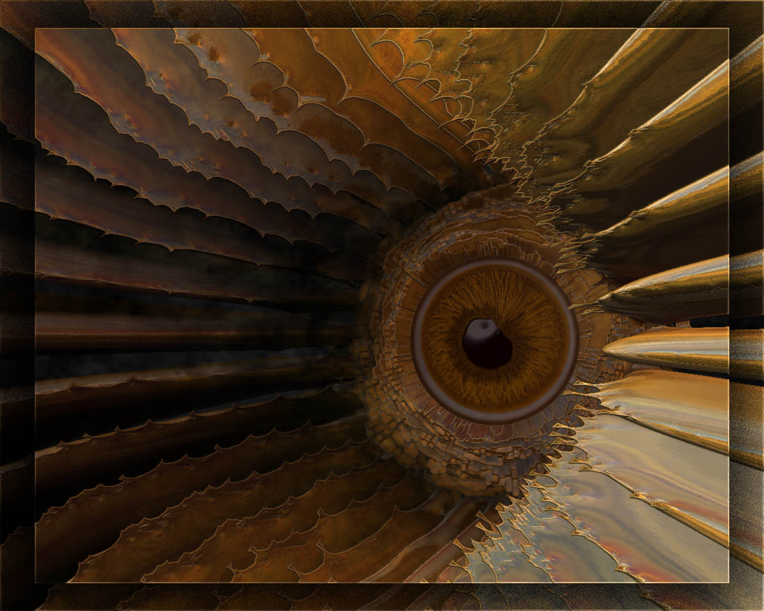
That was done in ZBrush when it first became popular. It's mostly for modeling, but it's a superb 3D painting program. It's pricey though. There are probably open source programs similar now, but I've not paid attention for years.
One thing I'd add is, do it for yourself, not to please anyone else.
That was done in ZBrush when it first became popular. It's mostly for modeling, but it's a superb 3D painting program. It's pricey though. There are probably open source programs similar now, but I've not paid attention for years.
One thing I'd add is, do it for yourself, not to please anyone else.
originally posted by: Blaine91555
a reply to: AOx6179
That was done in ZBrush when it first became popular. It's mostly for modeling, but it's a superb 3D painting program. It's pricey though. There are probably open source programs similar now, but I've not paid attention for years.
One thing I'd add is, do it for yourself, not to please anyone else.
I always have, but will admit to always wondering if I'm the only one that's going to like it. 😂
I get lost in this one. That eye stares into my soul.
I'll check out some of that 3D art and see what I come up with. Preesh
I would totally have that on like a bag of some sort. Like purse or tote or overnight bag or even a reusable grocury bag. Maybe it would be super
awesome as one of those super fuzzy blankets!
It's maybe something that I could see being wall art in a modern building. Very cool, Interesting, thought provoking.
Without the title, I wonder what is this eye looking at. Who's eye is it? Does it see things the same way I would. Where is the creature who possesses this eye and what does it look like? What is the size of the creature? Can it only see? Does it have powers?How does it change what it is seeing? Being go vivid in color, does the colors of the eye or surrounding eye affect the vision? Is the eye sensitive to dark or light? What sort of material is it made of?
You know things like that....
originally posted by: cre8chaos
I would totally have that on like a bag of some sort. Like purse or tote or overnight bag or even a reusable grocury bag. Maybe it would be super awesome as one of those super fuzzy blankets!
It's maybe something that I could see being wall art in a modern building. Very cool, Interesting, thought provoking.
Without the title, I wonder what is this eye looking at. Who's eye is it? Does it see things the same way I would. Where is the creature who possesses this eye and what does it look like? What is the size of the creature? Can it only see? Does it have powers?How does it change what it is seeing? Being go vivid in color, does the colors of the eye or surrounding eye affect the vision? Is the eye sensitive to dark or light? What sort of material is it made of?
You know things like that....
Wow, great view of it. I see sort of the same.
I will say this. This is my artistic interpretation of my Minds Eye being opened. As if this is my first glimpse at the world through my "Third Eye." aka "Dawn of Insight"
Thanks for sharing what you see!
edit on 9-3-2023 by AOx6179 because: (no reason given)
originally posted by: Spacespider
a reply to: AOx6179
I wanna try
Nice! Looks like an AI version.
edit on 9-3-2023 by AOx6179 because: (no reason given)
a reply to: AOx6179
That's excellent, AOx6179!!
I enjoyed your first attempts as well, but with this one you've taken it up a notch. The beauty of art is not only the form, but the colours. I think you've got the right balance going; it is powerful, but not overwhelming.
When you mentioned t-shirts and your smoke shop, I got an idea, and like an itch, I just couldn't resist scratching. My battleground is Photoshop and I've been doing digital art for years. I'm not a professional, but I've done quite a few logos and designs for people. I love typefaces and try to integrate text into a design so that it doesn't just sit there, but melds and integrates with the image; it has to compliment, not overwhelm.
So, long story short, just for fun, I tried something with a generic name for want of knowing your business's name. I tried to be as subtle as possible so as not to detract from your original art.
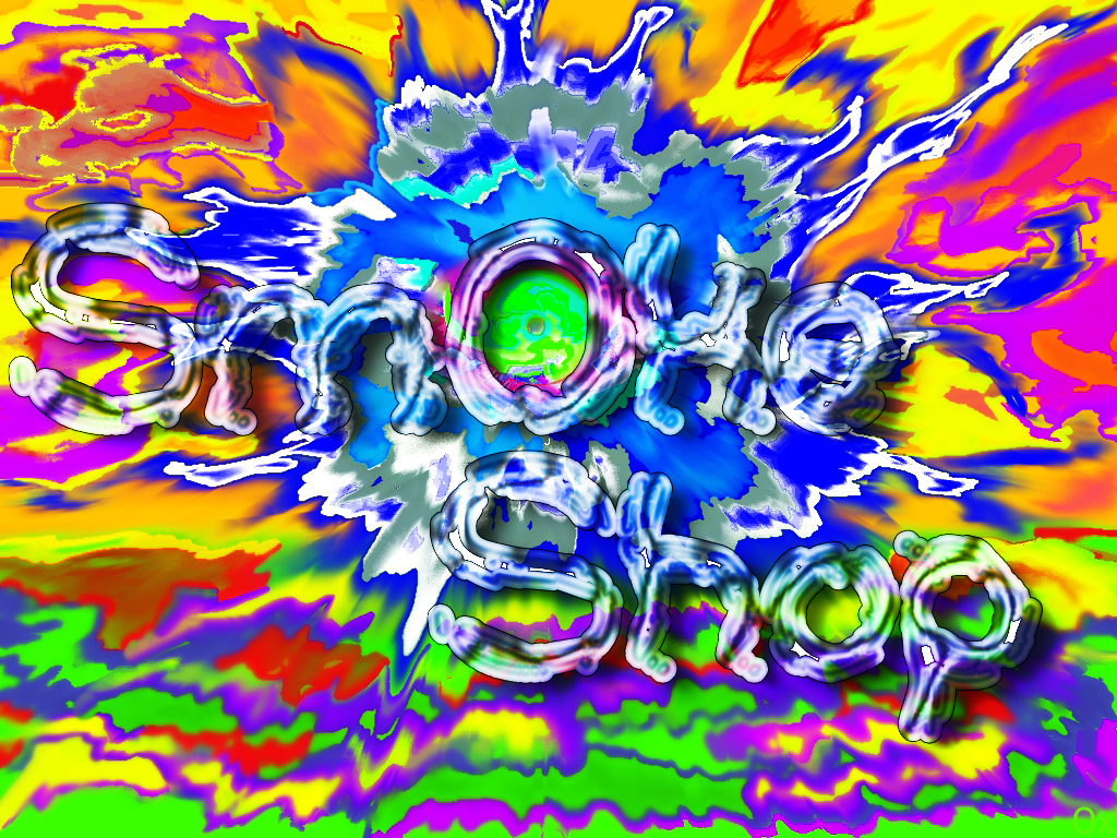

edit on 10/3/2023 by Encia22 because: Forgot to add a bit of drop shadow.
a reply to: Blaine91555
That's a compelling image, Blaine91555. I love the depth and the tonality. I think that which makes it pleasing to the eye is the off-center placing of the "eye"... I don't know if you planned it, but the positioning and various elements follow the Golden Ratio rule.
That's a compelling image, Blaine91555. I love the depth and the tonality. I think that which makes it pleasing to the eye is the off-center placing of the "eye"... I don't know if you planned it, but the positioning and various elements follow the Golden Ratio rule.
originally posted by: Encia22
a reply to: AOx6179
That's excellent, AOx6179!!
I enjoyed your first attempts as well, but with this one you've taken it up a notch. The beauty of art is not only the form, but the colours. I think you've got the right balance going; it is powerful, but not overwhelming.
When you mentioned t-shirts and your smoke shop, I got an idea, and like an itch, I just couldn't resist scratching. My battleground is Photoshop and I've been doing digital art for years. I'm not a professional, but I've done quite a few logos and designs for people. I love typefaces and try to integrate text into a design so that it doesn't just sit there, but melds and integrates with the image; it has to compliment, not overwhelm.
So, long story short, just for fun, I tried something with a generic name for want of knowing your business's name. I tried to be as subtle as possible so as not to detract from your original art.
That is a magnificent idea, and that looks super wicked with what youve done there with it! It makes that eye really pop., and yeah, that blends beautifully into the original art; and you have made it look as if it just breathes right into the painting. I appreciatte that idea!!
edit on 10-3-2023 by AOx6179 because: (no reason given)
a reply to: AOx6179
Cheers! I couldn't find the font I had envisioned. In fact, it took me 10 mins. to find the font and 5 to do the (sloppy) work.
In case you're interested, the font is : "Nice Dream Come True", you can grab it here -->www.dafont.com...
I think with the right font and some fine tuning, you got great branding posibilities.
edit on 10/3/2023 by Encia22 because: (no reason given)
originally posted by: Encia22
a reply to: Blaine91555
That's a compelling image, Blaine91555. I love the depth and the tonality. I think that which makes it pleasing to the eye is the off-center placing of the "eye"... I don't know if you planned it, but the positioning and various elements follow the Golden Ratio rule.
The placement is intentional. I'm sad to say that I abandoned my art long ago, but there was a time ... sigh... The pursuit of money to pay the bills led me in a different direction.
new topics
-
Famous Catholic Exorcist Visits Mir-a-Lago
US Political Madness: 4 hours ago
top topics
-
The Martian Lafayette Meteorite Interacted with Water Just 742 million years ago
Space Exploration: 17 hours ago, 7 flags -
Famous Catholic Exorcist Visits Mir-a-Lago
US Political Madness: 4 hours ago, 5 flags -
Biden FINALLY allows Ukraine to use US missiles inside of Russia.
General Conspiracies: 12 hours ago, 0 flags
active topics
-
Well, here we go red lines crossed Biden gives the go ahead to use long range missiles
World War Three • 138 • : CarlLaFong -
The Truth Behind the Manchester Airport "Police Assault" Video
Social Issues and Civil Unrest • 41 • : Oldcarpy2 -
Tomorrow will be the 7th day after the election, and they are still counting
US Political Madness • 45 • : PorkChop96 -
Racist Text Messages Mass Distributed
Social Issues and Civil Unrest • 30 • : WeMustCare -
Famous Catholic Exorcist Visits Mir-a-Lago
US Political Madness • 2 • : xuenchen -
Post A Funny (T&C Friendly) Pic Part IV: The LOL awakens!
General Chit Chat • 7783 • : baddmove -
Con Man Don
Jokes, Puns, & Pranks • 8 • : Moon68 -
POLLS - Leading Up To The November 2024 USA Elections.
2024 Elections • 323 • : NoCorruptionAllowed -
Former DOJ charged with defrauding Rep. Matt Gaetz’s family over sex-crimes investigation
Propaganda Mill • 25 • : fringeofthefringe -
The Change I Want To See
Rant • 64 • : doctordark

