It looks like you're using an Ad Blocker.
Please white-list or disable AboveTopSecret.com in your ad-blocking tool.
Thank you.
Some features of ATS will be disabled while you continue to use an ad-blocker.
11
share:
I was tempted to title this thread "Undeniable proof vaccines don't do jack", but that's not quite the truth as you'll see. In recent times I've seen
quite a few stories about what fraction of people hospitalized have been vaccinated, but looking at hospitalization rates isn't a very useful
indicator. Consider that if 100% of people were vaccinated, then 100% of people hospitalized would be vaccinated. In a place where not many people are
vaccinated, the fraction of unvaccinated people being hospitalized will obviously be higher.
That is one of the main reasons we see so many conflicting narratives when it comes to hospitalization rates of the unvaccinated vs vaccinated. A much better way to measure the effectiveness of the Covid-19 vaccines is to compare the most vaccinated countries with the least vaccinated, and see if they have any difference when it comes to stats such as case numbers and death rates. What I decided to do was take the open source data provided by Our World in Data, and create a scatter chart to compare all countries.
On the x-axis we have the number of vaccinations per capita, which means how many vaccines each person has received on average. So countries further to the right have higher vaccination rates. It looks like only one country has fully vaccinated almost every citizen (aka given everyone 2 doses), and that is the United Arab Emirates, although I haven't looked into how they achieved it or how believable it is. I did exclude a few tiny islands/countries and a couple of strange outliers such as China because they refuse to report any Covid-19 deaths.
On this first chart, the y-axis has the number of Covid-19 cases per capita, which is just the number of cases over a period of time divided by the total population size. We can't simply plot the number of cases in each country, because it highly depends on the size of the population. So by using the cases per capita we get a "normalized" value which allows us to compare all countries on equal footing. I specifically chose to use the August 1st to September 30th time period because that's when new strains such as Delta started spreading in many countries.
Also, the vaccination rates were lower in the past, so if I use data going back further in time it will make the analysis less reliable. Basically what I want to do is measure the effectiveness of the vaccine by comparing countries with different vaccination rates, and more specifically I want to see how effective the vaccines are against the newer strains of Covid-19 which the vaccines were not designed for. If the vaccines are effective, we should expect to see lower cases per capita in the most vaccinated countries, and the trend should be quite clear.
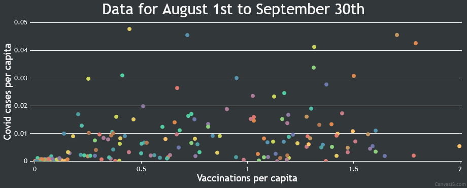
Maybe I'm seeing things, but it certainly looks like the above chart shows the opposite trend than what would be expected from an effective vaccine. It actually looks like Covid-19 has an easier time spreading through countries with higher vaccination rates, and those least vaccinated are forming a cluster of countries with very low case numbers. Well they admit the vaccine wont stop the spread of Covid-19, but maybe it will still reduce the symptoms? Well lets create another scatter chart, this time analyzing the fraction of cases which result in death.
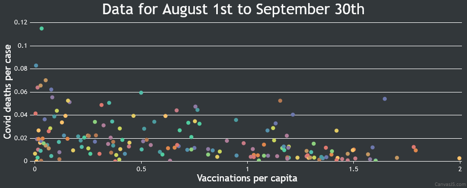
This trend is more in line with what we would expect to see from an effective vaccine. It appears as though the vaccines will indeed lower your chances of dying should you contract Covid-19. Lets sum up what we know, the vaccines allow Covid-19 to spread more easily, possibly because it creates more asymptotic cases, and partly because vaccinated people feel more safe to roam around. However, the vaccines don't appear to be completely useless even against the strains currently circulating, they do provide some protection. So what is the end result?
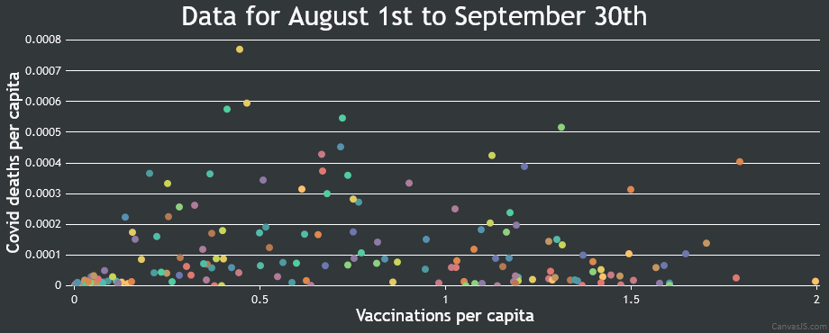
The above chart shows us Covid-19 deaths per capita (different to the previous chart which was deaths per case). This is arguably the most important chart, because it will tell us if the vaccines are actually reducing the number of overall Covid-19 deaths in a given population. It turns out, even though the vaccines provide some protection, they also increase case numbers, and those two things essentially cancel each other out. That is what we see in this 3rd chart, it's almost a combination of the trends seen in the first two charts.
We can see the least vaccinated countries have low death rates, but the most vaccinated countries also seem to have fairly low death rates, and the worst off countries are those in between. It almost looks like a Gaussian distribution, which would be hard to explain if you only looked at this 3rd chart and not the first two. So based on this analysis, I would have to conclude the vaccines aren't providing any overall benefit. I would also encourage others to run their own analysis and double-check my results. Here is the legend for the charts:

That is one of the main reasons we see so many conflicting narratives when it comes to hospitalization rates of the unvaccinated vs vaccinated. A much better way to measure the effectiveness of the Covid-19 vaccines is to compare the most vaccinated countries with the least vaccinated, and see if they have any difference when it comes to stats such as case numbers and death rates. What I decided to do was take the open source data provided by Our World in Data, and create a scatter chart to compare all countries.
On the x-axis we have the number of vaccinations per capita, which means how many vaccines each person has received on average. So countries further to the right have higher vaccination rates. It looks like only one country has fully vaccinated almost every citizen (aka given everyone 2 doses), and that is the United Arab Emirates, although I haven't looked into how they achieved it or how believable it is. I did exclude a few tiny islands/countries and a couple of strange outliers such as China because they refuse to report any Covid-19 deaths.
On this first chart, the y-axis has the number of Covid-19 cases per capita, which is just the number of cases over a period of time divided by the total population size. We can't simply plot the number of cases in each country, because it highly depends on the size of the population. So by using the cases per capita we get a "normalized" value which allows us to compare all countries on equal footing. I specifically chose to use the August 1st to September 30th time period because that's when new strains such as Delta started spreading in many countries.
Also, the vaccination rates were lower in the past, so if I use data going back further in time it will make the analysis less reliable. Basically what I want to do is measure the effectiveness of the vaccine by comparing countries with different vaccination rates, and more specifically I want to see how effective the vaccines are against the newer strains of Covid-19 which the vaccines were not designed for. If the vaccines are effective, we should expect to see lower cases per capita in the most vaccinated countries, and the trend should be quite clear.

Maybe I'm seeing things, but it certainly looks like the above chart shows the opposite trend than what would be expected from an effective vaccine. It actually looks like Covid-19 has an easier time spreading through countries with higher vaccination rates, and those least vaccinated are forming a cluster of countries with very low case numbers. Well they admit the vaccine wont stop the spread of Covid-19, but maybe it will still reduce the symptoms? Well lets create another scatter chart, this time analyzing the fraction of cases which result in death.

This trend is more in line with what we would expect to see from an effective vaccine. It appears as though the vaccines will indeed lower your chances of dying should you contract Covid-19. Lets sum up what we know, the vaccines allow Covid-19 to spread more easily, possibly because it creates more asymptotic cases, and partly because vaccinated people feel more safe to roam around. However, the vaccines don't appear to be completely useless even against the strains currently circulating, they do provide some protection. So what is the end result?

The above chart shows us Covid-19 deaths per capita (different to the previous chart which was deaths per case). This is arguably the most important chart, because it will tell us if the vaccines are actually reducing the number of overall Covid-19 deaths in a given population. It turns out, even though the vaccines provide some protection, they also increase case numbers, and those two things essentially cancel each other out. That is what we see in this 3rd chart, it's almost a combination of the trends seen in the first two charts.
We can see the least vaccinated countries have low death rates, but the most vaccinated countries also seem to have fairly low death rates, and the worst off countries are those in between. It almost looks like a Gaussian distribution, which would be hard to explain if you only looked at this 3rd chart and not the first two. So based on this analysis, I would have to conclude the vaccines aren't providing any overall benefit. I would also encourage others to run their own analysis and double-check my results. Here is the legend for the charts:

edit on 30/9/2021 by ChaoticOrder because: (no reason given)
l am waiting for reports out of Japan,s countyside since most elderly have been given two jabs
Okinawa and its surrounding islands will be a good start since we have to be tested to enter them islands
Okinawa and its surrounding islands will be a good start since we have to be tested to enter them islands
edit on
0900000054002021-09-30T06:00:54-05:00005409am6 by musicismagic because: (no reason given)
a reply to: ChaoticOrder
Thank you for crunching the numbers.
When the CDC had to recommend those vaccinated to wear PPE to prevent the spread of covid delta, that should have been a big warning to everyone.
Giving a false sense of security is never good.
Thank you for crunching the numbers.
When the CDC had to recommend those vaccinated to wear PPE to prevent the spread of covid delta, that should have been a big warning to everyone.
Giving a false sense of security is never good.
a reply to: ChaoticOrder
I figured the F.U. strain is next.
But honestly from all the things I see heading our way it looks like a yearly vaccine booster for, well forever, is the long term plan.
I figured the F.U. strain is next.
But honestly from all the things I see heading our way it looks like a yearly vaccine booster for, well forever, is the long term plan.
a reply to: ChaoticOrder
Data from the UK where about 95 percent of cases are delta says that between January and July there were 51,000 deaths related to covid. 38,000 were from unvaxxed people. 12,000 were from single vaxxed people and 640 were double vaxxed people.
The UK has a Vax rate of 4 in 5.
This means that 1 in 5 of the population are unvaxxed yet they make up 4 in 5 of all deaths. The conclusion is that the shot is kicking delta's butt.
More vaccinated people are dying of COVID than unvaccinated people, according to a recent report from Public Health England (PHE). The report shows that 163 of the 257 people (63.4%) who died of the delta variant within 28 days of a positive COVID test between February 1 and June 21, had received at least one dose of the vaccine. At first glance, this may seem alarming, but it is exactly as would be expected.
Doesn't sound like "butt kicking"
theconversation.com...
a reply to: AaarghZombies
Yes the vaccine does appear to reduce the death rate, but it also results in more cases, which causes more deaths, and those two things cancel each other out as this data shows. The vaccines haven't really reduced the overall rate of death, and it's probably far safer to be in that cluster of unvaccinated countries than any other country. Israel has one of the highest vaccination rates, and in the first chart you can see their dot located in the top right. They have massive case numbers despite high vaccination rates.
Yes the vaccine does appear to reduce the death rate, but it also results in more cases, which causes more deaths, and those two things cancel each other out as this data shows. The vaccines haven't really reduced the overall rate of death, and it's probably far safer to be in that cluster of unvaccinated countries than any other country. Israel has one of the highest vaccination rates, and in the first chart you can see their dot located in the top right. They have massive case numbers despite high vaccination rates.
edit on 30/9/2021 by ChaoticOrder because: (no reason
given)
originally posted by: AaarghZombies
a reply to: ChaoticOrder
Data from the UK where about 95 percent of cases are delta says that between January and July there were 51,000 deaths related to covid. 38,000 were from unvaxxed people. 12,000 were from single vaxxed people and 640 were double vaxxed people.
The UK has a Vax rate of 4 in 5.
This means that 1 in 5 of the population are unvaxxed yet they make up 4 in 5 of all deaths. The conclusion is that the shot is kicking delta's butt.
I think you have been asked to cite a source for your data in the past?
UK, another 35,000 new cases 9-29? www.worldometers.info...
When is this vaccine induced herd immunity going to kick in for the UK?
a reply to: AaarghZombies
You
The other thing that doesn’t make sense.
The elderly were the first push for being vaccinated.
I don’t think there was much vaccine hesitancy?
Most of the covid deaths are among the elderly.
But, somehow most of the deaths were from the unvaccinated?
It’s like the old game of calling someone with covid killed by cancer or a car accident as a covid death when a vaccine would have nothing to do with preventing the actual cause of death….
You
51,000 deaths related to covid.
The other thing that doesn’t make sense.
The elderly were the first push for being vaccinated.
I don’t think there was much vaccine hesitancy?
Most of the covid deaths are among the elderly.
But, somehow most of the deaths were from the unvaccinated?
It’s like the old game of calling someone with covid killed by cancer or a car accident as a covid death when a vaccine would have nothing to do with preventing the actual cause of death….
Kudos for the work, excellent stuff.
There is the problem of verifying the core data due to testing and other factors like reported deaths. Filtering out bad data would be close to impossible and very difficult I should think. But good work none the less, Bravo.
ETA: I'd like to see a comparison chart of fully vaccinated countries, under vaccinated countries and those who used forbidden treatments like ivermectin and HCQ.
edit on 30-9-2021 by MichiganSwampBuck because: Added extra comments
a reply to: MichiganSwampBuck
Yeah it would be interesting to compare countries who used the "forbidden" treatments. Also, I feel it's very important to point out that even though the vaccines appear to reduce the risk of dying if you contract Covid-19, these charts don't take into account the risk of death which comes with taking a vaccine. The data indicates that risk is greater than all other vaccines combined, but even so I don't think it would change the results greatly.
Your chance of dying from the vaccine is obvious much lower than the chance of dying from Covid-19, but what is the probability you'll catch Covid-19 compared to the probability you'll get vaccinated. And you wont be vaccinated just once, it will be at least twice each year. I haven't ran the numbers on that specific issue, but I suspect the risk of those circumstances are starting to approach each other, because we're trying to vaccinate everyone.
The other core issue is we really don't understand the long term side-effects which may arise, so it shouldn't be made mandatory in any way. I don't really care either way if people want to get vaccinated, people should be allowed to make their own choices and suffer any potential consequences. But I care deeply when people are forced into it, especially children who have a 5-6 times higher chance of adverse reactions and virtually no chance of death.
With no source but your own mouth and knowing your personal motive from past posts and tendency to lie and post hyperbole, I don’t trust your
personal numbers or analysis, sorry but you’ll need better data than what comes from your rear.
originally posted by: AaarghZombies
a reply to: ChaoticOrder
Data from the UK where about 95 percent of cases are delta says that between January and July there were 51,000 deaths related to covid. 38,000 were from unvaxxed people. 12,000 were from single vaxxed people and 640 were double vaxxed people.
The UK has a Vax rate of 4 in 5.
This means that 1 in 5 of the population are unvaxxed yet they make up 4 in 5 of all deaths. The conclusion is that the shot is kicking delta's butt.
new topics
-
Just spotted an unusual aircraft Melbourne Australia
Aliens and UFOs: 5 hours ago -
The truth lets admit it
Aliens and UFOs: 10 hours ago
top topics
-
Mass Shooting Towson, Maryland - 7 shot, 1 possibly dead
Social Issues and Civil Unrest: 13 hours ago, 6 flags -
The truth lets admit it
Aliens and UFOs: 10 hours ago, 6 flags -
Just spotted an unusual aircraft Melbourne Australia
Aliens and UFOs: 5 hours ago, 5 flags
active topics
-
Defending the need for adherence to Old Testament commandments under the new covenant of Christ
Conspiracies in Religions • 40 • : lilzazz -
The truth lets admit it
Aliens and UFOs • 29 • : AlroyFarms -
Mass Shooting Towson, Maryland - 7 shot, 1 possibly dead
Social Issues and Civil Unrest • 13 • : xuenchen -
Just spotted an unusual aircraft Melbourne Australia
Aliens and UFOs • 3 • : xuenchen -
Statements of Intent from Incoming Trump Administration Members - 2025 to 2029.
2024 Elections • 48 • : WeMustCare -
New job to help stop school shootings
Social Issues and Civil Unrest • 23 • : Xtrozero -
Trump Cancel trip to New Jersey because of drones
Aliens and UFOs • 62 • : Xtrozero -
School shooting in Madison Wi.
Social Issues and Civil Unrest • 69 • : Xtrozero -
Was Biden's Mass clemency and pardons one last cash grab?
US Political Madness • 5 • : mysterioustranger -
Post A Funny (T&C Friendly) Pic Part IV: The LOL awakens!
General Chit Chat • 7921 • : underpass61
11
