It looks like you're using an Ad Blocker.
Please white-list or disable AboveTopSecret.com in your ad-blocking tool.
Thank you.
Some features of ATS will be disabled while you continue to use an ad-blocker.
7
share:
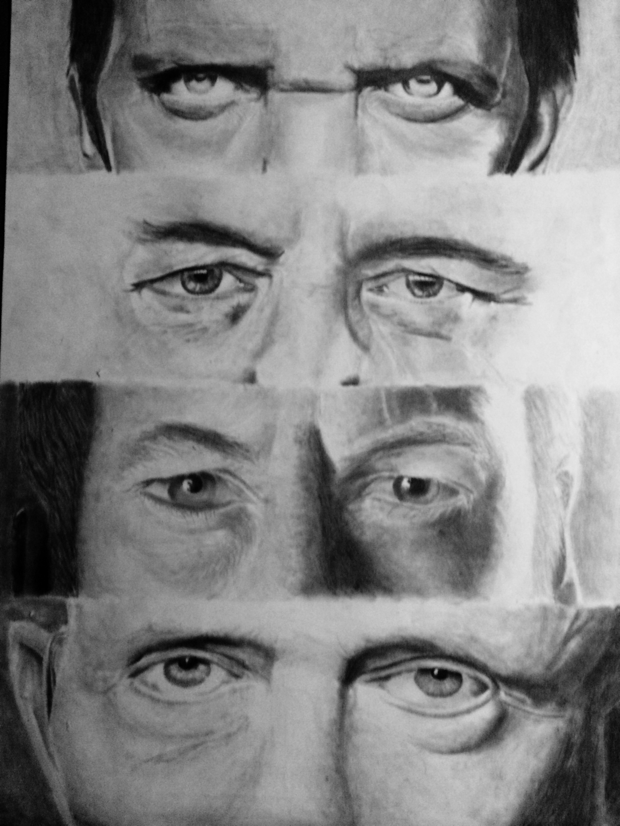
I've spent the past 3 months procrastinating/drawing this project which was assigned for my drawing class. The topic could be freely chosen. Unlike
most of my drawings, I used multiple references which were cropped/edited. If anyone wants me to post the references for credibility sake, just ask.
I've had a few people go off on me because of that which I'm not entirely surprised considering I'm looking directly off the reference(s). Anyway
feedback is always appreciated.

In case anyone was wondering, the subjects are (respectively):
Hugh Laurie
Kevin Spacey
Bob Odenkirk (Saul goodman)
Jonathan Banks
I might go back and make little touch-ups here and there before Wednesday when it's due. I noticed that scaling isn't exactly on point in some places which I can't do much about at this point.
edit on 5-12-2016 by golden23 because: (no reason given)
a reply to: golden23
My brother had the talent and never used it. I wish I had his talent but I don't. Envy is psychologically wrenching. I can't draw a good stick person. Keep it up. Good work....
My brother had the talent and never used it. I wish I had his talent but I don't. Envy is psychologically wrenching. I can't draw a good stick person. Keep it up. Good work....
edit on 2016-12-05T22:03:27-06:0010pmMon, 05 Dec 2016 22:03:27 -0600MondayAmerica/Chicago2731 by CharlesT
because: (no reason given)
Fantastic ! Such realism..The shadowing and style is reminiscent of actual 1940's black and white newspaper photos.
I'd love to see you do a vintage style mock up front page news drawing with characters from current politics.
I'd love to see you do a vintage style mock up front page news drawing with characters from current politics.
a reply to: Bleeeeep
I scaled it so that even if I filled that part of the paper, there wouldn't be enough space(pun intended) for the ears. Or if there was it would be a small part of the ear. I thought fading it out would be a better option.
The paper is 18/24 and each part is 6/18
I scaled it so that even if I filled that part of the paper, there wouldn't be enough space(pun intended) for the ears. Or if there was it would be a small part of the ear. I thought fading it out would be a better option.
The paper is 18/24 and each part is 6/18
edit on 6-12-2016 by golden23 because: (no reason given)
a reply to: SlapMonkey
It's just a highschool level Drawing I class. I'm taking drawing II next semester.
It's just a highschool level Drawing I class. I'm taking drawing II next semester.
new topics
-
Judge rules president-elect Donald Trump must be sentenced in 'hush money' trial
US Political Madness: 8 hours ago -
Farmers wife
Music: 9 hours ago -
NJ Drones tied to Tesla explosion at Trump Las vegas
General Conspiracies: 10 hours ago
top topics
-
Matthew Livelsberger said he was being followed by FBI
Political Conspiracies: 16 hours ago, 16 flags -
New Jersey-Teachers Can Now Be Certified Without Passing Basic Reading Writing Math Testing
Education and Media: 14 hours ago, 8 flags -
NJ Drones tied to Tesla explosion at Trump Las vegas
General Conspiracies: 10 hours ago, 6 flags -
Judge rules president-elect Donald Trump must be sentenced in 'hush money' trial
US Political Madness: 8 hours ago, 3 flags -
Farmers wife
Music: 9 hours ago, 2 flags
active topics
-
Farmers wife
Music • 1 • : JJproductions -
Tesla Cybertruck Explodes in Front of Trump Hotel in Las Vegas
Mainstream News • 204 • : CarlLaFong -
New Jersey-Teachers Can Now Be Certified Without Passing Basic Reading Writing Math Testing
Education and Media • 10 • : crayzeed -
Judge rules president-elect Donald Trump must be sentenced in 'hush money' trial
US Political Madness • 5 • : CarlLaFong -
Petition Calling for General Election at 564,016 and rising Fast
Political Issues • 211 • : angelchemuel -
Paranoid Liberals Believe U.S. Service Members are More Dangerous than Illegal Aliens.
Social Issues and Civil Unrest • 34 • : Lazy88 -
Here we again... CHINA having mass outbreak of something
Diseases and Pandemics • 21 • : Scratchpost -
Musk calls on King Charles III to dissolve Parliament over Oldham sex grooming gangs
Mainstream News • 94 • : Freeborn -
Vehicle Strikes people in New Orleans
Mainstream News • 293 • : Flyingclaydisk -
NJ Drones tied to Tesla explosion at Trump Las vegas
General Conspiracies • 9 • : Flyingclaydisk
7
