It looks like you're using an Ad Blocker.
Please white-list or disable AboveTopSecret.com in your ad-blocking tool.
Thank you.
Some features of ATS will be disabled while you continue to use an ad-blocker.
3
share:

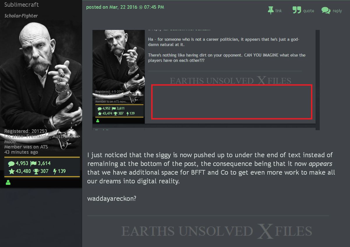
I just noticed that the siggy is now pushed up to under the end of text instead of remaining at the bottom of the post, the consequence being that it now appears that we have additional space for BFFT and Co to get even more work to make all our dreams into digital reality.
waddayareckon?
a reply to: Sublimecraft
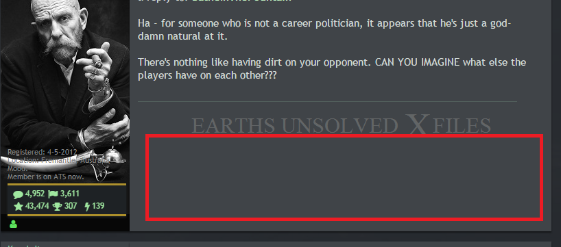
Not seeing that here:

Apparently not everybody sees the same thing. Some people see the background in the avatar area stretched out, some people don't, I'm in the latter camp. (even when it has a big background I don't see it). But I'm not seeing any space below the signature and I think to make that big would like that would not be the intent of ATS.
I had a signature pic a few pixels over the limit and a mod removed it, so I had to redo it with a few pixels less to stay within ATS limits, so if they are that picky about a few pixels that's why I doubt they would intentionally make the sig area that much larger.
Not seeing that here:

Apparently not everybody sees the same thing. Some people see the background in the avatar area stretched out, some people don't, I'm in the latter camp. (even when it has a big background I don't see it). But I'm not seeing any space below the signature and I think to make that big would like that would not be the intent of ATS.
I had a signature pic a few pixels over the limit and a mod removed it, so I had to redo it with a few pixels less to stay within ATS limits, so if they are that picky about a few pixels that's why I doubt they would intentionally make the sig area that much larger.
Same amount of space for me, I read this, so I tried to jam my background into my sig.
hmm using up all the space gave me the box underneath that you see, but I couldn't see it in your post either.
hmm using up all the space gave me the box underneath that you see, but I couldn't see it in your post either.
edit on 23-3-2016 by Lysergic
because: (no reason given)
Mine is actually a little smaller now.. And the bottom letters are pushed all the way to bottom so letters like 'Y' look funky as hell. I'm trying not
to be bothered by it. For me your sign looks as it always did.
Y and G cut off in signature above me.. "Stony things"
a reply to: Sublimecraft
Y and G cut off in signature above me.. "Stony things"
a reply to: Sublimecraft
edit on 23-3-2016 by Reverbs because: (no reason given)
new topics
-
ILLUMINATION: Dimensions / Degrees – Da Vincis Last Supper And The Philosophers Stone
Secret Societies: 1 hours ago -
Just Sick of It! Done! Can't take it anymore!
General Chit Chat: 2 hours ago -
Speaking of Pandemics
General Conspiracies: 4 hours ago -
Stuck Farmer And His Queue Jumping Spawn
Rant: 4 hours ago
top topics
-
Joe Biden gives the USA's Highest Civilian Honor Award to Hillary Clinton and George Soros.
US Political Madness: 14 hours ago, 13 flags -
Winter Storm
Fragile Earth: 15 hours ago, 7 flags -
A great artist and storyteller, for kids of all ages
General Entertainment: 17 hours ago, 6 flags -
Paradox of Progress
Ancient & Lost Civilizations: 12 hours ago, 6 flags -
Biden Face Planted Somewhere
Politicians & People: 17 hours ago, 5 flags -
Stuck Farmer And His Queue Jumping Spawn
Rant: 4 hours ago, 2 flags -
ILLUMINATION: Dimensions / Degrees – Da Vincis Last Supper And The Philosophers Stone
Secret Societies: 1 hours ago, 2 flags -
Just Sick of It! Done! Can't take it anymore!
General Chit Chat: 2 hours ago, 1 flags -
Speaking of Pandemics
General Conspiracies: 4 hours ago, 0 flags
3
