It looks like you're using an Ad Blocker.
Please white-list or disable AboveTopSecret.com in your ad-blocking tool.
Thank you.
Some features of ATS will be disabled while you continue to use an ad-blocker.
share:
Starting with the site home page, we're going to begin rolling out quite a few incremental improvements throughout all of ATS. With the new home page,
I focused more on a broad-picture overview of what's happening on ATS "right now," rather than the categoried approach of the home page we have now.
Much of the overall design is the same, just some layout improvements.
Here is the new prototype home page, light version, represented in two "scrolls." (Click the thumbnails for full-size images)
No scroll...
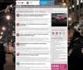
First scroll...
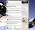
Second scroll...
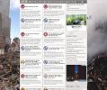
As you can see, there are rotating background images. Right now we have 1) The police lined up for a protest in NYC, 2) The TPP negotiating table, 3) Surveillance cameras, and 4) The WTC wreckage. For those users on desktop browsers, it feels like these thematic backgrounds help to make up for the (unfixable) fact that our topics have no associated images or photography.
Here's where I could use your help... what other iconic imagery would you like to see rotating in the background of our site home page?
Help find some images. The must be images with a Creative Commons deed that allows both commercial use and modifications. An excellent source is Flickr or WIki Commons. The original should also be at least 2,000 pixels wide.
Let me know what you think of the revises home, and also your ideas for the imagery.
Here is the new prototype home page, light version, represented in two "scrolls." (Click the thumbnails for full-size images)
No scroll...

First scroll...

Second scroll...

As you can see, there are rotating background images. Right now we have 1) The police lined up for a protest in NYC, 2) The TPP negotiating table, 3) Surveillance cameras, and 4) The WTC wreckage. For those users on desktop browsers, it feels like these thematic backgrounds help to make up for the (unfixable) fact that our topics have no associated images or photography.
Here's where I could use your help... what other iconic imagery would you like to see rotating in the background of our site home page?
Help find some images. The must be images with a Creative Commons deed that allows both commercial use and modifications. An excellent source is Flickr or WIki Commons. The original should also be at least 2,000 pixels wide.
Let me know what you think of the revises home, and also your ideas for the imagery.
edit on 6-2-2016 by SkepticOverlord because: (no reason
given)
a reply to: SkepticOverlord
First thing that always comes to mind for me: The American flag with the Bill of Rights as an overlay.
Second: a donkey and an elephant on one side of the screen, a large bald eagle head with piercing eyes on the other staring them down.
Third: the scales of justice with armed guards.
Just a few to get started...
a reply to: Vroomfondel
The American flag with the bill of rights as an overlay? Haha I seriously hope not.
The American flag with the bill of rights as an overlay? Haha I seriously hope not.
a reply to: SkepticOverlord
Man.. 9/11.. STILL Burns a hole in my butt. I'm OK with this. I was against the new changes as you will see my member join up date. But as time went on. I'm for them. The changes envoked us members.
Subliminally you may inspire a new member. May not be your intent. But there was something that sparked one of us to quit lurking. And join.
👍
Edit: I still mostly operate off a mobile tablet. The backgrounds don't show. But that 9/11. 😌
Man.. 9/11.. STILL Burns a hole in my butt. I'm OK with this. I was against the new changes as you will see my member join up date. But as time went on. I'm for them. The changes envoked us members.
Subliminally you may inspire a new member. May not be your intent. But there was something that sparked one of us to quit lurking. And join.
👍
edit on 6-2-2016 by Bigburgh because: (no reason given)
Edit: I still mostly operate off a mobile tablet. The backgrounds don't show. But that 9/11. 😌
edit on 6-2-2016 by Bigburgh because: (no
reason given)
a reply to: Vroomfondel
ATS has many members from all over the world.
I hope you were joking.
As for the new look. Eh....
But I didn't care for this look either.
I'll keep an eye out for some good images.
ATS has many members from all over the world.
I hope you were joking.
As for the new look. Eh....
But I didn't care for this look either.
I'll keep an eye out for some good images.
I find the art scemes more drawing than the photos. Like the mascottes and action figure stuff. It feels like it might inspire more than the
absolutes that photos represent. But I am the "outside the box" type so my opinion might not be shared by the serious researchers on this site that
would appreciate the the more solid theme.
It is kind of topic drift but relevant. I have my phone site settings to desktop version, but when I go to ats.com it takes me to the mobile homepage, so I never see the page that you are spiffing up. I go to the recent threads page from my browser history to avoid it.
It is kind of topic drift but relevant. I have my phone site settings to desktop version, but when I go to ats.com it takes me to the mobile homepage, so I never see the page that you are spiffing up. I go to the recent threads page from my browser history to avoid it.
a reply to: SkepticOverlord
I'm just trying to give ideas.
Pandemic/viral outbreak theme

static.independent.co.uk...
Missle/war theme
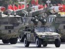
static4.businessinsider.com...
I'm just trying to give ideas.
Pandemic/viral outbreak theme

static.independent.co.uk...
Missle/war theme

static4.businessinsider.com...
edit on
7-2-2016 by gmoneystunt because: Add Links For Thumbnails
FEMA Camp

d1nt4a7y8dwdsx.cloudfront.net...
HAARP
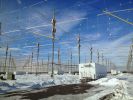
rosselderdotcom.files.wordpress.com...
CERN/Hadron Collider

blogs-images.forbes.com...
www.oeaw.ac.at...

d1nt4a7y8dwdsx.cloudfront.net...
HAARP

rosselderdotcom.files.wordpress.com...
CERN/Hadron Collider

blogs-images.forbes.com...
www.oeaw.ac.at...
edit on 7-2-2016 by gmoneystunt because: (no reason given)
Iconic?
This says it all in my view.

With or without the words!
For the US centric crowd,

and that pic could apply to any western Nation.
P
This says it all in my view.

With or without the words!
For the US centric crowd,

and that pic could apply to any western Nation.
P
If the new home page is going to reflect what is going on , on ATS right now, shouldn't at least one of the background images reflect that? Not just
revolving, but the ability to swap it out to reflect current events, and the remaining images be the iconic symbols. How often were you planning to
change the images?
If the goal is to present more of a general overview of what's 'happening now', I would suggest finding a handful of images representative of each of
the main forums. Every forum would then have a 'set' of images associated with it, and based on what threads (and what forum they're from) are
trending on the home page, you could randomly apply an image from the associated set as the background.
That way you'd ensure that the background is at least marginally related to the current topics, and you wouldn't see, for example, half a dozen topics about UFOs with an image of the World Trade Center as the background. It would also make the site look and feel more dynamic to repeat visitors.
Just my two cents...
I am thinking some sort of space image, for the page background. Not everyone in ATS is from the U.S. But we are universally under the same stars, and
outer space.
how about a pic of the moon landing, or earth (round one) from space?
An alien space ship, Sasquatch, chupacabra to name a few.
I know for someone showing up to the site for the first time may shy away because it makes us look loony, but it seems that stuff like that is what brought most of our members to the site anyways, so who knows?
how about a pic of JFK, MLK jr, Nixon, things like the Bermuda Triangle, other general conspiracy.
what other iconic imagery would you like to see rotating in the background of our site home page?
Plenty of images >2000pixels on Google images..........
A random scrolling of awesome ATS avatars
Hindenburg disaster
First moon landing
JFK assassination
Battle of LA UFO pic
Hessdalen lights
Mjr Marcel holding the "weather balloon"
Pearl Harbour
Ancient magaliths (Baabek, obelisk of Aswan, Trilithon etc)
Giants
Bigfoot
Jesus
NSA spying
Bacon.
Cats.
a reply to: SkepticOverlord
There are lots of iconic images out there. Famous and interesting monuments and ancient sites, the scenes of battles from a thousand theatres of war, the aftermath of quakes and volcanic eruptions.
I think the real difficultly is choosing a shot where there is enough going on in the left and right of shot, to make it worth putting up. Most photos have a busy centre shot, and things get less detailed from there. The shot looses context if you only see the sides.
But if you take a side on shot of a chessboard full of pieces, then you might have something for one of them!
a reply to: SkepticOverlord
A google earth picture of Area 51. A montage of the 7 greatest wonders of the world.
Number 3 looks a little cluttered.
A google earth picture of Area 51. A montage of the 7 greatest wonders of the world.
Number 3 looks a little cluttered.
new topics
-
Man Stabbed or Cardiac arrest on Westminster Bridge, London, UK
Mainstream News: 28 minutes ago -
A fix for the Trans players in sports
Social Issues and Civil Unrest: 1 hours ago -
Petition Calling for General Election at 564,016 and rising Fast
Political Issues: 5 hours ago -
Rep. Alexandria O. Cortez Says Forcing People to Use The Correct Bathroom is Dangerous.
US Political Madness: 11 hours ago
top topics
-
France gives Ukraine license to fire long-range missiles at Russia
World War Three: 16 hours ago, 9 flags -
Petition Calling for General Election at 564,016 and rising Fast
Political Issues: 5 hours ago, 9 flags -
Rep. Alexandria O. Cortez Says Forcing People to Use The Correct Bathroom is Dangerous.
US Political Madness: 11 hours ago, 7 flags -
Ok this is some BS now WTH
Rant: 14 hours ago, 5 flags -
A fix for the Trans players in sports
Social Issues and Civil Unrest: 1 hours ago, 5 flags -
Cooperation zones
World War Three: 12 hours ago, 3 flags -
Man Stabbed or Cardiac arrest on Westminster Bridge, London, UK
Mainstream News: 28 minutes ago, 0 flags
active topics
-
Petition Calling for General Election at 564,016 and rising Fast
Political Issues • 30 • : Cymru -
International Criminal Court Issues Arrest Warrant For Netanyahu
Mainstream News • 46 • : JJproductions -
Results of the use of the Oreshnik missile system in Dnepropetrovsk
World War Three • 184 • : Oldcarpy2 -
-@TH3WH17ERABB17- -Q- ---TIME TO SHOW THE WORLD--- -Part- --44--
Dissecting Disinformation • 3367 • : Thoughtful3 -
Rep. Alexandria O. Cortez Says Forcing People to Use The Correct Bathroom is Dangerous.
US Political Madness • 28 • : WeMustCare -
Ok this is some BS now WTH
Rant • 10 • : awhispersecho -
A fix for the Trans players in sports
Social Issues and Civil Unrest • 9 • : Xtrozero -
France gives Ukraine license to fire long-range missiles at Russia
World War Three • 27 • : BedevereTheWise -
Man Stabbed or Cardiac arrest on Westminster Bridge, London, UK
Mainstream News • 0 • : Bilbous72 -
Post A Funny (T&C Friendly) Pic Part IV: The LOL awakens!
General Chit Chat • 7820 • : underpass61

