It looks like you're using an Ad Blocker.
Please white-list or disable AboveTopSecret.com in your ad-blocking tool.
Thank you.
Some features of ATS will be disabled while you continue to use an ad-blocker.
8
share:
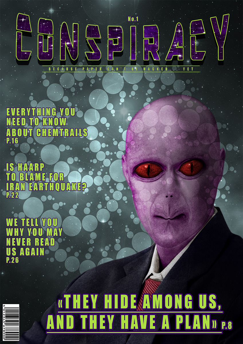
I did this for a contest using photoshop. The theme was "create a magazine cover", and the rules are not to use copyrighted images, but there was
another rule : it is prohibited to use "premanipulated images", and in this case the alien because it is CGI (or at least it seems to be, it could
be the face of a human that has been manipulated to look like this) even if it is a free image that can even be used for commercial purpose.
Anyway, I figured I would post it here instead. And here are the source images I used : alien, stars and crop circles.
click here for the high resolution version

Anyway, I figured I would post it here instead. And here are the source images I used : alien, stars and crop circles.
click here for the high resolution version

Hmmm. But where is the page where I can learn more about what a man wants, written by a woman? (and vice versa)
Nice work
Nice work
Just doesnt seem like enough headlines on the cover to make me want to steal it from a news paper stand.
Seems a little sparse on story's.
If you look at a standard issue magazine they almost have the index on the cover these days.
Obviously more info on the cover appeals to more tastes
Apart from that it looks good
Seems a little sparse on story's.
If you look at a standard issue magazine they almost have the index on the cover these days.
Obviously more info on the cover appeals to more tastes
Apart from that it looks good
edit on 18-1-2016 by Raggedyman because: (no reason given)
a reply to: gosseyn
It's a pretty decent foundation. I'm a professional graphic designer for the past 11 years, so there are quite a few things I could point out that may help polish it up, like typeface choice and the magazine wordmark, but overall it's not too bad.
But, if you're looking for constructive criticism, I'd be glad to throw that out there, I just don't want to do it without you having asked for it
a reply to: SlapMonkey
Yes, you can tell me. I know there are many things that seem out of place, like for example the sort of subtitle that doesn't look good and doesn't catch the eye. The font of the headlines also doesn't look good. To tell the truth the only things that I really like are the alien(which needs more work and I am not happy with the purple color of his skin), the title (which at the beginning was blue instead of purple), and the background (it's the star image on top of the crop circles image on top of the cloud effect of photoshop on top of a grayscale gradient) almost totally desaturated with a little blue and green. Also the "A" in the title looks distorted too much . That took me two days, I had a different version that I trashed and kept only the alien, and the font and distortion of the title.
Yes, you can tell me. I know there are many things that seem out of place, like for example the sort of subtitle that doesn't look good and doesn't catch the eye. The font of the headlines also doesn't look good. To tell the truth the only things that I really like are the alien(which needs more work and I am not happy with the purple color of his skin), the title (which at the beginning was blue instead of purple), and the background (it's the star image on top of the crop circles image on top of the cloud effect of photoshop on top of a grayscale gradient) almost totally desaturated with a little blue and green. Also the "A" in the title looks distorted too much . That took me two days, I had a different version that I trashed and kept only the alien, and the font and distortion of the title.
a reply to: gosseyn
Yeah, the alien looks okay--the only things that bother me about it are the pucker effect in the lips and the size of the eyes in relation to their distance apart, but it's an alien, so that's just subjective concerns which need not be heeded.
I'm glad you dislike the font used in the title--from a constructive point of view, I would say that the quality of the lettering and the type of lettering cause it to look relatively cheap or unrefined. That alone would make me not take the magazine seriously. Couple that with the "arc upper" curve of the title, and it takes away a lot of the credibility that could be contained within the publication.
You've already addressed the illegibility of the subtitle/tagline, so I'll leave that alone except to say that yellow isn't the best choice for type for the cover of a magazine (in most instances).
Same goes for the headlines, as well, plus the typeface that you chose (Headline or Haettenschweiler or something similar) is actually harder to read than if you were to have chosen a medium-weight without the outlines...a subtle drop shadow without any blur and held close to the letters is a much better approach than a relatively heavy outline. And I would stay away from heavily-condensed typefaces and combining that with spacious tracking, as it kind of defeats the purpose for the usefulness of a condensed typeface.
Anyhoo, that's my constructive criticism, for the most part. Hopefully it'll help in future endeavors.
Take care...and don't take anything personally, as criticism is how we grow.
new topics
-
Mass Extinctions May Hold the Key to Life in the Universe
Education and Media: 2 hours ago -
Can we be certain that Jesus Christ was born on December 25th?
Religion, Faith, And Theology: 4 hours ago -
RIP Merrily Harpur British Big Cat Realist
Cryptozoology: 6 hours ago -
Australian mercenary caught and crying as he is a prisoner of war.
Other Current Events: 11 hours ago
top topics
-
Panamanian President-“every square meter” of the Panama Canal belongs to Panama.
New World Order: 13 hours ago, 12 flags -
Australian mercenary caught and crying as he is a prisoner of war.
Other Current Events: 11 hours ago, 10 flags -
NYPD arrests migrant who allegedly set woman on fire on subway train, watched her burn to death
Breaking Alternative News: 15 hours ago, 9 flags -
JILL BIDEN Wants JOE to Punish Democrats Who Forced Him to Leave Office in Disgrace on 1.20.2025.
2024 Elections: 12 hours ago, 9 flags -
RIP Merrily Harpur British Big Cat Realist
Cryptozoology: 6 hours ago, 6 flags -
Mass Extinctions May Hold the Key to Life in the Universe
Education and Media: 2 hours ago, 3 flags -
Can we be certain that Jesus Christ was born on December 25th?
Religion, Faith, And Theology: 4 hours ago, 1 flags
active topics
-
NYPD arrests migrant who allegedly set woman on fire on subway train, watched her burn to death
Breaking Alternative News • 25 • : Flyingclaydisk -
Can we be certain that Jesus Christ was born on December 25th?
Religion, Faith, And Theology • 18 • : FullHeathen -
F-18 shot down over Red Sea....by our own Destroyer?
Other Current Events • 13 • : Cosmo14 -
Panamanian President-“every square meter” of the Panama Canal belongs to Panama.
New World Order • 19 • : FullHeathen -
Mass Extinctions May Hold the Key to Life in the Universe
Education and Media • 1 • : BeyondKnowledge3 -
Australian mercenary caught and crying as he is a prisoner of war.
Other Current Events • 32 • : BedevereTheWise -
‘Something horrible’: Somerset pit reveals bronze age cannibalism
Ancient & Lost Civilizations • 19 • : Scratchpost -
RIP Merrily Harpur British Big Cat Realist
Cryptozoology • 2 • : angelchemuel -
The Daily Mail trying to imply “it’s aliens”
Dissecting Disinformation • 15 • : crayzeed -
Post A Funny (T&C Friendly) Pic Part IV: The LOL awakens!
General Chit Chat • 7947 • : underpass61
8
