It looks like you're using an Ad Blocker.
Please white-list or disable AboveTopSecret.com in your ad-blocking tool.
Thank you.
Some features of ATS will be disabled while you continue to use an ad-blocker.
share:
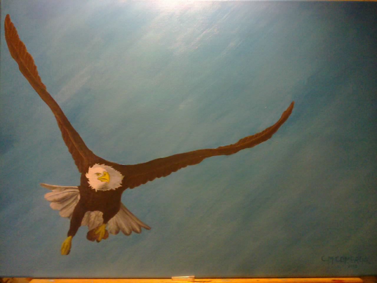
Here is a painting I did last year. I did this one as a gift for my spiritual mentor.
This was my 3rd painting. Please, give me your opinions.

This was my 3rd painting. Please, give me your opinions.

I think the colors and vision are fabulous, but I would love to see more wing span and feather detail there, as well do you think the bird's head
should be further to the right?
edit on 22-12-2014 by InTheLight because: (no reason given)
a reply to: InTheLight
I worked from a photo, as always, so the head is at an actual position, if that makes sense at all, but yes, it does look odd. Due to the fact that I gave this painting away, I do not have a better photo, (A big mistake I made not getting a better photo), I took this one with my phone.
When I go and visit again, I will get better photos for you. I did spent weeks on the detail of the feathers.
a reply to: InTheLight
I just remembered that my sister-in-law should have some good photos from the art exhibition from last year. I will ask her when I see her. I will send you an update as soon as I get them for you.
I just remembered that my sister-in-law should have some good photos from the art exhibition from last year. I will ask her when I see her. I will send you an update as soon as I get them for you.
It's a great start you could really do this piece justice to keep working it. It doesn't look complete yet but it does display some serious talent
and looks good. You earned a star from me artist!
a reply to: IndependentAgent
It's nice overall, but it feels flat--some more dramatic darks on the eagle itself would help, along with brighter highlights. It could be the exposure of the camera, though, and the white balance, but it just feels flat overall.
It's nice overall, but it feels flat--some more dramatic darks on the eagle itself would help, along with brighter highlights. It could be the exposure of the camera, though, and the white balance, but it just feels flat overall.
a reply to: Skid Mark
For those who have not seen my other thread, here it is.
www.abovetopsecret.com...
For those who have not seen my other thread, here it is.
www.abovetopsecret.com...
originally posted by: IndependentAgent
a reply to: InTheLight
I just remembered that my sister-in-law should have some good photos from the art exhibition from last year. I will ask her when I see her. I will send you an update as soon as I get them for you.
Great, because the bird certainly looks like it is flying in an odd position and as above, a little highlighting where the sunshine would hit it's back and feathers and some darker tones below on the bird, would be a nice contrast, and make it pop a bit. Are there any golden tones in the bird's feathers? Maybe the head area looks odd because a neck is not defined?
edit on 22-12-2014 by InTheLight because: (no reason given)
a reply to: InTheLight
Maybe yes. And about the golden tones, I can not really remember! It may just be a bit more than a year, but it seems so long ago.
Maybe yes. And about the golden tones, I can not really remember! It may just be a bit more than a year, but it seems so long ago.
Saw this and your wildcat one, love them! I suck so bad at painting! LOL
originally posted by: IndependentAgent
Here is a painting I did last year. I did this one as a gift for my spiritual mentor.
This was my 3rd painting. Please, give me your opinions.
I found the pic online and if the neck was defined with darker tones (to shape and lift the head) then the head would shift further to the right and up. See what I mean?
edit on 22-12-2014 by InTheLight because: (no reason given)
edit on 22-12-2014 by InTheLight because: (no reason
given)
a reply to: InTheLight
You are right yes! And I have to give you a star for finding the photo to be able to give a comparison!
I should add that I had a light directly above the paining, it may have impacted and effected the true color of the painting.
Maybe I will get the painting back from his owner, and do some improvements. Thanks for the advise!!
edit on 22-12-2014 by IndependentAgent
because: (no reason given)
new topics
-
Christmas Car Near Detroit…
Automotive Discussion: 1 hours ago -
Assetto Corsa EVO - a New Chapter in Simracing starts January 16th
Video Games: 4 hours ago -
The Phenomenon documentary by James Fox
Aliens and UFOs: 7 hours ago -
New UK Petition - Close the borders! Suspend ALL immigration for 5 years!
Regional Politics: 8 hours ago -
The Looking Glass - Episode 3: The Path of Least Resistance
Short Stories: 10 hours ago
top topics
-
Treasury Secretary Janet Yellen Says The USA Will Be in Debt Default in Jan 2025 - Unless...
Mainstream News: 16 hours ago, 8 flags -
Credit card debt
Relationships: 12 hours ago, 7 flags -
The Phenomenon documentary by James Fox
Aliens and UFOs: 7 hours ago, 7 flags -
President-elect Trump asks the Supreme Court to Let Tik-Tok Continue Operating in the U.S..
Mainstream News: 13 hours ago, 6 flags -
Trash To Treasure: Dumpster Diving With Mike The Scavenger
General Chit Chat: 17 hours ago, 4 flags -
Christmas Car Near Detroit…
Automotive Discussion: 1 hours ago, 4 flags -
The Looking Glass - Episode 3: The Path of Least Resistance
Short Stories: 10 hours ago, 3 flags -
New UK Petition - Close the borders! Suspend ALL immigration for 5 years!
Regional Politics: 8 hours ago, 2 flags -
Assetto Corsa EVO - a New Chapter in Simracing starts January 16th
Video Games: 4 hours ago, 2 flags
active topics
-
Plane Crash Today --Azerbaijanian E190 passenger jet
Mainstream News • 62 • : Oldcarpy2 -
President-elect Trump asks the Supreme Court to Let Tik-Tok Continue Operating in the U.S..
Mainstream News • 21 • : GENERAL EYES -
-@TH3WH17ERABB17- -Q- ---TIME TO SHOW THE WORLD--- -Part- --44--
Dissecting Disinformation • 3832 • : Thoughtful3 -
Instrumental Surf Music - Origins to the Present Day
Music • 249 • : underpass61 -
Post A Funny (T&C Friendly) Pic Part IV: The LOL awakens!
General Chit Chat • 7965 • : KrustyKrab -
Trump's idea to make Canada the 51st US state: 'Potential is massive'
Mainstream News • 102 • : Oldcarpy2 -
Russia Ukraine Update Thread - part 3
World War Three • 6899 • : gortex -
Treasury Secretary Janet Yellen Says The USA Will Be in Debt Default in Jan 2025 - Unless...
Mainstream News • 28 • : Coelacanth55 -
The Looking Glass - Episode 3: The Path of Least Resistance
Short Stories • 4 • : BingoMcGoof -
Elon Musk futurist?
Dreams & Predictions • 22 • : cherokeetroy

