It looks like you're using an Ad Blocker.
Please white-list or disable AboveTopSecret.com in your ad-blocking tool.
Thank you.
Some features of ATS will be disabled while you continue to use an ad-blocker.

Photo shopping of Antarctica? Pics as proof?
page: 1share:
This may have been addressed but I tried the famous search and didn't find anything specific to this. So I was going down the rabbit hole a bit today
and was doing some google earthing. Mostly today was Nazi bases in Antarctica. In that, got a little convoluted with some hollow and flat earth
stuff. Trying to push flat or hollow earth is NOT the intent of this OP. However it could be. While searching google Earth, I cam across what I
believe is very obvious photo shopping.
What first caught my eye was the fact that this section of coast in Antarctica was conspicuously name ' Rothschild'
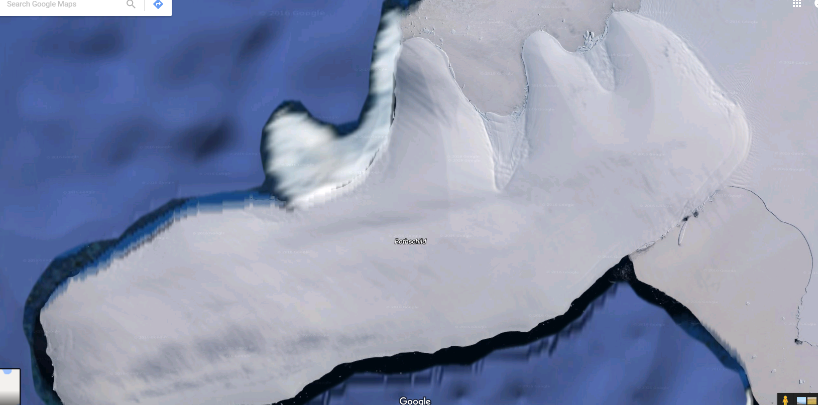
I tried to show an image here that shows the picture quality is actually VERY VERY detailed. Which only contrasts the obvious photo-shopping along the coast. So I kept scrolling around a bit and found more photo-shopping

And another one here

This one is as close up as GE would allow. Again it just shows how obvious ( to me anyways) the photo-shopping is.
So a couple questions then. First off, is this actual photo-shopping? I mean, we live in a day where you can google earth area 51 with almost HD clarity. IF it is photo-shopping, then why? and this is where we go down the rabbit hole. Could be anything from Nazi bases, to US bases to god knows what else. Point is, there HAS TO BE A REASON to wipe away what is really happening. Again though, all an if. I would love if someone could end my rabbit hole search of the day and debunk this.
eta:
Does anyone wanna tell me what this is?
What first caught my eye was the fact that this section of coast in Antarctica was conspicuously name ' Rothschild'
I tried to show an image here that shows the picture quality is actually VERY VERY detailed. Which only contrasts the obvious photo-shopping along the coast. So I kept scrolling around a bit and found more photo-shopping
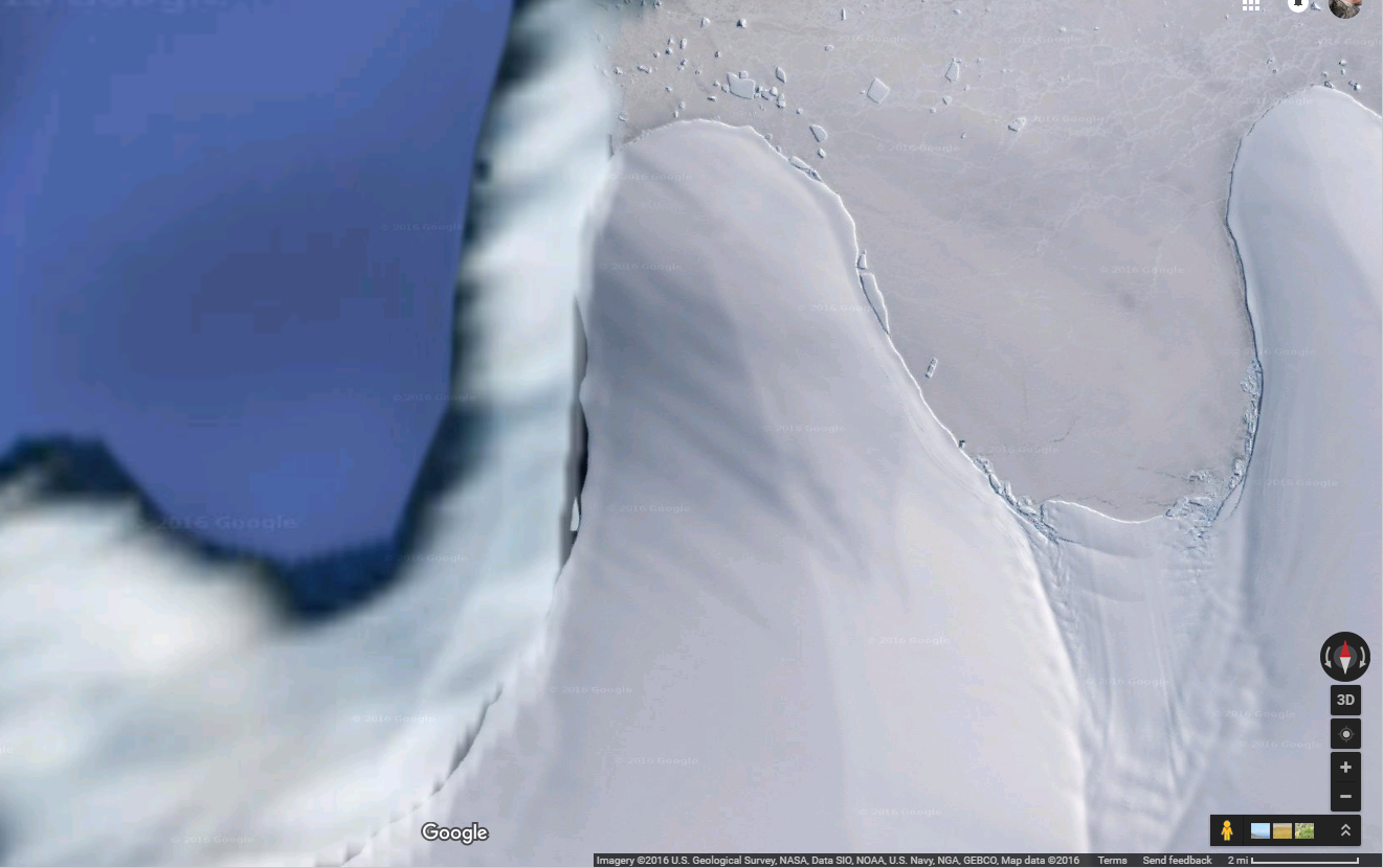
And another one here
This one is as close up as GE would allow. Again it just shows how obvious ( to me anyways) the photo-shopping is.
So a couple questions then. First off, is this actual photo-shopping? I mean, we live in a day where you can google earth area 51 with almost HD clarity. IF it is photo-shopping, then why? and this is where we go down the rabbit hole. Could be anything from Nazi bases, to US bases to god knows what else. Point is, there HAS TO BE A REASON to wipe away what is really happening. Again though, all an if. I would love if someone could end my rabbit hole search of the day and debunk this.
edit on 29-6-2016 by bknapple32 because: (no reason given)
eta:
Does anyone wanna tell me what this is?
edit on 29-6-2016 by bknapple32 because: (no reason given)
a reply to: bknapple32
Most of those imagines are composites of many images. Depending on the time frame they were taken and then collaged together, I could see there being this section that's blurry and not as defined as the rest.
Especially since the sea ice tends to vary greatly from year to year as well.
Just thinking out loud. I would not be surprised if it was shopped in some way.
~Tenth
a reply to: tothetenthpower
I noticed a lot of composite cut and pastes as well... All very on the level and plausible, so I didn't want to include those. I viewed these as a bit different just based on how vivid the detail is compared to what I see as blurring.
I noticed a lot of composite cut and pastes as well... All very on the level and plausible, so I didn't want to include those. I viewed these as a bit different just based on how vivid the detail is compared to what I see as blurring.
originally posted by: DBCowboy
a reply to: bknapple32
They look like clouds.
I dont know what they are. But I know what they aren't. Those are not clouds.
a reply to: bknapple32
Take a look around McMurdo Station, I found some strange "black out" anomalies around that area.
Pladuim
Take a look around McMurdo Station, I found some strange "black out" anomalies around that area.
Pladuim
I have been intrigued by Antarctica, I wonder what is really under all that ice and snow. star gates? very ancient technology? I wanna know.
originally posted by: ware2010
I have been intrigued by Antarctica, I wonder what is really under all that ice and snow. star gates? very ancient technology? I wanna know.
Ive always kind of thought very ancient tech. Which is what led to Hitler's interest in the region.
a reply to: bknapple32
Yeah, I definitely think that what's under those "blurs" is kept secret on a "need to know" basis only. They're their for a reason. Too bad Google Earth doesn't have the high quality hiding techniques that NASA has! LOL
Yeah, I definitely think that what's under those "blurs" is kept secret on a "need to know" basis only. They're their for a reason. Too bad Google Earth doesn't have the high quality hiding techniques that NASA has! LOL
The whole concept of Google Earth is photo shopping
Anyway, not many satellites is passing over the poles therefore there are obvious photo shopping as high resolution is not available, you see the same type of photoshop on the moon and such.
It does look weird though.
Anyway, not many satellites is passing over the poles therefore there are obvious photo shopping as high resolution is not available, you see the same type of photoshop on the moon and such.
It does look weird though.
edit on 29-6-2016 by Mianeye because: (no reason given)
a reply to: bknapple32
yes that's what I felt too, I think that may be where hitler and his scientist learned some of the interesting tech and ideas, and now the U.S. Government is controlling it/studying it. may be portals to other worlds and they travel back and forth, or there is a major city under the ice.. like Atlantis, or even older.
yes that's what I felt too, I think that may be where hitler and his scientist learned some of the interesting tech and ideas, and now the U.S. Government is controlling it/studying it. may be portals to other worlds and they travel back and forth, or there is a major city under the ice.. like Atlantis, or even older.
What I dont get is how they can put up stunning hd pics like this one:

But then we see the blurry photoshop or even worse on other images. And most of the photo-shopping seems to be happening along the coast. Where ports and naval bases would be?
But then we see the blurry photoshop or even worse on other images. And most of the photo-shopping seems to be happening along the coast. Where ports and naval bases would be?
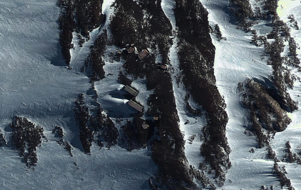
Edited the OP. But wanted to post it as well. Located at 74°45'58.9"S 136°48'06.7"W
edit on 29-6-2016 by bknapple32 because: (no reason given)
To me it looks like out buildings or something close to ISO containers.
a reply to: bknapple32
Well it is the Antarctic.
Where a lot of research goes on.
I don't see anything out of the ordinary.
Well it is the Antarctic.
Where a lot of research goes on.
I don't see anything out of the ordinary.
a reply to: tothetenthpower
Uh, hold on! I can chime in on this.
The whole "Nazi Antarctica"-connection was bothering me for awhile. I figured it could easily be debunked with a decent look into it. So I went in rummaging in and around every available piece of data I could find.
1. Google Earth is probably getting a lot of attention right now because they just released a new database. They now have the new Landsat images in their DB I believe.
2. The Landsat data has actually been available for awhile now. Unfortunately the interface wasn't as good as Google Earth, but you could review all of it with just a browser and some patience. The reason it was released was for open-source data for scientists around the world (mostly climate related)
3. Many of the Landsat images (in very specific locations) are worse quality than the predecessors, but only in areas which are worse quality than others. HINT: Seems to be very specific.
Here is the LIMA database. Which I've noticed Google Earth is using since the update.
I was very familiar with LIMA before this update. As soon as Google issued the update I went right in, and noticed I was seeing the same stuff I've been scouring over in LIMA. LIMA stands for = Landsat Imagine Mosaic of Antarctica.
Why is that important, because the mosaics do not mean "this is stitched together so some bad sections will still exist here and there."
Mosiacs mean: Here is a perfect, cloudless, seamless, high resolution survey of the entire area! Problem is: it doesn't actually turn out like this.
The reason? Don't believe it. There are obvious clone marks in some areas, obvious poor resolution spots, and obvious tampering. In the past there were better shots, and in some cases Google even stitches older shots with new shots, to make sure they get a....cloudless, seamless, high resolution survey...but that isn't the end goal all the time.
Sometimes it's about obfuscating certain areas. And you will notice this on the Moon as well. Where a guy with his own amateur, makeshift observatory, somehow takes better pictures on Earth, than they do with surveyors floating right outside the Moon.
Here are some points I noted while looking into Antarctica overall:
1. The somewhat recent "Alien ship in a crevice" is a CGI ship added in to a climate expedition done around 30+ years ago.
2. There are numerous cases of disinformation related to Antarctica, from Hollow Eath, to Flat Earth, to Nazi UFO, to current Alien Base, etc, etc
3. I find it bizarre Project Highjump was never declassified
4. There was a story that went around awhile ago about a 'anomaly' in the area. A website was created and later deemed to be a viral-marketing campaign for a book. However, the book came out 2-3 years later. Everything relate to the original story died off the net. (A few threads around here on it), and the author was a former newshead, who decided to get into writing. That whole story is a little strange. Others exist like that too.
In conclusion I can't think of much more. What I realized is that for sure something is being covered up down there. What it is? No idea. There are plenty of disinformation campaigns which don't appear to be natural. (Just a lone kook trying to make some money off a hoax idea, etc) There are also a few scientists who met an unnatural demise after staying down there for research. My current thoughts are: worth more investigation. Good luck looking into it without getting sidetracked in a mountain of BS though.
Most of those imagines are composites of many images. Depending on the time frame they were taken and then collaged together, I could see there being this section that's blurry and not as defined as the rest.
Uh, hold on! I can chime in on this.
The whole "Nazi Antarctica"-connection was bothering me for awhile. I figured it could easily be debunked with a decent look into it. So I went in rummaging in and around every available piece of data I could find.
1. Google Earth is probably getting a lot of attention right now because they just released a new database. They now have the new Landsat images in their DB I believe.
2. The Landsat data has actually been available for awhile now. Unfortunately the interface wasn't as good as Google Earth, but you could review all of it with just a browser and some patience. The reason it was released was for open-source data for scientists around the world (mostly climate related)
3. Many of the Landsat images (in very specific locations) are worse quality than the predecessors, but only in areas which are worse quality than others. HINT: Seems to be very specific.
Here is the LIMA database. Which I've noticed Google Earth is using since the update.
I was very familiar with LIMA before this update. As soon as Google issued the update I went right in, and noticed I was seeing the same stuff I've been scouring over in LIMA. LIMA stands for = Landsat Imagine Mosaic of Antarctica.
Why is that important, because the mosaics do not mean "this is stitched together so some bad sections will still exist here and there."
Mosiacs mean: Here is a perfect, cloudless, seamless, high resolution survey of the entire area! Problem is: it doesn't actually turn out like this.
The reason? Don't believe it. There are obvious clone marks in some areas, obvious poor resolution spots, and obvious tampering. In the past there were better shots, and in some cases Google even stitches older shots with new shots, to make sure they get a....cloudless, seamless, high resolution survey...but that isn't the end goal all the time.
Sometimes it's about obfuscating certain areas. And you will notice this on the Moon as well. Where a guy with his own amateur, makeshift observatory, somehow takes better pictures on Earth, than they do with surveyors floating right outside the Moon.
Here are some points I noted while looking into Antarctica overall:
1. The somewhat recent "Alien ship in a crevice" is a CGI ship added in to a climate expedition done around 30+ years ago.
2. There are numerous cases of disinformation related to Antarctica, from Hollow Eath, to Flat Earth, to Nazi UFO, to current Alien Base, etc, etc
3. I find it bizarre Project Highjump was never declassified
4. There was a story that went around awhile ago about a 'anomaly' in the area. A website was created and later deemed to be a viral-marketing campaign for a book. However, the book came out 2-3 years later. Everything relate to the original story died off the net. (A few threads around here on it), and the author was a former newshead, who decided to get into writing. That whole story is a little strange. Others exist like that too.
In conclusion I can't think of much more. What I realized is that for sure something is being covered up down there. What it is? No idea. There are plenty of disinformation campaigns which don't appear to be natural. (Just a lone kook trying to make some money off a hoax idea, etc) There are also a few scientists who met an unnatural demise after staying down there for research. My current thoughts are: worth more investigation. Good luck looking into it without getting sidetracked in a mountain of BS though.
a reply to: bknapple32
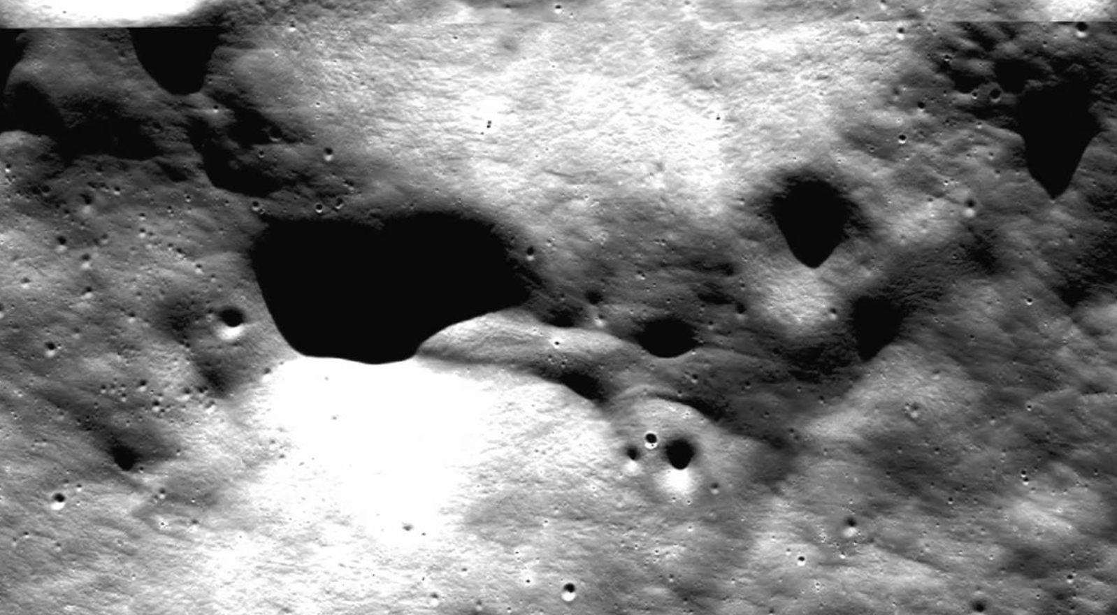
Yes. That's it precisely. And it's not just there, it's on the moon too. There are images that show quite clearly distinctive lines, ridges and squared edges from old, 1960s-70s photography, and supposedly with 'high-def' images returned it shows a flat, smeary nothing, like it was swallowed by the boring landscape.
Nope.
I ignored this for years just looking at it as any rational person would. You get supposedly better images, see nothing, move on. Im guessing that was the point.
It hit me when I was looking at some amateur astronomy photos, of the moon specifically. They were getting better quality pictures of the bright side of the moon, from their home set-up rigs. Better than Clementine, Chang-E, etc
Many Apollo shots still had ridge detail which was better than current stuff. Once I saw the amateur pics showing similar it just didn't make sense. Im guessing their post processing algorithms smooth out ridge detail for public release. It would explain why all of the newer moon pictures look similar, and look very unnatural. Overly smooth.
Im guessing the nature of landsat mosaics and because of acceptable man-made objects on Earth, there is no 'one size fits all' solution to "fixing" landsat images. So it has to be done one by one. Either make it blurry, or clone in other areas to cover up what they need to.
Here's the old Geo-Survey, I think circa 2006:

Here's the 'new' uh....'high-res' image:

If it were treated like normal images, they would've stitched in the higher res to the rest of it. You can see if you play with the historical settings actually, they sometimes stitch in photos taken over 30 year periods and use the best ones.
Keep in mind the this has already been done in the landsat database, and then its done again by Google. So it should have the best of the best in there. Obviously it doesn't.
I remember when Google Earth first came out and people found "mysterious" stuff. It was a pretty big thing for awhile. And I even messed around with it. Then there was some pushback and people tossed a lot of negative responses at those who were investing so much time into. In the meantime, numerous places have been washed over, made blurry, cloned, removed entirely, etc. Part of me wishes I spent a little more time doing it back in the day.
Moon example (please ignore the Hoax this is related to-the following images are real):
Near the Descartes crater, this picture was an official photo from Apollo:
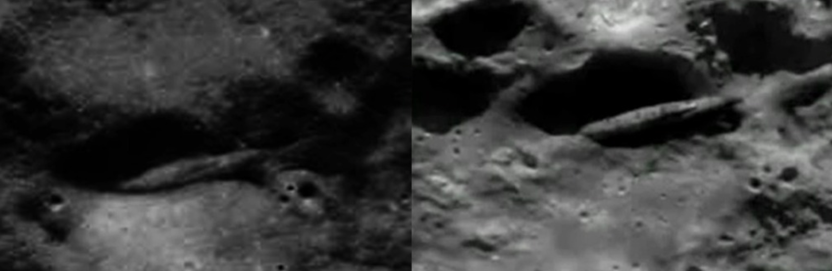
In between, I think it was Clementine or another one, they took a "better" pic of it, and it just removed the area the ship was in entirely. Of course, that didn't fly so they took another "better" one:
And we got this:
I've gone over every publicly available picture related to this area, and it's my strong conviction that the original Apollo images are more representative of what's in that area. There were distinct features in early Apollo images, which became more defined as newer photos and camera tech was used (in the set previously mentioned with the 'disappeared' crater) but then the following imaging somehow got worse. Everything was smoothed over and previously when you'd spot distinctive lines, the newest set (LRO I think?) would just show a smoothed area up close. Doesn't make sense.
Note: People might remember the Descartes pic associated with the Apollo 20 moon hoax. I was happy to point out the hoax and break down everything that was wrong with that story as it emerged, however...looking back now it doesn't make sense. Is it possible certain information in it was real, and purposely disseminated as dis-info because they new a leak was imminent or probable? Who knows... All the people related to that hoax evaporated, as if they were created just for that alone.
What I dont get is how they can put up stunning hd pics like this one:
But then we see the blurry photoshop or even worse on other images.
Yes. That's it precisely. And it's not just there, it's on the moon too. There are images that show quite clearly distinctive lines, ridges and squared edges from old, 1960s-70s photography, and supposedly with 'high-def' images returned it shows a flat, smeary nothing, like it was swallowed by the boring landscape.
Nope.
I ignored this for years just looking at it as any rational person would. You get supposedly better images, see nothing, move on. Im guessing that was the point.
It hit me when I was looking at some amateur astronomy photos, of the moon specifically. They were getting better quality pictures of the bright side of the moon, from their home set-up rigs. Better than Clementine, Chang-E, etc
Many Apollo shots still had ridge detail which was better than current stuff. Once I saw the amateur pics showing similar it just didn't make sense. Im guessing their post processing algorithms smooth out ridge detail for public release. It would explain why all of the newer moon pictures look similar, and look very unnatural. Overly smooth.
Im guessing the nature of landsat mosaics and because of acceptable man-made objects on Earth, there is no 'one size fits all' solution to "fixing" landsat images. So it has to be done one by one. Either make it blurry, or clone in other areas to cover up what they need to.
Here's the old Geo-Survey, I think circa 2006:
Here's the 'new' uh....'high-res' image:
If it were treated like normal images, they would've stitched in the higher res to the rest of it. You can see if you play with the historical settings actually, they sometimes stitch in photos taken over 30 year periods and use the best ones.
Keep in mind the this has already been done in the landsat database, and then its done again by Google. So it should have the best of the best in there. Obviously it doesn't.
I remember when Google Earth first came out and people found "mysterious" stuff. It was a pretty big thing for awhile. And I even messed around with it. Then there was some pushback and people tossed a lot of negative responses at those who were investing so much time into. In the meantime, numerous places have been washed over, made blurry, cloned, removed entirely, etc. Part of me wishes I spent a little more time doing it back in the day.
Moon example (please ignore the Hoax this is related to-the following images are real):
Near the Descartes crater, this picture was an official photo from Apollo:
In between, I think it was Clementine or another one, they took a "better" pic of it, and it just removed the area the ship was in entirely. Of course, that didn't fly so they took another "better" one:
And we got this:
I've gone over every publicly available picture related to this area, and it's my strong conviction that the original Apollo images are more representative of what's in that area. There were distinct features in early Apollo images, which became more defined as newer photos and camera tech was used (in the set previously mentioned with the 'disappeared' crater) but then the following imaging somehow got worse. Everything was smoothed over and previously when you'd spot distinctive lines, the newest set (LRO I think?) would just show a smoothed area up close. Doesn't make sense.
Note: People might remember the Descartes pic associated with the Apollo 20 moon hoax. I was happy to point out the hoax and break down everything that was wrong with that story as it emerged, however...looking back now it doesn't make sense. Is it possible certain information in it was real, and purposely disseminated as dis-info because they new a leak was imminent or probable? Who knows... All the people related to that hoax evaporated, as if they were created just for that alone.
edit on 29-6-2016 by boncho because: (no reason given)
I wonder if the image of the buildings are maybe an old base of some kind? Why wouldnt that have been blurred out as well however?
new topics
-
An Implausible New Electoral Process?
Political Ideology: 2 hours ago -
A Couple Of Great Movies Ive Watched Today
General Chit Chat: 2 hours ago -
WHY is DOJ Not Turning Over the AUDIO of JOE BIDENs Sworn Testimony to Prosecutor Robert Hur.
Above Politics: 2 hours ago -
Boeing 737 Max whistleblower Joshua Dean, 45, dead after sudden illness
Whistle Blowers and Leaked Documents: 3 hours ago -
Bigger than Covid
US Political Madness: 6 hours ago -
Modern Mind Control
General Conspiracies: 9 hours ago -
Trump Warns Time Magazine of Rising Anti-White Sentiment
2024 Elections: 11 hours ago -
Illegal Immigration Outlawed in Oklahoma Starting July 1
Social Issues and Civil Unrest: 11 hours ago -
California Must Spend 20 Billion on Power Grid Upgrades If It Wants EVs
Fragile Earth: 11 hours ago
top topics
-
Illegal Immigration Outlawed in Oklahoma Starting July 1
Social Issues and Civil Unrest: 11 hours ago, 19 flags -
Two lifeforms merge into one for first time in a billion years
Science & Technology: 13 hours ago, 13 flags -
Bigger than Covid
US Political Madness: 6 hours ago, 9 flags -
Trump Warns Time Magazine of Rising Anti-White Sentiment
2024 Elections: 11 hours ago, 9 flags -
WHY is DOJ Not Turning Over the AUDIO of JOE BIDENs Sworn Testimony to Prosecutor Robert Hur.
Above Politics: 2 hours ago, 7 flags -
California Must Spend 20 Billion on Power Grid Upgrades If It Wants EVs
Fragile Earth: 11 hours ago, 6 flags -
Modern Mind Control
General Conspiracies: 9 hours ago, 6 flags -
A Couple Of Great Movies Ive Watched Today
General Chit Chat: 2 hours ago, 4 flags -
Boeing 737 Max whistleblower Joshua Dean, 45, dead after sudden illness
Whistle Blowers and Leaked Documents: 3 hours ago, 4 flags -
Cambridge professor founds signs of life on another planet
Aliens and UFOs: 17 hours ago, 3 flags
active topics
-
Modern Mind Control
General Conspiracies • 17 • : 5thHead -
An Implausible New Electoral Process?
Political Ideology • 8 • : chr0naut -
WHY is DOJ Not Turning Over the AUDIO of JOE BIDENs Sworn Testimony to Prosecutor Robert Hur.
Above Politics • 8 • : WeMustCare -
US drug control agency will move to reclassify marijuana in a historic shift, AP sources say
Breaking Alternative News • 72 • : GENERAL EYES -
Young People Now Identifying as 'Gender Season' - seasogender, gender season, or gendersian
Social Issues and Civil Unrest • 25 • : GENERAL EYES -
Rendlesham Forest 1980 Pt II - Will There Be An Answer?
Aliens and UFOs • 3658 • : Ophiuchus1 -
Trump Warns Time Magazine of Rising Anti-White Sentiment
2024 Elections • 46 • : Zanti Misfit -
International law versus "rules-based order"
New World Order • 43 • : YouSir -
Candidate TRUMP Now Has Crazy Judge JUAN MERCHAN After Him - The Stormy Daniels Hush-Money Case.
Political Conspiracies • 1017 • : WeMustCare -
ALERT - U.S. President JOE BIDEN Examined and Found NOT OF SOUND MIND.
2024 Elections • 69 • : Zanti Misfit