It looks like you're using an Ad Blocker.
Please white-list or disable AboveTopSecret.com in your ad-blocking tool.
Thank you.
Some features of ATS will be disabled while you continue to use an ad-blocker.

Ebola - my visual charts & projections based on WHO data
page: 3share:
Since this is a number's thread...
Samaritan's epidemiologists are saying the current CDC numbers, both in terms of cases and deaths, is but 25%-50% of the actual numbers.
Isaacs' bottom line in his congressional testimony today:
"I think we will see death tolls that are unimaginable right now...."
Samaritan's epidemiologists are saying the current CDC numbers, both in terms of cases and deaths, is but 25%-50% of the actual numbers.
Isaacs' bottom line in his congressional testimony today:
"I think we will see death tolls that are unimaginable right now...."
a reply to: DancedWithWolves
"It's official; no longer pending per AP news wire
World-wide emergency declaration pending.
"It's official; no longer pending per AP news wire
LONDON (AP) — The World Health Organization on Friday declared the Ebola outbreak in West Africa to be an international public health emergency that requires an extraordinary response to stop its spread. The WHO announced the Ebola outbreak — the largest and longest in history — is worrying enough to merit being declared an international health emergency. WHO declared similar emergencies for the swine flu pandemic in 2009 and for polio in May.
Official death toll numbers continue to climb.
source
And as others have pointed out, unofficial numbers are most assuredly higher.
The death toll from the Ebola outbreak in West Africa stood at 961 people as of Aug 6, with 29 deaths reported on Aug 5-6, the World Health Organization said on Friday.
There were 68 new cases, bringing the total to 1,779. Four of the new cases were in Nigeria, the most recent country to be affected, and there were no new cases in Guinea, where the outbreak began. Four people died in Guinea, one in Nigeria, 12 in Sierra Leone and 12 in Liberia.
source
And as others have pointed out, unofficial numbers are most assuredly higher.
Thank you to everyone for the updates. Since Samaritan's Purse should know better than most how bad things really are, I found these two quotes
particularly chilling:
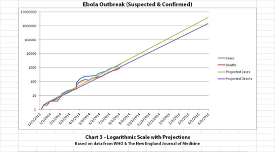
I really hope that the projections on Chart 3 and the last quote above somehow do not come to pass. Perhaps WHO's designation of this as a Public Health Emergency of International Concern (PHEIC) and the steps it leads to will help prevent worst case scenarios.
SOURCE: WHO
The full statement has a lot of information on their recommendations on the steps to take now that this has been declared a PHEIC.
originally posted by: Manawydan
We believe the reported numbers only show 25-50% of the cases.
-- Ken Isaacs (Vice President of Program and Government Relations Samaritan’s Purse)
originally posted by: loam
Isaacs' bottom line in his congressional testimony today:
"I think we will see death tolls that are unimaginable right now...."
I really hope that the projections on Chart 3 and the last quote above somehow do not come to pass. Perhaps WHO's designation of this as a Public Health Emergency of International Concern (PHEIC) and the steps it leads to will help prevent worst case scenarios.
After discussion and deliberation on the information provided, the Committee advised that:
- the Ebola outbreak in West Africa constitutes an ‘extraordinary event’ and a public health risk to other States;
- the possible consequences of further international spread are particularly serious in view of the virulence of the virus, the intensive community and health facility transmission patterns, and the weak health systems in the currently affected and most at-risk countries.
- a coordinated international response is deemed essential to stop and reverse the international spread of Ebola.
It was the unanimous view of the Committee that the conditions for a Public Health Emergency of International Concern (PHEIC) have been met.
SOURCE: WHO
The full statement has a lot of information on their recommendations on the steps to take now that this has been declared a PHEIC.
a reply to: ikonoklast
If you read the NY Times article from yesterday, it's clear this thing is only just getting started:
Which is exactly what will happen in this country if an outbreak occurs.
Meanwhile the article mentioned something I hadn't realized was true in Liberia:
Talk about adding fuel to a fire. And where the hospitals are open in Liberia:
If you read the NY Times article from yesterday, it's clear this thing is only just getting started:
‘Don’t Touch the Walls’: Ebola Fears Infect an African Hospital
So many patients, nurses and health workers have died in the government hospital that many people in this city, a center of the world’s worst Ebola epidemic, see it as a death trap.
Now, the wards are empty in the principal institution fighting the disease. Ebola stalks the city, claiming lives every day, but patients have fled the hospital’s long, narrow buildings, which sit silent and echoing in the fading light. Few people are taking any chances by coming here.
“Don’t touch the walls!” a Western medical technician yelled out. “Totally infected.”
...
“People don’t die here now,” said the deputy chief of the hospital’s burying team, Albert J. Mattia, exasperated after a long day of Ebola burials. “They are dying in the community, five, six a day.” Mr. Mattia was particularly disturbed that many of the bodies his team were putting in the ground had come from outside the hospital, thwarting attempts to isolate patients and prevent them from passing the disease to others.
“It’s very, very dangerous, very hazardous; it is contributing to the Ebola dead,” he said as his two deputies nodded glumly in agreement. “You go to the wards, there are no patients.”
“There’s a perception in the population that it is a dangerous place,” said Philippe Barboza, an epidemiologist who heads the World Health Organization team here. “ ‘The farther one is from the hospital, the better,’ ” said Mr. Barboza, summing up the widely held sentiment. “Even to have a meeting here is difficult.”
Which is exactly what will happen in this country if an outbreak occurs.
Meanwhile the article mentioned something I hadn't realized was true in Liberia:
Dead bodies have been appearing on the streets and in houses throughout Monrovia, with people staging roadblocks to ensure that health workers remove them. But with hospitals closed in the capital, it was unclear how many of the victims had died of Ebola, or from other causes.
Talk about adding fuel to a fire. And where the hospitals are open in Liberia:
“People are afraid of the hospital because you don’t know if you will meet up with a nurse who has it,” said Ibrahim Bah, 56.
...
“Unfortunately, people are not coming, because they are afraid,”
edit on 8-8-2014 by loam because: (no reason given)
Is it just me, or have the updates in regards to numbers suddenly stopped? The last update was 961 two days ago. It seemed like prior to Wednesday,
there were updates every day? Also, the man in Saudia Arabia arrived at the hospital on Tuesday, died early Wednesday and there's been no updates at
all about his test results. It seemed to be taking 2 days for the results to come back in all the other suspected cases, so I figured yesterday we
would have heard, this morning at the latest. Worrisome, or am I too anxious?
a reply to: Michelle129th
We've noticed it, too.
However, a few news (online) sites just released a statement by Dr. Brantley.
www.wsoctv.com...
We've noticed it, too.
However, a few news (online) sites just released a statement by Dr. Brantley.
ews/local/doctor-treated-ebola-releases-statement-recovery/ngx8H/
In a statement released Friday by Samaritan's Purse, the doctor being treated for Ebola gives thanks for prayers and his recovery.
www.wsoctv.com...
a reply to: Michelle129th
Could it be that we have now reached the threshold of no longer being able to track the numbers?
I think it's probably TPTB not wanting the truth of how bad it has truly gotten to be known by the general public.
Bishop
Could it be that we have now reached the threshold of no longer being able to track the numbers?
I think it's probably TPTB not wanting the truth of how bad it has truly gotten to be known by the general public.
Bishop
Thanks for the link drwill, and bishop, that was the line of thinking I was on myself. Either they've just lost track, or the numbers have jumped
exponentially and they don't want panic to set in, or what healthcare workers remain are just too busy to report numbers to anyone anymore. I guess
i'll just have to wait. Very interested to find out the status of the case in Riyadh. All I can find for any kind of update is on a few sites that
i'm unsure of their legitimacy.
CDC says Ebola not likely to be widespread in the US
CDC says Ebola not likely to be widespread in the US
A Saudi Arabian man who had recently traveled to Sierra Leone and showed Ebola-like symptoms died Wednesday of a heart attack, but authorities in Riyadh did not reveal the results of Ebola tests.
a reply to: Michelle129th
Some WHO VIP got a phone call & was told to STFU with the daily updates, lol
We all knew the culling would happen sooner or later. The desensitization through media, entertainment, & extended/perpetually reinforced normalcy bias is finally reaching it's peak. It's about time for something to actually happen.
originally posted by: ikonoklast
I'm glad the visuals are helpful for people, you're welcome and thanks for all the feedback. To be honest, I was kind of hoping the thread would get shot down and some of ATS's patron saints (or resident naysayers) would have really logical reasons why the projections in Chart 3 won't happen.
........
I'm going to do some naysaying, I'm not an analytical maths type person so I really can't critisize the methods you've used or anything like that but I can think of a few points...
The data used for your graph is (I think) the total cases of all the West African countries. Sierra Leone has 631 confirmed cases, 259 deaths, Guinea 355/231, Liberia 148/132, Nigeria 4/1. If you add them all up and draw your line you are simplifying what will happen in all countries and an exponential line emerges.
What would happen if you did a similar thing for each county? Would you get some exponetial growth in some but not others? If that is the case, the virus may die out in some countries.
There is evidence to support that the virus may have reached it's peak and is dying out in some areas, particularly in Guinea. Previous outbreaks have followed a 'bell curve' path, ie. reached a peak and then declined. So this may be characteristic of the virus, This study (link below, has loads of graphs) shows the virus ( in past outbreaks) peaking and then beginning to die down. It is thought that identifying an outbreak early on and implementing certain measures has an effect on how it behaves.
in our estimates for Congo and Uganda shows that the implementation of control measures such as education, contact tracing and quarantine will have a significant effect on lowering the effective reproductive rate of Ebola
math.lanl.gov...
The analysis of the epidemiological data during the last 3 weeks shows that the number of new cases is decreasing in Guekedou.
www.afro.who.int... may-2014.html
Chris Witty, a DFID advisor and Professor of Public and International health at the London School of Hygiene and Tropical Medicine, said Guinea had already seen the worst of the outbreak and cases were now beginning to decrease.
www.telegraph.co.uk...
Does this mean that Guinea has successfully got a grip on the disease through education and quarantine? or has the virus just died out... I don't know.
Other factors would be the cultural practices and healthcare . For example if in Nigeria less people wash, touch and kiss dead family members, the disease may not spread as much. If healthcare is better in Nigeria, again this might make a difference, if it is stopped in Nigeria the rest of the world will be safer. The above figures show that Liberia has quite a high number of deaths compared to the others, I don't know why that is but it shows there must be all kinds of factors to consider about the individual countries.
Obviously there will be other factors that could help the virus spread but it seems in some areas at least it's peaked and the exponential growth line wouldn't apply, the deaths would remain in the hundreds to thousands if that is the case. I sincerely hope that is the case.
originally posted by: Michelle129th
CDC says Ebola not likely to be widespread in the US
The CDC admits that Arsenic > Fluoride > Lead.
I'm pretty sure lead is banned from most anything, yet fluoride is happily pumped into public water supply & who knows what else.
I couldn't care less about anything the CDC says or does. Most agencies are in total compliance with what is to come & what has been going on.
a reply to: DrHammondStoat
You do make some valid points, but it doesn't fit into my fatalistic nihilism & so I will not acknowledge your optimistic naysaying any further.
edit on 8-8-2014 by Eunuchorn because: (no reason given)
originally posted by: Michelle129th
Is it just me, or have the updates in regards to numbers suddenly stopped? The last update was 961 two days ago. It seemed like prior to Wednesday, there were updates every day? Also, the man in Saudia Arabia arrived at the hospital on Tuesday, died early Wednesday and there's been no updates at all about his test results. It seemed to be taking 2 days for the results to come back in all the other suspected cases, so I figured yesterday we would have heard, this morning at the latest. Worrisome, or am I too anxious?
I wouldn't say suddenly stopped. The last WHO update is dated today the 8th, and they have upates on the 6th an 4th. Before that they were farther apart as it wasn't as serious. It seems it takes them 2 days to put together the figures. Maybe we'll get another update on the 10th?
www.who.int...
The Saudi man and revealing test results I suppose would be a seperate issue, I don't think governments are obliged to reveal this type of information, maybe they are covering it up who knows.
edit on 8-8-2014 by DrHammondStoat because: (no reason given)
I updated the charts (below) with the latest official data released on August 8, 2014 by the World Health Organization (WHO). That data is actually
the numbers through August 6, 2014. From what I've seen as I compiled these numbers, it is typical for the data to be a day or two behind.
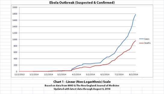
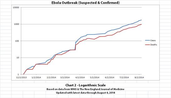
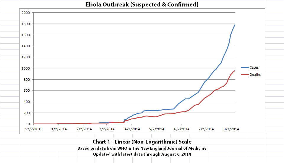
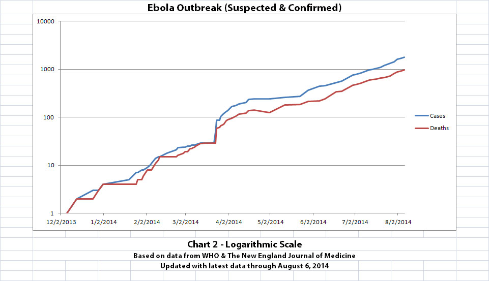
As with the original charts, Chart 1 and Chart 2 show the number of cases and the number of deaths for the Ebola outbreak that have actually been reported. In Chart 1, the y-axis is linear. In Chart 2, the y-axis is a logarithmic scale where divisions of the axis increase by powers of 10.
Click the graphic for a larger version.
Click the graphic for a larger version.
The data used is from the news updates on the following WHO and The New England Journal of Medicine websites:
SOURCE: WHO website 1
SOURCE: WHO website 2
SOURCE: The New England Journal of Medicine
Charts 1 and 2 were created and updated by me using the official data from the references above.
Charts 3, 4 (new), and 5 (new) below include future projections that were done by me. This is why the thread title uses the phrase, "my visual charts & projections." I don't want anyone mistakenly thinking these are official projections from WHO or any other health organization.
I am not an expert on Ebola, nor am I an epidemiologist or virologist or even an MD. But I am a retired engineer, and I can read publicly released data, create graphs, and draw conclusions based on what seem to me to be obvious trends.
I don't think it takes an epidemiologist to do this when what the data shows is this clear. But if you prefer, you can draw your own conclusions based on the known data plotted in Charts 1 and 2.
Hopefully, the future projections in Charts 3, 4, and 5 below will NOT happen. Actual data was only available through August 6, 2014.
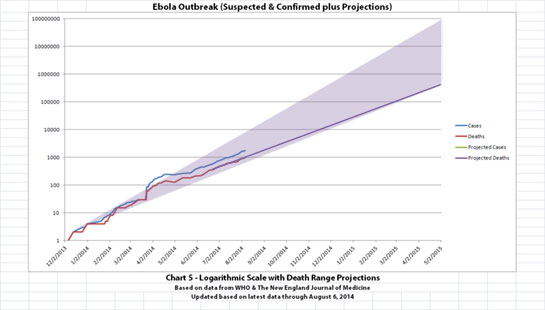
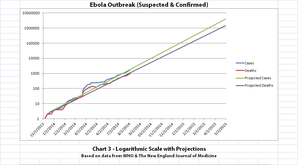
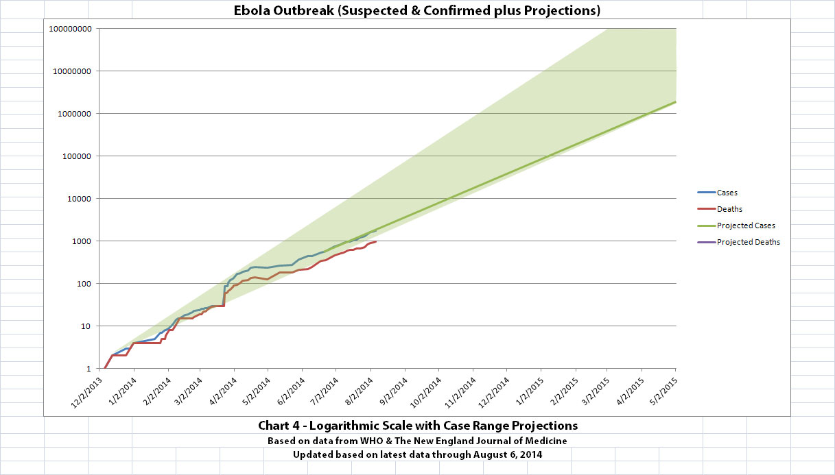
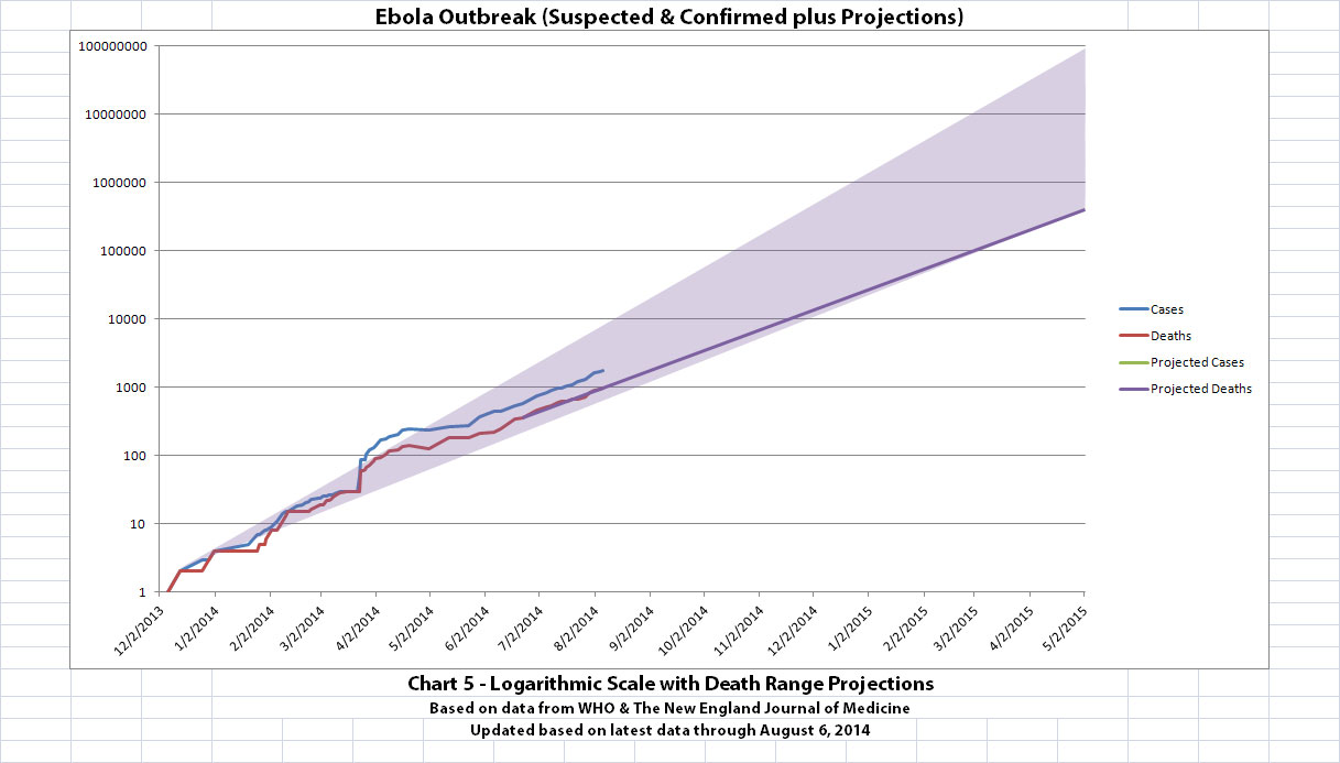
Chart 3 came from the realization that the rate of growth of the current Ebola outbreak(s) is relatively linear on a semi-log graph (the x-axis is a linear scale, the y-axis is a logarithmic scale).
Click the graphic for a larger version.
At least one ATS member criticized that it is too simplistic to just project a straight line. That's somewhat true, although I do think 9 months of known official data supports the model as reasonably accurate enough to project the trend if nothing can be changed drastically.
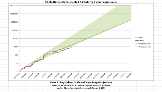
But to address this concern, I've added two additional charts. These charts show a projected range for the increase in Ebola cases (in Chart 4) and Ebola deaths (in chart 5). The method of charting these ranges is one of the commonly used methods, essentially projecting a triangular area that encompasses the area between a line through peaks of the 'wave' on the graph and another through the troughs.
I know that's a somewhat controversial method too, but it is one of the commonly used methods to guesstimate ranges for projections.
I slightly modified the lower side of the triangle because the slope of the most recent part of the 'line' is very slightly lower than some of the initial stages.
Click the graphic for a larger version.
Click the graphic for a larger version.
One last disclaimer:
I hope this information will encourage people to stay aware of what's going on. The known data and the projections in these charts are just plain scary. But please do not do anything you might later regret based on a few amateur graphs on ATS. Remember that there have been Ebola outbreaks before and they all ended without apocalyptic consequences. Efforts to contain, quarantine, treat, prevent, or cure Ebola will hopefully turn things around this time as well and prove these projections completely wrong.
As with the original charts, Chart 1 and Chart 2 show the number of cases and the number of deaths for the Ebola outbreak that have actually been reported. In Chart 1, the y-axis is linear. In Chart 2, the y-axis is a logarithmic scale where divisions of the axis increase by powers of 10.
Click the graphic for a larger version.
Click the graphic for a larger version.
The data used is from the news updates on the following WHO and The New England Journal of Medicine websites:
SOURCE: WHO website 1
SOURCE: WHO website 2
SOURCE: The New England Journal of Medicine
Charts 1 and 2 were created and updated by me using the official data from the references above.
Charts 3, 4 (new), and 5 (new) below include future projections that were done by me. This is why the thread title uses the phrase, "my visual charts & projections." I don't want anyone mistakenly thinking these are official projections from WHO or any other health organization.
I am not an expert on Ebola, nor am I an epidemiologist or virologist or even an MD. But I am a retired engineer, and I can read publicly released data, create graphs, and draw conclusions based on what seem to me to be obvious trends.
I don't think it takes an epidemiologist to do this when what the data shows is this clear. But if you prefer, you can draw your own conclusions based on the known data plotted in Charts 1 and 2.
Hopefully, the future projections in Charts 3, 4, and 5 below will NOT happen. Actual data was only available through August 6, 2014.
Chart 3 came from the realization that the rate of growth of the current Ebola outbreak(s) is relatively linear on a semi-log graph (the x-axis is a linear scale, the y-axis is a logarithmic scale).
Click the graphic for a larger version.
At least one ATS member criticized that it is too simplistic to just project a straight line. That's somewhat true, although I do think 9 months of known official data supports the model as reasonably accurate enough to project the trend if nothing can be changed drastically.
But to address this concern, I've added two additional charts. These charts show a projected range for the increase in Ebola cases (in Chart 4) and Ebola deaths (in chart 5). The method of charting these ranges is one of the commonly used methods, essentially projecting a triangular area that encompasses the area between a line through peaks of the 'wave' on the graph and another through the troughs.
I know that's a somewhat controversial method too, but it is one of the commonly used methods to guesstimate ranges for projections.
I slightly modified the lower side of the triangle because the slope of the most recent part of the 'line' is very slightly lower than some of the initial stages.
Click the graphic for a larger version.
Click the graphic for a larger version.
One last disclaimer:
I hope this information will encourage people to stay aware of what's going on. The known data and the projections in these charts are just plain scary. But please do not do anything you might later regret based on a few amateur graphs on ATS. Remember that there have been Ebola outbreaks before and they all ended without apocalyptic consequences. Efforts to contain, quarantine, treat, prevent, or cure Ebola will hopefully turn things around this time as well and prove these projections completely wrong.
a reply to: DrHammondStoat
One of the reasons I first did this was because everyone else was doing it separately for each country. There are many different sources to see the data listed and graphed like that. I felt like that was obscuring the big picture. I wanted to see what it looked like as one big outbreak, so I specifically went out and added up all the separate official figures to graph the big picture. No one else seemed to be doing that, at least not publicly.
Thanks for the reference, I will read through it. I actually expected this to die out like previous outbreaks when I first heard about it. WHO also expected that. So far it has not behaved as expected. Here's a news article that quotes a lot of experts on why they think things are different this time:
CBC News
Basically, this outbreak is bigger. It is in major cities rather than sparsely populated areas. It has crossed national borders. And it has spread between countries by air travel. In a nutshell, it's a matter of scale. In a tiny village, it can be isolated. In a worst cast scenario a village can be quarantined.
The problem of containment this time is far more difficult and the strain on resources to treat patients, do contact tracing, educate the public, etc. on a large scale is more than the countries involved can bear. That's why WHO declared it a Public Health Emergency of International Concern (PHEIC) today. Hopefully that will bring enough help that the scale of the outbreak can be contained.
This is just my opinion, and I am not an expert. It may be that looking at it as separate outbreaks in individual countries (outbreaks that were expected to die out like past outbreaks) caused it to not be recognized as an international emergency sooner. Graphing it as one outbreak may be more appropriate.
I sincerely hope you're right and it does die out like past outbreaks. I think everyone hopes that.
If you add them all up and draw your line you are simplifying what will happen in all countries and an exponential line emerges.
What would happen if you did a similar thing for each county? Would you get some exponetial growth in some but not others?
One of the reasons I first did this was because everyone else was doing it separately for each country. There are many different sources to see the data listed and graphed like that. I felt like that was obscuring the big picture. I wanted to see what it looked like as one big outbreak, so I specifically went out and added up all the separate official figures to graph the big picture. No one else seemed to be doing that, at least not publicly.
There is evidence to support that the virus may have reached it's peak and is dying out in some areas, particularly in Guinea. Previous outbreaks have followed a 'bell curve' path, ie. reached a peak and then declined. So this may be characteristic of the virus, This study (link below, has loads of graphs) shows the virus ( in past outbreaks) peaking and then beginning to die down. It is thought that identifying an outbreak early on and implementing certain measures has an effect on how it behaves.
Thanks for the reference, I will read through it. I actually expected this to die out like previous outbreaks when I first heard about it. WHO also expected that. So far it has not behaved as expected. Here's a news article that quotes a lot of experts on why they think things are different this time:
CBC News
Basically, this outbreak is bigger. It is in major cities rather than sparsely populated areas. It has crossed national borders. And it has spread between countries by air travel. In a nutshell, it's a matter of scale. In a tiny village, it can be isolated. In a worst cast scenario a village can be quarantined.
The problem of containment this time is far more difficult and the strain on resources to treat patients, do contact tracing, educate the public, etc. on a large scale is more than the countries involved can bear. That's why WHO declared it a Public Health Emergency of International Concern (PHEIC) today. Hopefully that will bring enough help that the scale of the outbreak can be contained.
This is just my opinion, and I am not an expert. It may be that looking at it as separate outbreaks in individual countries (outbreaks that were expected to die out like past outbreaks) caused it to not be recognized as an international emergency sooner. Graphing it as one outbreak may be more appropriate.
I sincerely hope you're right and it does die out like past outbreaks. I think everyone hopes that.
originally posted by: ikonoklast
I updated the charts (below) with the latest official data released on August 8, 2014 by the World Health Organization (WHO). That data is actually the numbers through August 6, 2014. From what I've seen as I compiled these numbers, it is typical for the data to be a day or two behind.
As with the original charts, Chart 1 and Chart 2 show the number of cases and the number of deaths for the Ebola outbreak that have actually been reported. In Chart 1, the y-axis is linear. In Chart 2, the y-axis is a logarithmic scale where divisions of the axis increase by powers of 10.
Click the graphic for a larger version.
Click the graphic for a larger version.
The data used is from the news updates on the following WHO and The New England Journal of Medicine websites:
SOURCE: WHO website 1
SOURCE: WHO website 2
SOURCE: The New England Journal of Medicine
Charts 1 and 2 were created and updated by me using the official data from the references above.
Charts 3, 4 (new), and 5 (new) below include future projections that were done by me. This is why the thread title uses the phrase, "my visual charts & projections." I don't want anyone mistakenly thinking these are official projections from WHO or any other health organization.
I am not an expert on Ebola, nor am I an epidemiologist or virologist or even an MD. But I am a retired engineer, and I can read publicly released data, create graphs, and draw conclusions based on what seem to me to be obvious trends.
I don't think it takes an epidemiologist to do this when what the data shows is this clear. But if you prefer, you can draw your own conclusions based on the known data plotted in Charts 1 and 2.
Hopefully, the future projections in Charts 3, 4, and 5 below will NOT happen. Actual data was only available through August 6, 2014.
Chart 3 came from the realization that the rate of growth of the current Ebola outbreak(s) is relatively linear on a semi-log graph (the x-axis is a linear scale, the y-axis is a logarithmic scale).
Click the graphic for a larger version.
At least one ATS member criticized that it is too simplistic to just project a straight line. That's somewhat true, although I do think 9 months of known official data supports the model as reasonably accurate enough to project the trend if nothing can be changed drastically.
But to address this concern, I've added two additional charts. These charts show a projected range for the increase in Ebola cases (in Chart 4) and Ebola deaths (in chart 5). The method of charting these ranges is one of the commonly used methods, essentially projecting a triangular area that encompasses the area between a line through peaks of the 'wave' on the graph and another through the troughs.
I know that's a somewhat controversial method too, but it is one of the commonly used methods to guesstimate ranges for projections.
I slightly modified the lower side of the triangle because the slope of the most recent part of the 'line' is very slightly lower than some of the initial stages.
Click the graphic for a larger version.
Click the graphic for a larger version.
One last disclaimer:
I hope this information will encourage people to stay aware of what's going on. The known data and the projections in these charts are just plain scary. But please do not do anything you might later regret based on a few amateur graphs on ATS. Remember that there have been Ebola outbreaks before and they all ended without apocalyptic consequences. Efforts to contain, quarantine, treat, prevent, or cure Ebola will hopefully turn things around this time as well and prove these projections completely wrong.
the chart show very slow slope not compatible with a very infectious virus infection.
it is a proof that the epidemic is compound and artificial made from several strains of zaire strain and probably others even marburg, moreover they were all released in the woods in different times the current slope is a combination of several slopes of different strains ranging in incubation period from 2 days to 23 days, like a huge tsunami.
originally posted by: reletomp
the chart show very slow slope not compatible with a very infectious virus infection.
On average, this Ebola outbreak has been doubling approximately every 3 weeks so far. Your comment made me wonder how this compared to other infectious viruses like the flu, since they have similar basic reproduction numbers (R0). I found a graph of the H1N1 flu outbreak of 2009 here for the sake of a comparison:
H1N1 2009 Flu Pandemic Graph
So that H1N1 flu outbreak spread much faster over the first couple weeks, but after that it looks like it doubled about every 2 weeks or so. That's still faster than this Ebola outbreak, but not as much faster as I would have guessed (or hoped) when you consider the differences in how they are transmitted and in the incubation period or in the severity and mortality rate.
a reply to: Eunuchorn
public.govdelivery.com...
My last update
networkforphl.webex.com... etworkforphl.webex.com%2Fec0701l%2Feventcenter%2Fevent%2FeventAction.do%3FtheAction%3Ddetail%26confViewID%3D1749947180%26%26MK%3D668698095%26%26%26sit eurl%3Dnetworkforphl
I have found the CDC updates I subscribe to are very realistic as you see over time, they seem very straight to me.
I couldn't care less about anything the CDC says or does. Most agencies are in total compliance with what is to come & what has been going on.
public.govdelivery.com...
My last update
networkforphl.webex.com... etworkforphl.webex.com%2Fec0701l%2Feventcenter%2Fevent%2FeventAction.do%3FtheAction%3Ddetail%26confViewID%3D1749947180%26%26MK%3D668698095%26%26%26sit eurl%3Dnetworkforphl
originally posted by: kruphix
Ummm...you can't just calculate a slope and make a projection like that...that isn't how these things work.
Horrible math, horrible "projections", just all around horrible.
Wrong, this is exactly the type of thing you can do, in point if fact.
Using data from two epidemics [in Democratic Republic of Congo (DRC) in 1995 and in Uganda in 2000], we built a mathematical model for the spread of Ebola haemorrhagic fever epidemics taking into account transmission in different epidemiological settings. We estimated the basic reproduction number (R0) to be 2·7 (95% CI 1·9–2·8) for the 1995 epidemic in DRC, and 2·7 (95% CI 2·5–4·1) for the 2000 epidemic in Uganda.
As long as the R0 remains greater than 1, the number of infections will grow on a log-linear scale.
One thing to keep in mind is that these numbers and projections are only.vased upon reported cases and as a result could be skewed down.
Since we fitted the model to available data on reported symptom onset dates (291 on 315 cases for the DRC epidemic and 418 on 425 cases for the Uganda epidemic) this may have led to an underestimation of R0. At the beginning of the epidemic, there may have been additional cases that went unreported.
With so many healthcare workers contracting the disease, one might think.something has changed.
We assumed that after the control interventions were put in place, there was no transmission at hospital or after death of patients.
Except that we have seen how many top doctors lately, who really know what theyre doing in regards to contact procedures, gettng sick.
Our results show that rapid implementation of interventions and, when barrier nursing and isolation wards are efficient, rapid hospitalization of cases are key factors for the control of Ebola epidemics.
The above is a good guideline, but as can be seen in the current epidemic, old rules do not seem to apply; the current outbreak is.breaking and writing new rules as we speak.
I'd hate to imagine the slope on those projections in chart 3 if they included the unreported cases.
All above excerpts from Understanding the dynamics of Ebola epidemics
a reply to: ikonoklast
I don't know if this one has been added to your database . I heard about it while driving home from work. Sorry if already posted...
Catholic Nun Dies From Ebola While Working In Liberia
Good work Ikon...keep it up, valuable ATS asset...
Des
I don't know if this one has been added to your database . I heard about it while driving home from work. Sorry if already posted...
Catholic Nun Dies From Ebola While Working In Liberia
MADRID (AP) – A Catholic humanitarian group based in Spain says a nun from the Congo who was working in Liberia has died of the Ebola virus.
The San Juan de Dios hospital order says Saturday that Sister Chantal Pascaline died "from Ebola in the Hospital San Jose de Monrovia, despite the care she received from a volunteer nurse."
Pascaline belonged to the same order as a Spanish missionary priest and nun evacuated to Madrid by jet this week. Both are in stable condition in a Madrid hospital.
The latest Ebola outbreak is the largest and longest ever recorded for the disease and so far has killed at least 961 people, the U.N. health agency said Friday. It emerged in Guinea in March and has since spread to Sierra Leone, Liberia and Nigeria latino.foxnews.com...
Good work Ikon...keep it up, valuable ATS asset...
Des
new topics
-
What is the white pill?
Philosophy and Metaphysics: 12 minutes ago -
Mike Pinder The Moody Blues R.I.P.
Music: 56 minutes ago -
Putin, Russia and the Great Architects of the Universe
ATS Skunk Works: 4 hours ago -
A Warning to America: 25 Ways the US is Being Destroyed
New World Order: 8 hours ago
top topics
-
President BIDEN's FBI Raided Donald Trump's Florida Home for OBAMA-NORTH KOREA Documents.
Political Conspiracies: 14 hours ago, 31 flags -
A Warning to America: 25 Ways the US is Being Destroyed
New World Order: 8 hours ago, 14 flags -
Is AI Better Than the Hollywood Elite?
Movies: 15 hours ago, 4 flags -
Mike Pinder The Moody Blues R.I.P.
Music: 56 minutes ago, 2 flags -
Maestro Benedetto
Literature: 15 hours ago, 1 flags -
Putin, Russia and the Great Architects of the Universe
ATS Skunk Works: 4 hours ago, 1 flags -
What is the white pill?
Philosophy and Metaphysics: 12 minutes ago, 1 flags
active topics
-
Putin, Russia and the Great Architects of the Universe
ATS Skunk Works • 15 • : CriticalStinker -
Alternate Electors vs Fake Electors - What is the Difference.
2024 Elections • 123 • : frogs453 -
Gaza Terrorists Attack US Humanitarian Pier During Construction
Middle East Issues • 61 • : FlyersFan -
Massachusetts Drag Queen Leads Young Kids in Free Palestine Chant
Social Issues and Civil Unrest • 17 • : ToneD -
Hate makes for strange bedfellows
US Political Madness • 51 • : network dude -
The Acronym Game .. Pt.3
General Chit Chat • 7755 • : F2d5thCavv2 -
What is the white pill?
Philosophy and Metaphysics • 0 • : kwaka -
Meadows, Giuliani Among 11 Indicted in Arizona in Latest 2020 Election Subversion Case
Mainstream News • 16 • : Threadbarer -
Democrats Introduce Bill That Will Take Away Donald Trumps Secret Service Protection
2024 Elections • 75 • : TzarChasm -
New whistleblower Jason Sands speaks on Twitter Spaces last night.
Aliens and UFOs • 68 • : baablacksheep1