It looks like you're using an Ad Blocker.
Please white-list or disable AboveTopSecret.com in your ad-blocking tool.
Thank you.
Some features of ATS will be disabled while you continue to use an ad-blocker.
4
share:
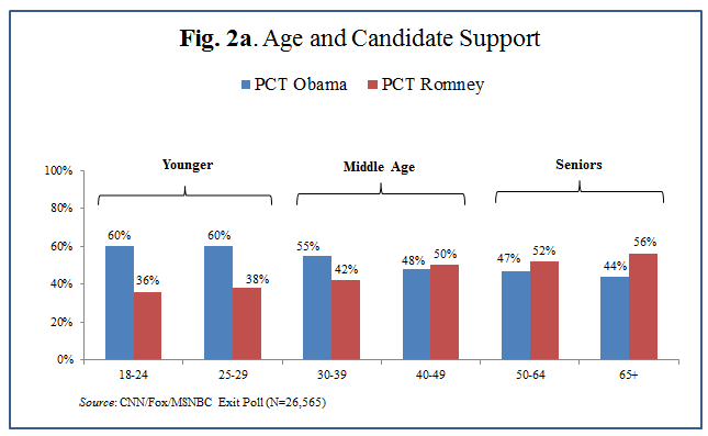
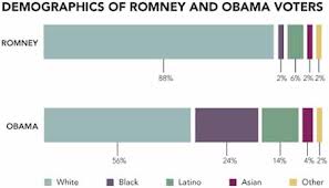
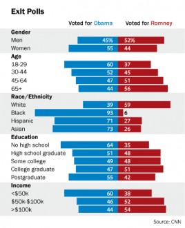
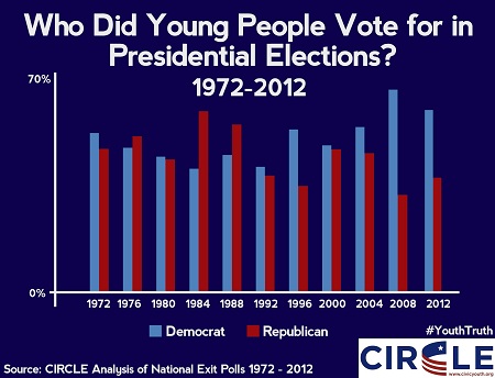
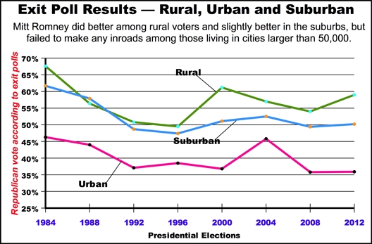
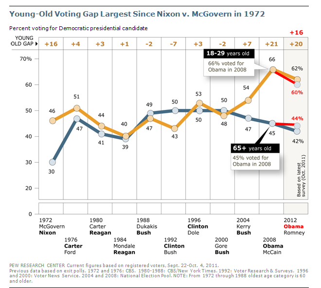
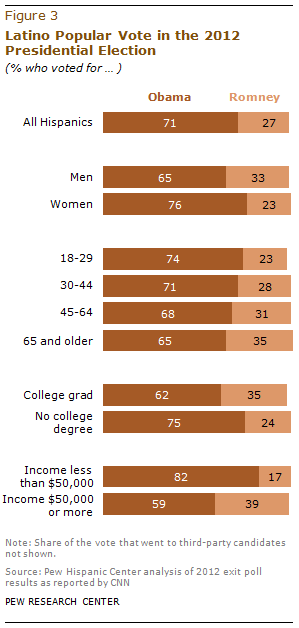
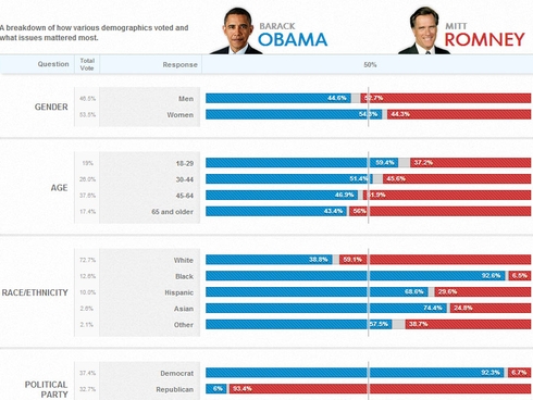
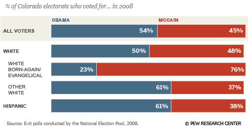
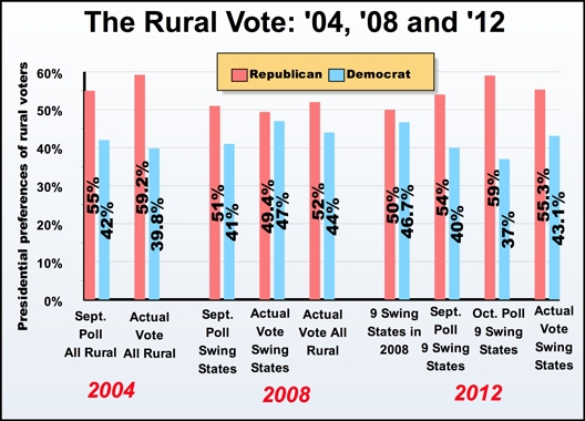
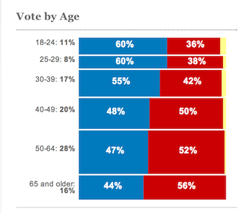
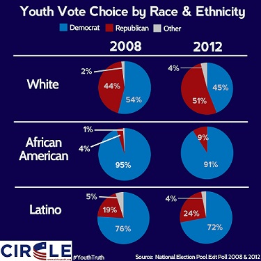
I found these graphs to be interesting. I think most people can easily draw a conclusion from this that if the GOP plans on remaining relevant in the
future of this country it is going to need to make some changes and make themselves appeal to a wider base.
It seems the target demographic of the GOP keeps getting smaller. I don’t need to say much on the issue because these graphs say plenty. The country is changing and I do not see it turning back. Many of the charts share information but also compare it with additional info. This is the most complete list I could compile together and I hope this thread can be used as reference for others threads,
I certainly hope the GOP will see the writing on the wall because what these charts tell me is there is a great divide between who they represent and what America has become and they need to appeal to more people which will means they need to change.
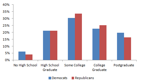
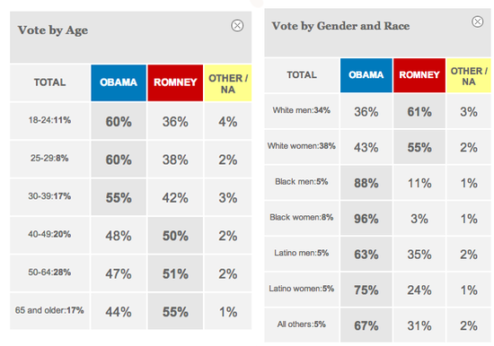
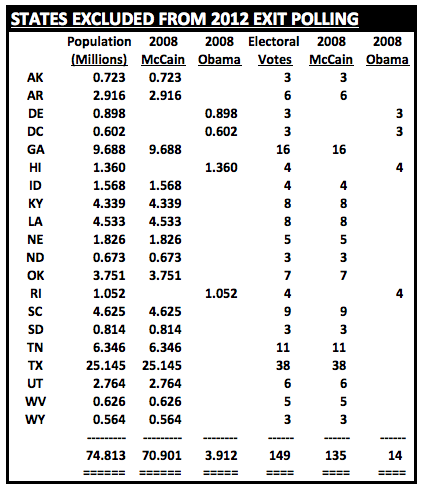
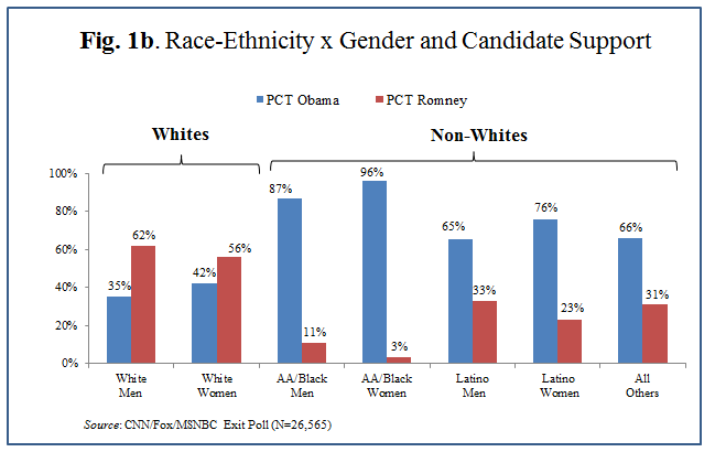
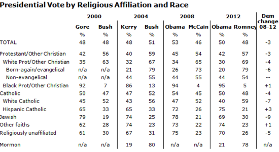
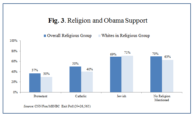
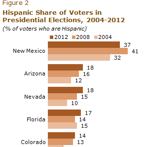
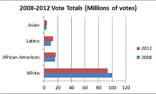
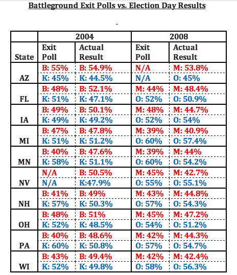
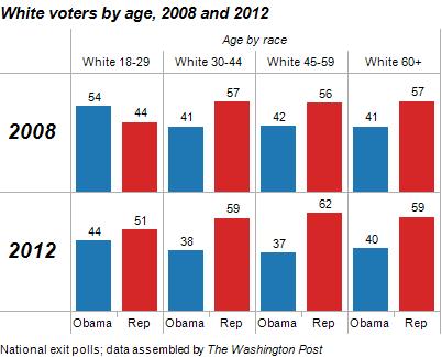
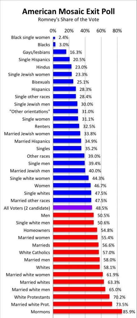
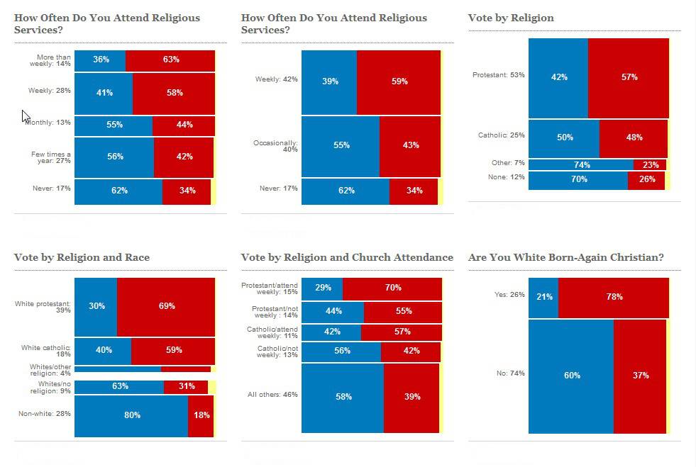

AP had a really good graph with exit polls but it will not refresh for me now but I added the link anyway I hope it gets fixed. AP link with great Graph
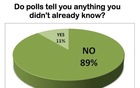
It seems the target demographic of the GOP keeps getting smaller. I don’t need to say much on the issue because these graphs say plenty. The country is changing and I do not see it turning back. Many of the charts share information but also compare it with additional info. This is the most complete list I could compile together and I hope this thread can be used as reference for others threads,
I certainly hope the GOP will see the writing on the wall because what these charts tell me is there is a great divide between who they represent and what America has become and they need to appeal to more people which will means they need to change.


AP had a really good graph with exit polls but it will not refresh for me now but I added the link anyway I hope it gets fixed. AP link with great Graph

edit on 12-11-2012 by Grimpachi because: add link
it is all irrelevant and fake...
spain tallied the votes
stop being suckers and quit falling for it.
spain tallied the votes
stop being suckers and quit falling for it.
Judging by the graphs you posted, the "Republicans" will be breed out of existence within a few election cycles.
Good thing the third-party/Libertarian movements are getting more traction!
Good thing the third-party/Libertarian movements are getting more traction!
new topics
-
Planned Civil War In Britain May Be Triggered Soon
Social Issues and Civil Unrest: 1 hours ago -
Claim: General Mark Milley Approved Heat and Sound Directed Energy Weapons During 2020 Riots
Whistle Blowers and Leaked Documents: 3 hours ago
4
