It looks like you're using an Ad Blocker.
Please white-list or disable AboveTopSecret.com in your ad-blocking tool.
Thank you.
Some features of ATS will be disabled while you continue to use an ad-blocker.
7
share:
Well, sorry if it have been discussed before, I haven't found anything related on the search engine.
I'm an absolute fan since the end of the 70's of Pink Floyd, listening at the time the full album "Wish you were here" for hours, amongst many other!
Anyway, I remember when I was a kid about this odd front cover that always intrigued me, searching what could be its meaning... Then years goes by and I totally forgot about it until recently when, trying to illustrate Pink Floyd's songs, I searched for this cover on the Net.
To my surprise, googling "pink floyd wish you were here front cover" results in two different pictures:
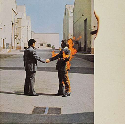
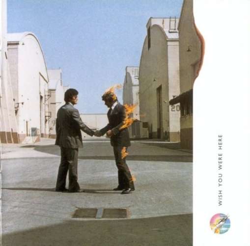
I searched all over the Net for any explanation about the story of these different covers that were apparently taken at the same place with the same actors, not in the same position though; but without success!!
If anyone here have any information about these covers, their meaning (if there's any!), why two, etc... It will solve a long time mystery for me!
I'm an absolute fan since the end of the 70's of Pink Floyd, listening at the time the full album "Wish you were here" for hours, amongst many other!
Anyway, I remember when I was a kid about this odd front cover that always intrigued me, searching what could be its meaning... Then years goes by and I totally forgot about it until recently when, trying to illustrate Pink Floyd's songs, I searched for this cover on the Net.
To my surprise, googling "pink floyd wish you were here front cover" results in two different pictures:


I searched all over the Net for any explanation about the story of these different covers that were apparently taken at the same place with the same actors, not in the same position though; but without success!!
If anyone here have any information about these covers, their meaning (if there's any!), why two, etc... It will solve a long time mystery for me!
reply to post by elevenaugust
source
Photos were taken at Warner Bros studios in LA.
The album's cover image was inspired by the idea that people tend to conceal their true feelings, for fear of "getting burned", and thus two businessmen were pictured shaking hands, one man on fire. "Getting burned" was also a common phrase in the music industry, used often by artists denied royalty payments. Two stuntmen were used (Ronnie Rondell and Danny Rogers), one dressed in a fire-retardant suit covered by a business suit. His head was protected by a hood, underneath a wig. The photograph was taken at the Warner Bros. studios in Los Angeles.[34][35] Initially the wind was blowing in the wrong direction, and the flames were forced into Rondell's face, burning his moustache. The two stuntmen changed positions, and the image was later reversed.
source
Photos were taken at Warner Bros studios in LA.
^^ beat me too it.
edit on 13-4-2012 by Vardoger because: (no reason given)
Thank you!
So the burning man represent those who "tend to conceal their true feelings", and the other 'non-burning man'?
Is there an idea of reconciliation between two different states of mind hidden behind this concept?
But why two different covers?
So the burning man represent those who "tend to conceal their true feelings", and the other 'non-burning man'?
Is there an idea of reconciliation between two different states of mind hidden behind this concept?
But why two different covers?
Try this;
www.floydianslip.com...
Also;
en.wikipedia.org...
So the differences could be due to the groups ideas about the album itself or is part of the reproductional work done later and as a way to 'make a difference' to enhance the 'absence' of the original..
just a thought..
Oh, and to get the first info, I searched for 'shaking hands with a burning man'...
The overall theme of the album is absence. In fact, Roger Waters said that the title could have just as easily been "Wish We Were Here," when enthusiasm for the project waned in the beginning, as members of the group were filled with self-doubt about trying to follow up a wildly successful album — about being a rock band at all. Design team Hipgnosis took the theme and visualized it as four photos for the album jacket and sleeve, also playing on the four basic elements: earth, fire, air and water. To further the concept, the LP was sold wrapped in an opaque plastic, in some way making the album itself absent, if only from the eyes of the buying public. The now-familiar logo of the mechanical shaking hands was stuck to the outside, a symbol of a gesture that should be filled with warmth and meaning, but more often is reduced to a cold, empty ritual. The logo also evokes a song on the album: "Welcome to the Machine."
www.floydianslip.com...
Also;
Wish You Were Here has been remastered and re-released on several formats. In the UK and US the album was re-issued in quadraphonic using the SQ format in 1976,[nb 5] and in 1980 a special Hi-Fi Today audiophile print was released in the UK.[nb 6] In the US it was released on CD in 1983, and in the UK 1985,[nb 7] and again as a remastered CD with new artwork in 1994.[nb 8] In the US, Columbia's CBS Mastersound label released a half-speed mastered audiophile LP in 1981,[nb 9] and in 1994 Sony Mastersound released a 24-carat gold-plated CD, remastered using Super Bit Mapping, with the original artwork from the LP in both longbox and jewel case forms, the latter with a cardboard slipcover.[nb 10][35] The album was included as part of the box set Shine On,[56] and five years later Columbia Records released an updated remastered CD, 17 seconds longer than the EMI remasters from 1994, giving a running time of 44:28. Its label was a recreation of the original machine handshake logo, with a black and blue background.[nb 11] The album was subsequently re-released in 2000 for its 25th anniversary, on the Capitol Records label in the US.[nb 12][35] The album was re-released and remixed in 2011 in multiple editions as part of the Why Pink Floyd...? re-release campaign. The Immersion Box Set includes the new stereo digital remaster (2011) by James Guthrie on CD, a previously unreleased 5.1 Surround Mix (2009) by James Guthrie on DVD and Blu-ray, a Quad Mix (previously released only on vinyl LP and 8-track tape) on DVD, as well as the original stereo mix (1975) on DVD and Blu-ray.[nb 13] This campaign also featured the 2011 stereo remaster on 180g heavyweight vinyl [nb 14] as well as the 2011 stereo remaster and the 5.1 surround sound mix (2009) as a Hybrid SACD.
en.wikipedia.org...
So the differences could be due to the groups ideas about the album itself or is part of the reproductional work done later and as a way to 'make a difference' to enhance the 'absence' of the original..
just a thought..
Oh, and to get the first info, I searched for 'shaking hands with a burning man'...
its funny,but if yiu use your imagination,the guy on fire in the first pic looks as tough ther is a 'flame demon.behind him with its arms stretched
out in front of the guy!
floyd is awesome! seen them 3 times and have owned every album at some point in my life
cool post, and thank you to the other members for their answers!
......... by the way,which ones pink!
floyd is awesome! seen them 3 times and have owned every album at some point in my life
cool post, and thank you to the other members for their answers!
......... by the way,which ones pink!
My guess is that the one with the flaming guy leaning back is Columbia's first pressing or something. It seems rarer, and the label of its vinyl is
not fancified with robot handshake. Just a guess.
reply to post by elevenaugust
Just to add to this 'mystery'..
The other night on UK TV , there was a programme about this exact same album with the members of Floyd, producers, artists etc. discussing the entire album.
The idea of the two men shaking hands whilst one is burning relates to 'welcome to the machine' where, in business, you shake hands on a deal only to get burnt.. ie ripped off, scammed..
Point being that what is usually a warm and welcoming gesture, usually turns out to be a cold, unfelt mockery.
They were saying that there is a story floating around about how some people carefully slit open the plastic covering of the album and slid the record out and have never seen this picture.. only the outer blackcover..
The album is basically a tribute to Syd Barrett, how the music business offers you a cigar, invites you to ride the gravy train, destroying your freedom to move or think for yourself, and once inside the machine, chews you up and spits you out..
Syd, the crazy diamond, was lost to drug use. Floyd said that without Syd, they may never have come so far.
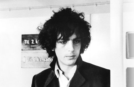
And here is Syd in Abbey road, 1975...
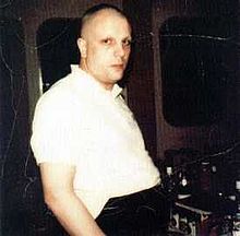
Syd Barrett.. RIP
Richard Wright.. RIP
en.wikipedia.org...
Just to add to this 'mystery'..
The other night on UK TV , there was a programme about this exact same album with the members of Floyd, producers, artists etc. discussing the entire album.
The idea of the two men shaking hands whilst one is burning relates to 'welcome to the machine' where, in business, you shake hands on a deal only to get burnt.. ie ripped off, scammed..
Point being that what is usually a warm and welcoming gesture, usually turns out to be a cold, unfelt mockery.
They were saying that there is a story floating around about how some people carefully slit open the plastic covering of the album and slid the record out and have never seen this picture.. only the outer blackcover..
The album is basically a tribute to Syd Barrett, how the music business offers you a cigar, invites you to ride the gravy train, destroying your freedom to move or think for yourself, and once inside the machine, chews you up and spits you out..
Syd, the crazy diamond, was lost to drug use. Floyd said that without Syd, they may never have come so far.

And here is Syd in Abbey road, 1975...

Syd Barrett.. RIP
Richard Wright.. RIP
en.wikipedia.org...
Syd was an excellent songwriter in his creativity and loose thinking, however I think that what began as a creative experimentation with '___'
transformed into an abuse of the drug to cope with stress and isolation... This might be why he eventually lost it completely.
'___' is not a particularily dangerous drug, but can be mentally damaging if used in the wrong way or under the wrong circumstances. Being stressed and isolated is not the ideal condition for using copious amounts of the drug, as it is a drug that provides its most positive influences when the user is in a state of exploration, expansion and relaxation. I think during his early '___' days, Syd was in the perfect state to be using the drug, but as the fame and pressure grew on him, he started falling out of tune with that state of mind, building up more mental barriers from his true individual self.
This is how I explain '___' use to people who have never tried it and have fears about trying it:
As people grow up within society, they are taught from a very young age to be like someone else, and this causes them to shut out their real personalities. They build walls around their true selves using images of what others expect them to be, and naturally some people build much thicker walls than others.
When a person takes '___', it's like firing a bullet into your psyche, and depending on the thickness of the walls, some people experience an effect where this bullet gets lodged into the thickness of their barriers, thus causing them to experience effects of isolation which could lead to psychosis.
The people who do not experience this have stripped away some of these barriers and the bullet can often shatter whatever remains, allowing it to reach the inner psyche... These people often have strong experiences of self-learning and will often discover amazing things through their experiences.
Basically, anyone has the mental capacity to handle an '___' trip if they are sufficiently prepared for it. The idea is that you must often come to terms with some of the ugly truths about the self that many people fear to admit. Every person has the power to break their own barriers if they so choose, but they must be willing to do so, and ultimately, they must be willing to accept all the truths that they learn in the process. '___' is just a tool to force you to look at yourself, and in the end, once a person has come to accept all the darkness in their souls, then they will perhaps find the light and see what makes them beautiful in contrast, and this can be quite an amazing experience.
I have never been one to push the use of '___' on people, I feel it is their own choice to make, however, I will always be willing to educate people before they make their decisions. I always give them a fair warning, but in contrast, I also tell them about the endless possibilities that make it a very unique and interesting experience which can help them grow as a person... if they so choose to take it. I always use Syd as an example of how NOT to use '___'.
new topics
-
'Proud Prophet' 12 Day Exercise Predicted Global Nuclear Catastrophe
World War Three: 4 hours ago -
Never say Never?
Science & Technology: 7 hours ago
top topics
-
Lies lies lies, green energy is black.
The Gray Area: 14 hours ago, 11 flags -
Never say Never?
Science & Technology: 7 hours ago, 8 flags -
'Proud Prophet' 12 Day Exercise Predicted Global Nuclear Catastrophe
World War Three: 4 hours ago, 3 flags
active topics
-
Never say Never?
Science & Technology • 24 • : Flyingclaydisk -
President-Elect Trump Picks Indian-American KASHYAP P. PATEL for F.B.I. Director.
2024 Elections • 48 • : WeMustCare -
Biden pardons his son Hunter despite previous pledges not to
Mainstream News • 96 • : RickinVa -
President-Elect DONALD TRUMP's 2nd-Term Administration Takes Shape.
Political Ideology • 267 • : WeMustCare -
Ford Motor Company sold to Elon Musk
Ludicrous Online Lies • 10 • : YouCanCallMeAl -
Lies lies lies, green energy is black.
The Gray Area • 25 • : CriticalStinker -
The Final Experiment is Scheduled for December 2024. Will it Finally Answer the Question?
Science & Technology • 26 • : Arbitrageur -
Mass UAP events. DC. Machester Airport, UFOs over sub base in CT, Nuke bases.
Aliens and UFOs • 51 • : WeMustCare -
'Proud Prophet' 12 Day Exercise Predicted Global Nuclear Catastrophe
World War Three • 10 • : TheValeyard -
The Reactionary Conspiracy 13. The plot’s theology.
General Conspiracies • 319 • : andy06shake
7
