It looks like you're using an Ad Blocker.
Please white-list or disable AboveTopSecret.com in your ad-blocking tool.
Thank you.
Some features of ATS will be disabled while you continue to use an ad-blocker.
share:
It seems it's been a few weeks since the last time we were spoken to about this whole 2010 thing our lovely staff are going on about.
I'm wondering if there's anymore information?
Yes, I'm calling you out Springer and SO lol.
I'm looking forward to the changes and it would be great if we were actively advised of what was taking place and the new things that will be coming.
~Keeper
I'm wondering if there's anymore information?
Yes, I'm calling you out Springer and SO lol.
I'm looking forward to the changes and it would be great if we were actively advised of what was taking place and the new things that will be coming.
~Keeper
Bump.
Seems the border and header have changed. ATS2010 the future is near. Where are you SO? Anticipation,,,,,,,,
[atsimg]http://files.abovetopsecret.com/images/member/457d3bcafa56.jpg[/atsimg]
Seems the border and header have changed. ATS2010 the future is near. Where are you SO? Anticipation,,,,,,,,
[atsimg]http://files.abovetopsecret.com/images/member/457d3bcafa56.jpg[/atsimg]
I can assure you SkepticOverlord is working hard and ATS2010 will be AMAZING
[edit on March 9th 2010 by greeneyedleo]
[edit on March 9th 2010 by greeneyedleo]
All things in their time.
It's stunning, but not quite ready for prime time. You'd be shocked how much code is involved with a site this complex, busy and huge.
Even more shocked if you had to basically strip it all away and start from scratch.
Stay tuned...
Springer...
It's stunning, but not quite ready for prime time. You'd be shocked how much code is involved with a site this complex, busy and huge.
Even more shocked if you had to basically strip it all away and start from scratch.
Stay tuned...
Springer...
Are you guys hiring a professional designer? Because... right now - sorry to say - but it's horrible. A horrible mess of code, design styles, colors,
fonts, images, over-done outer glows and drop shadows etc.
Hire someone like 45royale.com... or anyone from bestwebgallery.com...
Also - consider the usage of XHTML & CSS instead of tables.
[edit on 9-3-2010 by opnmind]
[edit on 9-3-2010 by opnmind]
Hire someone like 45royale.com... or anyone from bestwebgallery.com...
Also - consider the usage of XHTML & CSS instead of tables.
[edit on 9-3-2010 by opnmind]
[edit on 9-3-2010 by opnmind]
Thank you Springer and GEL. I can't even begin to imagine the coding involved. This is one of the reasons I love ATS. The site is continually
improved and is never stale.
The new ATS 2010 is a complete top-to-bottom recode of the entire site. And yes, we're migrating everything to a 100% CSS/DIV layout with a
consistent menu system throughout the site, which will be the same for both members and guests.
Most of what you know about ATS remains intact, though every page is redesigned for a much cleaner look and smoother information flow.
There are some very-tricky code-based issues being worked through now, but we're hopeful for a beta-test version for our staff to use by the end of the month, then a full-release some time in April.
While it's tempting to reveal some of our completed pages, I think it's best to wait until the entire project is complete. But, here are some tidbits to consider:
"Way Above Top Secret" is returning, but in a different way
Artistic members won't *need* to rethink their avatars...
... ...but some might want to
Dark backgrounds on thread pages are the default...
... ...but there will be a lighter option (only on thread pages)
Every important site page is accessible from the top main menu
ATS forums and BTS forums are accessible under one domain...
... ...but you can keep them separate and never see one if that's what you want
Better integration of the media portal...
... ...changing your ATS/BTS password will also change your media password (yay!)
A very different thread page
A significantly different forum list page
A significantly different recent posts list page
and much more
reply to post by SkepticOverlord
"Artistic members won't *need* to rethink their avatars...
... ...but some might want to "
Interesting can't wait to see the finale.
Fighting urge to beg for preview and a date.
"Artistic members won't *need* to rethink their avatars...
... ...but some might want to "
Interesting can't wait to see the finale.
Fighting urge to beg for preview and a date.
reply to post by SkepticOverlord
Waits patiently...I know it's a lot of work SO....just kinda worried about how everything will change. You have seen how we all react to change in the past here..so hoping it won't confuse the heck out of us.
Waits patiently...I know it's a lot of work SO....just kinda worried about how everything will change. You have seen how we all react to change in the past here..so hoping it won't confuse the heck out of us.
*BH waits not-so-patiently.*
It sounds really great and very exciting!
Thanks for all the hard work! I can't wait! Well, I can. You know what I mean.
It sounds really great and very exciting!
Thanks for all the hard work! I can't wait! Well, I can. You know what I mean.
Will the code and database queries be lighter or heavier?
Because at off-peak hours a typical text-only thread loads fully within 5 seconds here.
And my bandwidth is only 1 mbps or 128 KB/s.
Will the load times improve or stay the same?
Because at off-peak hours a typical text-only thread loads fully within 5 seconds here.
And my bandwidth is only 1 mbps or 128 KB/s.
Will the load times improve or stay the same?
reply to post by SkepticOverlord
Those are always fun
Patiently waiting
I am sure it has been said before and I am sure I speak for a great number of members when I say...
Thank You!! to the owners and administrators for all your hard work.
I think we all need to hear that now and again for our efforts. The paycheck doesn't hurt either.
Keep it up!!
a complete top-to-bottom recode of the entire site
Those are always fun
Patiently waiting
I am sure it has been said before and I am sure I speak for a great number of members when I say...
Thank You!! to the owners and administrators for all your hard work.
I think we all need to hear that now and again for our efforts. The paycheck doesn't hurt either.
Keep it up!!
Hopefully the sections in each category on the home page will be uniform. It has slightly agitated my OCD in the past that some of the folder colors
are different than the rest in the category. For example, in the Conspiracy Theory Discussion Forum category all the folders are pink except for the
Alternative Substances section, which is manila. Oh and by the way, someone never even added text to that section on the board home page. It's just
the folder.
That's really my only issue with the site. That and sometimes the organizational issues. Sometimes it seems like just a jumbled mess. But I suppose that's going to happen with such a large site.
Other than that, a new look and feel is always a good thing from time to time.
That's really my only issue with the site. That and sometimes the organizational issues. Sometimes it seems like just a jumbled mess. But I suppose that's going to happen with such a large site.
Other than that, a new look and feel is always a good thing from time to time.
reply to post by NovusOrdoMundi
My guess to the lack of text in the Alternative Substances forum, is they don't want to draw much attention to that forum, keeping it somewhat protected.
My guess to the lack of text in the Alternative Substances forum, is they don't want to draw much attention to that forum, keeping it somewhat protected.
After some internal discussion and contemplation... we agree that our members deserve a preview of what's coming. In many ways, the changes are not a
great deal more than an overall upgrade of our existing "image." But in some ways, the new design represents a significant step forward.
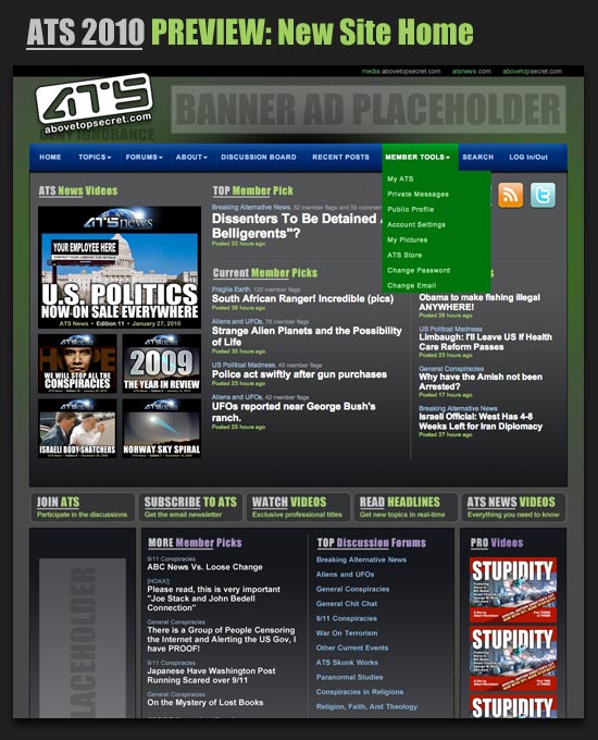
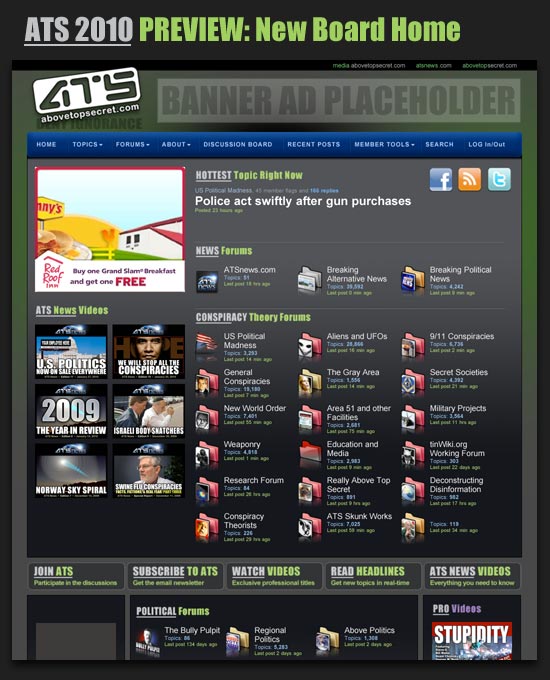
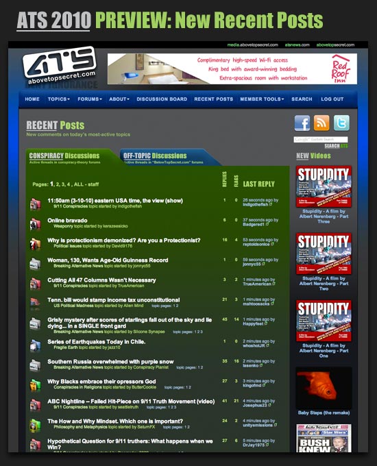
Below are three screen-shots of existing, fully-functional pages on our testbed server.
While the pages are fully-function, they also represent "works in progress" so there may be some minor changes between the finished pages and what you see here.
Below are three screen-shots of existing, fully-functional pages on our testbed server.
While the pages are fully-function, they also represent "works in progress" so there may be some minor changes between the finished pages and what you see here.
AAAAHHHHH! I iz skerred!
[atsimg]http://files.abovetopsecret.com/images/member/a56e1d9100d3.gif[/atsimg]
Actually, it looks really cool! I like what you did with BTS and the tab option to keep it separate.
[atsimg]http://files.abovetopsecret.com/images/member/a56e1d9100d3.gif[/atsimg]
Actually, it looks really cool! I like what you did with BTS and the tab option to keep it separate.
reply to post by SkepticOverlord
The preview looks pretty cool!
The listed "tid-bits" sound great!
Good deal you guys. Really sounds like a lot of tedium to implement. Cheers!
The preview looks pretty cool!
The listed "tid-bits" sound great!
Good deal you guys. Really sounds like a lot of tedium to implement. Cheers!
new topics
-
F-18 shot down over Red Sea....by our own Destroyer?
Other Current Events: 1 hours ago -
California Business Owners Blindsided by Surprise Payroll Taxes
US Political Madness: 2 hours ago -
Anti-Government Protest in Serbia
Social Issues and Civil Unrest: 7 hours ago -
The Effects of Electric Fields and Plasma on Plant Growth
Science & Technology: 8 hours ago
top topics
-
California Business Owners Blindsided by Surprise Payroll Taxes
US Political Madness: 2 hours ago, 14 flags -
NYPD Chief Jeffrey Maddrey Resigns - Forced Officers to Give Sex for Overtime Pay and Favors.
Posse Comitatus: 17 hours ago, 11 flags -
The Effects of Electric Fields and Plasma on Plant Growth
Science & Technology: 8 hours ago, 7 flags -
Swarms of tiny 'ant-like' robots lift heavy objects and navigate obstacles
Science & Technology: 16 hours ago, 6 flags -
Anti-Government Protest in Serbia
Social Issues and Civil Unrest: 7 hours ago, 6 flags -
The Daily Mail trying to imply “it’s aliens”
Dissecting Disinformation: 15 hours ago, 4 flags -
F-18 shot down over Red Sea....by our own Destroyer?
Other Current Events: 1 hours ago, 3 flags
active topics
-
Spiritual Solstice
Short Stories • 13 • : argentus -
The Acronym Game .. Pt.4
General Chit Chat • 1023 • : FullHeathen -
California Business Owners Blindsided by Surprise Payroll Taxes
US Political Madness • 4 • : charlest2 -
-@TH3WH17ERABB17- -Q- ---TIME TO SHOW THE WORLD--- -Part- --44--
Dissecting Disinformation • 3785 • : Thoughtful3 -
F-18 shot down over Red Sea....by our own Destroyer?
Other Current Events • 5 • : watchitburn -
Anti-Government Protest in Serbia
Social Issues and Civil Unrest • 5 • : Imhere -
Drones everywhere in New Jersey ---and Elsewhere Master Thread
Aliens and UFOs • 225 • : Ravenwatcher -
NYPD Chief Jeffrey Maddrey Resigns - Forced Officers to Give Sex for Overtime Pay and Favors.
Posse Comitatus • 10 • : xuenchen -
Labour Plotting to Postpone May's Council Elections ?
Regional Politics • 12 • : gortex -
‘Something horrible’: Somerset pit reveals bronze age cannibalism
Ancient & Lost Civilizations • 14 • : Scratchpost


