It looks like you're using an Ad Blocker.
Please white-list or disable AboveTopSecret.com in your ad-blocking tool.
Thank you.
Some features of ATS will be disabled while you continue to use an ad-blocker.
0
share:
Okay, I started this thread to see how many prople here see "symbols" within corporate logo's. And what do you, in your own words, believe that
they mean.
I myself see fanciful artwork, nothing more. How about you?
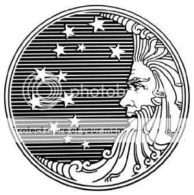
One of my favorite is the old Proctor and Gamble "Moon and Stars" logo.
There were many myths about this logo, including that P&G was owned by the "Moonies", and there are the numbers "666" in the curly hairs of the beard.(supposedly indicating some satanic relationship)

I don't have the source url anymore, as the image came off of my hard drive.
But I'm sure it is copyright P&G. www.pg.com...
So, what's your interesting logo?
If you post a copyrighted logo, please include source, or at least link to copyright holder.
I myself see fanciful artwork, nothing more. How about you?
One of my favorite is the old Proctor and Gamble "Moon and Stars" logo.
There were many myths about this logo, including that P&G was owned by the "Moonies", and there are the numbers "666" in the curly hairs of the beard.(supposedly indicating some satanic relationship)

I don't have the source url anymore, as the image came off of my hard drive.
But I'm sure it is copyright P&G. www.pg.com...
So, what's your interesting logo?
If you post a copyrighted logo, please include source, or at least link to copyright holder.
Corporate logos are supposed to attract attention, and those people who continually talk about the Satanism of images do themselves a disservice by
advertising the company.
As for the PG logo I see nothing but the Man in the moon looking at some stars. A nice looking image but with no connotations whatsoever.
As for the PG logo I see nothing but the Man in the moon looking at some stars. A nice looking image but with no connotations whatsoever.
Originally posted by Mechanic 32
So, what's your interesting logo?
Not really a logo, but an instantly recognisable brand.
I remember hearing from friends in school, how the company was owned by the KKK:
In the 1980s an urban myth spread throughout the United States and even Europe, that Marlboro packaging carried imagery related to the Ku Klux Klan. The myth held that the Klan owned all, or a major part of, the Philip Morris company, and that Philip Morris himself was involved with the organization. And the symbols on the sides of the Marlboro represented 'K,K,K', as well as Marlboro upside down being seen, by some, to read 'Orobl Jew'. Also, when the Marlboro pack is upside down, as you cover the top half of the letters, you can allegedly see an image portraying a man and a midget being hung; finally, if you look between the legs of the prancing horse the white outline resembles the infamous Ku Klux Klan hood. These allegations are unfounded - to own even 1% of the company would require over $500 m, and Philip Morris was a British tobacco merchant.
However, just because that isn't true, doesn't mean that they're not evil:
Marlboro cigarettes burn an estimated 25% faster than other top-selling premium brands such as Camel, Winston, Dunhill, and Player's. Philip Morris uses re-constituted sheet tobacco and processed stems as filler, as well as chemical additives or treatments such as formaldehyde and ammonia.
Source.
new topics
-
Swarms of tiny 'ant-like' robots lift heavy objects and navigate obstacles
Science & Technology: 18 minutes ago -
NYPD Chief Jeffrey Maddrey Resigns - Forced Officers to Give Sex for Overtime Pay and Favors.
Posse Comitatus: 1 hours ago -
The Carpet Coating that Attacked the Environment
Medical Issues & Conspiracies: 5 hours ago -
Microplastics in your drinks
Medical Issues & Conspiracies: 7 hours ago
0

