It looks like you're using an Ad Blocker.
Please white-list or disable AboveTopSecret.com in your ad-blocking tool.
Thank you.
Some features of ATS will be disabled while you continue to use an ad-blocker.
16
share:
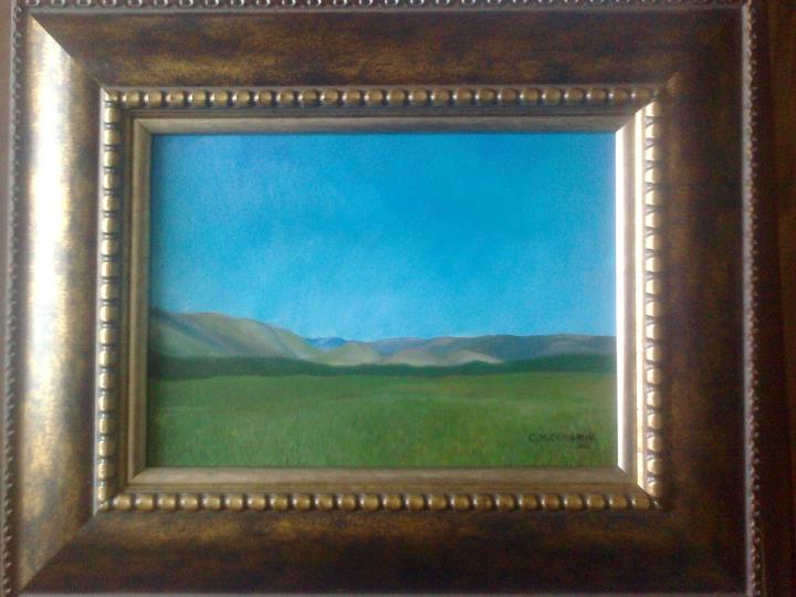
This was my very first oil painting I did. So you can be honest...
(I only focused on the landscape)


(I only focused on the landscape)


a reply to: IndependentAgent
I like this one the best! The hills look incredibly realistic
However all of them are better than anything I could ever paint lol.
I like this one the best! The hills look incredibly realistic
However all of them are better than anything I could ever paint lol.
a reply to: IndependentAgent
Very Nice First Painting! But all I have seen so far, are REAL Good!!!!!! Syx.
Very Nice First Painting! But all I have seen so far, are REAL Good!!!!!! Syx.
a reply to: IndependentAgent
Reasonably executed and pretty good for a first time!
What size is the frame? The picture gives no idea of scale.
Reasonably executed and pretty good for a first time!
What size is the frame? The picture gives no idea of scale.
a reply to: IndependentAgent
Are you open to some constructive criticism?
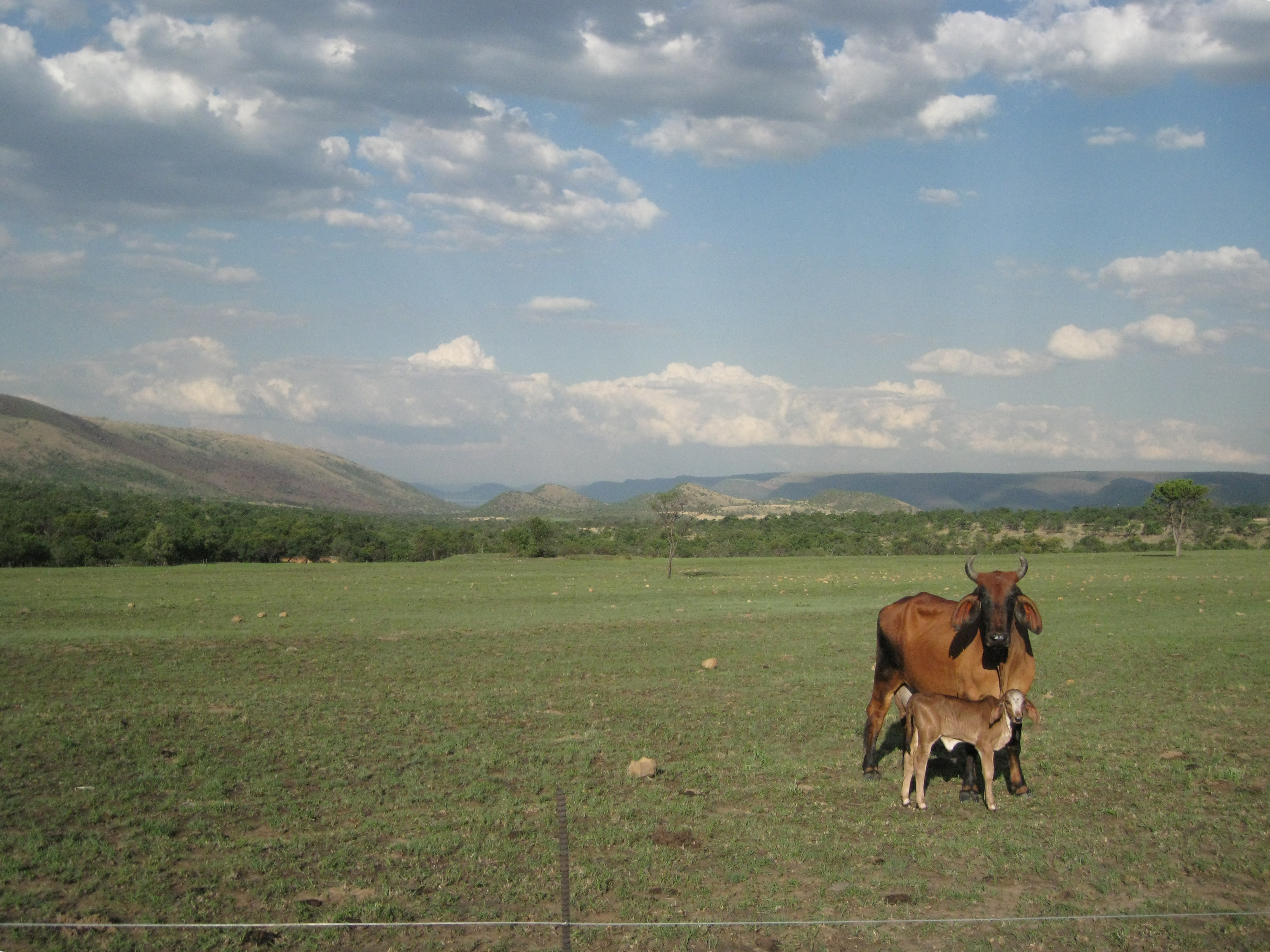
The painting is pretty good, colors on the mountains (i.e. depth) are perfect. I know you said you focused only on the landscape, but you need something to grab to the attention. Someone walked past the painting they would notice it, and that it's nice, but the moment would be fleeting. If you had something in the foreground that they could "investigate", it would be perfect. Like the "mother and child" cows in the original painting could've worked perfectly well.
Still, for a first oil, that is excellent. Keep painting!
But that's just my opinion - one artist to another.
a reply to: Gemwolf
I always welcome constructive criticism!!
If you look very closely, (a bit hard to do this on a pc screen), but you will see a lake, it is a bit more clear blue. Maybe the photo is a bit to small to see the focus point of the painting.
I thought that I should someday paint the original photo, "mother and child" cows included, on a big stretched canvas. maybe in the year 2015!
Thanks again for all the constructive criticism from all of you, throughout all my art threads!!
new topics
-
Feng Shui…
Health & Wellness: 6 hours ago -
Elon Musk to Make Games Great Again - XAI_GAMES Announcement Incoming.
Video Games: 7 hours ago -
North Korea in Ukraine conflict???
World War Three: 8 hours ago -
Most Complex Backyard Rube Goldberg Machine You'll See All Day
General Chit Chat: 9 hours ago
top topics
-
Most Complex Backyard Rube Goldberg Machine You'll See All Day
General Chit Chat: 9 hours ago, 9 flags -
Elon Musk to Make Games Great Again - XAI_GAMES Announcement Incoming.
Video Games: 7 hours ago, 6 flags -
North Korea in Ukraine conflict???
World War Three: 8 hours ago, 5 flags -
Feng Shui…
Health & Wellness: 6 hours ago, 5 flags
active topics
-
Chasing Red Mercury – One Drop from Doomsday?
General Conspiracies • 59 • : Skinnerbot -
Feng Shui…
Health & Wellness • 11 • : GENERAL EYES -
North Korea in Ukraine conflict???
World War Three • 16 • : CarlLaFong -
Of course it was DEI
Dissecting Disinformation • 18 • : Flyingclaydisk -
I thought Trump was the existential threat?
World War Three • 148 • : Xtrozero -
Elon Musk to Make Games Great Again - XAI_GAMES Announcement Incoming.
Video Games • 15 • : Athetos -
Most Complex Backyard Rube Goldberg Machine You'll See All Day
General Chit Chat • 8 • : billxam1 -
population madness
New World Order • 23 • : Xtrozero -
Encouraging News Media to be MAGA-PAF Should Be a Top Priority for Trump Admin 2025-2029.
Education and Media • 85 • : fringeofthefringe -
-@TH3WH17ERABB17- -Q- ---TIME TO SHOW THE WORLD--- -Part- --44--
Dissecting Disinformation • 3424 • : fringeofthefringe
16
