It looks like you're using an Ad Blocker.
Please white-list or disable AboveTopSecret.com in your ad-blocking tool.
Thank you.
Some features of ATS will be disabled while you continue to use an ad-blocker.
share:
As mentioned previously, I will probably be updating the charts roughly monthly now unless there are significant changes such as new countries
affected or a sudden increase in growth again.
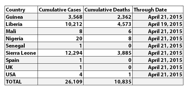
According to WHO, through April 21, 2015 the reported numbers for Ebola cases and deaths were:

I've updated the Ebola charts with this WHO data. Explanations of the charts are below.


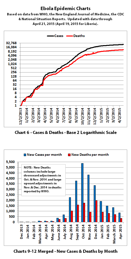
Charts 1, 2, and 6 show the cumulative numbers of reported cases and deaths so far. In Chart 1, the y (left) axis is linear. In Chart 2, the y axis is a logarithmic scale where major divisions of the axis increase by powers of 10 (the base is 10). Chart 6 has the y axis in powers of 2 (the base is 2, so 1, 2, 4, 8, etc.), so each major division represents a doubling of the numbers.
Exponential growth will look like a rapidly escalating curve on a linear scale but like a straight line on a logarithmic scale (base 10 or base 2 in these charts). Linear growth will look like a straight line on a linear scale and like a curve approaching a flat horizontal line on an exponential scale.
Charts 3, 4, and 5 show actual cases and deaths versus historical projections made in early August 2014 when I first started doing the charts. They show what would have most likely happened if nothing changed to slow or stop the spread of Ebola.
For quite a while, reported cases and deaths followed these projections closely. But you can clearly see that reported data started deviating down from these early projections back in October 2014.
Charts 4B-4E and 5B-5E include the latest data versus projection ranges that were last updated in January 2015.
The green ranges were the projections if the spread had continued as it had been at that time. The darker green in the lower part of some ranges was what would have been expected if the spread had continued to trend away from exponential growth toward linear growth (toward the bottom of the shaded areas).
The yellow range would have been expected if the trend had gone back to spreading at the previous faster rates.
And the red range would have been expected if Ebola had started growing again at the worst rates experienced so far during this epidemic.
Currently, actual reported data is trending at the bottom or a little below the lowest projections that were made back in January 2015.
Charts 7-8 were discontinued quite a while back.
Charts 9-12 were merged previously, and the combined chart shows monthly new cases and deaths reported.
Charts 13-14B show cumulative cases and deaths by country.
Chart 15 shows how many days it has taken for the cumulative number of cases to double over time. Higher points in this chart are good, they mean it is taking longer to double. Lower points are bad, they mean it is doubling faster.
Previously cases doubled every 3 to 4 weeks. But for quite a while now, the doubling rate has been slowing down. Currently, cases are doubling in about 169 days according to reported numbers.
The charts do not include the Congo, as that was allegedly an unrelated outbreak and it has been declared over.
These charts rely on 'official' reported numbers and can only be as accurate as that data. Reported Ebola data is subject to change as cases and deaths are reclassified, or as data sources or reporting methods change. I do not know how accurate 'official' reported numbers are, but there are a number of possible issues:
1. WHO,the CDC, Doctors Without Borders (MSF), etc. have in the past stated that actual cases and deaths "vastly" outnumber reported figures, possibly by at least 2 to 5 times.
2. There have been sudden large decreases or increases at times in officially reported cases and deaths. It is unclear why, but the sudden decreases and increases may indicate an inability to keep up with data tracking and recording.
3. Many countries have clamped down on Ebola news. At least one journalist has been arrested and at least one newspaper has been closed in west Africa. In the USA, an 'Ebola Czar' with a reputation as a political/public relations 'fixer' (and with no medical experience) was appointed for a time to lead the US Ebola effort. And some countries have apparently not publicly posted their own official situation reports for more than a month.
4. There are theories regarding Ebola that differ from the 'official' reports. Some believe there is no such thing as Ebola or that what is spreading is not Ebola. Some believe there is no outbreak at all. Some believe people are purposely being infected for economic or depopulation plans. I do not know if there is any truth to any of these beliefs, it can be a strange world.
The same disclaimers and references apply to all of these charts:
Charts and future projections were done by me, not by WHO, except in cases where it is stated that a chart includes WHO projections. I am not an Ebola expert, epidemiologist, virologist, or MD, but I manually compiled the data used to create these graphs from news updates on the following websites:
SOURCE: WHO website 1
SOURCE: WHO website 2
SOURCE: WHO website 3
SOURCE: WHO website 4
SOURCE: WHO website 5
SOURCE: CDC website 1
SOURCE: The New England Journal of Medicine
SOURCE: Guinea Situation Reports (posted on Humanitarian Response)
[NOTE: Situation Reports from Guinea are in French.]
SOURCE: Liberia Situation Reports
Mali Ministry of Sanitation and Hygiene
[NOTE: Situation Reports from Mali are in French.]
SOURCE: Sierra Leone Situation Reports
Please do not do anything you might regret based on charts or projections. Hopefully efforts to contain, quarantine, treat, prevent, or cure Ebola will eventually be successful, and hopefully sooner rather than later.
According to WHO, through April 21, 2015 the reported numbers for Ebola cases and deaths were:

I've updated the Ebola charts with this WHO data. Explanations of the charts are below.


Charts 1, 2, and 6 show the cumulative numbers of reported cases and deaths so far. In Chart 1, the y (left) axis is linear. In Chart 2, the y axis is a logarithmic scale where major divisions of the axis increase by powers of 10 (the base is 10). Chart 6 has the y axis in powers of 2 (the base is 2, so 1, 2, 4, 8, etc.), so each major division represents a doubling of the numbers.
Exponential growth will look like a rapidly escalating curve on a linear scale but like a straight line on a logarithmic scale (base 10 or base 2 in these charts). Linear growth will look like a straight line on a linear scale and like a curve approaching a flat horizontal line on an exponential scale.
Charts 3, 4, and 5 show actual cases and deaths versus historical projections made in early August 2014 when I first started doing the charts. They show what would have most likely happened if nothing changed to slow or stop the spread of Ebola.
For quite a while, reported cases and deaths followed these projections closely. But you can clearly see that reported data started deviating down from these early projections back in October 2014.
Charts 4B-4E and 5B-5E include the latest data versus projection ranges that were last updated in January 2015.
The green ranges were the projections if the spread had continued as it had been at that time. The darker green in the lower part of some ranges was what would have been expected if the spread had continued to trend away from exponential growth toward linear growth (toward the bottom of the shaded areas).
The yellow range would have been expected if the trend had gone back to spreading at the previous faster rates.
And the red range would have been expected if Ebola had started growing again at the worst rates experienced so far during this epidemic.
Currently, actual reported data is trending at the bottom or a little below the lowest projections that were made back in January 2015.
Charts 7-8 were discontinued quite a while back.
Charts 9-12 were merged previously, and the combined chart shows monthly new cases and deaths reported.
Charts 13-14B show cumulative cases and deaths by country.
Chart 15 shows how many days it has taken for the cumulative number of cases to double over time. Higher points in this chart are good, they mean it is taking longer to double. Lower points are bad, they mean it is doubling faster.
Previously cases doubled every 3 to 4 weeks. But for quite a while now, the doubling rate has been slowing down. Currently, cases are doubling in about 169 days according to reported numbers.
The charts do not include the Congo, as that was allegedly an unrelated outbreak and it has been declared over.
These charts rely on 'official' reported numbers and can only be as accurate as that data. Reported Ebola data is subject to change as cases and deaths are reclassified, or as data sources or reporting methods change. I do not know how accurate 'official' reported numbers are, but there are a number of possible issues:
1. WHO,the CDC, Doctors Without Borders (MSF), etc. have in the past stated that actual cases and deaths "vastly" outnumber reported figures, possibly by at least 2 to 5 times.
2. There have been sudden large decreases or increases at times in officially reported cases and deaths. It is unclear why, but the sudden decreases and increases may indicate an inability to keep up with data tracking and recording.
3. Many countries have clamped down on Ebola news. At least one journalist has been arrested and at least one newspaper has been closed in west Africa. In the USA, an 'Ebola Czar' with a reputation as a political/public relations 'fixer' (and with no medical experience) was appointed for a time to lead the US Ebola effort. And some countries have apparently not publicly posted their own official situation reports for more than a month.
4. There are theories regarding Ebola that differ from the 'official' reports. Some believe there is no such thing as Ebola or that what is spreading is not Ebola. Some believe there is no outbreak at all. Some believe people are purposely being infected for economic or depopulation plans. I do not know if there is any truth to any of these beliefs, it can be a strange world.
The same disclaimers and references apply to all of these charts:
Charts and future projections were done by me, not by WHO, except in cases where it is stated that a chart includes WHO projections. I am not an Ebola expert, epidemiologist, virologist, or MD, but I manually compiled the data used to create these graphs from news updates on the following websites:
SOURCE: WHO website 1
SOURCE: WHO website 2
SOURCE: WHO website 3
SOURCE: WHO website 4
SOURCE: WHO website 5
SOURCE: CDC website 1
SOURCE: The New England Journal of Medicine
SOURCE: Guinea Situation Reports (posted on Humanitarian Response)
[NOTE: Situation Reports from Guinea are in French.]
SOURCE: Liberia Situation Reports
Mali Ministry of Sanitation and Hygiene
[NOTE: Situation Reports from Mali are in French.]
SOURCE: Sierra Leone Situation Reports
Please do not do anything you might regret based on charts or projections. Hopefully efforts to contain, quarantine, treat, prevent, or cure Ebola will eventually be successful, and hopefully sooner rather than later.
Thanks, soficrow and secretcarver, and you're welcome!
a reply to: soficrow
In the latest situation report from WHO, they state:
FYI, I just posted the latest chart updates.
a reply to: soficrow
In the latest situation report from WHO, they state:
The decline in confirmed cases of Ebola virus disease (EVD) has halted over the last three weeks.
FYI, I just posted the latest chart updates.
a reply to: ikonoklast
Your dedication is amazing.....Really bravo OP. You have been covering this from the start and doing a right proper job of it.
Seriously you must be one heck of a good employee and family member because you really do a great dedicated passionate job.
Your dedication is amazing.....Really bravo OP. You have been covering this from the start and doing a right proper job of it.
Seriously you must be one heck of a good employee and family member because you really do a great dedicated passionate job.
a reply to: ikonoklast
I agree with all who have said you rock! I am still spooked about Ebola, but on the plus side I am now ready if we have an earthquake in sunny California and the utilities go out lol!
Lil
I agree with all who have said you rock! I am still spooked about Ebola, but on the plus side I am now ready if we have an earthquake in sunny California and the utilities go out lol!
Lil
a reply to: ikonoklast
....About that guy who was just diagnosed with Ebola in his eye after recovering months ago....
....About that guy who was just diagnosed with Ebola in his eye after recovering months ago....
a reply to: Destinyone
Hey. I can't create my own thread yet. So I'm posting here.
I think ebola might have spread to Canada.
www.ctvnews.ca...
It's a small isolated native reserve.
The kids there are all getting these really ebola looking rashes.
Also, there was a diamond mine near it with a company that does a lot of work in Africa so maybe one of their employees brought it over?
Anyway, I think it's worth looking into.
new topics
-
Joe Biden gives the USA's Highest Civilian Honor Award to Hillary Clinton and George Soros.
US Political Madness: 34 minutes ago -
Winter Storm
Fragile Earth: 1 hours ago -
Biden Face Planted Somewhere
Politicians & People: 2 hours ago -
A great artist and storyteller, for kids of all ages
General Entertainment: 3 hours ago -
What Is 'Quad Demic'? Mask Mandate Returns In These US States
Diseases and Pandemics: 7 hours ago -
The Future of fashion .
Social Issues and Civil Unrest: 7 hours ago -
Bin Cyber Junk…
Short Stories: 8 hours ago -
The Undertones - Teenage Kicks
Music: 9 hours ago -
Volcano Watch 2025
Fragile Earth: 9 hours ago
top topics
-
What Is 'Quad Demic'? Mask Mandate Returns In These US States
Diseases and Pandemics: 7 hours ago, 9 flags -
The Future of fashion .
Social Issues and Civil Unrest: 7 hours ago, 6 flags -
Volcano Watch 2025
Fragile Earth: 9 hours ago, 5 flags -
Bin Cyber Junk…
Short Stories: 8 hours ago, 5 flags -
Biden Face Planted Somewhere
Politicians & People: 2 hours ago, 4 flags -
A great artist and storyteller, for kids of all ages
General Entertainment: 3 hours ago, 3 flags -
Winter Storm
Fragile Earth: 1 hours ago, 3 flags -
Joe Biden gives the USA's Highest Civilian Honor Award to Hillary Clinton and George Soros.
US Political Madness: 34 minutes ago, 3 flags -
The Undertones - Teenage Kicks
Music: 9 hours ago, 2 flags
active topics
-
Winter Storm
Fragile Earth • 8 • : RickinVa -
Joe Biden gives the USA's Highest Civilian Honor Award to Hillary Clinton and George Soros.
US Political Madness • 7 • : WeMustCare -
Biden Face Planted Somewhere
Politicians & People • 6 • : NoCorruptionAllowed -
My personal experiences and understanding of orbs
Aliens and UFOs • 37 • : Compendium -
What Is 'Quad Demic'? Mask Mandate Returns In These US States
Diseases and Pandemics • 26 • : Xtrozero -
Tesla Cybertruck Explodes in Front of Trump Hotel in Las Vegas
Mainstream News • 220 • : Guyfriday -
Judge rules president-elect Donald Trump must be sentenced in 'hush money' trial
US Political Madness • 17 • : Vermilion -
The Why Files Lacerta Reveals the Truth of our Creation
Aliens and UFOs • 12 • : Astrocometus -
The Future of fashion .
Social Issues and Civil Unrest • 17 • : Flyingclaydisk -
Strange fog all over the northern hemisphere
General Conspiracies • 48 • : fringeofthefringe
