It looks like you're using an Ad Blocker.
Please white-list or disable AboveTopSecret.com in your ad-blocking tool.
Thank you.
Some features of ATS will be disabled while you continue to use an ad-blocker.

Logos - Finding the hidden meaning - To be updated.
page: 113
share:
Logo's are an important part of our society. They represent a company's image and become world known to everybody. If there is some sort of secret
society going on all the owners of large corporations would surely put a meaning into their logos?
Lets start with this company.
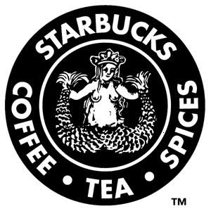
Starbucks. A pretty well known company.
I have done a thread on this before which featured a blog belonging to someone which I will link at the end. I will do a brief summary of their findings as it links into my other research. Pictures are best way of showing you the linkage.
Note that a picture links a secret society with the same acronym as the colour scheme - GWB (Great White Brotherhood) Great White Brotherhood Information I believe this is irrelevant, but some may find a link if you look hard enough. I haven't gone that deep but plan to as I put up more of my findings.
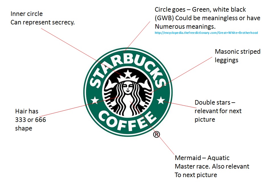
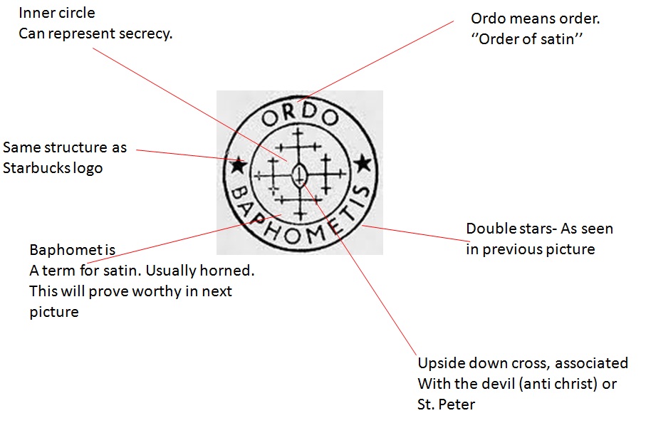
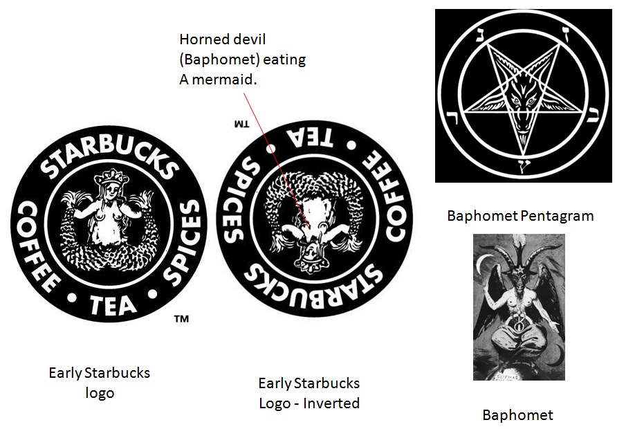
Those are the symbols and other weird things surrounding the Starbucks logo. These are the different stages of the logo.
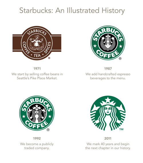
The designer of these logos is Terry Heckler of Heckler Associates - I found this out by emailing Starbucks themselves.
I in no way take credit for these findings. An addition I made to my research is the GWB acronym and the Baphomet pentagram. The original article talks about that Ordo Baphomet symbol being used on Nazi graves but I couldn't find anything on that so I left it out.
There is a lot of information on the web about the Starbucks logo in particular but this is one so you can see the linkage.
I will continue to add my other findings on other logos in this thread, so don't post unless you have some really good information and that would be much appreciated. If you feel the need to say great find or anything U2U or comments on my profile is fine but I don't find it necessary. This is no way my work. I have some of my own stuff being prepared to be posted up for tomorrow.
In the mean time this is the original post that brought the starbucks logo to my attention.
Blog Gobs
I did my best to only put up information only that I am sure is true.
Something to add is that in the 1970's logo, the mermaid represents Obsession, addiction and death.
More information
You will see more posts come up over time of various other messages portrayed to us daily. If you think these are purely coincidences, I don't mind. It's a possibility. I am just pointing out links between them.
Stay tuned for more!
CRB
NOTE* I didn't mention the reason behind the relevance of the mermaid which I said would show in the next picture. I was going to link it in that a master race was the same agenda as Adolf Hitler. Since I decided not to link the Nazi grave symbolism I decided to leave out the mermaid link and forgot to change it. I will dig deeper to find a link between rune symbol and Nazi graves.
Lets start with this company.
Starbucks. A pretty well known company.
I have done a thread on this before which featured a blog belonging to someone which I will link at the end. I will do a brief summary of their findings as it links into my other research. Pictures are best way of showing you the linkage.
Note that a picture links a secret society with the same acronym as the colour scheme - GWB (Great White Brotherhood) Great White Brotherhood Information I believe this is irrelevant, but some may find a link if you look hard enough. I haven't gone that deep but plan to as I put up more of my findings.
Those are the symbols and other weird things surrounding the Starbucks logo. These are the different stages of the logo.
The designer of these logos is Terry Heckler of Heckler Associates - I found this out by emailing Starbucks themselves.
I in no way take credit for these findings. An addition I made to my research is the GWB acronym and the Baphomet pentagram. The original article talks about that Ordo Baphomet symbol being used on Nazi graves but I couldn't find anything on that so I left it out.
There is a lot of information on the web about the Starbucks logo in particular but this is one so you can see the linkage.
I will continue to add my other findings on other logos in this thread, so don't post unless you have some really good information and that would be much appreciated. If you feel the need to say great find or anything U2U or comments on my profile is fine but I don't find it necessary. This is no way my work. I have some of my own stuff being prepared to be posted up for tomorrow.
In the mean time this is the original post that brought the starbucks logo to my attention.
Blog Gobs
I did my best to only put up information only that I am sure is true.
Something to add is that in the 1970's logo, the mermaid represents Obsession, addiction and death.
More information
You will see more posts come up over time of various other messages portrayed to us daily. If you think these are purely coincidences, I don't mind. It's a possibility. I am just pointing out links between them.
Stay tuned for more!
CRB
NOTE* I didn't mention the reason behind the relevance of the mermaid which I said would show in the next picture. I was going to link it in that a master race was the same agenda as Adolf Hitler. Since I decided not to link the Nazi grave symbolism I decided to leave out the mermaid link and forgot to change it. I will dig deeper to find a link between rune symbol and Nazi graves.
edit on 22-11-2012 by curiousrb because: (no reason
given)
Satin is evil! I'm sure you meant to say satan, and I find the work you have done to be interesting. I often wonder how some companies come up
with their logos and the meaning behind them.
reply to post by VikingWarlord
Haha thanks for pointing that out! Oh well, my spelling isn't that great. A lot of the puzzle had been done. I just put a bit of it together but all the information is out there.
Haha thanks for pointing that out! Oh well, my spelling isn't that great. A lot of the puzzle had been done. I just put a bit of it together but all the information is out there.
reply to post by curiousrb
Indeed - whether one is religiously inclined or otherwise, this one is a real eye-opener.
House of Windsor Coat-of-Arms.......Biblical Revelations symbology-fest!!!!
If there is some sort of secret society going on all the owners of large corporations would surely put a meaning into their logos?
Indeed - whether one is religiously inclined or otherwise, this one is a real eye-opener.
House of Windsor Coat-of-Arms.......Biblical Revelations symbology-fest!!!!
reply to post by curiousrb
I can't spell worth crap anymore, I thought it was kind of funny. I know that subliminal messages are used a lot in advertisement, and I'm
sure the same applies to logo's and symbols.
Next Logo
The famous company

EBAY was founded by Pierre Omidyar, who is a French-born American Iranian.
The most interesting logo design by ebay is this one.
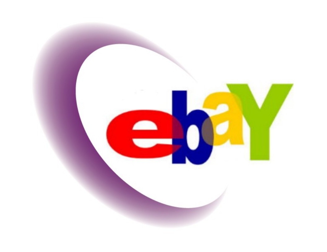
A few things that are represented in this concept.
- The crescent
Obviously this could be interpreted into ebay's ability or ambition to ''grow'', ''increase in power''.
From the same persons blog, an interesting concept is brought up.
I then made a connection with another symbol which links into the middle eastern back ground of the founder.
The star and crescent.
In this case ebay is the star.
This is tricky because depending on how you view the star is whether you see it upside down or not.
I think the 5 pointed star has a deeper meaning. Christians see the star as evil due to the French occultist ''Eliphas Levi''. It's important to note he was a French occult author. He tried to publish his books under his name translated into Hebrew. Although he was not Jewish.
This alone is a very strange tie in with the French and middle east culture such as ebay founder has French and middle eastern ties.
So how does the star tie in with Islamic symbolism?
Now it's interesting as to how an Islamic symbol is incorporated into a company founded by a French Iranian.
Well as mentioned earlier, Eliphas Levi, gave the 5 pointed star an evil image.
This is his concept of a 5 pointed star.
I wouldn't find the link interesting if there wasn't a French - middle easter connection, even though Levis middle eastern connect is poor. I believe it has some value due to its randomness and possibility he had ties with the Jewish.
The crescent and star is also often seen through out the middle eastern symbols such as flags.
I believe while the logo is unlike the starbucks logo, and has a less sinister representation, there is a possibility of a cult behind the company.
That one has the possibility of being extremely further explored. The ties with Jewish religion lead me to believe the logo represents worship.
I think that's enough of that logo, before it gets a bit out of hand.
If you want sources etc just say so, but there is a lot so I willl provide on request.
The famous company
EBAY was founded by Pierre Omidyar, who is a French-born American Iranian.
The most interesting logo design by ebay is this one.
A few things that are represented in this concept.
- The crescent
The word crescent is derived etymologically from the present participle of the Latin verb crescere "to grow", thus meaning "waxing" or "increasing",
Obviously this could be interpreted into ebay's ability or ambition to ''grow'', ''increase in power''.
From the same persons blog, an interesting concept is brought up.
he disc is the "Invisible Sun" that gives off the "dark light" of lucifer. Also an occult crescent moon. Also the incomplete circle of the new world order (lowercase intentional). Just as shapes and numbers have symbolic meanings in the occult, so does every colour. Red and blue are the two rites of masonry. Gold and green are the colours of money
I then made a connection with another symbol which links into the middle eastern back ground of the founder.
The star and crescent.
In this case ebay is the star.
This is tricky because depending on how you view the star is whether you see it upside down or not.
The inverted star (upside down) is also used in some Wiccan traditions as a symbol of the 2nd degree
I think the 5 pointed star has a deeper meaning. Christians see the star as evil due to the French occultist ''Eliphas Levi''. It's important to note he was a French occult author. He tried to publish his books under his name translated into Hebrew. Although he was not Jewish.
This alone is a very strange tie in with the French and middle east culture such as ebay founder has French and middle eastern ties.
So how does the star tie in with Islamic symbolism?
The five-pointed star can be said to represent the give (5) pillars of Islam: (1) the declaration of faith; (2) the duty to pray 5 times a day; (3) giving zakat, the annual charity, (4) fasting in the month of Ramadan; and (5) performance of Hajj, the pilgrimage, and the 7 points in the symbol - 5 fro the star and 2 from the crescent moon - may be likened to represent the 7 articles of faith for the Muslims, they are belief in (1) Allah (God); (2) Angles; (3) God’s Books - the Torah, the Bible, and the Qur’an; (4) God’s Messengers - Adam to Moses to Jesus to Muhammad (Peace be upon them all); (5) the Day of Resurrection; (6) Destiny; and (7) Life after Death.
Now it's interesting as to how an Islamic symbol is incorporated into a company founded by a French Iranian.
Well as mentioned earlier, Eliphas Levi, gave the 5 pointed star an evil image.
This is his concept of a 5 pointed star.
I wouldn't find the link interesting if there wasn't a French - middle easter connection, even though Levis middle eastern connect is poor. I believe it has some value due to its randomness and possibility he had ties with the Jewish.
The crescent and star is also often seen through out the middle eastern symbols such as flags.
I believe while the logo is unlike the starbucks logo, and has a less sinister representation, there is a possibility of a cult behind the company.
That one has the possibility of being extremely further explored. The ties with Jewish religion lead me to believe the logo represents worship.
I think that's enough of that logo, before it gets a bit out of hand.
If you want sources etc just say so, but there is a lot so I willl provide on request.
edit on 22-11-2012 by curiousrb because: (no reason
given)
If you would like to give me a logo don't mind having a look. I can try my best but can't promise to find anything. The better ones are the ones
primarily fueled on money. And wealth... I.E the powerful ones...
reply to post by kerazeesicko
This is a very common tactic used by those who can not wrap their minds around a reality they have just been confronted with.
It is called ridicule.
This is a very common tactic used by those who can not wrap their minds around a reality they have just been confronted with.
It is called ridicule.
My next lgo is that of a company who have an important role in our world.
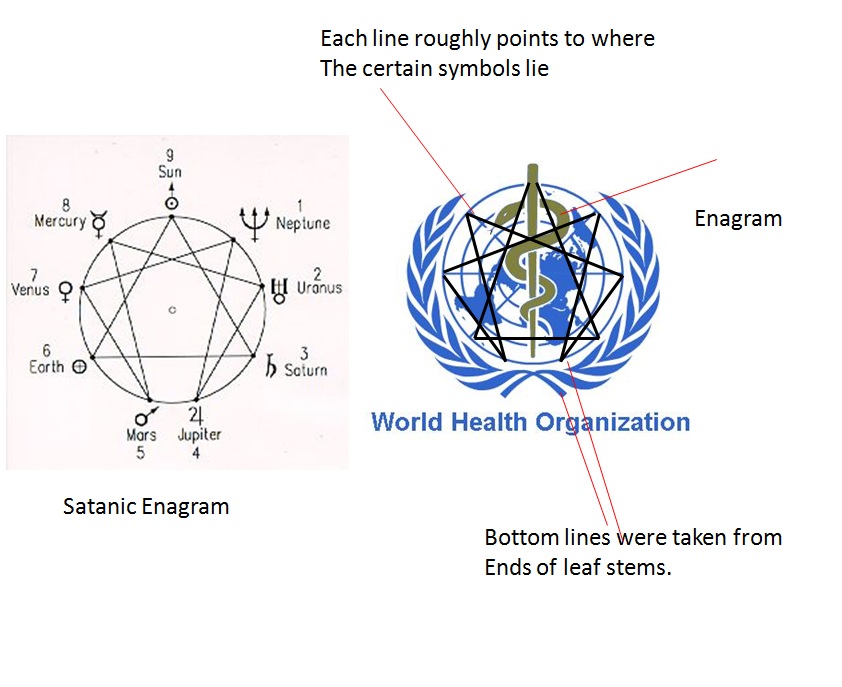
Well WHO?
That's it, WHO. The World Health Organization.
This is a specialist organization of the UN.
A very interesting and detailed logo.
This logo would actually seem to have a less sinister logo - Depending on the symbols you look at.
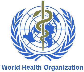
The serpent alone is a very interesting symbol on its own. And being wrapped around a sword make WHO seem like a nice organization.
So, the serpent wrapped around the sword is a christian symbol.
It is know as ''The serpent lifted up''.
It means a sign of salvation coming from the old testament and mentioned in John 3:14.
Source
But can it have a double meaning?
Well where do we know the serpent from? In religious terms?
The Adam and Eve story. So the serpent can also be seen as the devil.
Lets have a look at the dagger.
The dagger is said to symbolize deception (important), stealth and/or treachery.
Source
So are we seeing deception of the WHO?
It would fit wouldn't it?
They are making us think the represent salvation when it could possibly mean they're are the devil, deceiving the world.
The bracketed numbers are just the sources of the wikipedia article.
Find it here
Did WHO play up the Swine Flu ''pandemic'' to introduce vaccines?
Do I need to explain why introducing vaccines is a bit.... suspicious?
No, I think we all know where that will head and what it could possibly imply.
The second symbolic part of the logo is the wheat.
Wheat is a symbol of life and resurrection - This is also a religious belief.
But how does this relate to WHO? Or the UN for that matter as they have the same logo but the UN logo has no serpent.
Does this mean the life, death and then resurrection of the human race?
Perhaps it doesn't quite mean we are going to die but more that the earth will experience near death or come to a sort of dooms-day, which will end with a few surviving to resurrect what is left. I have no clue.
Another way of looking at it is denoting immortality. This could mean that the UN can't be stopped. This is a more appropriate symbol of wheat and is state in this article
The same article also talks about wheat being a strong masonic symbol.
We can also look at it as what the Greek gods and goddesses wore.
They are known as a ''Wreath of Laurel leaves'' and are a symbol of victory.
Read it here Article
For further fame and recognition?
maybe thats what the immortality part means?
The UN/WHO will be immortal through the mark they left on history?
My last bit of hidden symbolism which i will leave you to ponder on.
That's all for the UN/WHO logo anyway.
More to come.
Well WHO?
That's it, WHO. The World Health Organization.
This is a specialist organization of the UN.
A very interesting and detailed logo.
This logo would actually seem to have a less sinister logo - Depending on the symbols you look at.
The serpent alone is a very interesting symbol on its own. And being wrapped around a sword make WHO seem like a nice organization.
So, the serpent wrapped around the sword is a christian symbol.
It is know as ''The serpent lifted up''.
It means a sign of salvation coming from the old testament and mentioned in John 3:14.
Source
But can it have a double meaning?
Well where do we know the serpent from? In religious terms?
The Adam and Eve story. So the serpent can also be seen as the devil.
Lets have a look at the dagger.
The dagger is said to symbolize deception (important), stealth and/or treachery.
Source
So are we seeing deception of the WHO?
It would fit wouldn't it?
They are making us think the represent salvation when it could possibly mean they're are the devil, deceiving the world.
2009 influenza pandemic Main article: 2009 flu pandemic Swine Influenza A/H1N1 In 2007, the WHO organized work on pandemic influenza vaccine development through clinical trials in collaboration with many experts. A pandemic involving the H1N1 influenza virus was declared by Director-General Margaret Chan in April 2009. By the post-pandemic period critics claimed the WHO had exaggerated the danger, spreading "fear and confusion" rather than "immediate information".[102] Industry experts countered that the 2009 pandemic had led to "unprecedented collaboration between global health authorities, scientists and manufacturers, resulting in the most comprehensive pandemic response ever undertaken, with a number of vaccines approved for use three months after the pandemic declaration. This response was only possible because of the extensive preparations undertaken in during the last decade".[103]
The bracketed numbers are just the sources of the wikipedia article.
Find it here
Did WHO play up the Swine Flu ''pandemic'' to introduce vaccines?
Do I need to explain why introducing vaccines is a bit.... suspicious?
No, I think we all know where that will head and what it could possibly imply.
The second symbolic part of the logo is the wheat.
Wheat is a symbol of life and resurrection - This is also a religious belief.
But how does this relate to WHO? Or the UN for that matter as they have the same logo but the UN logo has no serpent.
Does this mean the life, death and then resurrection of the human race?
Perhaps it doesn't quite mean we are going to die but more that the earth will experience near death or come to a sort of dooms-day, which will end with a few surviving to resurrect what is left. I have no clue.
Another way of looking at it is denoting immortality. This could mean that the UN can't be stopped. This is a more appropriate symbol of wheat and is state in this article
The same article also talks about wheat being a strong masonic symbol.
We can also look at it as what the Greek gods and goddesses wore.
They are known as a ''Wreath of Laurel leaves'' and are a symbol of victory.
In common modern idiomatic usage it refers to a victory. The expression "resting on one's laurels" refers to someone relying entirely on long-past successes for continued fame or recognition, where to "look to one's laurels" means to be careful of losing rank to competition
Read it here Article
For further fame and recognition?
maybe thats what the immortality part means?
The UN/WHO will be immortal through the mark they left on history?
My last bit of hidden symbolism which i will leave you to ponder on.
That's all for the UN/WHO logo anyway.
More to come.
edit on 23-11-2012 by curiousrb because: (no reason given)
This next company has a logo which is pretty normal and is hard to find much symbolism but I found a possible link.
Lets look at
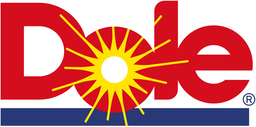
American based agricultural multi-national corporation.
Just so you know, I am 100% doubtful that DOLE has any care for its customers or any associations. Money is key in this company.
I think it's important that you all know about DOLE as they have a pretty horrific back ground.
For a start
Source
This logo is based on gods - From the symbolism I picked up.
First symbolic meaning.
The use of the sun in the ''O'' of the word DOLE.
A sun is known as the center of Worship.
God is seen as the sun. Many cultures and religions worshiped the sun as a god. DOLE is the god of the agricultural business. This would be the most accurate representation.
The sun is also a symbol of authority.
In this case it would be authority of the agricultural industry.
Alchemically, gold is seen as the material of the sun. This could represent the wealth of the DOLE corporation. Being based on wealth and gold. This related to what I mentioned earlier. It can be a metaphor. The sun is a source of energy to keep things going. Gold is what keeps DOLE going. Gold could be considered motivation to DOLE to carry on working as it grows larger.
Due to the location of the letters with the O (sun) being below the rest I am certain that it is a setting sun with the blue strip representing the water.
A setting sun is a symbol for
Source
If you read the DOLE wikipedia article you'll see they have a tendency to terminate people through their food. The GM food is also a worrying sign.
I believe this is a huge symbolism of sun and worship and power behind the DOLE logo.
The fact that they opposed GM labels doesn't surprise me but it does worry me. They have something to hide that's for sure. I can hopefully look further into this logo.
One thing to note is the red writing which is a colour of communism. But this could be mere design. As any of these symbols could be.
The sun symbol as a god also allows linkage to ancient Egyptian history with the Sun God ''Ra''. He later became associated with Horus. Some of you may know of the symbolic eye of Horus. Perhaps it is resembled through the letter E?
NEW IMPORTANT FINIDNG.
Dole from latin translates to english as suffer. This really worries me.
A few people have suffered from them. Check out Dole's history!
What is Dole's real agenda? They use genetically modified food, and oppose allowing labels displaying details on the genetic modification.
And these
This company is guilty of being in-humane.
I still can't believe Suffer in english translates to Dole in Latin.
They sure live up to their name.
Lets look at
American based agricultural multi-national corporation.
Just so you know, I am 100% doubtful that DOLE has any care for its customers or any associations. Money is key in this company.
I think it's important that you all know about DOLE as they have a pretty horrific back ground.
For a start
Throughout 2012, Dole Packaged Foods contributed $171,261 to a $46 million dollar political campaign known as "The Coalition Against The Costly Food Labeling Proposition, sponsored by Farmers and Food Producers" [34] This organization was set up to oppose a citizen's initiative, known as Proposition 37, demanding mandatory labeling of foods containing genetically modified ingredients. As a result, there is a growing boycott of their products across North America
Source
This logo is based on gods - From the symbolism I picked up.
First symbolic meaning.
The use of the sun in the ''O'' of the word DOLE.
A sun is known as the center of Worship.
God is seen as the sun. Many cultures and religions worshiped the sun as a god. DOLE is the god of the agricultural business. This would be the most accurate representation.
The sun is also a symbol of authority.
In this case it would be authority of the agricultural industry.
Alchemically, gold is seen as the material of the sun. This could represent the wealth of the DOLE corporation. Being based on wealth and gold. This related to what I mentioned earlier. It can be a metaphor. The sun is a source of energy to keep things going. Gold is what keeps DOLE going. Gold could be considered motivation to DOLE to carry on working as it grows larger.
Due to the location of the letters with the O (sun) being below the rest I am certain that it is a setting sun with the blue strip representing the water.
A setting sun is a symbol for
SUN-SETTING: A symbol either of the termination, or the commencement, of the great cycle of life
Source
If you read the DOLE wikipedia article you'll see they have a tendency to terminate people through their food. The GM food is also a worrying sign.
I believe this is a huge symbolism of sun and worship and power behind the DOLE logo.
The fact that they opposed GM labels doesn't surprise me but it does worry me. They have something to hide that's for sure. I can hopefully look further into this logo.
One thing to note is the red writing which is a colour of communism. But this could be mere design. As any of these symbols could be.
The sun symbol as a god also allows linkage to ancient Egyptian history with the Sun God ''Ra''. He later became associated with Horus. Some of you may know of the symbolic eye of Horus. Perhaps it is resembled through the letter E?
NEW IMPORTANT FINIDNG.
Dole from latin translates to english as suffer. This really worries me.
A few people have suffered from them. Check out Dole's history!
What is Dole's real agenda? They use genetically modified food, and oppose allowing labels displaying details on the genetic modification.
And these
Labor relations The banana industry has traditionally been dominated by a few large corporations, which employ low-wage workers in developing countries.[23][24] Dole was named as a defendant in a wrongful death lawsuit filed on behalf of 73 heirs of victims of paramilitary violence in Colombia.[25] In 2007, Nicaraguan plantation workers, represented by Los Angeles-based personal injury lawyer Juan Dominguez, sued Dole and Dow Chemical Company, claiming the use of illegal pesticides such as the now banned Nemagon (containing DBCP) had made them sterile. The pesticide was not banned in Nicaragua until after Dole ceased its operations within the country. The suit and two others were subsequently thrown out by California courts after it was concluded that “[c]ontrary to their sworn testimony, most of the plaintiffs never worked on Dole-affiliated banana farms and none were involved in the DBCP application process,” while similar lawsuits were filed in U.S. and Nicaraguan courts.[26]
In 2005, 23 people in Minnesota were sickened with E. coli O157:H7. The source of the bacteria was found to be Dole brand bagged lettuce.[21] Then in 2006, another E. coli outbreak that caused over 200 people to become ill and killed 3 more was linked to bagged spinach sold by Dole. The spinach was processed by Natural Selection Foods in California.[22]
Swedish director Fredrik Gertten made a documentary film about Dominguez and the alleged banana workers. The movie Bananas!* premiered in the 2009 Los Angeles Film Festival. Because Dole had serious concerns on what the film might reveal to the public, it urged festival officials to "immediately cease and desist" their sponsorship of the film.[27][28][29][30] The festival officials allowed the film to be screened, but it was not allowed to compete for placement in the competition. In addition, festival officials distributed information before the film's screening that indicated Dole believed the film to be factually inaccurate. Although the film was screened with a disclaimer from the festival, Gertten was subsequently sued for defamation by Dole.[31] The lawsuit was dropped on October 15, 2009, and in November 2010 a court in Los Angeles found in favour of the movie crew making it possible to release the movie in the USA, and ordering Dole to pay SEK 1.4 million (roughly USD 200,000) to the filmmakers.[32]
This company is guilty of being in-humane.
I still can't believe Suffer in english translates to Dole in Latin.
They sure live up to their name.
edit on 23-11-2012 by curiousrb because: (no reason given)
edit on 23-11-2012 by curiousrb because: (no reason given)
nice thread
it made me think, to be frank
there is symbolism everywhere, everywhere.
it made me think, to be frank
there is symbolism everywhere, everywhere.
reply to post by QQXXw
Thanks Just from that, you haven given me some motivation to cover a few more logos
Thanks Just from that, you haven given me some motivation to cover a few more logos
I'm back, and ready to research this next logo.
Lets take a look at a news provider.
The AP (Associated Press)
There logo is pretty basic, but there is one thing I noticed about it right away.
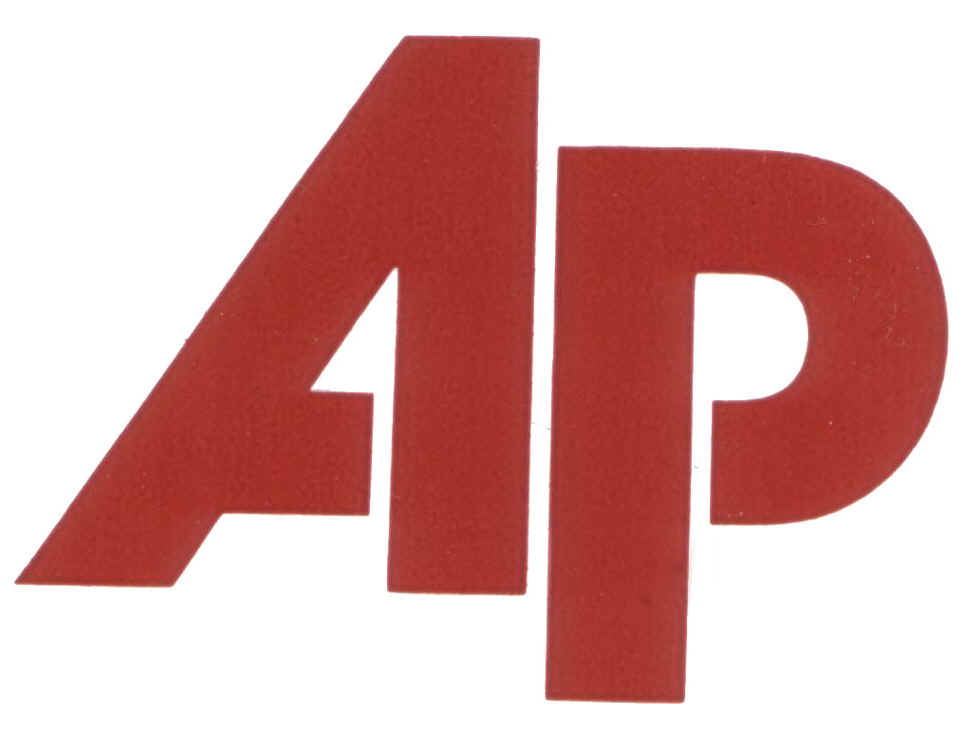
Here we have their logo.
Well I noticed this straight away.
The number one.
Well, what does this symbolize?
For a start, the number one has many symbolic meanings.
- Express the notion of chief, the first in a hierarchy of authority or of power.
- According to Aggripa, "the number 1 refers to the supreme God, which being one and innumerable, creates however numerable things and contains them in Himself". Saint Augustin affirms similarly telling that the Unit refers "to the supreme, God, Principle of all things".
- The unit is the starting point, the beginning, the symbol of the absolute origin and the outcome. The 1 is therefore the precursor, the pioneer, the initiator, the new, the original, the nine, the germ and at the same time the root, the birth of all that lives.
So apply this to AP?
AP are the first in a hierarchy of authority or of power. So what could this mean?
They have the most power in the media world?
The second point I have provided, would also point to this.
They are the supreme god of the media?
The third point I wasn't sure about including but thought I would.
The birth of all that lives?
The birth of all media?
That point could present a number of ideas.
Symbolism of number one
The red colour symbolizes communism.
That's about all I know on the AP's logo.
You could flip it upside down to get the letters ''dv''.
This translates to 500 and 5.
These two numbers both have significant meanings.
The 1 could in fact also be a flag. This can represent conquering due to the fact of what it is placed on. Have the conquered the media industry?
I'll get onto another logo shortly. One that has a bit more symbolism.
Lets take a look at a news provider.
The AP (Associated Press)
There logo is pretty basic, but there is one thing I noticed about it right away.
Here we have their logo.
Well I noticed this straight away.
The number one.
Well, what does this symbolize?
For a start, the number one has many symbolic meanings.
- Express the notion of chief, the first in a hierarchy of authority or of power.
- According to Aggripa, "the number 1 refers to the supreme God, which being one and innumerable, creates however numerable things and contains them in Himself". Saint Augustin affirms similarly telling that the Unit refers "to the supreme, God, Principle of all things".
- The unit is the starting point, the beginning, the symbol of the absolute origin and the outcome. The 1 is therefore the precursor, the pioneer, the initiator, the new, the original, the nine, the germ and at the same time the root, the birth of all that lives.
So apply this to AP?
AP are the first in a hierarchy of authority or of power. So what could this mean?
They have the most power in the media world?
The second point I have provided, would also point to this.
They are the supreme god of the media?
The third point I wasn't sure about including but thought I would.
The birth of all that lives?
The birth of all media?
That point could present a number of ideas.
Symbolism of number one
The red colour symbolizes communism.
That's about all I know on the AP's logo.
You could flip it upside down to get the letters ''dv''.
This translates to 500 and 5.
These two numbers both have significant meanings.
The 1 could in fact also be a flag. This can represent conquering due to the fact of what it is placed on. Have the conquered the media industry?
I'll get onto another logo shortly. One that has a bit more symbolism.
edit on 24-11-2012 by curiousrb because: (no reason given)
This next logo, you will all be familiar with
They are the cause of debt and need to go.
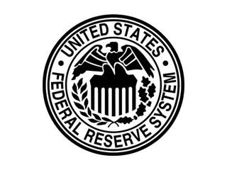
The Federal Reserve.
Already you would have noticed
Circle with in a circle.
This represents secrecy. And it's no surprise that there would be an element of secrecy surrounding such an institution.
This logo has a very similar logo structure to that of the Star Bucks logo which was discussed as the OP.
This logo also then has the wheat. The wheat can represent two things as earlier stated. Well it represents many things. Three are
Life and resurrection: The Federal reserve was established before the date of 1913, but was fought against and was removed. After various economic troubles, the bankers argued that the Federal reserve was needed. The Federal reserve had been resurrected.
Immortality: The Federal reserve has so far stood for 99 years and is going under review next year to look at the Federal reserve system itself. This could see the Federal reserve either stay or go.
Even if the reserve is terminated, I doubt it will be then end of the kind that run it. They will appear under different images. But that's my opinion.
Food of the lord: This could infer that the FR is a sort of Lord. Which there is no denying they hold a strong power over many aspects of today's civilization.
The eagle while being a significant symbol of the USA, has a meaning that could relate more to the FR.
The eagle represents dominance of a race. It is dominant of the birds and hence the symbolic meaning. This means the FR has dominance and therefore control over our race. This is true. Our race is based on a monetary system which they control. They print money and we want money.
The eagle also represents power. This again relates to the agenda of the FR. More and more power. They put the USA more and more in debt. They then ''bail the USA out'' by lending them more money. Making them look like good guys. Obviously this is not true and it is just a good way to utilize interest.
The eagle can also symbolize a Ruler, authority and command. Let me tell you now that the eagle in the Federal Reserve logo, most certainly does not symbolize freedom. It's far from it and basically the opposite.
It wouldn't be surprising it this institution was associated with secrecy or NWO. Especially looking at all the symbolism on American notes.
Any that's me for now. I'll be writing soon.
They are the cause of debt and need to go.
The Federal Reserve.
Already you would have noticed
Circle with in a circle.
This represents secrecy. And it's no surprise that there would be an element of secrecy surrounding such an institution.
This logo has a very similar logo structure to that of the Star Bucks logo which was discussed as the OP.
This logo also then has the wheat. The wheat can represent two things as earlier stated. Well it represents many things. Three are
Life and resurrection: The Federal reserve was established before the date of 1913, but was fought against and was removed. After various economic troubles, the bankers argued that the Federal reserve was needed. The Federal reserve had been resurrected.
Immortality: The Federal reserve has so far stood for 99 years and is going under review next year to look at the Federal reserve system itself. This could see the Federal reserve either stay or go.
Even if the reserve is terminated, I doubt it will be then end of the kind that run it. They will appear under different images. But that's my opinion.
Food of the lord: This could infer that the FR is a sort of Lord. Which there is no denying they hold a strong power over many aspects of today's civilization.
The eagle while being a significant symbol of the USA, has a meaning that could relate more to the FR.
The eagle represents dominance of a race. It is dominant of the birds and hence the symbolic meaning. This means the FR has dominance and therefore control over our race. This is true. Our race is based on a monetary system which they control. They print money and we want money.
The eagle also represents power. This again relates to the agenda of the FR. More and more power. They put the USA more and more in debt. They then ''bail the USA out'' by lending them more money. Making them look like good guys. Obviously this is not true and it is just a good way to utilize interest.
The eagle can also symbolize a Ruler, authority and command. Let me tell you now that the eagle in the Federal Reserve logo, most certainly does not symbolize freedom. It's far from it and basically the opposite.
It wouldn't be surprising it this institution was associated with secrecy or NWO. Especially looking at all the symbolism on American notes.
Any that's me for now. I'll be writing soon.
Interesting thread.
I can't get an image to post off my tablet
AOL America online
Link
First of all I want to point out its not just logos but initials they can use.
To me AOL stands for Angel of Light aka lucifer.
The circle within the triangle, not that this one is really a circle but two crescents, also used by alcoholics anomymous and various other companies has occult meanings, im not having any luck deciphering right now, but not only that, my own impression I thought of , is to imagine the circle is the earth and 3 satellites or other celestial entities or crafts are watching by line of sight. It's the idea we are being watched. You only need three vantage points to achieve this. Correct?
Don't forget the all seeing eye in the CBS Logo!
There is Green Giant which is said to be the god 'Pan'
reply to post by curiousrb
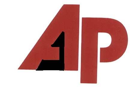
Funnily enough I didn't see the number one right away, how you blacked it out. I see an Egyptian seated statue or throne.
Funnily enough I didn't see the number one right away, how you blacked it out. I see an Egyptian seated statue or throne.
reply to post by violet
I can see both now that you mention it, the AP logo is very clever, the real purpose of AP is hidden within plain site
but we do not notice it until it has been pointed out
I can see both now that you mention it, the AP logo is very clever, the real purpose of AP is hidden within plain site
but we do not notice it until it has been pointed out
reply to post by curiousrb
OP I appreciate your thread.
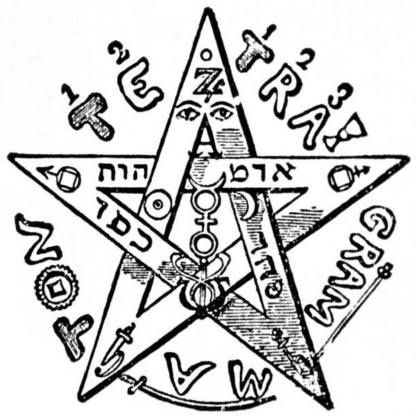
The pentacle/pentagram is representative of the material world (or manifestation in thereof). The hexagram is representative of the heavenly. This has to do with actual experience of the 'spiritual' realm (astral travel/ lucid dreaming). Did you know that '___' which is produced by your and every other human being's pineal gland has a carbon chain structure which has a hexagon attached to a pentagon?
The inverted pentacle is involved in activation the so called klippoth as opposed to the crown chakra. You can see this in the art of the students of the mysteries (see medici 6 points in a shield and rothschild shield).
Many of the other symbols have more to do with what is actually experienced or the intended experience of the 'working'.
The crescent moon with a star is common to Isis and all the mysteries tend to involve a triad of sun god, queen of heaven, and a divine child.
It is based heavily in astrological alignments and so you will often see the double cross (octagon) expressed as an eight spoke wheel which represents a heavenly clock of sorts. It represents the equinoxes and the four corners and is usually a solar symbol.
What you are seeing are symbols of societies which feel they qualify as solar beings (illuminated) in that there actions begin in the heavens and are expressed on earth (the material plane) and I find best represented in the kabblic sense of matter descending from God and increasingly becoming more dense in its travels from kether to malkuth.
Note:
Also the crescent often represents Saturn which is known to have a hexagon shaped storm on its pole.
OP I appreciate your thread.
The pentacle/pentagram is representative of the material world (or manifestation in thereof). The hexagram is representative of the heavenly. This has to do with actual experience of the 'spiritual' realm (astral travel/ lucid dreaming). Did you know that '___' which is produced by your and every other human being's pineal gland has a carbon chain structure which has a hexagon attached to a pentagon?
The inverted pentacle is involved in activation the so called klippoth as opposed to the crown chakra. You can see this in the art of the students of the mysteries (see medici 6 points in a shield and rothschild shield).
Many of the other symbols have more to do with what is actually experienced or the intended experience of the 'working'.
The crescent moon with a star is common to Isis and all the mysteries tend to involve a triad of sun god, queen of heaven, and a divine child.
It is based heavily in astrological alignments and so you will often see the double cross (octagon) expressed as an eight spoke wheel which represents a heavenly clock of sorts. It represents the equinoxes and the four corners and is usually a solar symbol.
What you are seeing are symbols of societies which feel they qualify as solar beings (illuminated) in that there actions begin in the heavens and are expressed on earth (the material plane) and I find best represented in the kabblic sense of matter descending from God and increasingly becoming more dense in its travels from kether to malkuth.
Note:
Also the crescent often represents Saturn which is known to have a hexagon shaped storm on its pole.
edit on 25-11-2012 by FriedBabelBroccoli
because: 101
new topics
-
4/27/24 New Jersey Earthquake
Fragile Earth: 4 hours ago -
Fun with extreme paints
Interesting Websites: 5 hours ago -
CIA is alleged to be operat social media troll frms in Kyiv
ATS Skunk Works: 6 hours ago -
Rainbow : Stargazer
Music: 7 hours ago -
I sleep no more.
Philosophy and Metaphysics: 9 hours ago -
Canada caught red-handed manipulating live weather data and make it warmer
Fragile Earth: 10 hours ago -
Why Files Our Alien Overlords | How We Secretly Serve The Tall Whites
Aliens and UFOs: 11 hours ago
top topics
-
Canada caught red-handed manipulating live weather data and make it warmer
Fragile Earth: 10 hours ago, 16 flags -
Why Files Our Alien Overlords | How We Secretly Serve The Tall Whites
Aliens and UFOs: 11 hours ago, 11 flags -
Curse of King Tuts Tomb Solved
Ancient & Lost Civilizations: 12 hours ago, 9 flags -
CIA is alleged to be operat social media troll frms in Kyiv
ATS Skunk Works: 6 hours ago, 6 flags -
4/27/24 New Jersey Earthquake
Fragile Earth: 4 hours ago, 6 flags -
What allies does Trump have in the world?
ATS Skunk Works: 12 hours ago, 5 flags -
I sleep no more.
Philosophy and Metaphysics: 9 hours ago, 4 flags -
Fun with extreme paints
Interesting Websites: 5 hours ago, 2 flags -
Rainbow : Stargazer
Music: 7 hours ago, 1 flags
active topics
-
Ireland VS Globalists
Social Issues and Civil Unrest • 14 • : covent -
Gov Kristi Noem Shot and Killed "Less Than Worthless Dog" and a 'Smelly Goat
2024 Elections • 92 • : cherokeetroy -
Today I am 8
Members • 21 • : randomuser2034 -
Big Storms
Fragile Earth • 19 • : lilzazz -
George Knapp AMA on DI
Area 51 and other Facilities • 40 • : TheDiscoKing -
I sleep no more.
Philosophy and Metaphysics • 13 • : RAY1990 -
Silent Moments --In Memory of Beloved Member TDDA
Short Stories • 76 • : RAY1990 -
Why Files Our Alien Overlords | How We Secretly Serve The Tall Whites
Aliens and UFOs • 11 • : TheValeyard -
What allies does Trump have in the world?
ATS Skunk Works • 6 • : nugget1 -
CIA is alleged to be operat social media troll frms in Kyiv
ATS Skunk Works • 23 • : theatreboy
13