It looks like you're using an Ad Blocker.
Please white-list or disable AboveTopSecret.com in your ad-blocking tool.
Thank you.
Some features of ATS will be disabled while you continue to use an ad-blocker.

Dazzling Map Reveals Rising Menace of US Fires
page: 12
share:
A colorful map created to show wildfires from 2001 thru July 2012. The creator of this map used data from NASA satellites and highlighted wildfires
that generated at least 100 Megawatts:
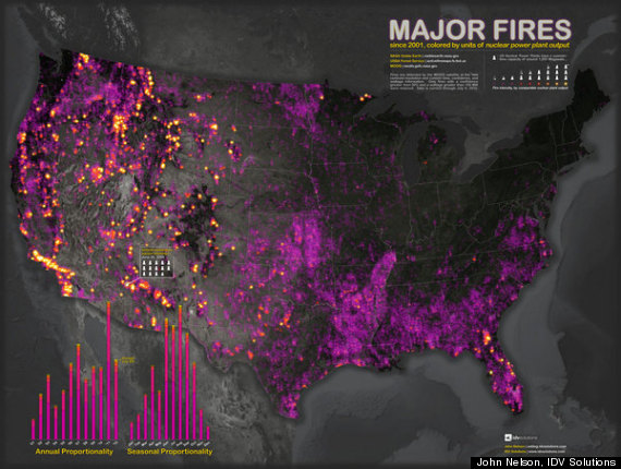
Visually, this map captures the intensity of wildfires occurring in North America as recently as the Colorado fires.
Link to website:
Dazzling Map Reveals Rising Menace of US Fires
For the purposes of his map, Nelson plotted only fires of at least 100 megawatts (MW), and those for which NASA expressed at least a 50 percent confidence rating. "I wanted to capture the more meaningful fire events," he said.
Visually, this map captures the intensity of wildfires occurring in North America as recently as the Colorado fires.
Link to website:
Dazzling Map Reveals Rising Menace of US Fires
reply to post by Kratos40
For me, this visually informative map reminds me of the Rodeo-Chediski wildfire that devastated a huge area of forest in Arizona. I got close enough to witness the huge blaze and several years later to see the aftermath. The only problem I have with the article is that it fails to mention intentional or accidental wildfires started by humans.
For me, this visually informative map reminds me of the Rodeo-Chediski wildfire that devastated a huge area of forest in Arizona. I got close enough to witness the huge blaze and several years later to see the aftermath. The only problem I have with the article is that it fails to mention intentional or accidental wildfires started by humans.
new topics
-
4/27/24 New Jersey Earthquake
Fragile Earth: 4 hours ago -
Fun with extreme paints
Interesting Websites: 5 hours ago -
CIA is alleged to be operat social media troll frms in Kyiv
ATS Skunk Works: 6 hours ago -
Rainbow : Stargazer
Music: 7 hours ago -
I sleep no more.
Philosophy and Metaphysics: 10 hours ago -
Canada caught red-handed manipulating live weather data and make it warmer
Fragile Earth: 10 hours ago -
Why Files Our Alien Overlords | How We Secretly Serve The Tall Whites
Aliens and UFOs: 11 hours ago
2